Home Tour - Contemporary Chateau
Introduction
When this project inquiry came across our inbox, we were instantly intrigued. Our clients had relocated from California to Lake Forest, bringing with them a contemporary and minimalist aesthetic that we were excited to incorporate into our design. The twist was that they had purchased a historic, French Chateau style home with ornate moldings and heavy damask drapery everywhere. This presented DGI with the challenge of marrying the existing French-style architectural details with contemporary furnishings and a minimalist aesthetic. We’re so glad we took on the challenge because the result is better than we even envisioned. We’re thrilled to bring you this home tour!
The moodboard we designed at the start of the project sets a sophisticated yet serene tone for the design. We brought in moody colors, minimal forms, and natural textures to the moodboard that we referred back to at each step of the design process.
BEFORE
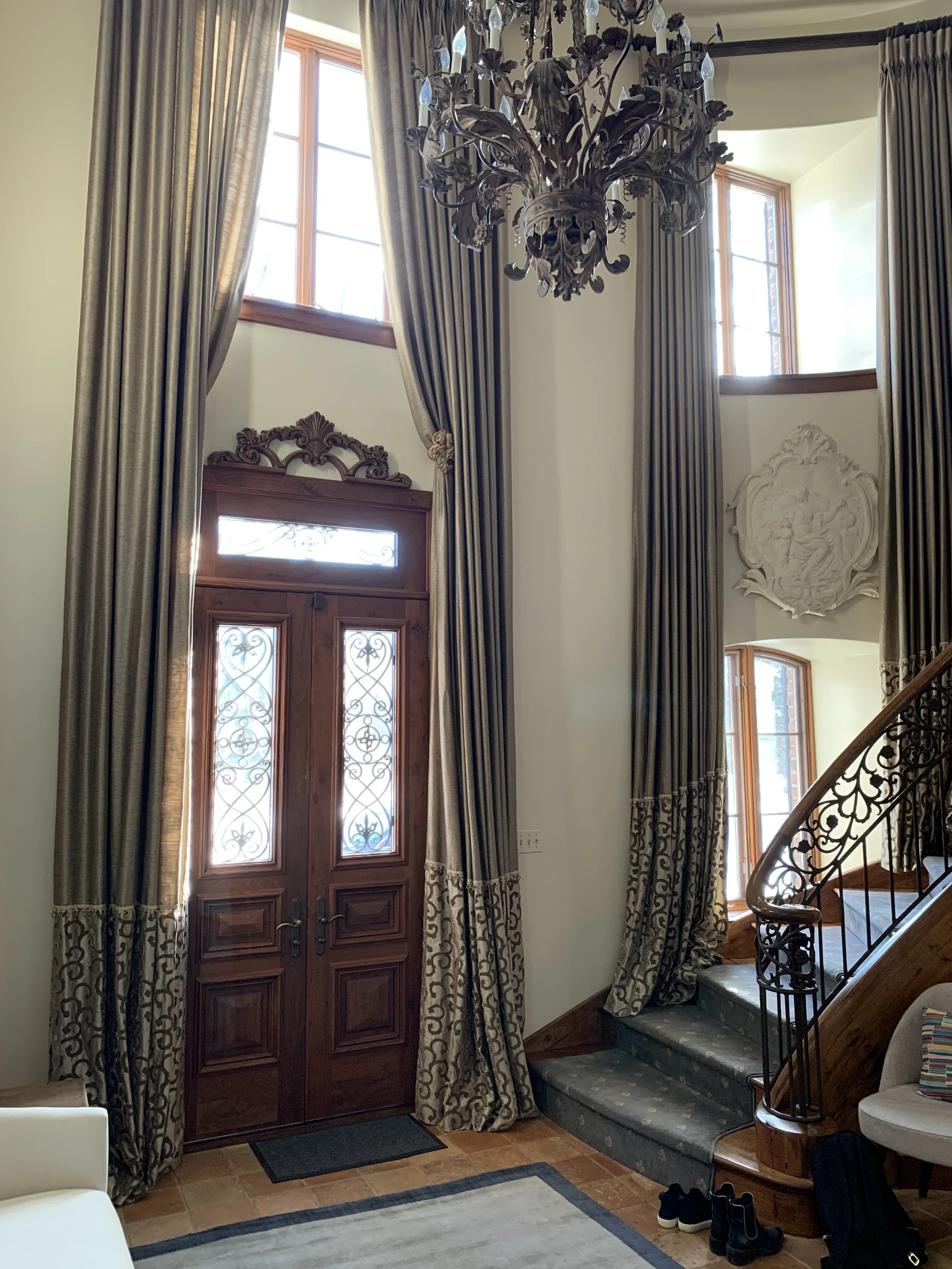
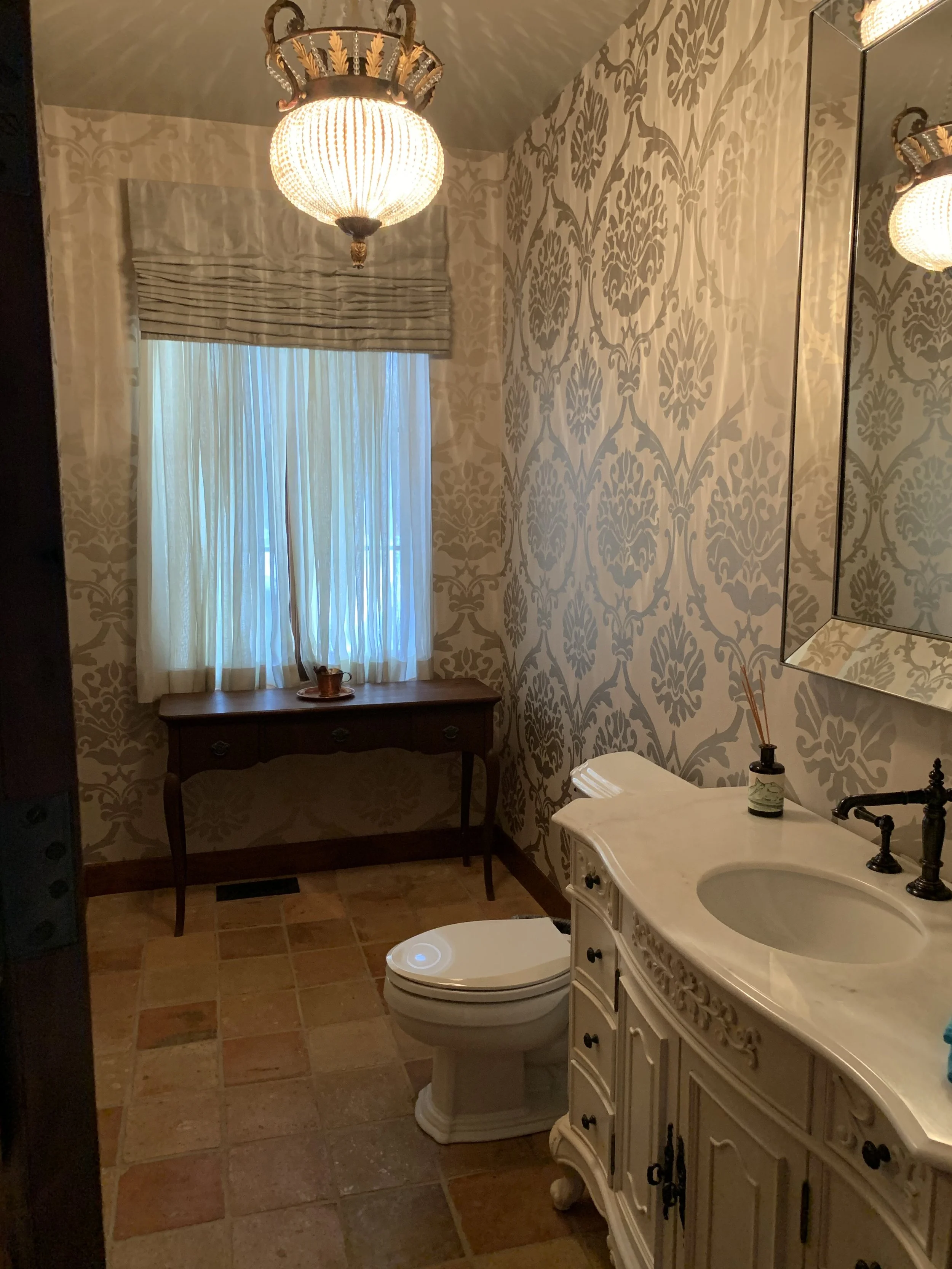
The before photos are shocking to look back on now! The ornate details, heavy damask drapery, and crystal light fixtures commanded the attention in every room. But underneath those layers, we could see the potential in the incredible hardwood floors, gorgeous fireplaces, beautiful arched doors, and large windows that allow natural light to flood into the home. Our intent was to allow these beautiful details to become the focal point with modern and minimal furnishings.
At the entry of the home, you’re met with all of the ornate details of a French Chateau. The damask drapery, elaborate mouldings, and crystal chandelier needed to be removed in order to achieve the light and minimal look our Californian clients were drawn to.
In the formal living room, we intended to elevate the existing crown moulding, the unique arched alcove beside the fireplace, and the doors that lead into the office. The fireplace would be reimagined with a more minimal and contemporary feel.
The existing arches throughout the home created a beautiful, unique feel to the space. DGI wanted to celebrate them by allowing them to stand out even more with minimal light fixtures and furniture.
The powder room would be one of the biggest transformations on the project. The space allowed for a much larger vanity, which we were excited to design with a modern look. The wallpaper, window treatments, and light fixture needed to be updated with more contemporary selections.
THE PROCESS
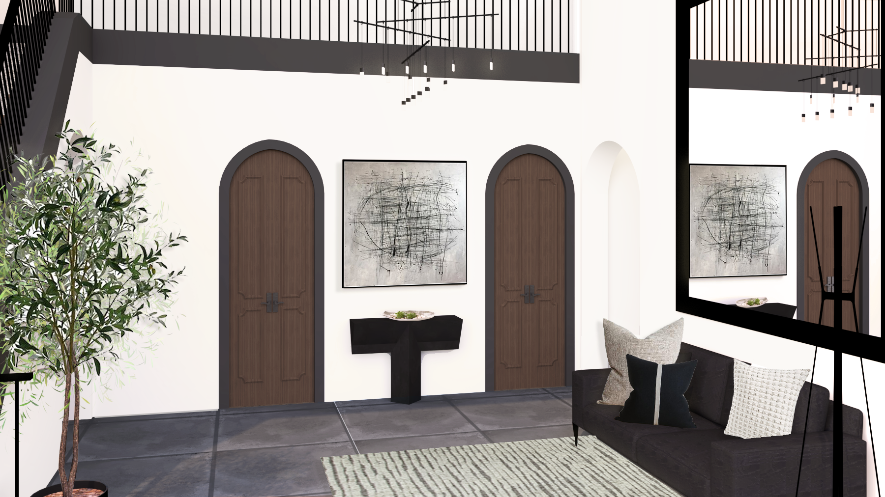
3D renderings of our design helped the clients visualize what we were proposing to bring new life to this special home.
The new foyer would swap out the existing ornate, heavy details for more contemporary furniture and minimal light fixtures that really create a light and serene feel at the entry of the home.
The new minimal design would incorporate light fixtures that draw your eyes up without distracting from the beautiful arches in the architecture of the home. We selected fixtures with sculptural curves to mimic the arches and truly celebrate them.
We always say there are no rules in a powder room, so we went bold and moody with the brand new design! A monochromatic, charcoal scheme with a waterfall countertop and integrated sink create a very modern and minimal look.
The Reveal
We are thrilled to finally share the results of this home remodel with all of you! It merges all of the best features of French Chateau architecture with modern furnishings and moody tones.
The entry of the home gives off an entirely different feel from the before photos. The crisp white walls, minimal floor tile, and suspended chandelier set a bright and modern tone as you enter the home. We swapped out the ornate stair rails for a modern, simplified baluster. However, we opted to keep the crown molding, trim, and door frames throughout the entire home. We decided to play off of the dramatic detailing by painting them a deep charcoal grey. It creates a bold contrast against the white walls in a modern and elevated way. Finally, we selected a modern, black leather sofa and sleek console table to complete the foyer, and painted the frame of the existing oversized mirror black.
Down the hall off of the foyer, you pass by the show-stopping powder room. We went moody and dramatic with the design while still incorporating minimalist details and clean lines to maintain a really modern feel. We opted for a glossy, stacked tile along the back wall to create a sleek look. The backlit vanity mirror creates a stunning floating effect while enhancing the reflective, glossy finish on the handmade tile. We selected a contemporary ceiling light fixture with petal-like LED panels that add a delicate touch to the space.
We covered the rest of the walls in a textured, charcoal wallpaper to add even more depth and dimension to the space. The new custom vanity is a major upgrade from the existing conditions. It’s larger in size and still creates a grounding focal point, but in a much more contemporary way. We opted for black stained wood, flat cabinetry with integrated pulls for the most minimal look. Then we selected a honed limestone countertop that we carried down both sides of the vanity in a waterfall effect. To maintain the most sleek and minimal look, we opted for an integrated sink and a custom cut out for trash.
We couldn’t resist a close up on this beauty. The integrated sink gives the space a really elevated and custom feel. We chose a minimal faucet in a matte black finish to allow the countertop to stand out.
Continuing down the hallway, you enter the sophisticated and inviting formal living room. The crown molding and trim were painted charcoal grey for a more modern look, which helps to draw your eyes up and around the room. We weren’t afraid to select darker, textured furniture and fabrics for the space because it’s balanced out by the white walls and soft sheer drapery.
We selected a custom area rug that grounds the space with texture and dimension. The boucle fabric side chair adds even more texture to the seating area, meanwhile the clean lines and sculptural forms of the other furniture pieces add to the minimal, modern aesthetic in the home.
We discarded the existing damask drapery and introduced modern ripplefold drapery and sheers instead. The woven drapery fabric creates a formal look in the room while maintaining a modern feel. We opted to add a layer of white sheers to soften it up and allow natural light to filter through.
Opposite from the windows, the fireplace was completely transformed from the traditional wood trim and mantle to a super sleek and minimal surround. We opted for a porcelain slab to create the modern, cement look finish. A simple wood mantle, stained to match the existing wood doors, completes the design. It’s minimal and modern but still creates an inviting, cozy ambiance in the formal living room
We kept the existing arch alcove beside the fireplace, but we opted to paint it the same charcoal grey as the trim and crown moulding throughout the home. Behind it, we added a soft, textured wallpaper to elevate the space. It creates the perfect space for displaying our client’s own artwork.
Off of the formal living room, we designed a large home office complete with two desks. The vaulted ceilings and wood beam details draw your eyes up, and we selected an aged iron chandelier to complement them. We kept the existing fireplace mantle, but we opted to paint the wooden surround in the same charcoal grey seen throughout the rest of the home. It creates a cohesive feel while elevating the fireplace with a more modern feel. Finally, we designed custom roman shades in a soft grey fabric that allows the fireplace to stand out as the focal point.
We opted for black office furniture and dark grey desk chairs to balance out the crisp white walls and create a moody tone in the office. We designed ripplefold drapery for the window treatments to keep up a cohesive, modern look.
Outside of the office, we transformed the open concept family room, breakfast area, and kitchen with modern furnishings and light fixtures, minimal window treatments, and a neutral palette of cool toned greys. The space feels incredibly bright and open compared to the detail-heavy before photos. We kept the wood window frames to add a touch of warmth throughout the space. We opted for the same charcoal trim and ripplefold drapery seen throughout the rest of the home to keep up the cohesive flow between each space.
The family room features a large, L-shaped Italian leather sectional that frames out the seating area. The pewter leather creates a contrast against the white walls and light grey area rug. We selected an oversized boucle bench and two channeled ottomans to round out the seating and add some texture into the space.
Despite the dark furnishings throughout the family room, the space maintains an overall serene and sophisticated feel because of the cool tones and clean lines of the furniture. We created a focal point in the family room through a custom granite plinth coffee table. It adds a beautiful depth and subtle texture to the seating area.
Custom stone tables are one of our favorite ways to instantly elevate a living room, and this satin black granite deserved it’s own close up. Fun fact: this coffee table took a team of nine men to set into place!
We also gave the family room fireplace a huge upgrade. We discarded the tile surround and ornate mantle for a super sleek and modern porcelain. It features the same cement-look porcelain slab as the formal living room to tie the spaces together. The minimal profile on the surround instantly gives the space an elevated, modern look.
We painted the existing built-in shelves in the same charcoal grey seen throughout the rest of the home. It adds a beautiful depth and contrast to the fireplace wall in a modern way. The leather sectional and granite coffee table play off of the charcoal paint to create balance between the dark grey and light grey tones in the family room.
Between the family room and the kitchen, we designed a modern breakfast table for more casual dining. We brought in the same black tones and bold contrasts seen throughout the rest of the home with the dining table and chairs. Above it, we selected a contemporary, wave-like light fixture. The curves of the fixture mimic the arches and alcoves seen throughout the rest of the home with a really minimal and modern look. In the kitchen, we selected complementary, minimal island pendants that instantly give the kitchen a more modern look.
Up close, you can see how the dining room furniture features subtle, sculptural forms and a gorgeous wood grain. The white leather seat and back of the chair gives off a minimal feel, while the wood framing features unique lines and subtle curves.
Off of the breakfast table, there is a built-in china cabinet in a unique, arched vestibule. DGI opted to paint the cabinet charcoal grey to give it a more modern feel. Then we selected a contemporary light fixture with sculptural curves that mimic the arches of the built-ins and doors.
Beyond the vestibule, we designed a moody and sophisticated formal dining room, incorporating the client’s existing table and chairs. We opted to cover the walls in a light grey textural wallcovering, but we couldn’t forget about the fifth wall: the ceiling. On the ceiling, we installed a charcoal grey grasscloth wallcovering to create a really moody look in the space. It allows the charcoal crown molding to flow directly into the dark and moody ceiling. We opted for lighter drapery in the dining room to balance it out.
The fireplace and built-ins were painted in the same deep charcoal grey as the ceiling and crown for a monochromatic effect. Above the fireplace mantle, we removed the ornate millwork and selected antique mirrors that add to the moody feel in the space. We completed the design by selecting a modern cylindrical chandelier and a minimal gallery wall with simple black frames.
That brings us to the end of this home tour! It’s always exciting to take on a unique design challenge like this, and we hope you enjoyed a peek inside this unique home. We absolutely loved working on this project. Onto the next challenge!
-dgw


