Home Tour - Lakefront Luxe
INTRODUCTION
One of the biggest challenges interior designers face is marrying two styles on a project. This project was the ultimate challenge…bring together the existing conditions of this 12,000SF luxurious lakehouse with the client’s more contemporary personal style. A lot of the components were in great shape already, so we wanted to keep some existing elements but build upon them or modify them to freshen the space up.
The moodboard for this project highlights the bright, textural palette we wanted to bring into the home to freshen it up. We also wanted to prioritize dramatic light fixtures and a core neutral palette to make the all the different elements of this home feel cohesive.
BEFORE
These clients bought the house fully furnished, so the existing furniture fit the house perfectly and was high quality but wasn’t their style at all. Everything was curly and colorful and a lot of the furniture was distressed. There were two rooms that needed the biggest change…the green kitchen and the dark cave-like den but everything needed a little update.
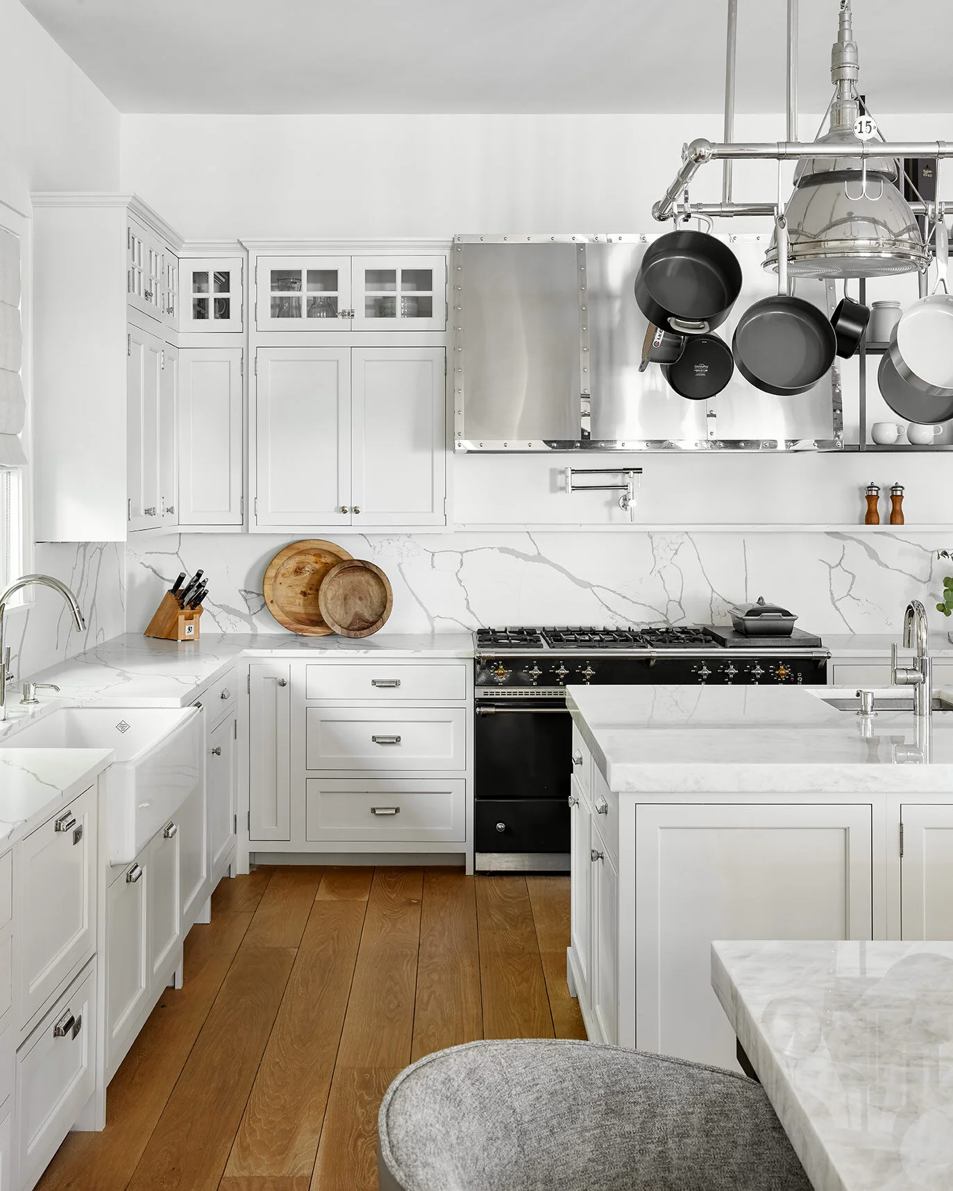
The kitchen cabinets and appliances were all in great shape, so we wanted to keep them but make the space feel less rustic. By swapping countertops, plumbing fixtures, backsplash and painting cabinets after modifying the trim details, we were able to keep the bones of the kitchen and still completely transform this room.
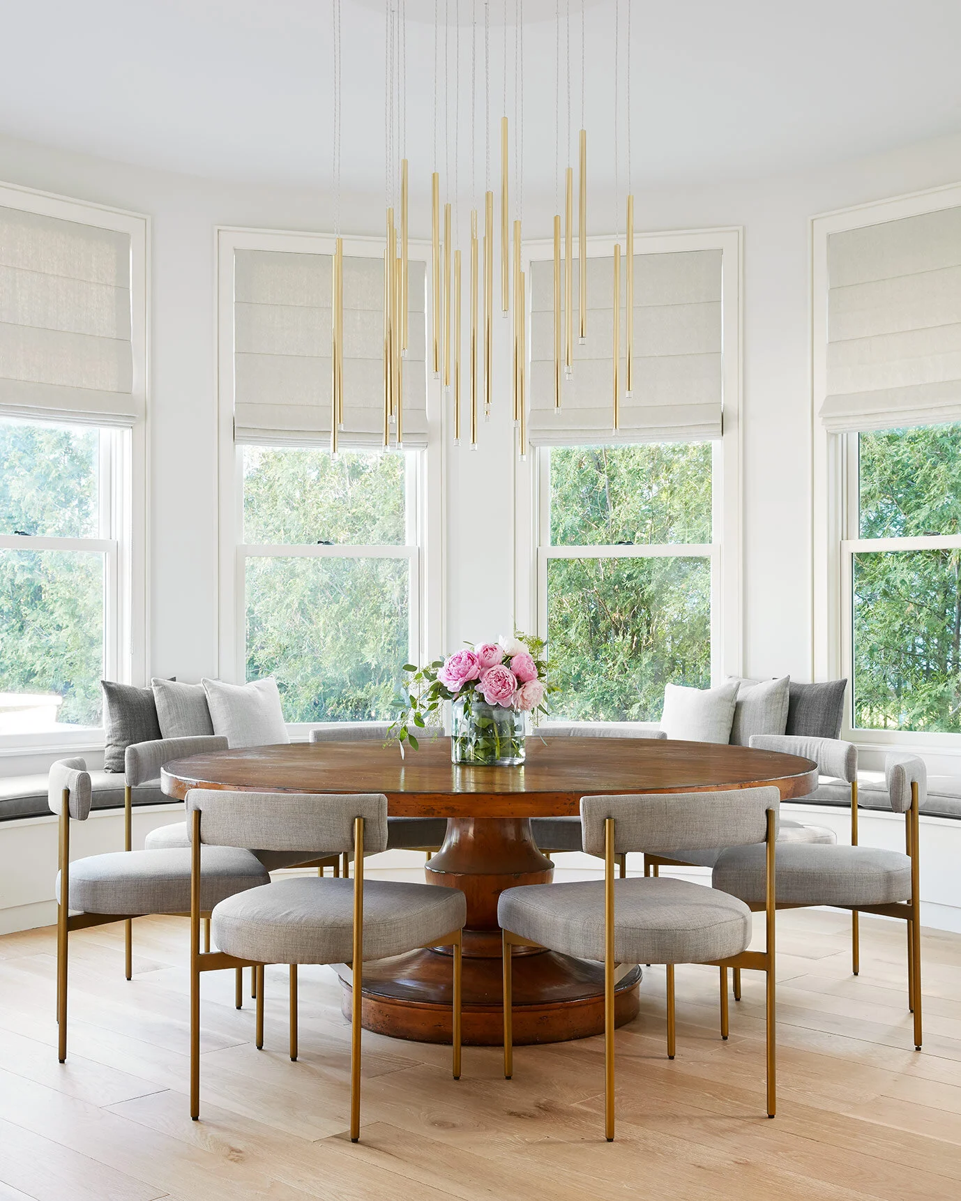
Right off of the kitchen, a round breakfast room provides tons of seating and some of the best views in the house, but it felt incredibly cottage-like and needed to be modernized.
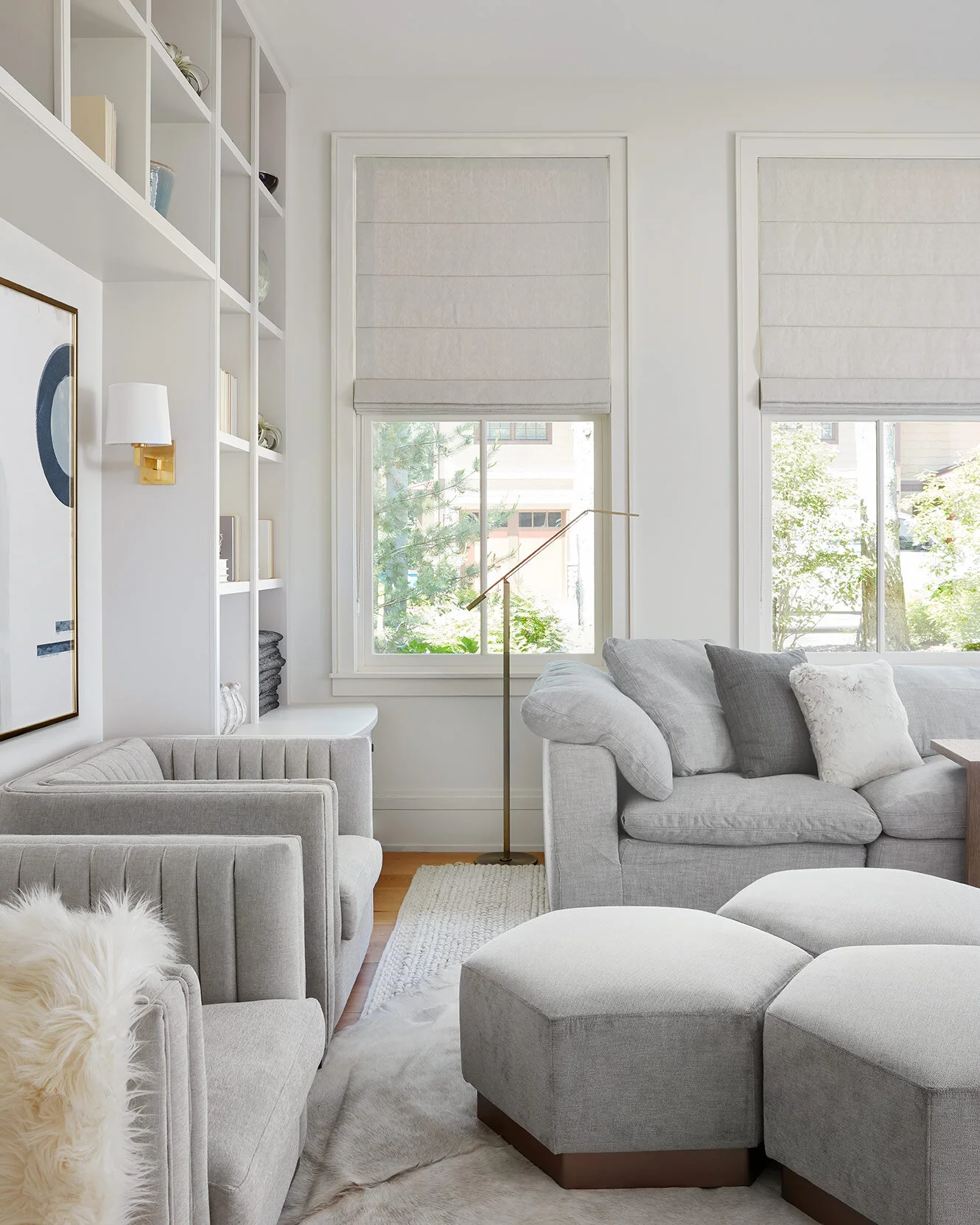
This den is the client’s favorite space to relax in but it was always so dark and stiff…not what you want for a family room. We love the custom built-ins that fill two walls of the room, but wanted to brighten them up and style the space with more modern and neutral accessories.
The daughter’s bedroom has such a unique build-out with four sets of bunkbeds, five trundles, and one special bed in the middle of everything. We knew we had to keep the structures but wanted to tone down the colors and transform the room into a brighter princess-themed room.
THE DESIGN PROCESS
As you guys know, our team always designs in 3D software so that we can fully communicate the designs to our clients before they invest any money in the construction or purchases.
Our rendering for the kitchen shows bright new finishes and plumbing fixtures along with some custom details that I’ll describe further in the full reveal. We ultimately studied four different countertop options for the perimeter and backsplash (again, the beauty of doing renderings!) before ultimately deciding on the white marbled look we went with.
In the den, we brightened up the space with new paint, and opened up the layout with a huge corner sectional and modular ottomans.
We had the most fun with this room. The design of the beds set up the perfect opportunity to build on top of the daughter’s central bed and incorporate a custom castle for her and her friends to play in.
THE REVEAL
Enough of the process, let’s get to the goods!
Let’s start with the kitchen. Remember that before shot? Green everywhere! We brightened this space up with new countertops, (marbled quartz on the perimeter and backsplash, Iceberg Quartzite on the two islands), and a fresh coat of white paint on the cabinets. If you look closely, you’ll also see that we carved the scalloped trim off of the toe kicks to square them off and make them more modern. On the island with seating, we removed the turned island legs and replaced them with custom square lucite and matte black legs to give a modern, glamorous kick. At the range, we filled in the niche above it, and instead turned the backsplash at the level it hit the upper cabinets to create a ledge that carries the rest of the length. We also removed the more traditional floating shelves and replaced them with custom black metal shelves suspended from the ceiling. Last but not least, new plumbing fixtures, counterstools, and even pots and pans (yes, we curated them to match the room) tie everything together and bring a modern new touch.
These clients KNOW how to throw a party, so we wanted to set this kitchen up so it can transform for entertaining. We backlit the Iceberg countertops on the island, so that for parties, the clients can dim the overhead lights and turn these on for a moody glow.
The kitchen is the perfect example of how we married the more traditional, lakehouse bones with the client’s personal contemporary style. The cabinet profiles and cabinet pulls all trend a little more traditional, but modern touches like the new backsplash and ledge, the island legs, floating shelves and new plumbing fixtures all pull more modern and make the space feel like the perfect balance between the two.
Let’s see those lit-up countertops one more time ;)
Here you can get a better view of the squared off trim at the toe kick (we simply carved off the scallop detail before painting) and the spice ledge and floating shelves. All subtle modern details to make the space more minimal but cohesive with the bones of the space.
Remember the breakfast room? We kept the existing table but carved off the scalloped bottom to modernize it a bit. From there, we brought in new chairs with sleek, clean lines, and a dripping brass chandelier to fill the dramatic height above the table. Around the perimeter, we actually got rid of all the wall sconces (no need, with a chandelier like this), and brought in clean, neutral Roman shades to soften the space. On the curved breakfast banquette, we reupholstered the cushion with a gray leather for durability, and recovered the existing pillows to coordinate with the new core palette that we brought in to the rest of the house.
On the first floor, we wanted the light fixtures to speak to each other. We went with a modern, “dripping” theme that you’ll see reflected in the dining chandelier as well, so that they feel cohesive yet they each have their own unique elements.
Off of the kitchen, the 12-person dining table is quite a focal point. We kept the existing table and reupholstered the chairs with a lighter twill fabric. The most significant change here, was the light fixture. The previous one was beautiful, but too small for the room…it hovered right above the table. We wanted to take advantage of the double height space, and the fact that it can be seen as you walk up the stairs to the second floor. We replaced the chandelier with a custom Bocci chandelier, dripping from the second floor down to the table to create the perfect sparkle in the space without competing with the incredible stone wall in the background.
The open concept living room ties directly into the dining room. We reupholstered all of the pillows on the sofa to tie in with the core palette bring a more modern aesthetic to the sectional. Other than that, we swapped out the chandelier for something more modern, and kept the rest of the elements as they were.
Up next, this den completely transformed. We peeled the brown grasscloth wallpaper off the walls AND ceiling, and painted the blue built-ins a crisp, warm white. To fill the room and create the perfect spot for afternoon naps, we incorporated a large, cloud-like sectional with six modular ottomans to be moved around and C-tables to provide as much flexibility as possible. In the niche between the built-ins we incorporated more structured chairs for additional seating with channel-tufted backs to mimic the bead-board texture in the open shelving. New, neutral and modern accessories updated the shelf-styling and made the space really feel cohesive with the rest of the house.
A thick, knit area rug sets the tone in here for comfort and relaxation. In order to marry the two seating zones together, we laid a white hide rug on top of the area rug and carried it off the side and under the accent chairs. Pro-tip for tricky shaped rooms!
From the front door, you get an incredible view of the dining area (and the lake) as well as some additional built-in shelves. We painted them the same color as the ones in the den, and styled the very similarly so that they knit the spaces together and carry a cohesive theme throughout the home.
At the top of the stairs, you can see how the dining chandelier carries into this space, and really creates a dramatic and elegant effect throughout the house.
The daughter’s room completely transformed while keeping the original bunkbeds and trundles. We swapped out the carpet for a silky gray backdrop and incorporated new, neutral and modular furniture to allow for a flexible hangout space for her and her friends. Above the daughter’s bed, we built a custom castle that is accessible from the top bunks and has quickly become the new sleeping area of choice, despite the 14 beds already in here.
We designed the castle to work with the pitched ceiling lines, and carried in blush and white throughout in the paint and bedding.
We will have a Part 2 for the indoor areas, because a few other spaces are still in the works right now. In the meantime, let’s move outside to see how we brought in all new furniture to activate different zones outside and create a private retreat for this family to enjoy throughout the summer.
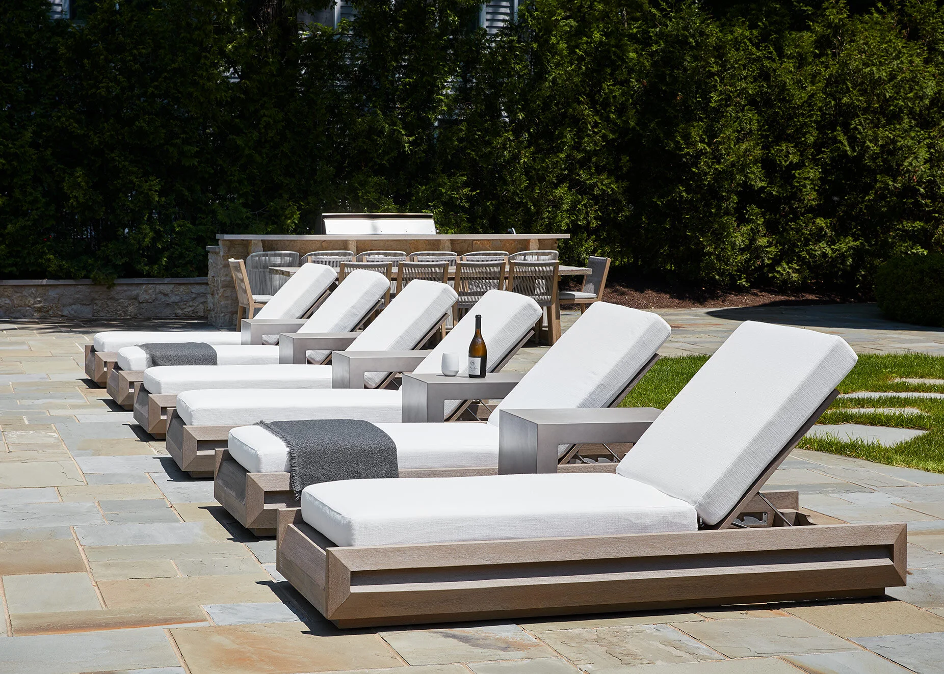
Along the poolside, we brought in sleek, modern chaise lounges with white cushions and concrete side tables. Our goal for the furniture was to be as minimal as possible, so that the focal point would be the infinity pool and lake.
Here, you can see why we wanted to keep the furniture clean and sleek. It’s all about the pool and Lake Michigan…can you see where the pool ends and the lake begins?
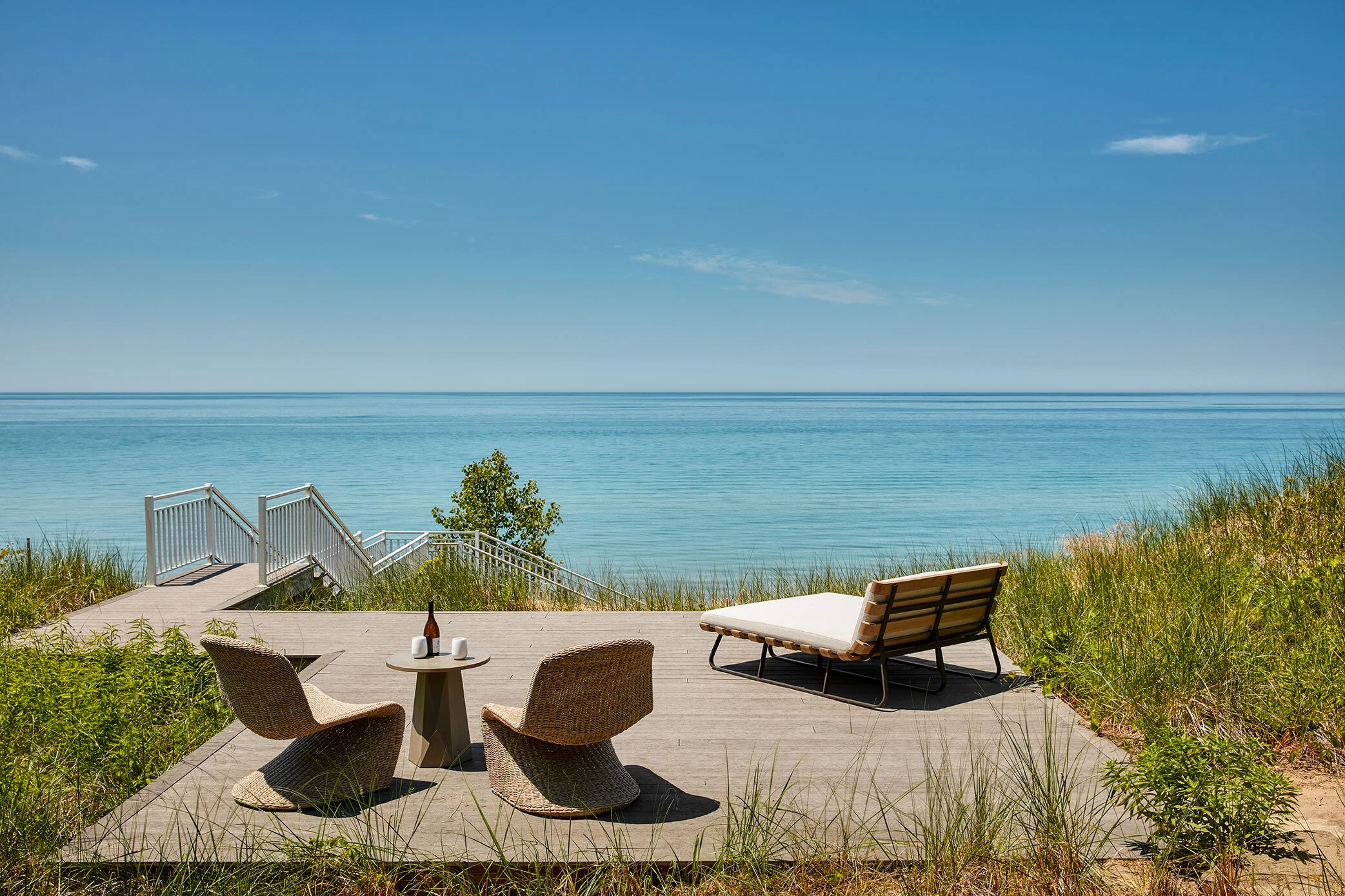
As you move down toward the lakefront, there are two “landing pads” that were previously empty and not utilized properly. We layered them with furniture to create different zones for the client to enjoy. This quickly rose to the top as my favorite spot on the property. That daybed facing the lake is the perfect spot to read a book and sip a glass of champagne.
The outdoor areas are all about cohesive zones. By the fireplace, we incorporated some modern rope lounge furniture to match the dining chairs and barstools, with concrete coffee tables to match the chaise lounge side tables.
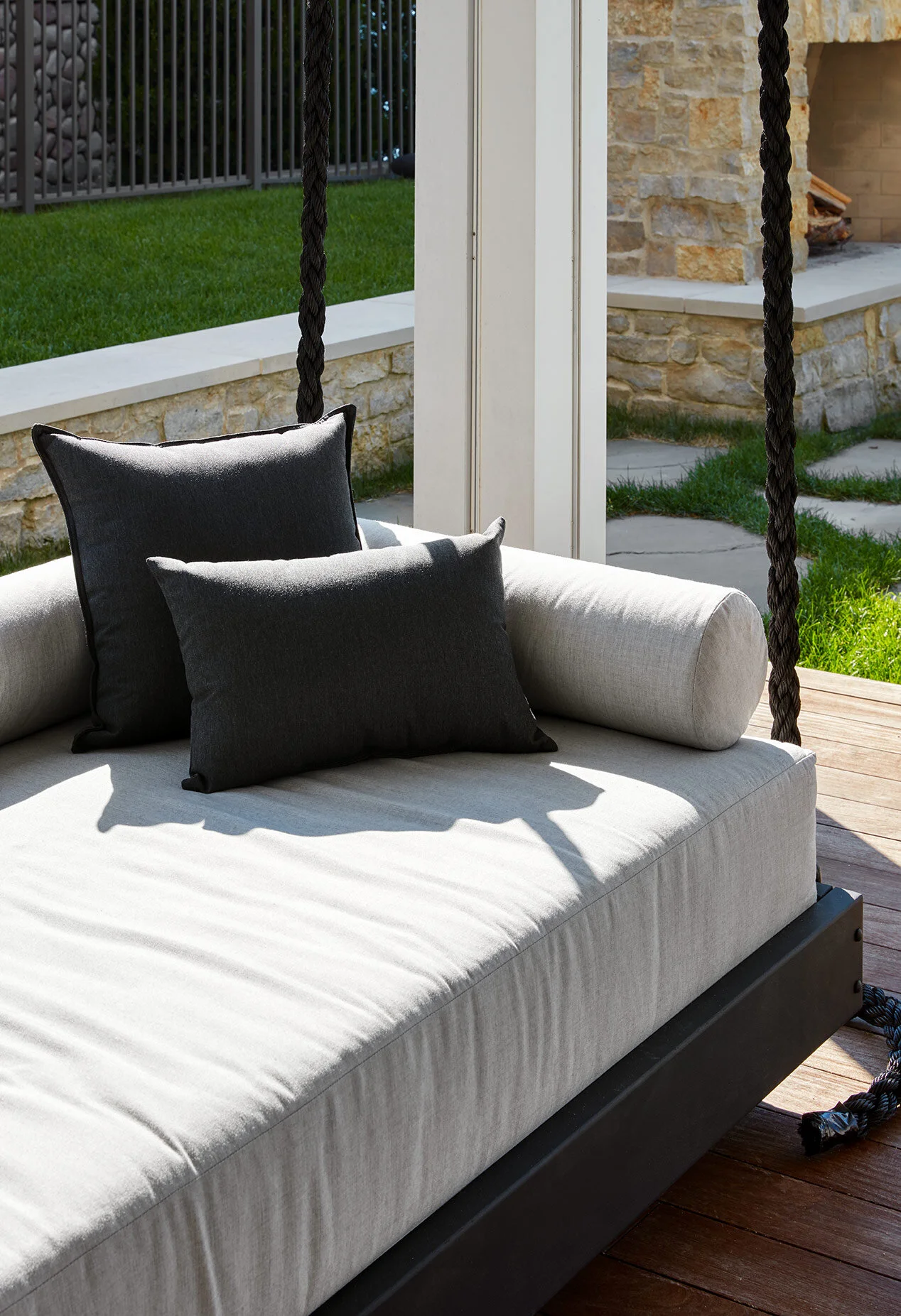
While the majority of the porch furniture is being replaced in the next phase, we did swap out the existing swing for a new, modern hanging swing. This is the same one Khloe Kardashian has (had to say it, sorry) and is suspended from the ceiling by giant black ropes for an extra dramatic effect.
I take it back…this is the perfect spot to read a book with a glass of champagne.
We are thrilled to be kicking off Phase 2 for this project and can’t wait to show you what we do next with it! In the meantime, I hope our clients are taking full advantage of this space this summer and putting those outdoor spaces to good use!
-dgw
Project Team: Devon Wegman, Michael Wegman, Emily Boyd, Emily Smith, Carolyn Cannon
Photograph: Dustin Halleck


