Home Tour - Lakeside Escape
INTRODUCTION
We work on a wide variety of projects at DGI, but it’s always very special when we get to renovate and refresh a family’s home that they’ve owned and loved for years. DGI was brought onto this project to gut and renovate a wonderful family’s secondary home in Michigan. It served as the quintessential lakeside escape for years, but our clients came to DGI looking to modernize and refresh the entire home. We completely transformed the space with a new, modern floor plan, a new screened in porch, and a fresh palette of earthy tones and textures, while also maintaining the inviting and charming feel of their beloved lakehouse.
The moodboard we created to kick off the design of this renovation is soft, warm, and inviting with subtle pops of color and earthy textures. When incorporating pops of color into a project like this one, the moodboard becomes an even more important tool for designing a cohesive home.
THE PROCESS
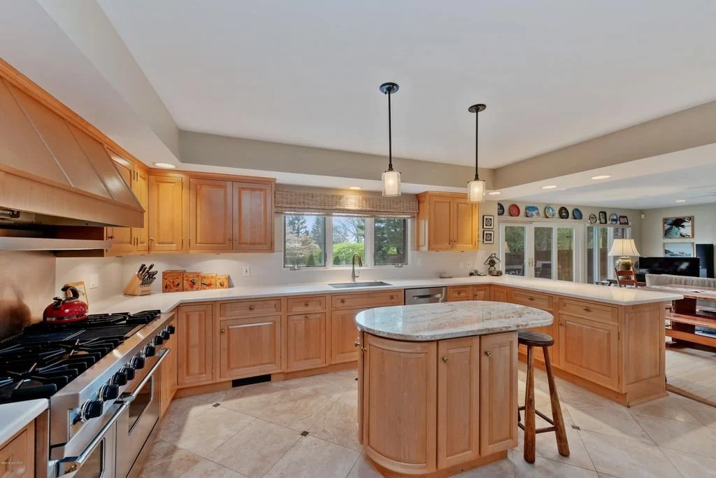
It’s amazing to look back at the before photos to see where this project began. The existing layout was really unique, with two curved staircases at the main entrance of the home and an open view right from the front door into the dining and living areas. Our intent was to preserve the unique features while creating a more modern and functional floor plan for the kitchen, dining, and living rooms.
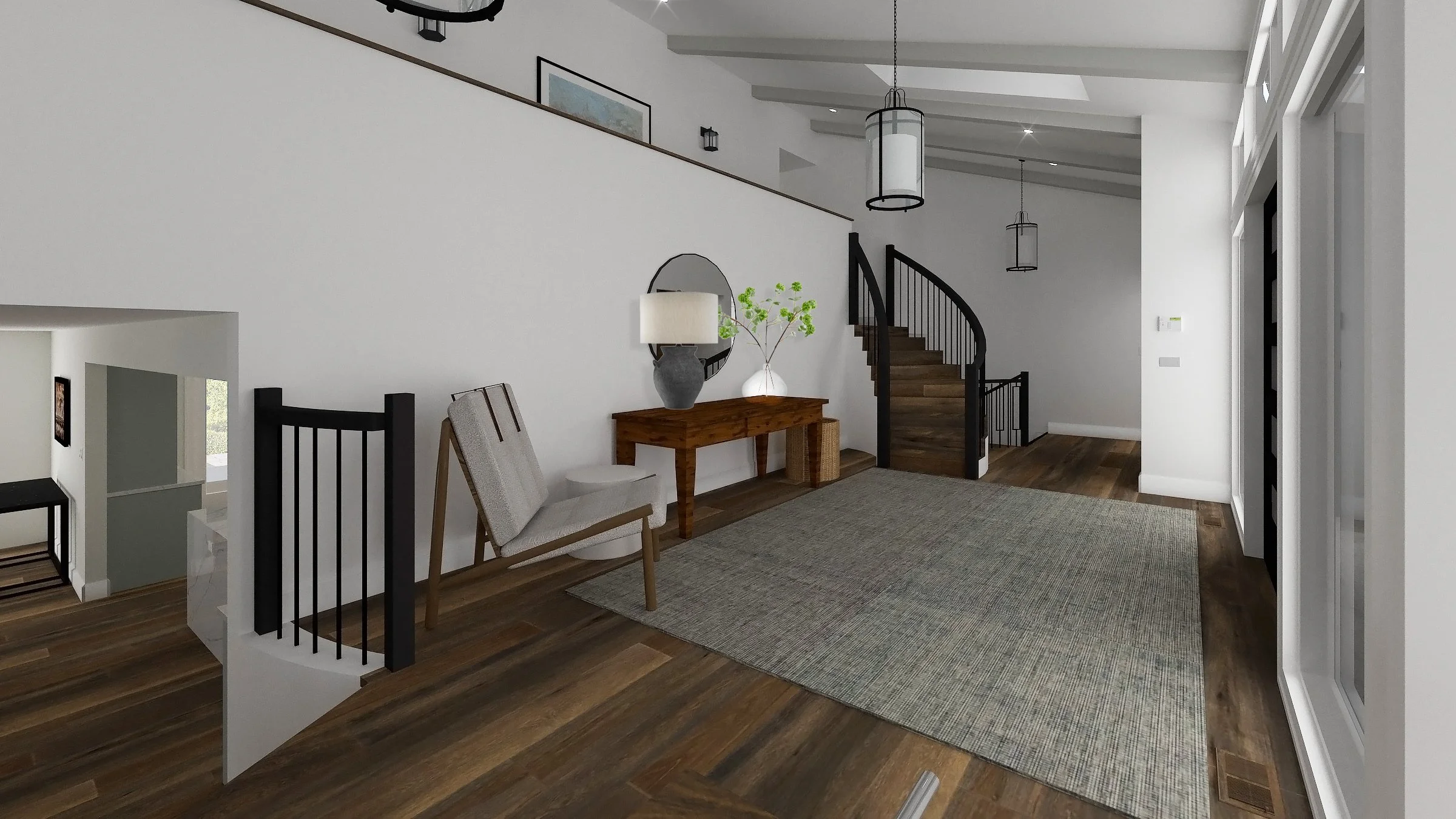
We decided to celebrate the existing curved, double staircases and vaulted ceiling in the entry way, but we would modernize the space with new railings, fresh floors, and paint. We also completely changed the layout on the first floor. We walled off the area between the entryway and dining room, flipped the kitchen around to where the dining room used to be, and created a much larger dining area in the old living room. By flipping the kitchen around, we were able to open it up more to a large family room so that there are plenty of areas for entertaining and relaxing as a family.
The existing kitchen was outdated and in desperate need of an update. In an effort to modernize the layout with a more open-concept feel, we flipped the kitchen to the other side of the room (where the dining room was) which allowed it to open up more to the family room, and to the new screened porch that we added. This space would now become a breakfast area with an open, casual dining space off of the new kitchen.
The family room had some great bones, like the oversized wood-burning fireplace, but it needed to be elevated. The fireplace is the focal point of the room, so we designed custom built-ins from wall to wall to truly celebrate it and house the client’s records and family photos. Outside of the living room doors, we designed a large screened porch to extend the living room even further and introduce an indoor/outdoor living experience.
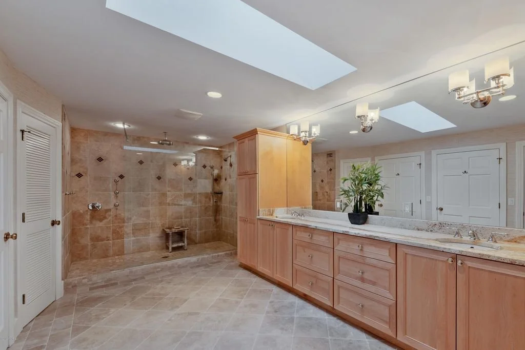
DGI renovated 5.5 bathrooms throughout the home, but the primary bathroom was the biggest transformation. We updated all the finishes and tile for a more modern, inviting, and luxurious look. The original bathroom was also unnecessarily big, so we shrunk it down a bit, and used the leftover space to add a second bathroom for the kids, accessibly from their side of the house.
The next step in our process was to present our design using 3D renderings, allowing us to communicate our vision and design direction for the renovation. Here are a few key renderings:
This rendering shows the new floors, paint, and furniture that create an inviting, modern look at the entry of the home. It also shows the new wall between the staircases which create a more clean aesthetic, and creates space for the new kitchen we designed on the other side of the wall.
This rendering communicates our proposed plan of flipping the kitchen to the opposite side of the room which created ample space for a large island and a breakfast dining table. The kitchen has a fresh, modern look with two-tone cabinets and sleek, polished quartz countertops and backsplash.
The family room rendering shows off the custom, fireplace built-ins that we designed, as well as the new screened porch outside!
THE REVEAL
Now that construction is complete and furniture is installed, we are thrilled to reveal the final result of the renovation. It’s better than we even imagined, and we hope our clients continue to enjoy their lakehouse for many years!
The entryway has a new fresh and inviting look, with rich hardwood floors and bright white paint. We introduced modern balusters and hand rails to the staircase with a crisp, black finish to add contrast and depth to the space.
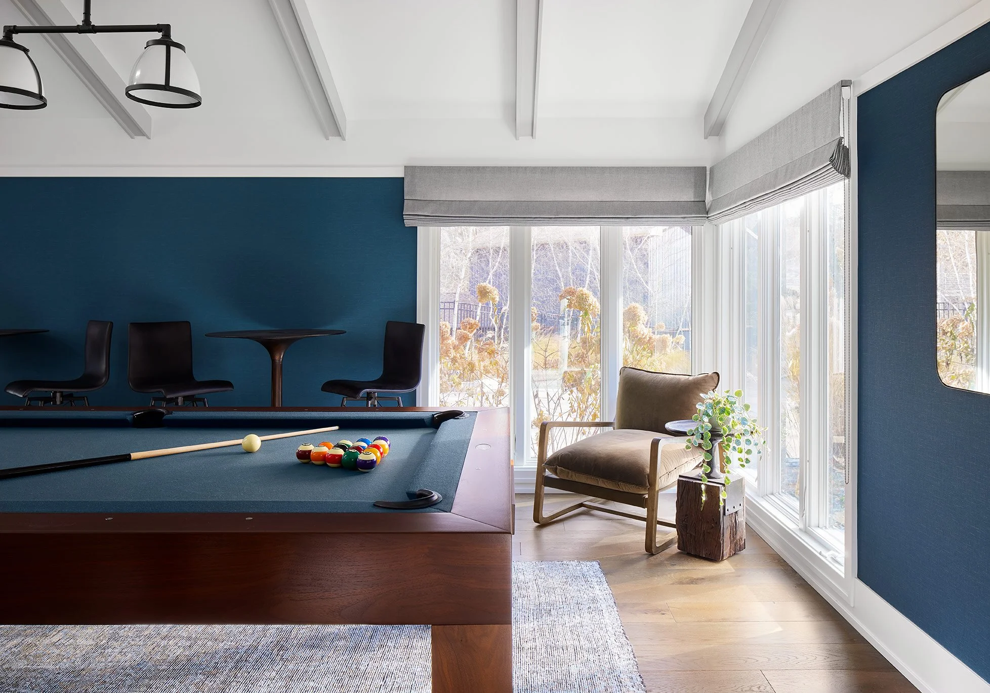
Off of the main entryway of the home, DGI designed a game room perfect for entertaining guests. We introduced a blue wallpaper with a subtle texture to help the space stand out. To celebrate the ceiling heights and unique angles, we opted to paint the beams a light grey to add subtle contrast that draws your eyes up.
A walnut-finished pool table, foosball table, and bar-height cocktail tables complete the space.
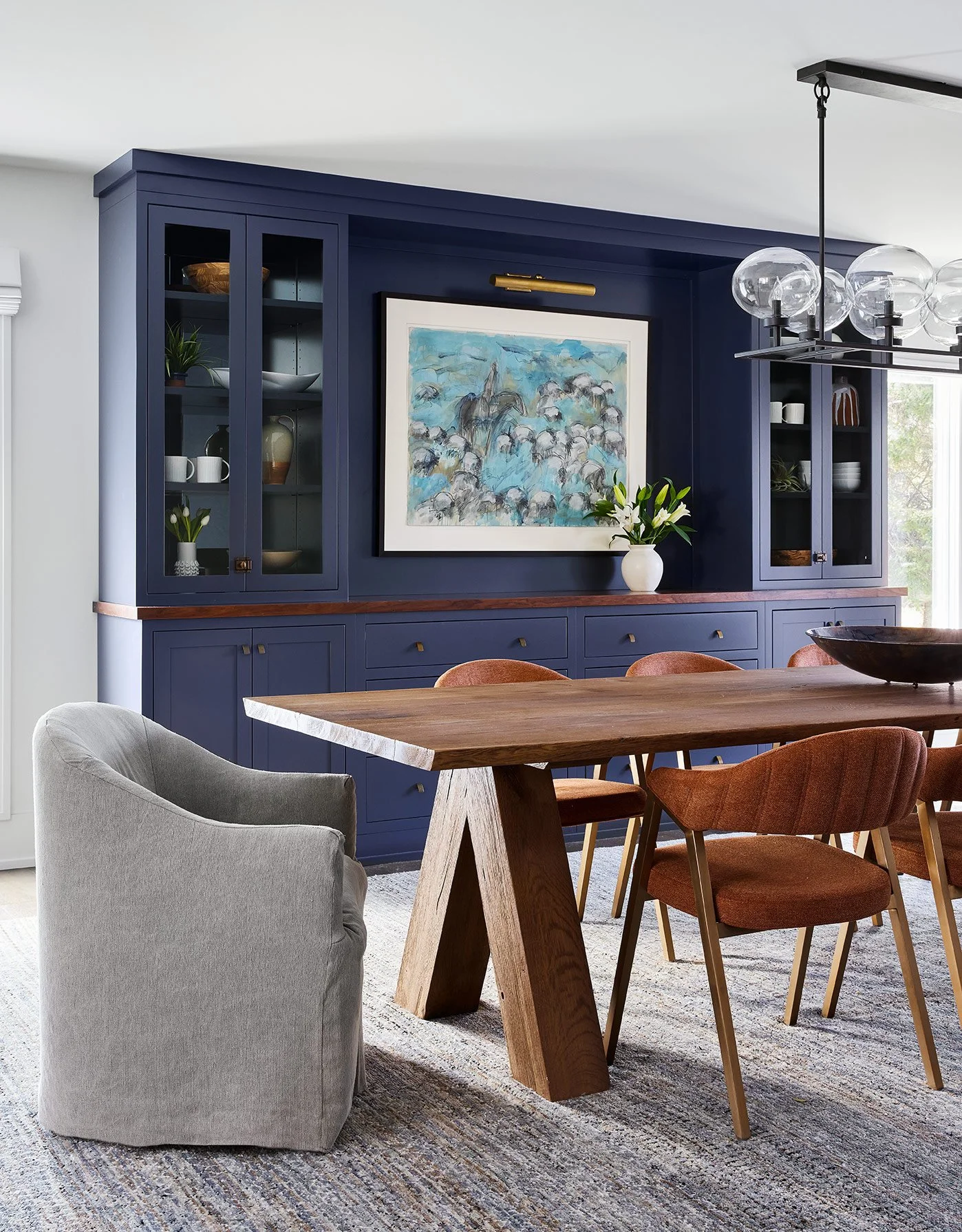
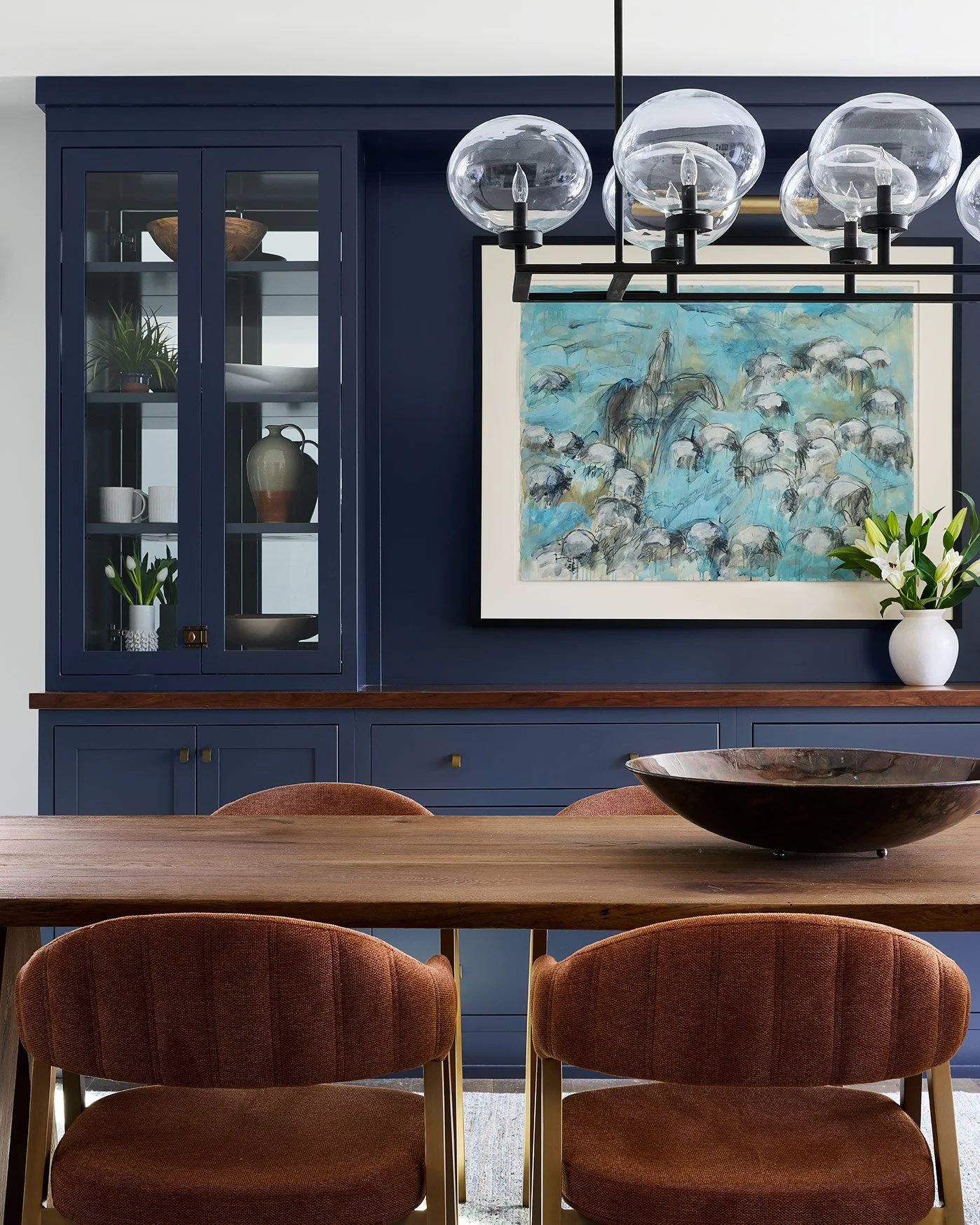
Down the stairs off the main entryway, you enter the new formal dining room. The focal point of the space is a custom, navy blue built-in along the back wall. The base cabinetry of the built-in offers plenty of concealed storage space for serving platters and dishware. Above it, two sets of glass cabinets provide space to display accessories and decorative dishware. Separating the base and upper cabinetry of the built-ins, we opted for a maple wood countertop finished in a rich. medium tone stain.
White windows and white window treatments blend into the freshly-painted, white walls to allow the built-ins and dining furniture to stand out on their own.
We selected a large, live-edge oak dining table that adds warmth and natural texture to the space. The sculptural dining chairs introduce a beautiful rust tone that complements the navy built-ins. At the head of the table, we opted for a slip-covered barrel chair that adds an inviting, casual look. The multi-color, wool area rug incorporates both the rust and navy tones in a subtle pattern to tie the entire space together.
The clients had a large, cherished collection of art that we incorporated back into the design of their new home. Along the back of the dining room built-in, we highlighted one of their favorite pieces with a warm, brass picture light.
On the other side of the dining room, the main floor of the home has a new, open-concept floor plan. The kitchen was flipped to the other side of the main floor, creating space for a large island and open, casual breakfast area. And these spaces flow directly into the family room in a functional way.
The kitchen has a completely new, updated look with a fresh palette of crisp, earthy tones. We opted for two tone cabinetry in the kitchen, pairing a natural wood finish with a soft, blue-grey paint. Polished Quartz countertops add a bright, clean look to the kitchen, and we opted to carry the same material up into the backsplash for a seamless, modern aesthetic.
We carried the sculptural silhouettes of the dining room furniture into the kitchen counterstools for a cohesive feel. The counterstool’s black oak finish also adds some contrast and depth into the kitchen.
Across from the kitchen, we designed a breakfast area for casual dining. A round dining table and chairs offer functional seating with the ability to circulate the space.
At the breakfast area, we carried over the same cabinetry finish from the kitchen into the built-ins to tie the spaces together. We opted for a combination of cabinetry and open shelving to display more accessories and decorative dishware. We also carried over the black oak finish on the dining chairs. We selected chairs with a cane backing details that adds a beautiful texture into the space.
This point of view off of the breakfast area shows the open-concept, cohesive flow between the different zones of the main floor. The new, wide plank engineered hardwood floors installed throughout the entire home contribute to the overall cohesive look.
Behind the breakfast area, we designed a cozy living room that is perfect for lounging with family after days at the lake. We kept the existing stone fireplace, but designed built-ins on either side to elevate it. Open shelving with natural wood backing adds a beautiful warmth to the space, and provides a place to display the client’s large collection of books and accessories from their travels.
We carried finishes and textures seen throughout the rest of the main floor into the living room, like a reclaimed wood sofa table that mimics the dining table and cane inserts at the built-in doors that mimic the breakfast chairs.
We selected cozy furniture that is suited for lounging and relaxing by the fire after long days on the lake. We introduced some more pops of color into the living room through the throw pillows and accessories.
Off of the living room, we designed a new screened porch for a true indoor/outdoor living experience. Crisp black windows and doors helps the screened porch stand out with a modern look. We selected a large outdoor dining table and wishbone chairs in a warm, wood finish. Then, we completed the space with a teak frame daybed to create the perfect spot for lounging with a cup of coffee or a good book.
Moving up to the second floor of the home, DGI designed a primary suite with a fresh, inviting, and modern aesthetic.
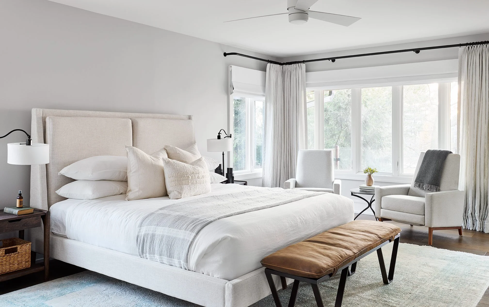
In the primary bedroom, DGI opted for a neutral palette and a serene aesthetic. It differs from the main floor’s palette of earthy tones, but it allows the views of the lake outside to be the highlight of the primary bedroom. We selected an off-white bed frame, bedding, and accent pillows that create a monochromatic, inviting look and add subtle texture to the space.
Two accent chairs beside the windows offer a space for a morning coffee with a view of the lake outside. The rich, wood finish on the nightstands contrasts the rest of the off-white and light grey furniture throughout the primary bedroom.
Remember the outdated primary bathroom? We gave it a completely fresh and modern look with all new tile, countertops, and a custom double vanity.
We opted for a stained wood double vanity and minimal brass knobs that add plenty of warmth to the space. We selected a quartz countertop that introduces a graphic veining into the primary bathroom.
On the floor, we opted for a combination of grey and white porcelain tiles that DGI designed in a unique, stacked square pattern. Beside the vanity, we designed a steam shower with book-matched porcelain slabs for a super luxurious look. A glass shower door with brass hinges contributes to the luxurious, modern look in the primary bathroom.
Across from the double vanity, we designed a secondary storage wall of custom cabinetry and a makeup vanity. We carried over the same finish and profile of the base cabinetry. However, we opted for mirror front cabinet doors for the two storage towers that sit on top of the quartz countertops.
At the makeup vanity, we selected elongated oval sconces with alabaster shades installed on both sides of the arched vanity mirror for a luxurious, feminine touch. Beneath it, we selected a small stool that carries in a touch of brass into the legs.
That completes the home tour of this fresh, modern, and inviting Michigan lakehouse. It was such a pleasure to renovate and refresh this cherished family home, and we absolutely love the result. Thanks for following along with us, we hope you enjoyed the tour!
-dgw
Photos: Dustin Halleck


