
Home Tour - Less is More
introduction
We couldn’t be more excited to officially bring this home tour to the blog. Our clients came to DGI looking to completely transform their outdated home and create a space that felt more tailored to their personal style. Our intent was to design a minimal and modern home with sleek touches and a cooler palette of soft greys and natural textures. After several phases of construction and furnishing, the end result is finally here. Enjoy our newest home tour!

As mentioned, we worked in phases for this project. Our clients initially hired us to renovate their bathrooms, and once those were complete, they decided it was time to do the whole first floor.With that, we developed two moodboards for each phase. The first phase of construction included the renovation of the two bathrooms and a main floor powder room. This moodboard incorporated sleek and modern elements that also feel inviting to guide the design of the bathrooms throughout the home.

The second moodboard that we developed set the tone for the construction of the main floor, which included the kitchen, dining, and living spaces. To keep our design cohesive with the first phase, we incorporated the same palette of cooler greys and natural textures. Modern furnishings and light fixtures would be the finishing touches that give the space an inviting feel.
The Process
This might just be my favorite part of home tours! Looking back at the before photos, we are reminded just how much this home has been transformed. When we first entered the space, we were met intense warm tones, seen in the kitchen cabinetry and bathroom tiles. It’s no wonder our clients were looking for a cooler, more serene feel in their home!

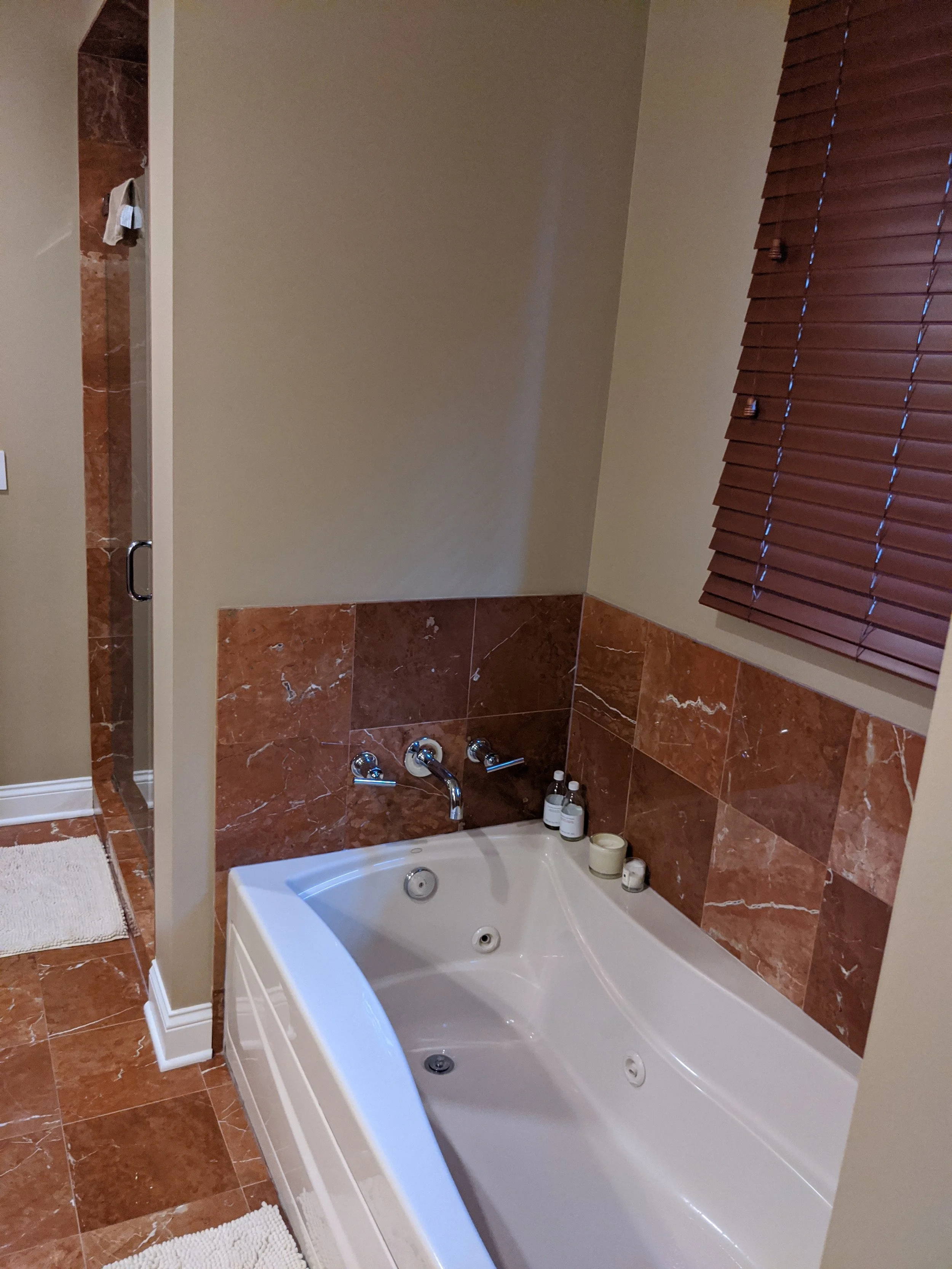
The primary bathroom is one of the first spaces we designed in phase one of construction. It originally featured a unique layout of separate his and hers vanities and a soaking tub. We knew we needed to enhance the spacious bathroom by opening up some walls to give it a more light and airy feel. With a more functional layout and new minimal finishes, we could see the potential for a really modern and inviting primary bathroom.

When phase one was completed, we moved downstairs and focused on the kitchen. The existing kitchen had good bones and an open floorplan which gave us room to design an adjacent breakfast table and family room. However, the cherry kitchen cabinetry needed to be completed gutted to achieve a more modern and minimal look in the home.
This type of dramatic, gut renovation project always needs detailed renderings so that we can accurately present our design vision to our clients. The renderings leave no room for misinterpretation which is key when our clients are trusting us with their home.

The primary bathroom design is incredibly light, open, and airy compared to the existing space.

The kitchen is unrecognizable in the rendering we presented to our clients, and they were completely on board with the modern and minimal aesthetic that we designed. The kitchen would have an overall soft and minimal feel with a bold focal point: a large, powder-coated steel hood.

Fun fact (with a photo for scale): the massive range hood took a team of five men to install. But it was all worth it for the end result!
The Reveal
Who was I kidding? The reveal is definitely my favorite part of home tours! Let’s dive right into the reason you’re all here,

We designed the entryway of the home to feel more light, open, and inviting. We achieved the look by opening up the drywall at the stairway and replacing it with modern wood spindles and a plush runner. We added just the right amount of functionality to the entryway with minimal furnishings and decor. The low console table acts as a catch-all zone for busy days in and out of the house. Below it, we tucked a couple of boucle ottomans for seating as the kids put on their shoes. Finally, we selected a 100% wool rug that introduces some dark grey and blue tones to hide any dirt that makes its way inside.

On the other side of the entryway, the formal living room invites you into the home. DGI selected structured furniture pieces with clean lines to create a modern feel as you enter the space. We opted for a low profile sofa with a minimal look to emphasize the ceiling height in the space. The cognac accent chairs feature a metal inset frame that gives the space a sleek, polished feel. To add some warmth and texture into the space, we introduced a wood coffee table with a more organic, natural shape.

Off of the formal living room, DGI designed a modern and minimal powder room with a hospitality feel. A texture-heavy wallpaper covers the walls, and we opted to paint the ceiling black for a moody and edgy feel.

We designed a custom vanity with a vessel bowl and a floating wood ledge to further the modern, hospitality feel. It gives the space an overall modern and minimal look. Matte black accents created the perfect finishing touch, adding a bit of depth and drama to the powder room.

Past the powder room, you enter the open concept kitchen and family room. The kitchen is arguably the biggest transformation of the project, and the result is a super modern and minimal space. To achieve the look, we designed custom cabinetry with a combination of grey wash oak and painted grey finishes that create a balanced feel. We kept the profile of the cabinetry flat and clean to allow the organic texture of the plain sawn oak to stand out. We also concealed as many appliances as possible through cabinet-front panels in order to achieve the most clean and minimal look in this kitchen.

We wanted to make the range hood disappear like the rest of the appliances while also creating a bold design accent, so we opted for a custom, super sleek powder-coated steel hood. It creates a focal point in the kitchen in a modern and minimal way, adding plenty of depth and contrast along the back wall. We selected simple, black leather counter stools to add another black accent and balance out the hood. Above them, we introduced a more organic shape to the kitchen through two wispy island pendants.

The range is one of our favorite details in this kitchen. We went all in on the hidden appliances and opted to embed the cooktop into the quartz countertops to achieve the most minimal look possible. It allows the beautiful quartz countertop to stand out even more, and we carried it up onto the backsplash to maintain the clean and modern aesthetic. Up close, you can see just how much the texture of the plain sawn cabinetry stands out. It adds the perfect natural warmth to the otherwise cool and clean design.

On the other side of the kitchen, we transformed the family with a modern fireplace surround and a custom built-in. We selected a monolithic, minimal porcelain for the fireplace, and we installed it from floor to ceiling for added verticality. The fireplace stone stands out in the family room because it is essentially the inverse of the stone seen throughout the rest of the home. In the kitchen and bathrooms, we opted for white stone with grey veining. However, at the fireplace we switched it up and opted for a sleek grey porcelain with white veining.

The family room design introduced custom built-ins with chunky wood shelves and metal mesh cabinetry below. The built-ins add functional storage space to the family room and also help to conceal the subwoofer. The open shelves provide a space to display our client’s personal accessories and decor, and we integrated LED strip lights into the shelves to help the accessories stand out even more.
Heading upstairs, DGI designed both the primary bathroom and the kid’s bathroom in the first phase of the renovation.

The kid’s bathroom design maintains the same minimal and modern feel seen throughout the rest of the home. However, we played with some fun textures and shapes in the space to give it a youthful touch. We installed hexagon tiles on the floor and a stacked subway tile across the walls. At the double vanity, we designed push-to-open drawers that are concealed by fluted wood details to add texture to the space. We completed the design with sleek white countertops and minimal polished chrome plumbing.

Remember the old red primary bathroom? It has a completely new look! We opened up the walls between the shower and the tub to give the space an overall light and airy feel. Then we played off of that new feel by selecting white floor tiles and countertops. The brightness and subtle veining of the stones gives the space a luxurious, spa-like feel. We opted to install a black textural tile behind the vanities to add some depth and contrast, and to keep the bathroom design cohesive with the rest of the home. Finally, we designed custom floating vanities that give the bathroom a super modern look. The plain sawn walnut introduces the perfect amount of warmth and texture to the sleek bathroom.

Leaving you off on a luxurious & relaxing note, we swapped out the old jacuzzi tub for a minimal freestanding tub that adds to the spa-like feel in the bathroom. Then we carried over the same textural black tile from behind the vanities to help the tub stand out even more. Finally, we selected a polished chrome tub filler to complete the design with a modern touch.
That brings us to the end of this home tour. Thank you so much for following along with us! We hope you enjoyed the tour as much as we enjoyed designing this project.
-dgw