
Home Tour - Modern Haven
INTRODUCTION
In the midst of uncertainty around the start of the Covid-19 pandemic, we received a call from some potential clients to renovate, design, and furnish their new home in Lincoln Park. Designing a young family’s dream home is one of our favorite types of projects to work on because we know they will enjoy our design for so many years to come. This project was a labor of love, and it’s bittersweet as it comes to an end but we couldn’t be more excited to share the result with all of you!
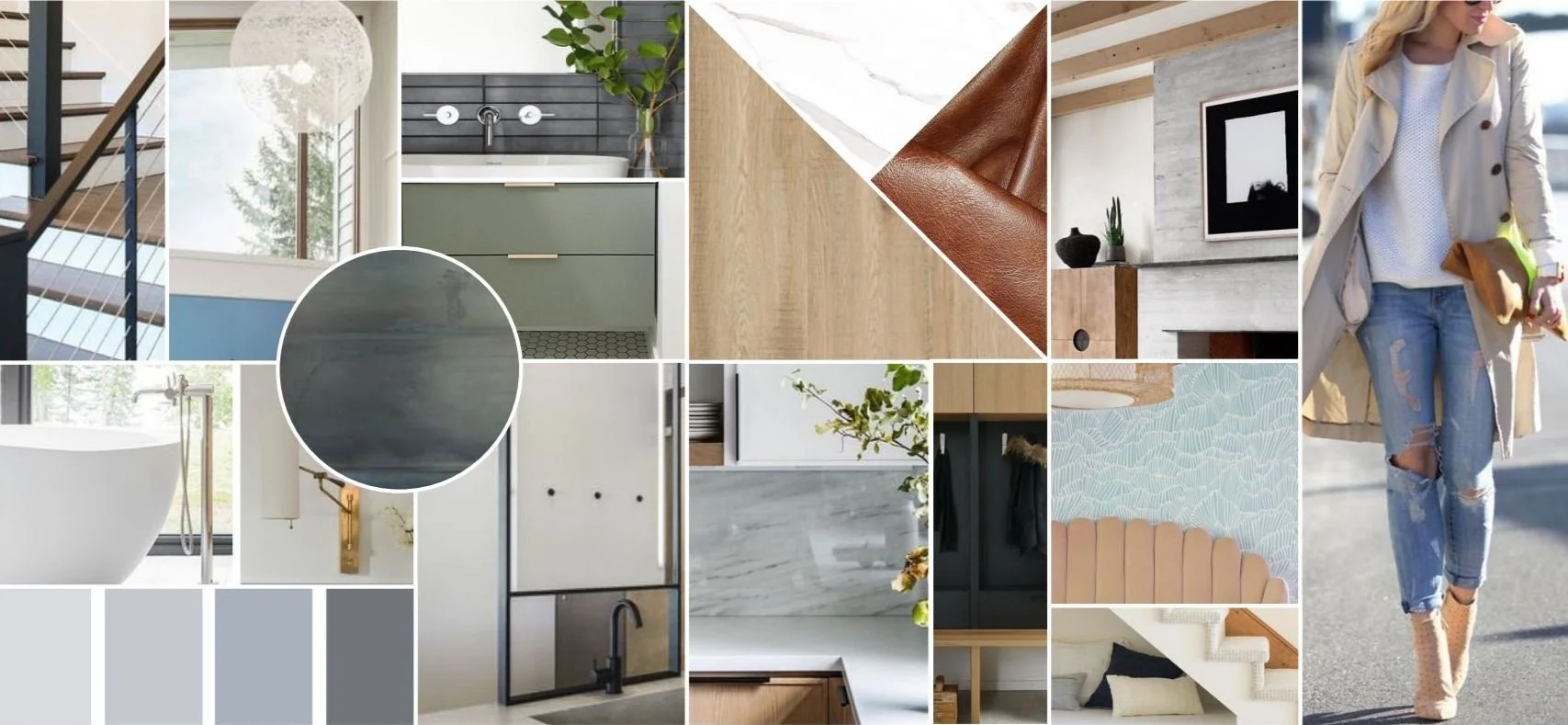
To kick off the design for the project, we created a core palette of light wood tones, crisp black accents, and subtle pops of color. We added images with modern finishes and clean lines to create a cohesive moodboard that we referred back to at each step in the design process, including both construction and furnishing phases.
THE PROCESS
When DGI was brought onto the project, the home was already pretty stripped. This gave us a completely blank slate to design the home, which is always an exciting place to start!

It’s amazing to look back at where the project started. The entry of the home was incredibly open, and the possibilities for our design were endless with the incredible scale of this unique house.

On the back side of the house, an incredible two-story high family room backs up to the kitchen and is framed with an open staircase leading to the second floor. We knew we wanted to declutter the space and elevate the railings with a super clean, modern look.
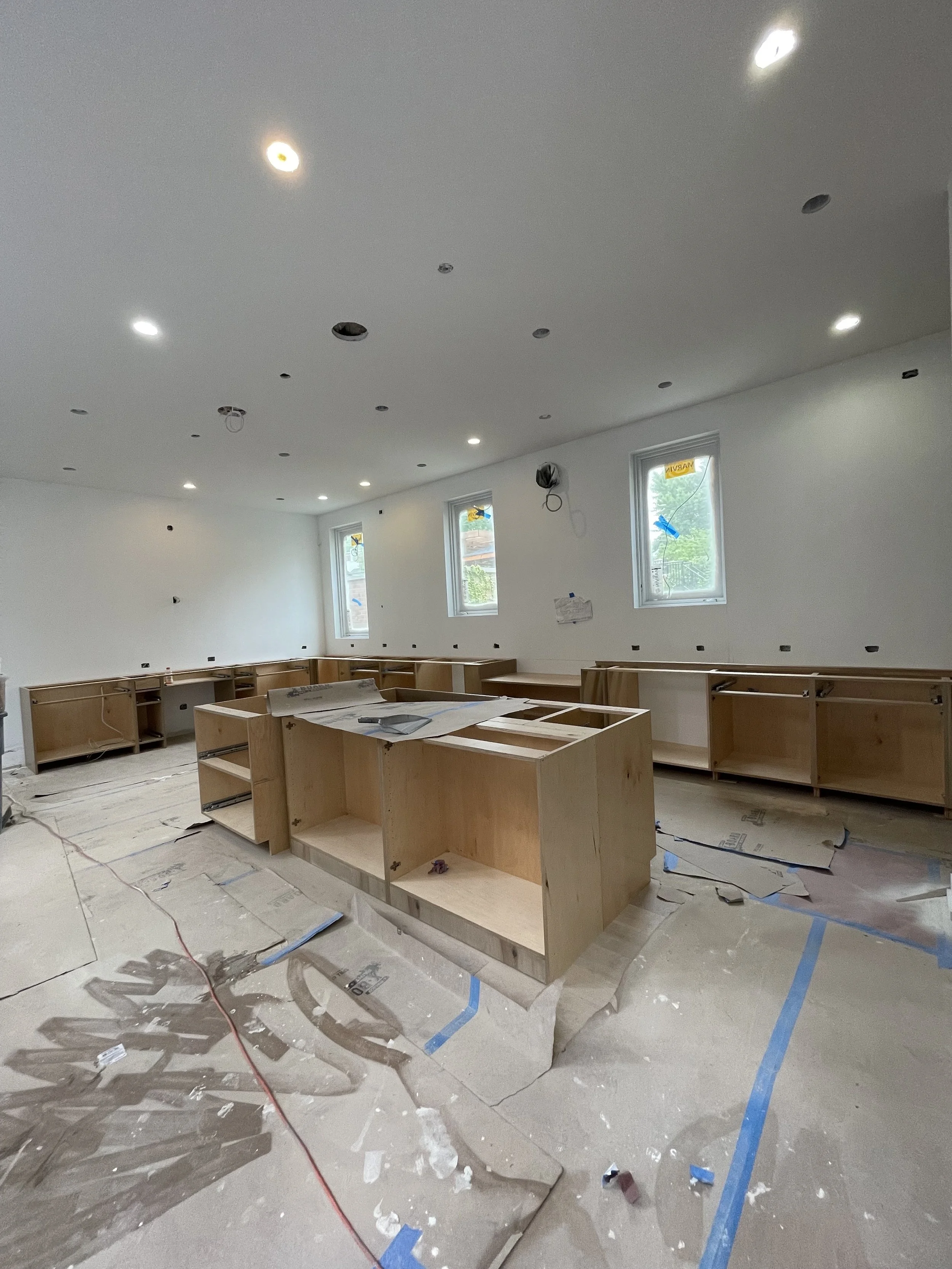
One of the turning points in the renovation process is when cabinets begin to be installed. When the base cabinets went in, we got a glimpse of our design coming to life. It’s an exciting moment as the room starts to feel more like a kitchen and less like a giant open space. In this project in particular, cabinets going in helped us really put in perspective the scale of the space…this is easily one of the biggest kitchens we’ve done.
Renderings are the best tool for communicating a clear vision for our design. It allows our clients to see every detail of their home, before it comes to life. Here are a few of the key renderings we presented for this home:
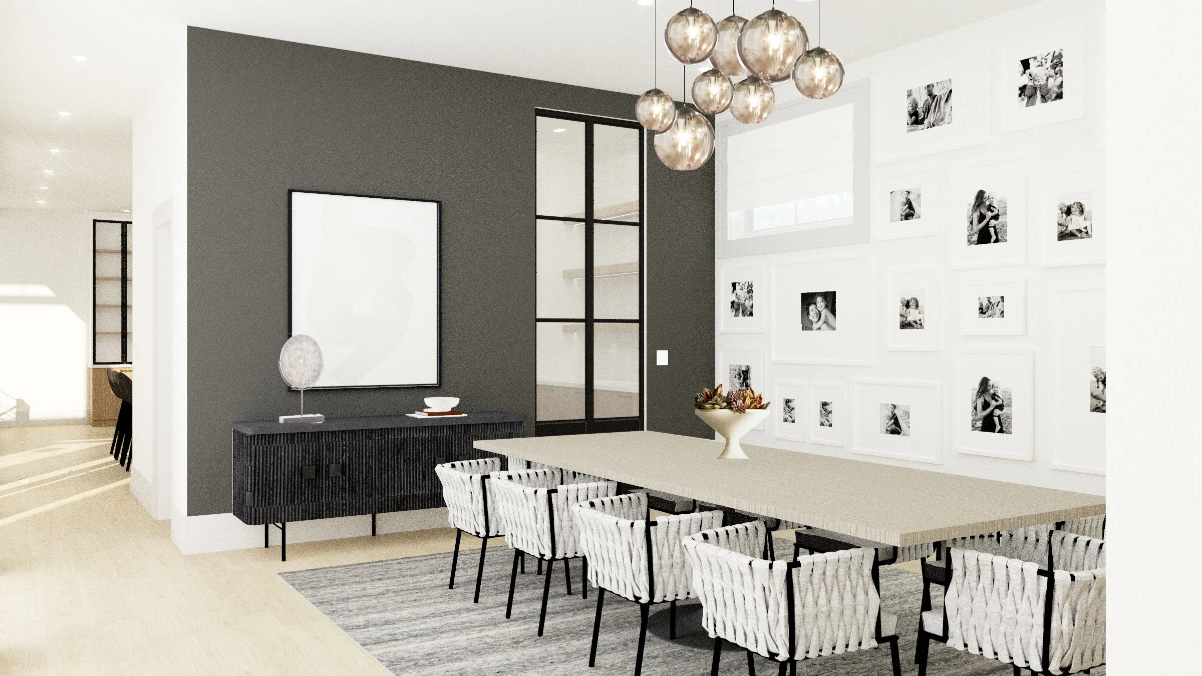
In the dining room, we introduced a neutral, black & white palette with a touch of wood at the dining table. Bold contrasts and textures would add some drama to the space. Along the back wall, the windows were very small and high up the wall, so instead of covering the wall with drapes, we decided to go with inside-mount Roman shades and fill the wall with a gallery wall, which the windows almost blend into.

In the primary bedroom, we designed an accent wall with unique molding and a deep blue paint color. It adds a moody and modern touch to the otherwise airy space.
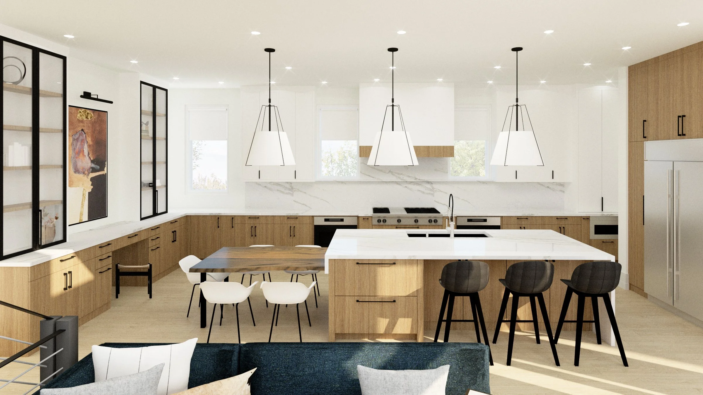
The kitchen is the heart of this home, and it deserved a really stunning and thoughtful design. Some of the unique features of our design include a massive island with an attached live-edge walnut breakfast table and large glass front cabinets that sit on top of the counters by a desk area.
THE REVEAL

The first impression of the home is an incredible, double height foyer which is incredibly unique in a city home. We kept the space fresh and open, letting the architectural details stand out and become the focal point. The foyer sets the tone for the rest of the home, and we kept this in mind while designing the space. Some of the features we intended to highlight in the entry are the high ceilings, large windows, sleek staircases, and cased openings that give a peek into the rest of the home. Then, we introduced crisp white paint, warm wood beams, airy light fixtures, and wide-plank engineered hardwood floors to elevate the design. One of our favorite subtle details is the incorporation of LED strip lights under each stair tread, illuminating the stairs in the evening and create a really dramatic first impression.

We kept the furniture in the foyer quite minimal, selecting a single chair and a large full sized mirror. Across from it, a simple console table creates a catch-all space for keys and necessities while exiting and entering the home. Above the space, a glass rail provides a peek into the living room. It also allows even more natural light to pour into the foyer, creating a bright, open, and airy aesthetic.

In the living room, floor to ceiling windows frame the space and create a bright and inviting feel. We selected modern, minimal ripplefold drapery to soften the windows and provide privacy in the evenings. Then, we introduced a palette of deep grey, blue, and rich cognac furniture that maintain a modern feel with their low profiles and clean lines. The hand-carved mahogany wood coffee table adds the perfect touch of texture to the living room, and soft corners for kids.
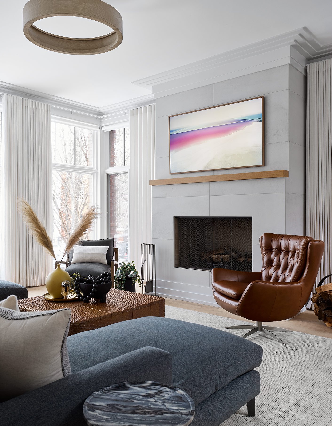
A sleek, modern fireplace is centered in the living room to create a focal point in the space. We selected a simple, porcelain tile surround and a minimal, white oak mantle to give the fireplace a super modern look.

In the dining room, we went with a modern, moody and textural look. A few of the eye-catching details in the space are the black accent wall, housing the glass and metal doors leading to the butler’s pantry, a large dining table, dripping sculptural chandelier, and a gallery wall that covers the entire back wall.
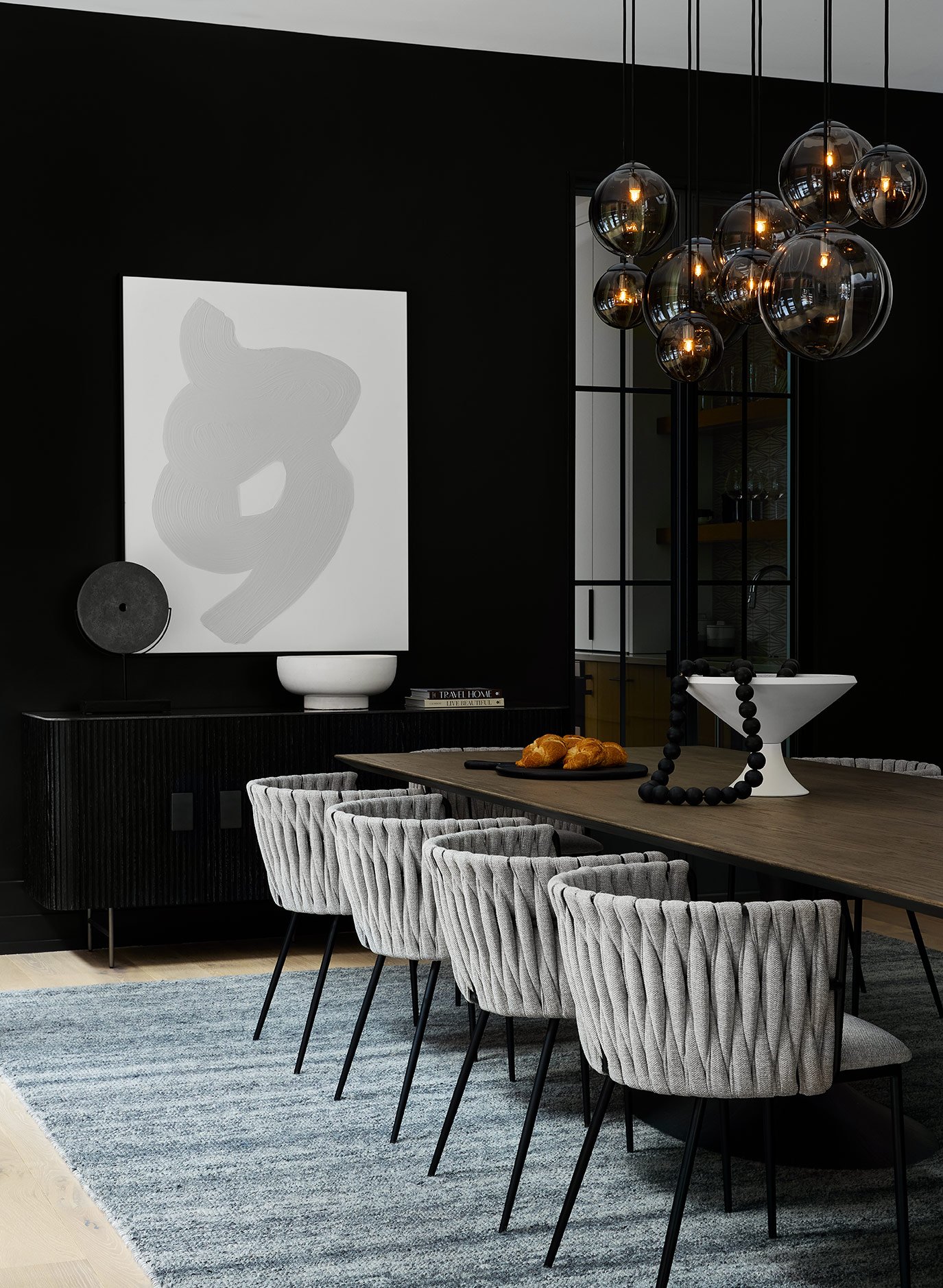
Paint can truly change the tone of a room. While the rest of this home is covered in crisp, white paint, we opted for a black accent wall in the dining room to set a more dramatic, intimate tone in the space. It still feels modern and clean, especially paired with the reeded wood sideboard and framed glass doors that provide a peek into the butler’s pantry.

Gallery walls are our favorite way to display family photos and prints because it feels like a curated art installation. In this dining room, it creates an epic backdrop for the modern and minimal dining table. The staggered, smoke glass globe chandelier suspended above the table creates a delicate and elegant feel in the space.

On the opposite end of the dining room, we designed a custom, white oak drybar for additional storage and separating the dining room from the foyer, providing privacy from the street. The wood tone adds some warmth to the otherwise cool, grey toned space. We opted for an ash oak finish on the dining table with a cast iron pedestal base. It’s modern and minimal, which allows the unique dining chairs to stand out. The upholstered barrel dining chairs feature a diamond weave back which give them a really textured, modern look. We wanted something that would be both elegant for entertaining guests, but also comfortable and safe to keep kids from falling out during family dinners.

Between the dining room and the kitchen, we tucked a powder room onto the main floor. We love to go bold with our powder room designs, so we selected a black textured tile on the vanity wall and a modern, geometric wallpaper to add some additional interest to the walls. A minimal, white oak vanity mimics the finish of the dining room cabinetry for a cohesive feel.

The true heart of this home is the kitchen which pulls in a clean, modern aesthetic with a neutral palette of warm wood, bright white, and crisp black materials. Functionality meets beauty in this kitchen, where the design incorporates beautiful finishes and interesting details without sacrificing an optimal floor plan and maximum storage space.
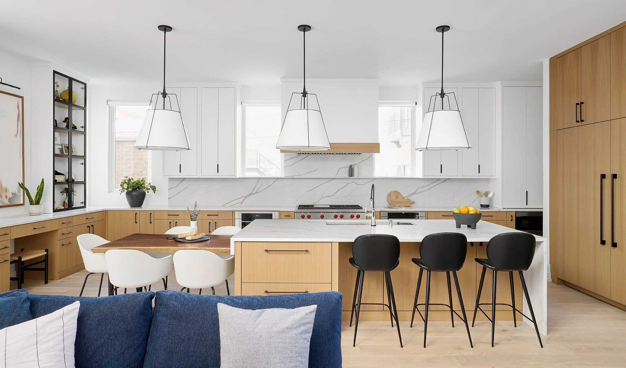
The symmetry in the kitchen helps maintain a clean, balanced aesthetic. The entire space feels grounded by the warm, white oak cabinets that run along the entire perimeter and the large island. Above the base cabinets, we selected durable quartz countertop with dramatic veining that we carried up into the backsplash for a sleek look. The white upper cabinets almost disappear against the white walls, which helps to maintain a really clean, light and airy look in the kitchen. On either side of the range, we added in two more windows and carried a stone ledge below the windows and across the cooking area to provide a little spot for salt/pepper and oils.

At the far end of the kitchen, we designed space for a small desk area. Above it, we incorporated a framed art piece to introduce some color and texture in the kitchen. On either side, we built-in tall cabinets with framed glass doors to display accessories and decor and breakup the solid cabinetry throughout the room.

We always love to hide appliances in the kitchen to avoid a disjointed feel. This large kitchen deserved an equally large refrigerator and freezer, and we opted for panel-front appliance so that they blend into the cabinetry. Back on the perimeter countertop, we incorporated another tall cabinet with pocket doors to hide the coffee maker and other small kitchen appliances.
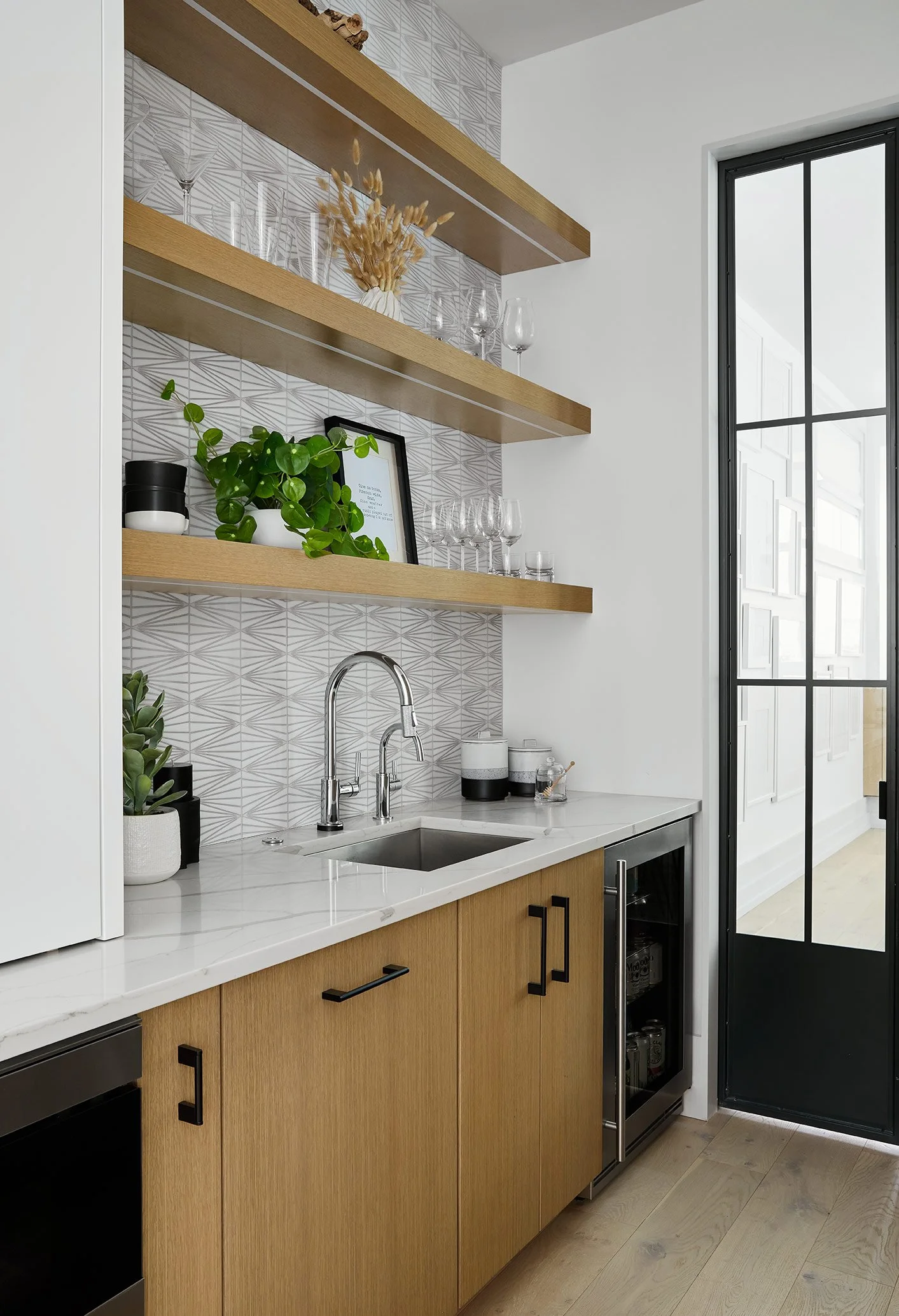
Tucked between the kitchen and dining room, we added a butler’s pantry with even more storage and appliances. A beverage fridge, filtered water faucet, and open shelves for glassware are a few of the key features in this butler’s pantry. We also introduced a modern, graphic backsplash tile with a similar pattern to the powder room wallpaper to really make the space stand out on its own.

Attached to the large kitchen island, DGI designed a custom, breakfast table with a live walnut table top to add a beautiful, natural texture to the kitchen. Then, we selected white, hard shell dining chairs with a black base to tie into the color palette seen throughout the rest of the kitchen.

The family room sits directly across from the kitchen providing a really open-concept living feel. In the family room, a double-height fireplace is the main focal point of the room. We opted for a modern, minimal plaster finish and carved out niches on either side to stack birch logs.

The family room is surrounded by large windows that allow natural light to pour into the space. Because of this, we were able to select some darker furniture pieces and bold finishes while maintaining an open, airy feel. We opted for a custom sectional sofa to frame the family room, and we introduced a pop of color with it’s navy blue fabric. Then, we selected several sleek, metal accents and side tables to complement the fireplace surround and add to the modern feel in the space.

Remember the staircase from the before photos? We discarded the heavy metal framing, and opted for a minimal metal railing and wire cables instead to give the staircase a really modern and sleek appearance. Above the room, we opted to make a statement that draws the eyes up to celebrate the incredible ceiling height with a contemporary, suspended chandelier.
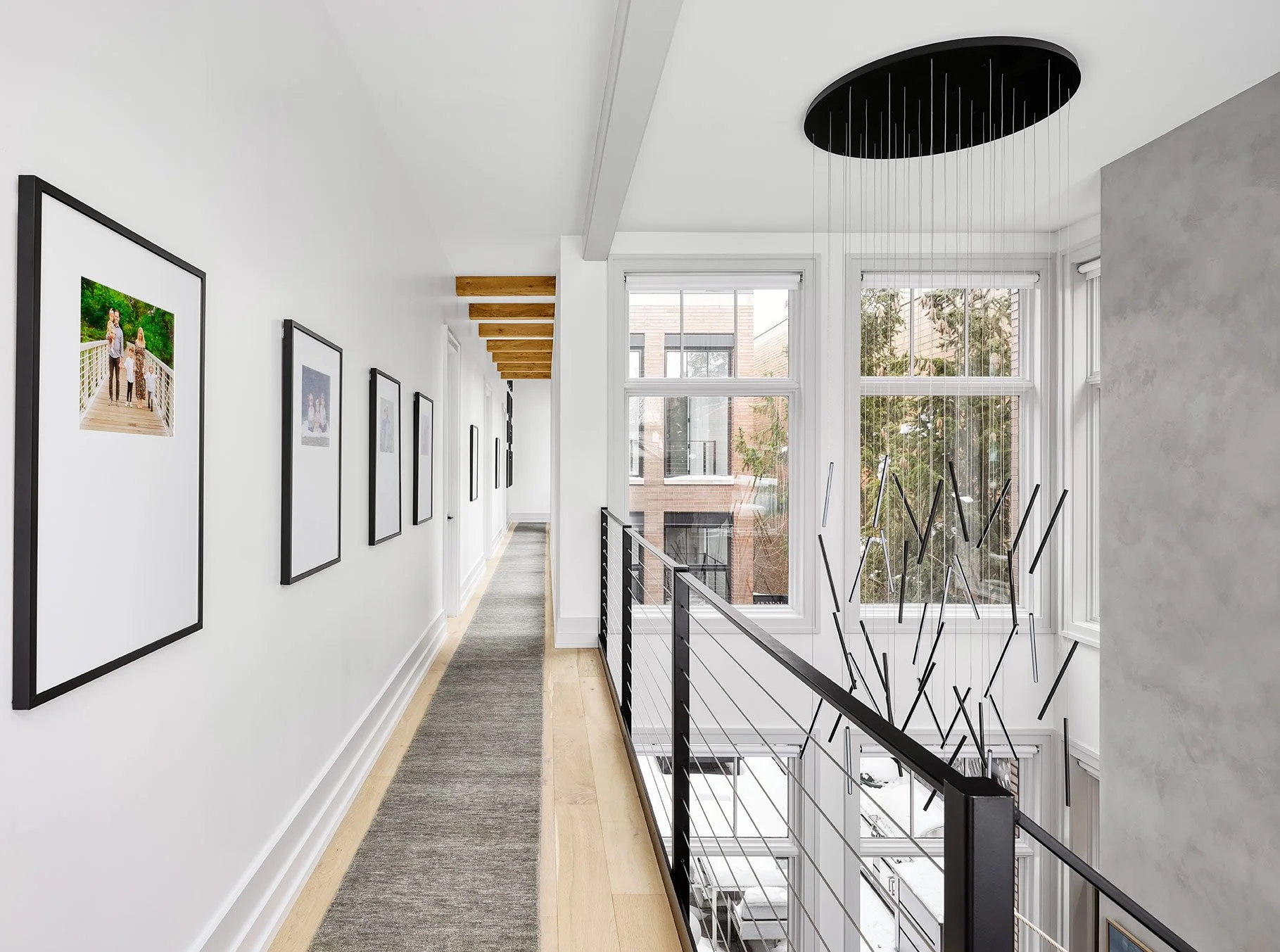
Even the hallway of this home is a show-stopper. The dripping light chandelier continues up to the second floor, uniting the two space. Upstairs, a custom 62’ runner, softens the space. Across the ceiling, we carried in the same wooden beams that were introduced in the foyer. To add a personal touch, we hung simple gallery frames, evenly spaced down the hall to display family photos.

Heading into the primary bedroom, we intended to design a space that felt both fresh and clean yet warm and inviting. We created a touch of drama and depth with a deep blue accent wall behind the bed and nightstands. A minimal, upholstered bed frame and hotel-like, white bedding adds to the clean look in the bedroom. While the rich, wood nightstands and textured, shearling bench add a warm and inviting touch to the space.

We opted for a wall sconce as a bedside light to keep the nightstands clear and uncluttered. The brass and amber glass wall sconce adds some contrast to the blue accent wall in a clean, elegant way.

Across from the bed, we designed another accent wall. This time, we carried the flooring up the wall with the same plaster finish as the fireplace beside it. We selected a contrasting wood dresser with super clean lines and a minimal profile to maintain a modern look.

The primary bathroom is one of our favorite spaces in the home. Originally the closet, we brought the bathroom to the front of the home to provide natural light, and incorporated bottom-up Roman shades for privacy. We kept the design very minimal and modern, while incorporating details that help it really stand out. For the floor tile, we opted for a matte grey porcelain tile to create a simple backdrop for the vanities and freestanding tub. The modern, freestanding tub is centered in the room to create a focal point, and the sleek tub filler stands beside it.

We designed two large, matching vanities on either side of the tub with clean, minimal cabinet profiles and sleek quartz countertops that waterfall down the exposed side of the vanities for a really elevated look. Similar to the detail at the range in the kitchen, we carried the stone up the backsplash and created a ledge above the wall-mounted faucet for the large mirrors to rest on. For an added touch of luxury, we installed LED strip lights at the vanity toekicks.

For the steam shower, we carried the matte grey porcelain tiles from the floor onto the walls for a really continuous, cohesive feel. A simple, black mosaic tile creates a bold contrast in the space while maintaining a sleek and modern aesthetic. We completed the design with custom glass doors and polished chrome plumbing fixtures.
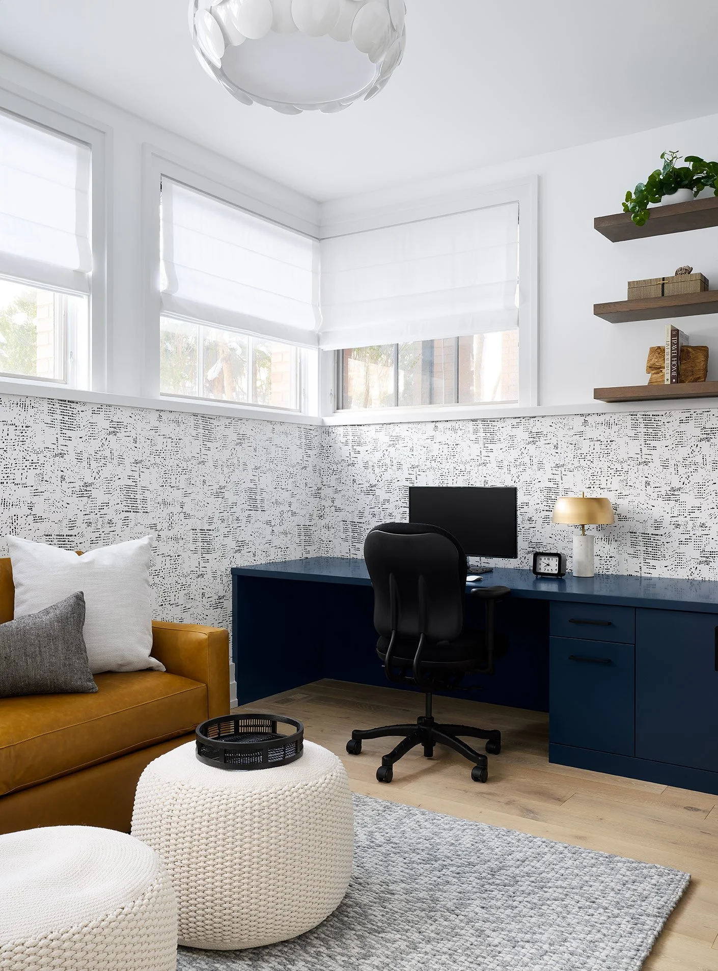
Heading downstairs into the basement, we designed a home office that can be converted into an additional guest room. It’s become a necessity in most homes these days with the new work from home lifestyle, and it was important to design a space our clients would feel great working in. We opted for a graphic patterned wallpaper that covers the bottom half of the walls, and we paired it with a custom, navy blue desk.
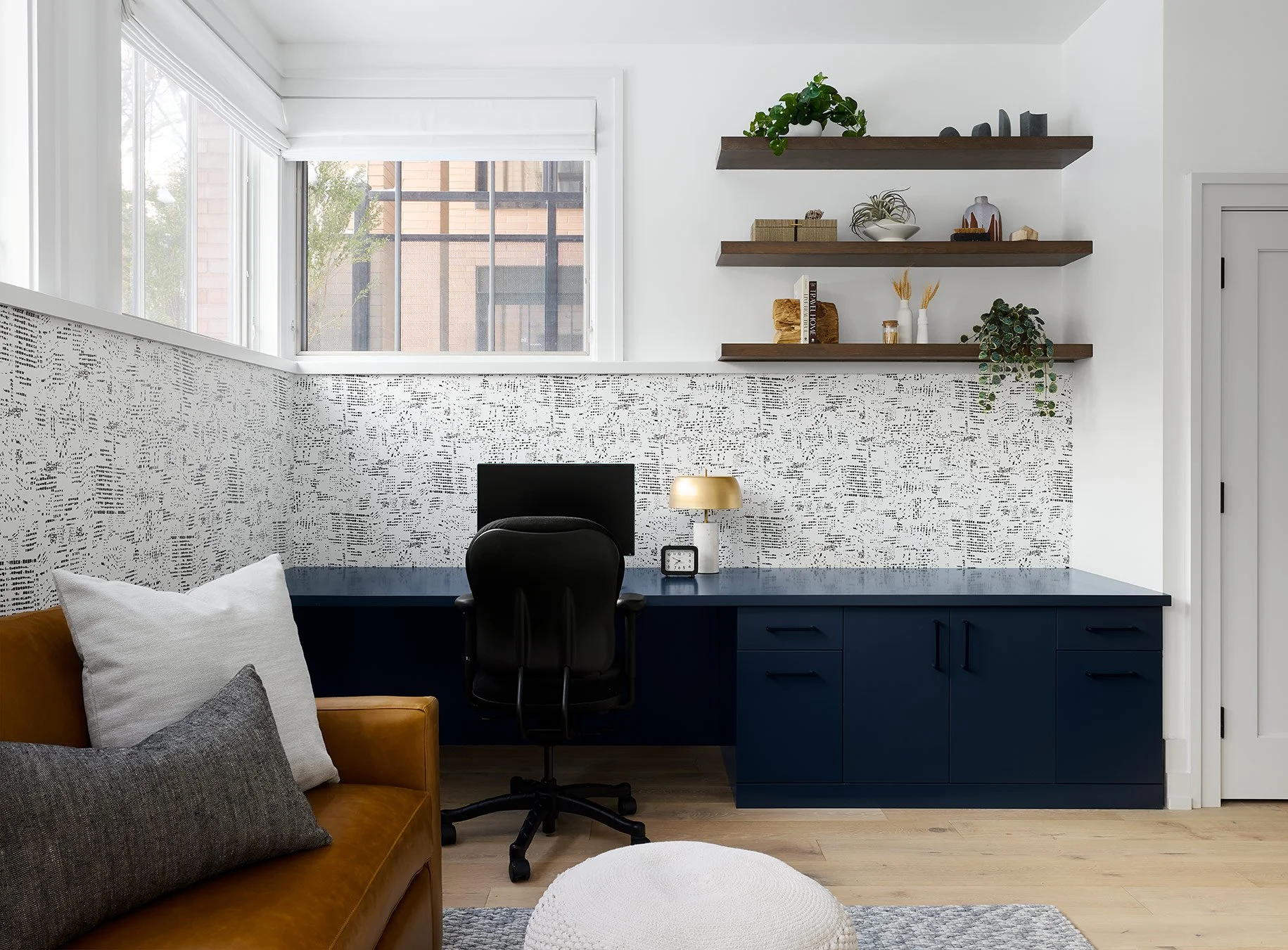
Above the desk, we introduced open shelves to provide a space for styling personal accessories that help the office feel personal. Beside the desk, we included a cognac leather sleeper sofa so that when guests come to visit there is always flexible sleeping space.

On the opposite end of the basement, we designed a recreation room just for the kids. A cozy, deep sectional frames the space, and we opted for a super durable fabric that will withstand spills and stains that are inevitable with kids. We designed a custom built-in wall, incorporating a space for the TV, closed cabinet storage, and cubbies along either side for additional open storage. You can never have enough with three kids!

Tucked under the staircase in the recreation room, we designed a reading nook with custom wood cubbies and a large cushion where the kids can curl up with a book. Behind the nook, there was still a ton of space under the stairs, and we decided to create a hidden playspace for the kids.
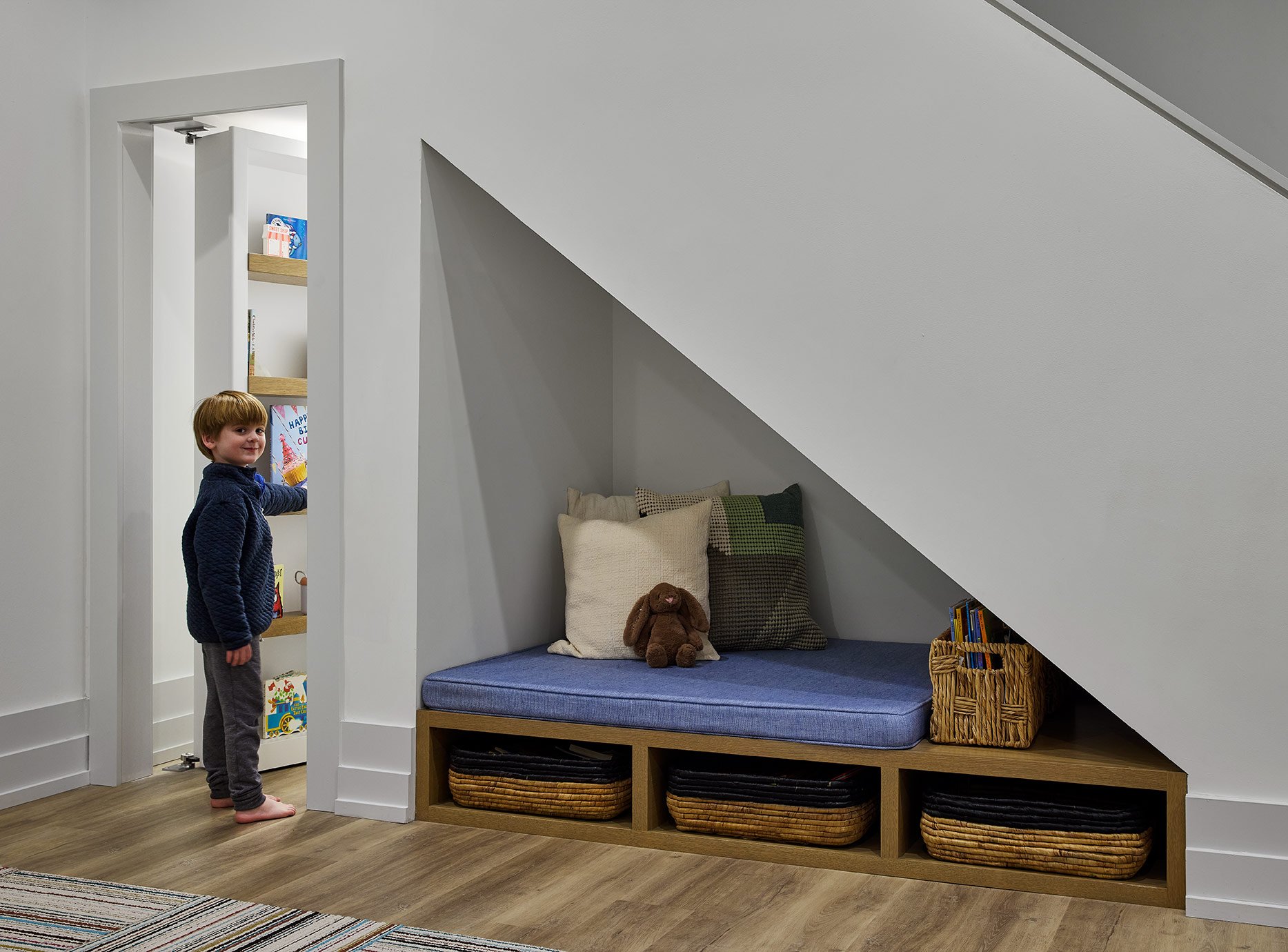
The bookshelf incorporated beside the nook opens up and reveals the secret hidden space for kids.
That completes the tour of this modern and unique family home! It’s always bittersweet when our projects come to an end, but we’re so glad our client’s young family gets to enjoy this gorgeous home for years to come. Thanks for following along on the tour, we hope you love the project as much as we do!
-dgw
Photography by: Dustin Halleck