Home Tour - Southern Charm
Introduction
It’s always a special opportunity to design a home for clients that have relocated from across the country, because we know our design will have a big impact on their experience and lifestyle as they settle into a new city. Our clients for this project came to DGI looking for a unique design that would turn their newly purchased Lincoln Park house into a home that was tailored to their personal style. Originally from Texas, the couple was drawn to a modern, urban design but wanted to incorporate touches of Texas charm that felt familiar and inviting to them. DGI was excited to take on the task of uniting modern, moody, and rustic touches into one cohesive design throughout the home. We couldn’t be happier with how it all came together, and we are so excited to finally reveal this home tour!
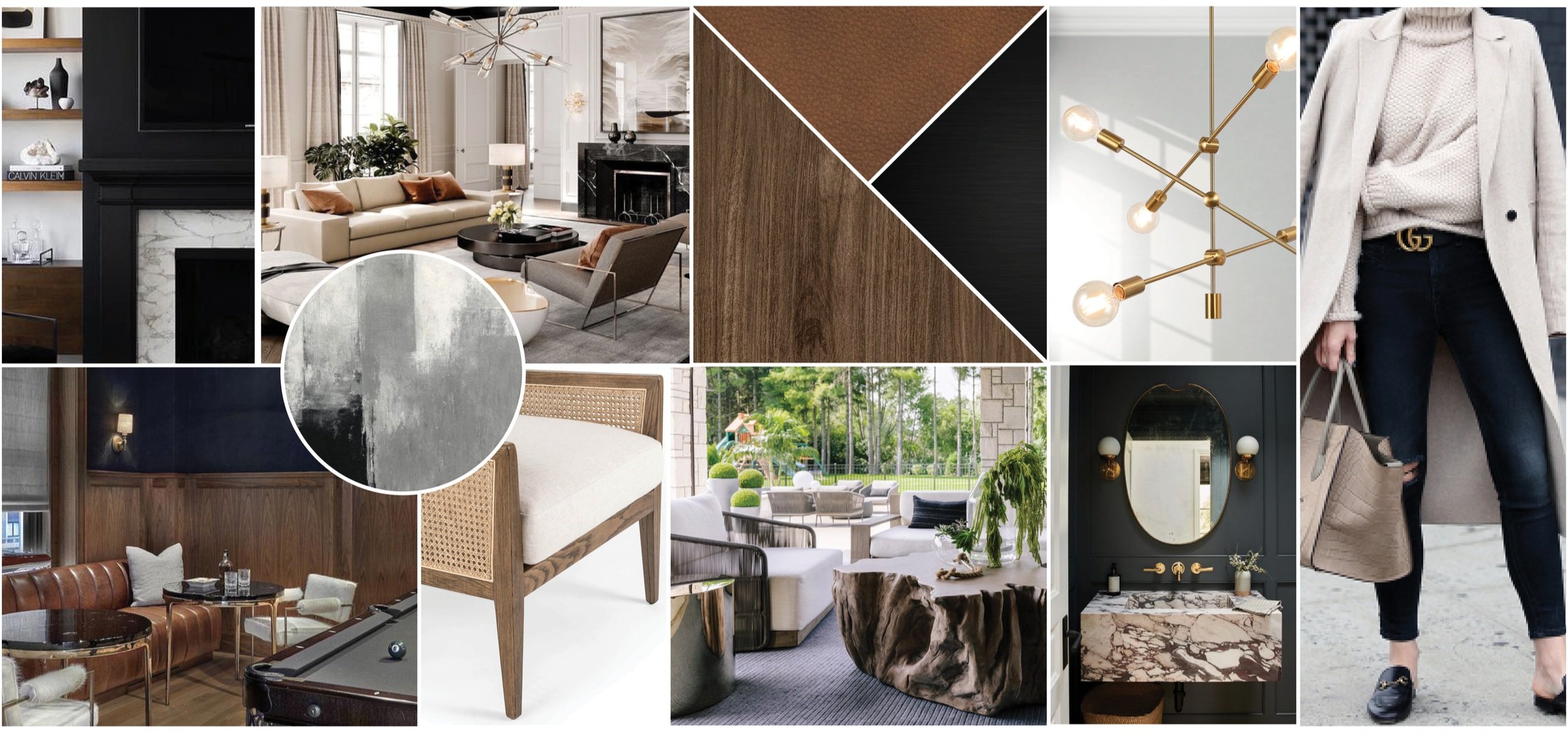
The moodboard is the initial step in our design process, where we pull together inspiration for our design that we can refer back to throughout the project. This moodboard pulled in dark and moody accents, modern furnishings, and natural textures.
The Process
With the moodboard finalized, DGI got to work implementing the concept onto the existing spaces of the home.
This home had really great bones, but our clients wanted the finishes to better align with their personal style. Fresh paint, custom window treatments, and modern, clean lines throughout would completely transform the home. A few of the areas that would undergo the biggest transformations include the formal living room, third floor rec room, and basement lounge.
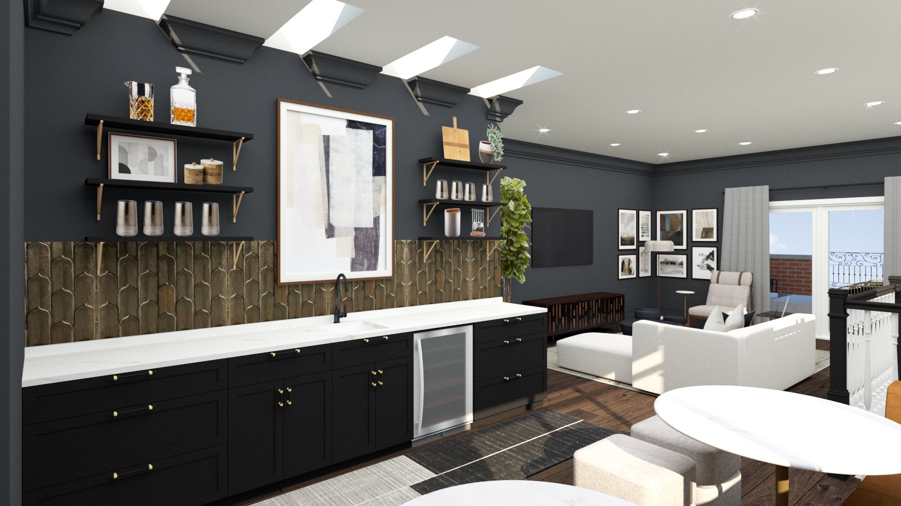
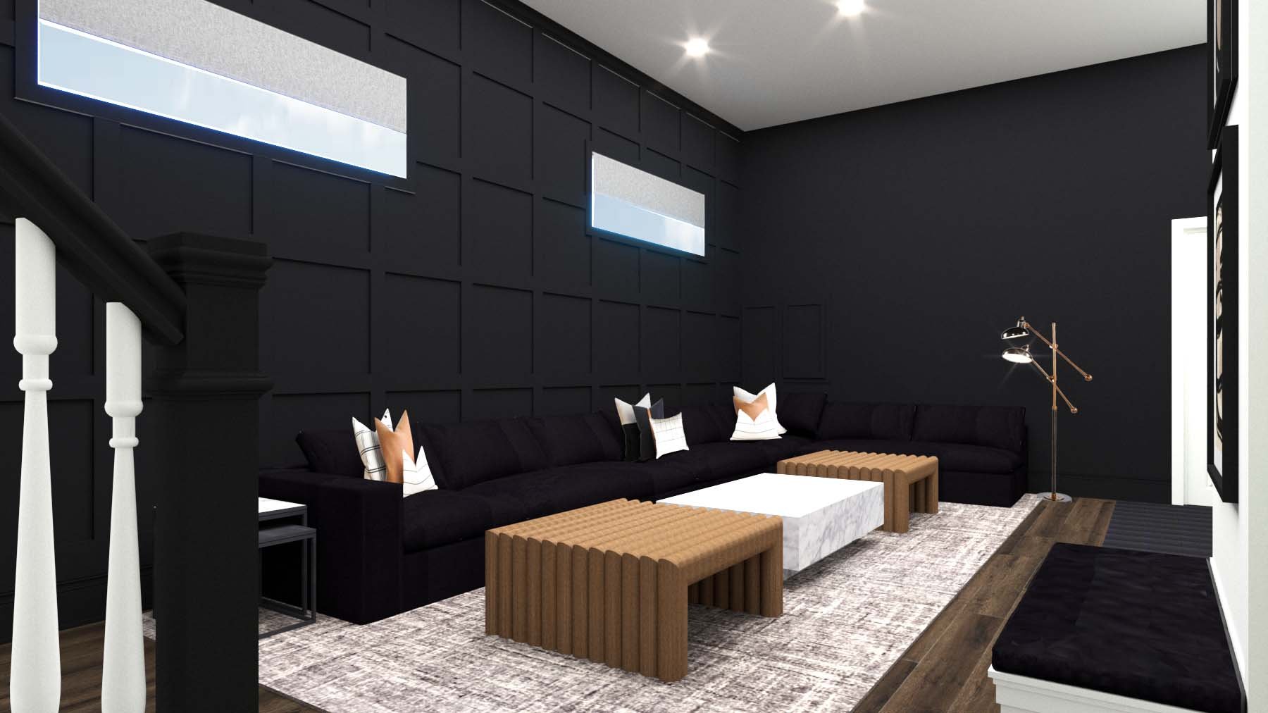
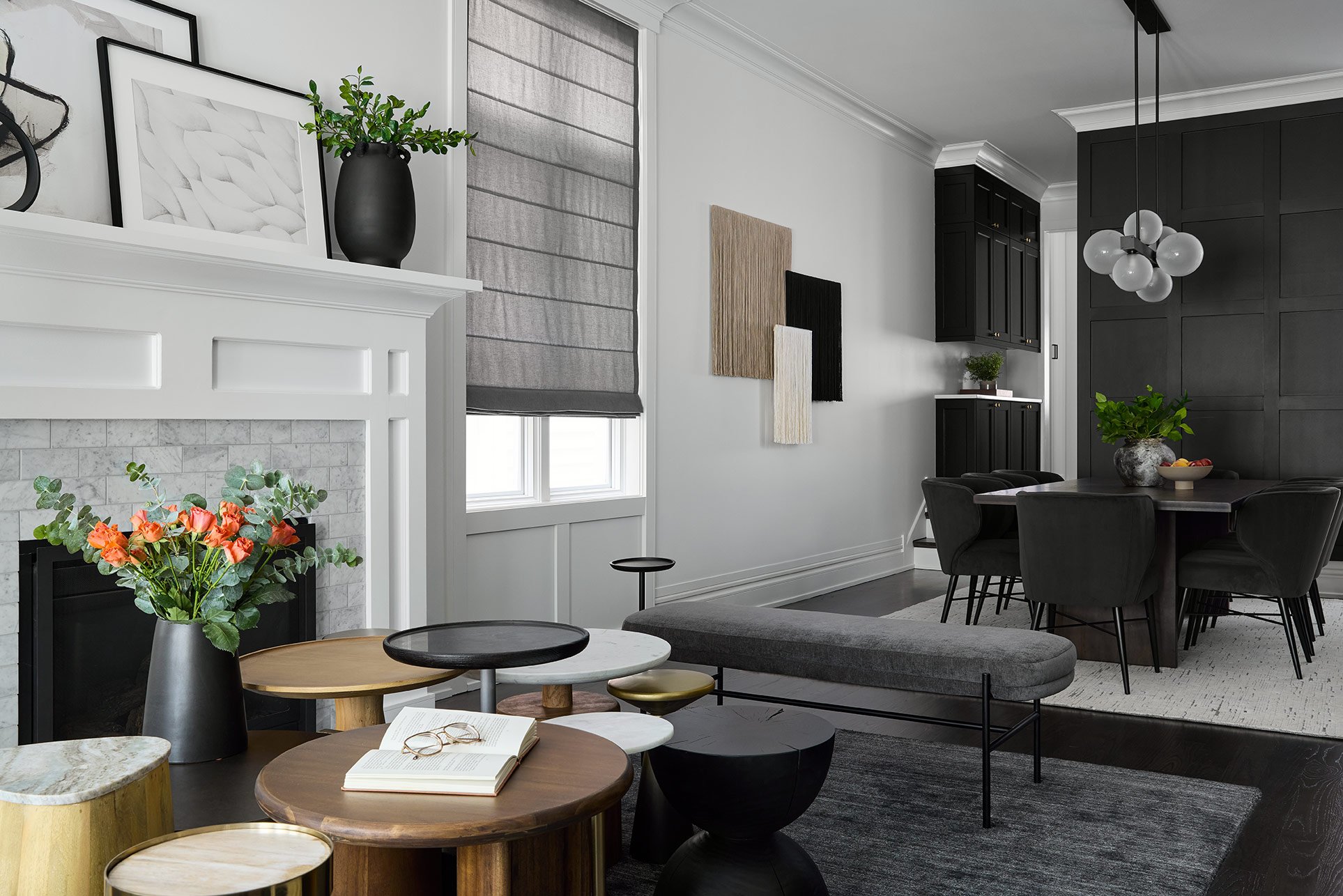
In the formal living room, we created a sculptural installation of side tables to provide more seating and a strong first impression of the home. The third floor rec room already had a built-in wet bar, but DGI intended to elevate it with open shelving, fresh paint, and a new backsplash. And in the basement lounge, DGI incorporated wall paneling to add texture and celebrate the unique, tall ceilings.
The Reveal
It’s been such a pleasure to work on this project, and we couldn’t be happier to finally reveal the results to all of you. We hope that our design helped our clients settle into their new city and home with ease. Now let’s get to the photos!
Formal Living Room
The formal living room is positioned at the front of the home, so it was important for DGI to create a space with a strong first impression.
We intended to make a statement in the formal living room that showcases the feel of the cohesive design that would be carried throughout the rest of the home. To achieve this, we designed a sculptural coffee table installation made up of a multiple side tables of varying heights, materials and shapes. If you follow along with DGI, you’ve seen this look once before, and it always adds a wow-factor to the space.
This space was designed to feel formal and structured for welcoming guests into the home. The custom roman shades give the space a polished feel while also providing privacy from the street views. In the design, it was important to merge an urban, city feel with the earthy, southern touches that our clients were drawn to. To achieve the urban feel, we incorporated metal accents like iron and brass into the design. Then, we layered in a cowhide rug and natural cane textures for subtle, southern touches.
DGI carefully selected the furnishings in the formal living room to showcase materials like wood, iron, and brass that we would carry throughout the rest of the home. The side tables in the coffee table installation introduce a mix of these materials in a really unique way. The accent chairs positioned in front of the windows have a structured and modern shape, and they make a statement with a sculptural and textural frame.
Because the formal living room is positioned right off of the entryway, DGI decided to take the opportunity to create a unique mirror accent wall for quick touch-ups coming in the door or heading out. DGI opted to split the accent wall in half, installing a moody black slat wall on one side and a floor-to-ceiling mirror on the other side.
Dining Room
The formal living room flows directly into the formal dining room that DGI transformed with custom paneling and modern furnishings.
The existing dining room featured crisp white walls, but DGI wanted to add some character into the space. Natural light floods through the formal living and dining room, so we had an opportunity to add some moodiness to the space without sacrificing a light and airy vibe. We opted to install custom wall paneling that introduces clean, modern lines along the back wall. Then, we covered it all in moody, black paint to add some drama. We also decided to paint the butler’s pantry cabinets the same color to tie the spaces together.
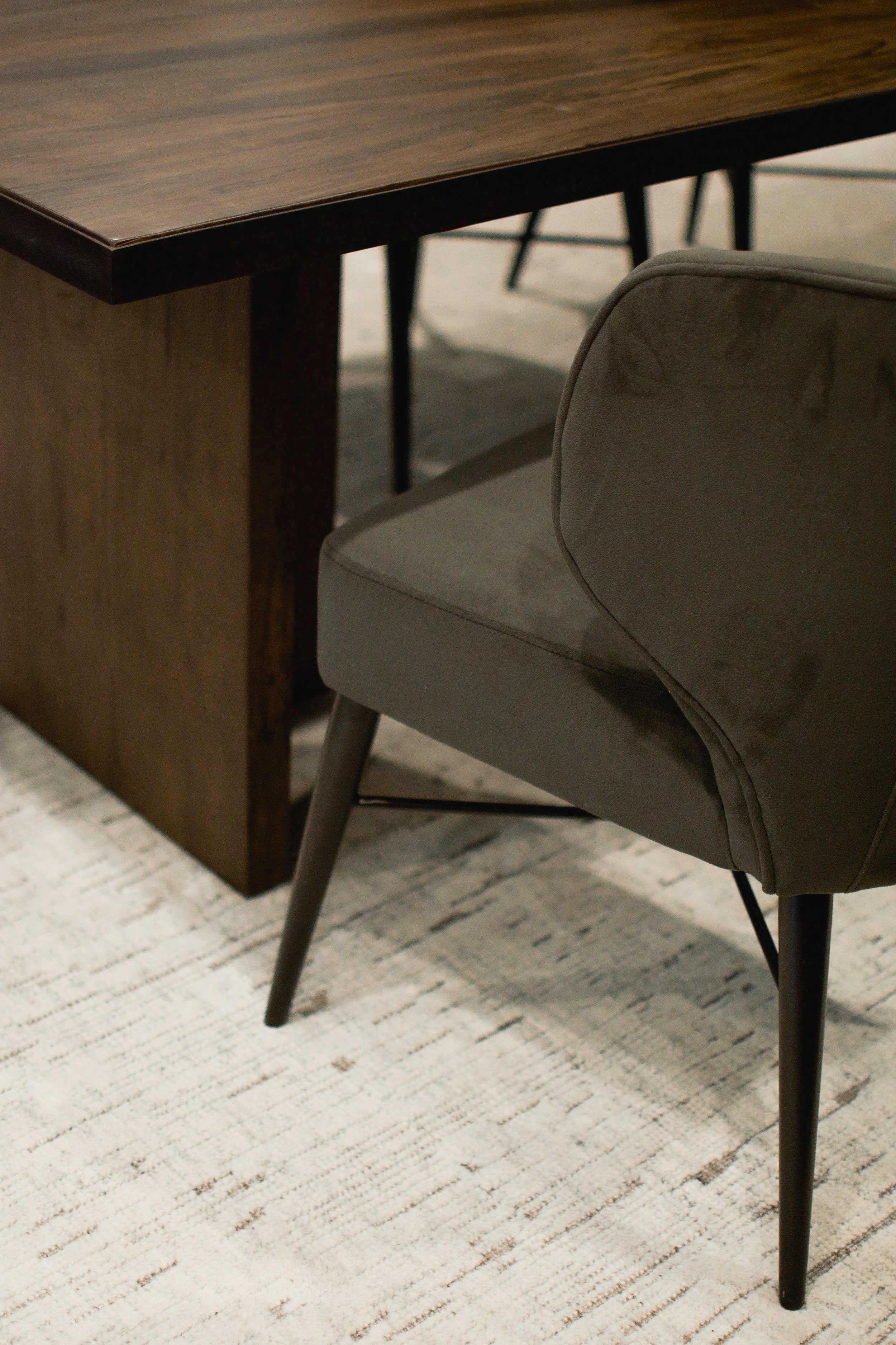
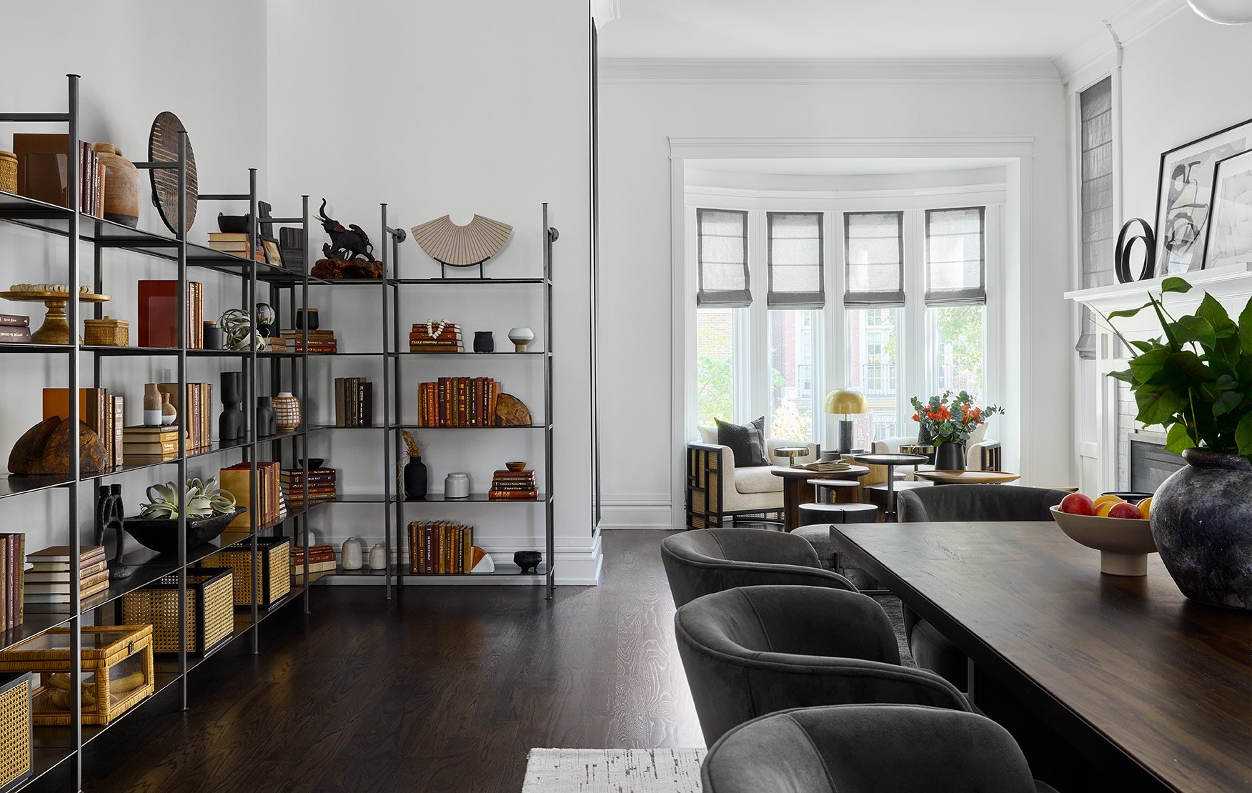
The dining room furniture introduces even more rich & dramatic tones. The dark wood dining table features a clean and modern structure, but the wood grain adds a beautiful, natural texture into the space. The velvet wingback dining chairs we selected give the dining room an elegant look. Above them, DGI opted for a linear globe chandelier that incorporates black metal for a cohesive feel. Finally, we installed custom macrame wall art that introduces soft textures and leans into the earthy, South-Western feel that our clients loved.
On the other side of the dining room, we installed gunmetal open shelving across nearly the entire wall. It provides a space for displaying personal keepsakes and accessories in a really impactful way. The open shelving truly merges the urban and earthy aesthetics of the home perfectly and activates an otherwise unused area. The clean-lined, metal shelving units contribute to the modern, urban look. While the vintage-look accessories pull in warm tones and earthy textures in a powerful way. We absolutely love the statement it creates in this space.
The metal shelving wraps around the corner to meet with the formal living room. From this point of view, you can see just how perfectly the shelving ties the dining room and living room spaces together.
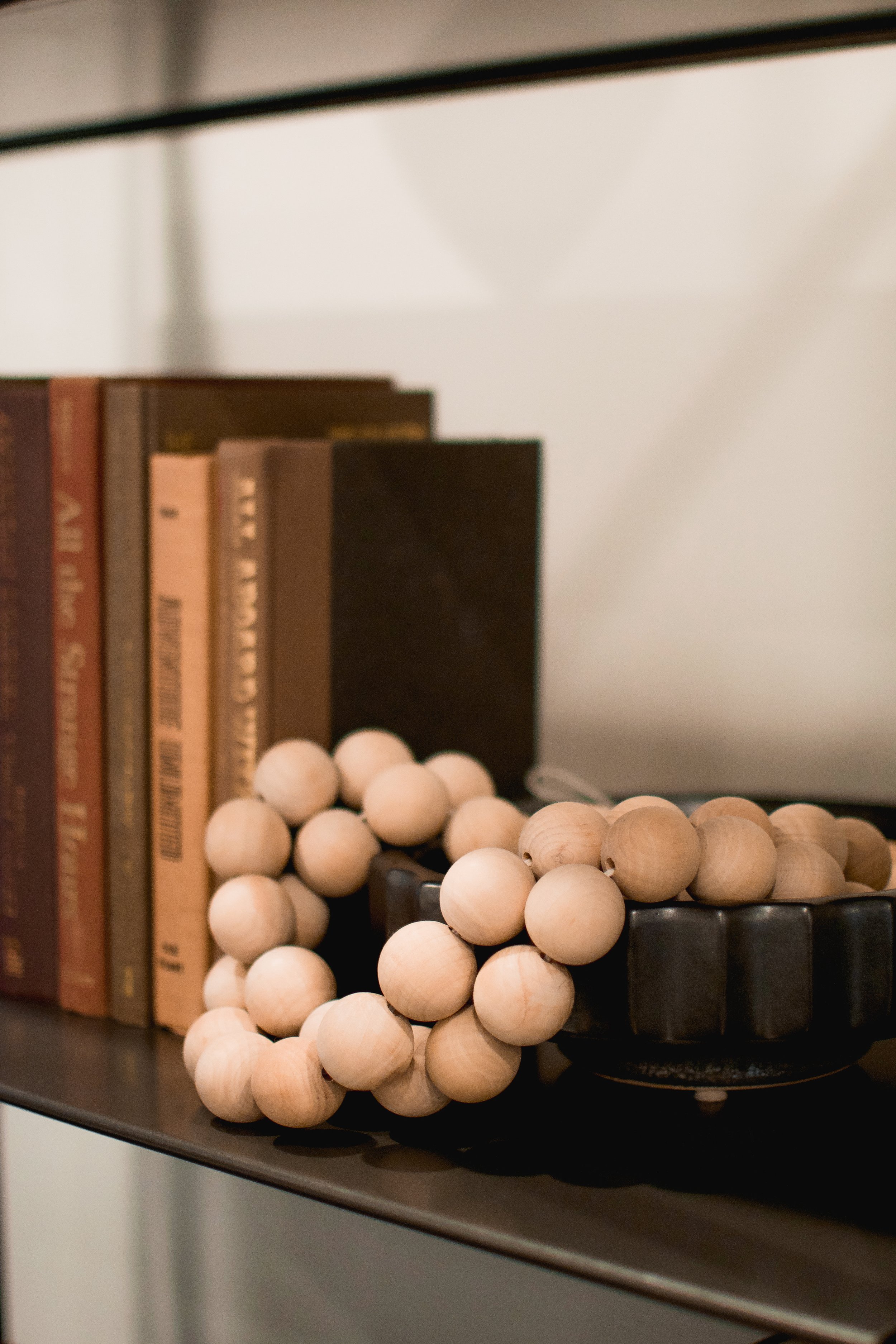
The shelf styling and accessories are where the vintage, southern feel really comes to life in this space. We took some of our client’s personal keepsakes from Texas and other travels, and displayed them next to more modern accessories that tie into our design, like the cane baskets or wooden vases.
Powder Room
A powder room is tucked directly behind the formal living and dining room, and DGI had the opportunity to renovate the room completely.
If you know DGI, you know it’s hard for us to resist a moody powder room. And since the design of this home incorporated moody touches throughout, we decided this is the perfect space to go all out with a moody feel. We decided to carry over the same wall paneling and paint from the dining room to cover the walls in the powder room, giving both a cohesive and dramatic feel. Then, we installed a geometric marble and wood-look tile on the floor that combines modern patterns and materials with a vintage, rustic look. A wood vanity adds organic texture to the space, and we opted to mix metals here to balance out warm brass and dramatic black fixtures.
Family Room
On the other side of the first floor, DGI designed a family room that is fit for lounging and relaxing.
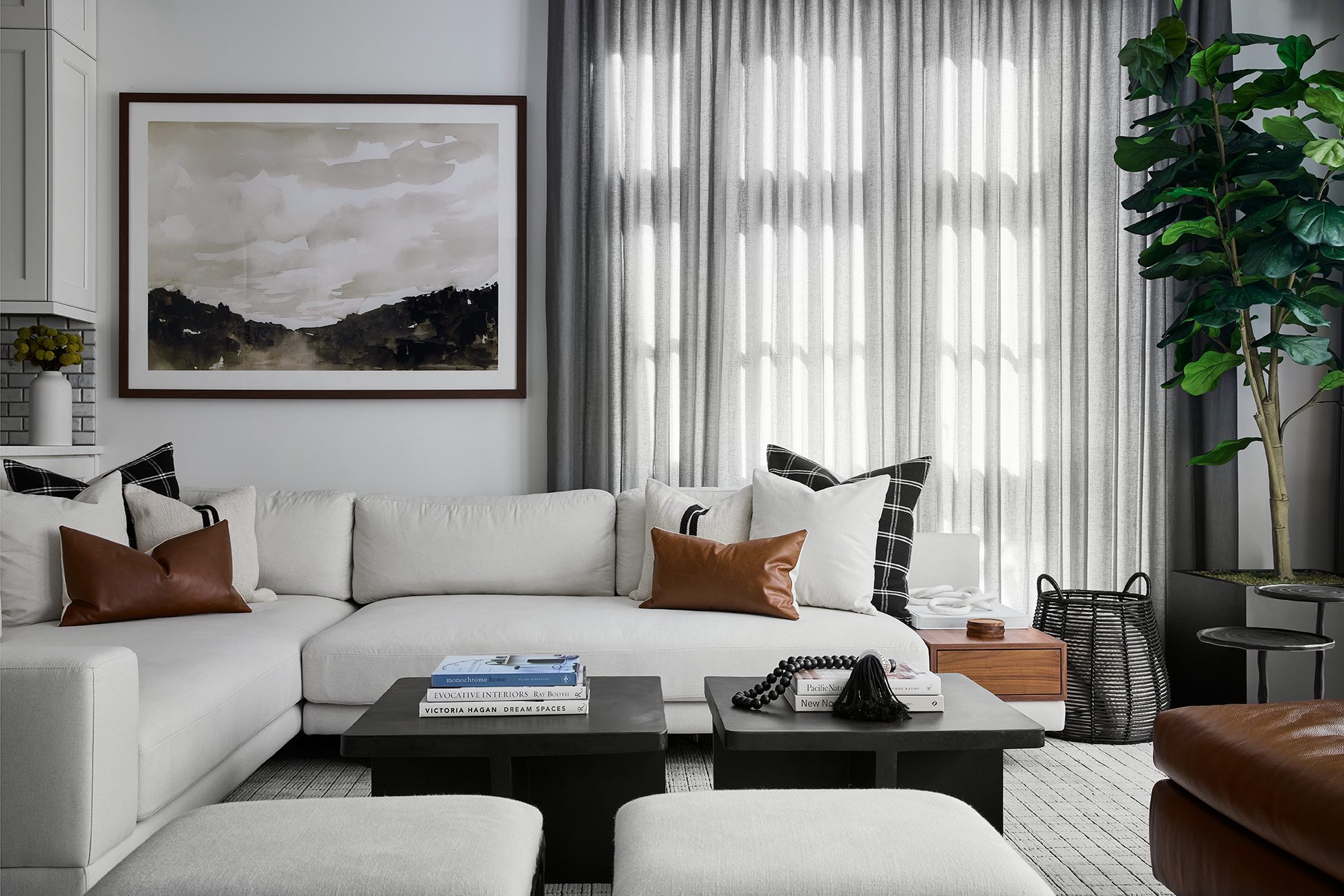
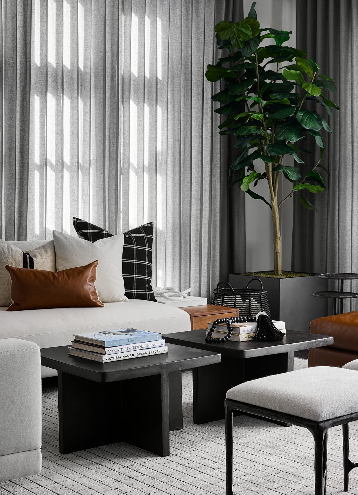
DGI designed the family room with a neutral palette of crisp whites, cognac leather, and aged iron accents to achieve both an urban and earthy look. We selected structured furniture pieces with clean lines throughout the space that give it a modern and sophisticated feel. To create a soft backdrop for the strong linear language of the furniture, we installed floor-to-ceiling ripplefold drapery in an airy grey linen fabric.
The custom area rug grounds the entire space with more linear language and subtle textures. Playing off of the subtle textures, we selected accent tables with natural materials, like marble and iron, that introduce a subtle patina to the space in an elegant way.
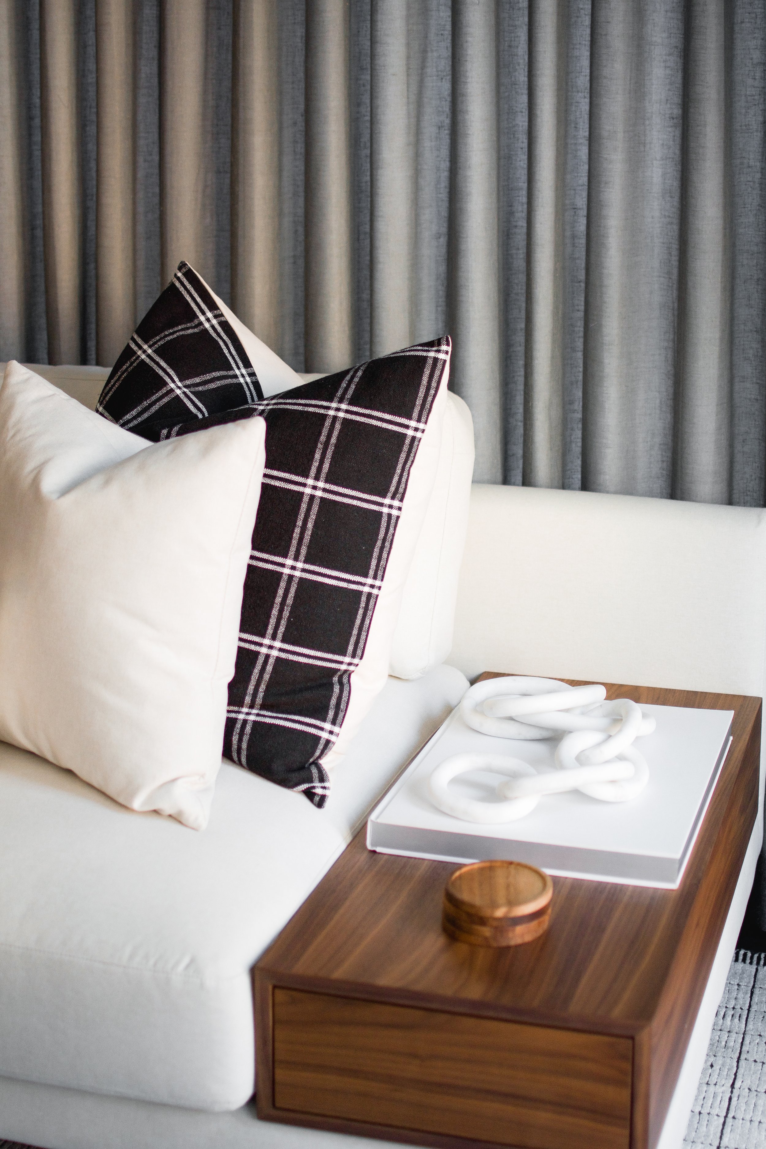
Because the furniture materials and profiles are so modern, we introduced accents that add pops of a classic, southern feel. Hammered metal, textural accessories, and plaid throw pillows are small accents that helped to achieve that overall feel.
Second Floor Landing
Heading upstairs to the second floor, which houses the bedrooms and bathrooms, you’re greeted with a charming reading nook at the landing.
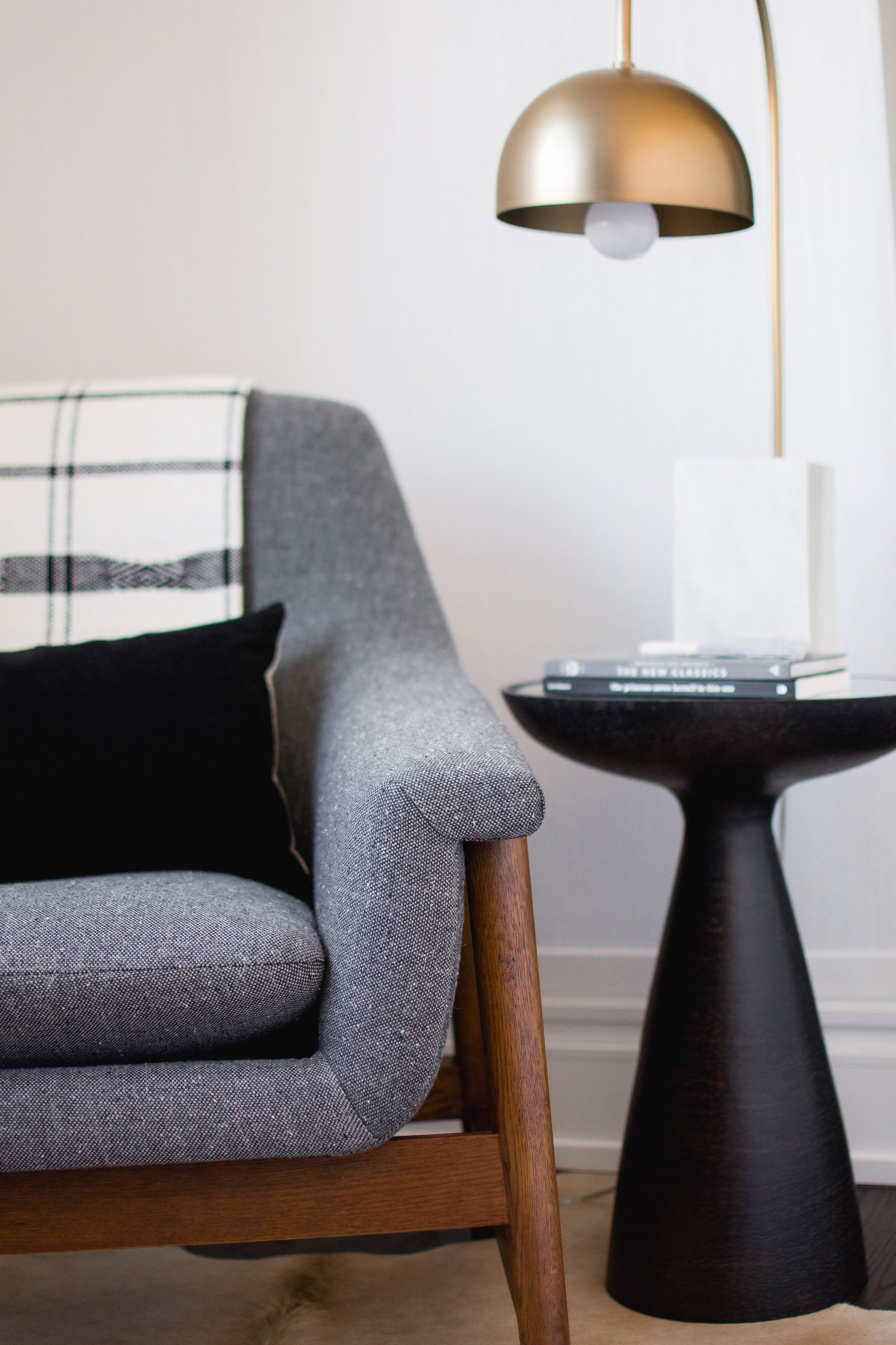
At the landing area, we positioned an accent chair and side table to create a reading nook or cozy spot for lounging. To ground the space, we laid a custom hide rug that came from Texas to add a personal touch for our clients. To help the space stand out even more, we installed a wallpaper with a subtle texture that is carried up all the way onto the ceiling for a continuous feel.
Guest Bedroom
Continuing down the hallway and past the landing nook, you reach the warm and inviting guest bedroom.
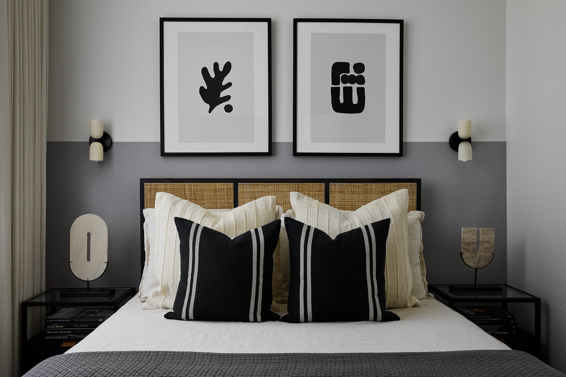
Since our clients were relocating from Texas, they planned to have lots of friends and family visiting often. So it was important that they have a dedicated space that welcomes all of their guests comfortably. They really wanted the space to feel inviting and hotel-like, and DGI was able to achieve this while maintaining a design that feels cohesive with the rest of the home.
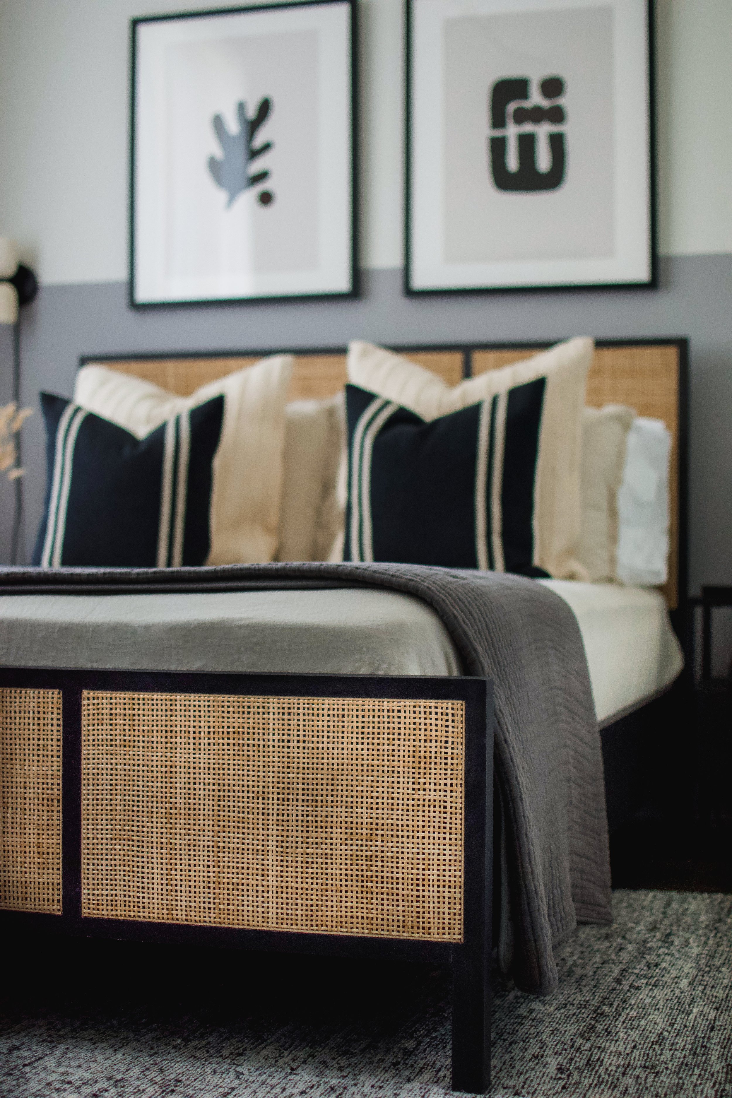
To add a unique focal point along the back wall, we opted to paint a half-accent wall with a soft grey paint. Then we positioned a woven cane bed with black metal nightstands on either side directly in front of it. The headboard introduces a cane texture that is seen in other areas throughout the home for a cohesive feel. Above the headboard, we installed two pieces of artwork that slightly overlap the accent wall to create a unique, layered effect. A stack of double-layered ripplefold drapery along the side wall gives guests the option for solid or sheer coverage from the windows, and they give the space a light and airy feel.
For the bedding, we selected a crisp, bone-colored linen set and layered in neutral throw pillows to add even more texture and depth to the space. On either side of the bed, we added an additional light source through delicate wall sconces. The dual ceramic shades have a subtle variation and texture to them that gives the fixture a vintage, charming look.
Primary Bedroom
On the other side of the second floor, DGI gave the primary suite a fresh and serene look.
DGI intended to give the space a really soft, open, and airy feel, and we achieved that through a neutral palette of off-white, warm greys, and woven textures. To give the space some depth and dimension, we also layered in some pops of black at the nightstands, mirrors, and frames. We installed another double layer of ripplefold drapery in the primary bedroom, including a sheer layer and a linen blend layer with a blackout lining, which is great for bedrooms because it creates the option for both privacy and/or light-blocking.
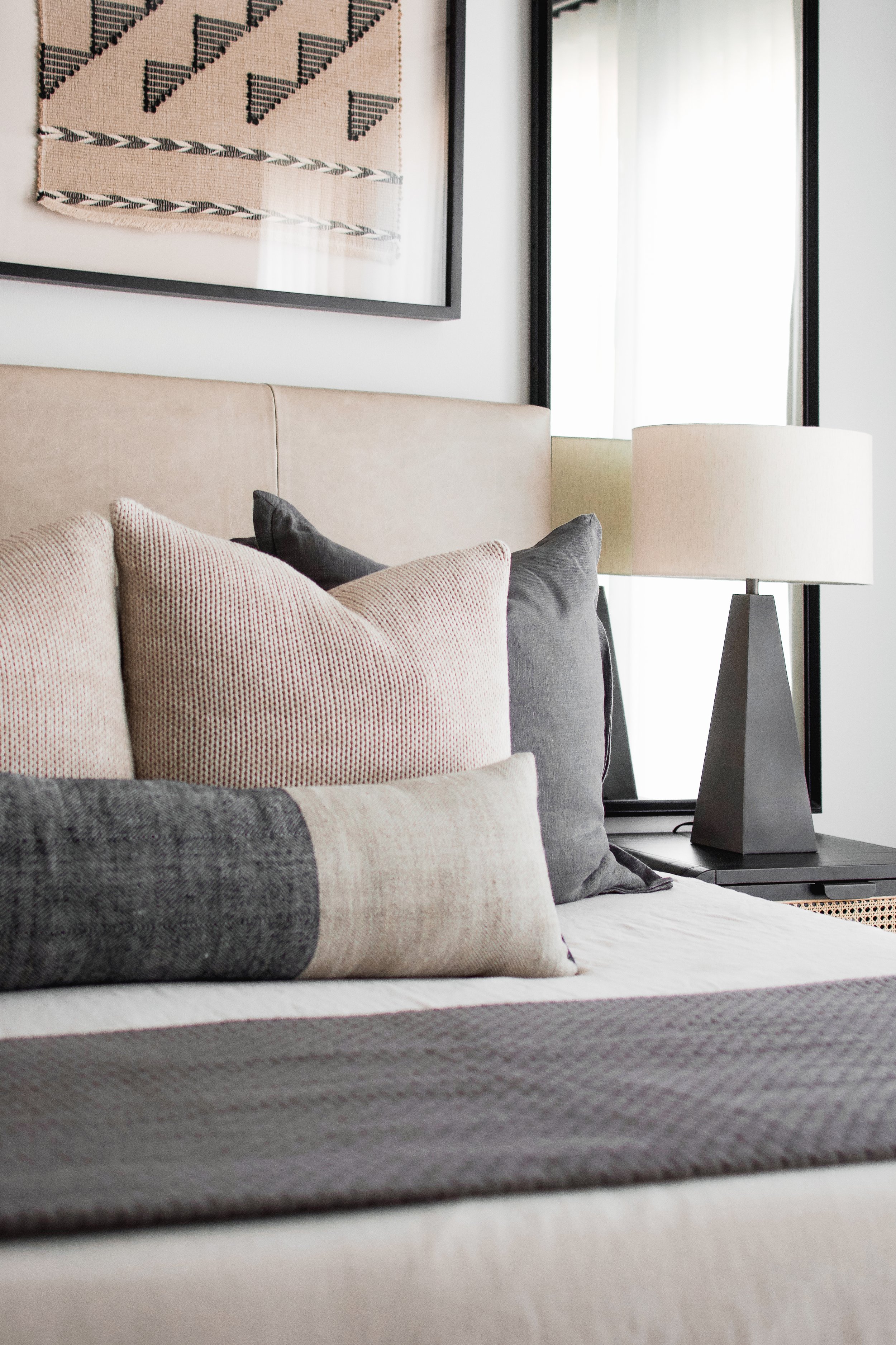
Above the nightstands, which introduce another pop of cane texture, we installed floor length mirrors to emphasize height in the space and bounce light around. Framed textile art was installed above the leather headboard as a nod to the southern feel throughout the home. Beside the bed we tucked a textured black console table and woven baskets to function as a catch-all zone and a space for displaying accessories in the bedroom.
The bone-colored bedding is balanced out with warm grey throw pillows that add depth to the spread, and a charcoal woven light fixture is hung above the space to draw your eyes up.
Rec Room
Heading upstairs to the third floor, DGI had the opportunity to design a masculine, moody recreation room and home office.
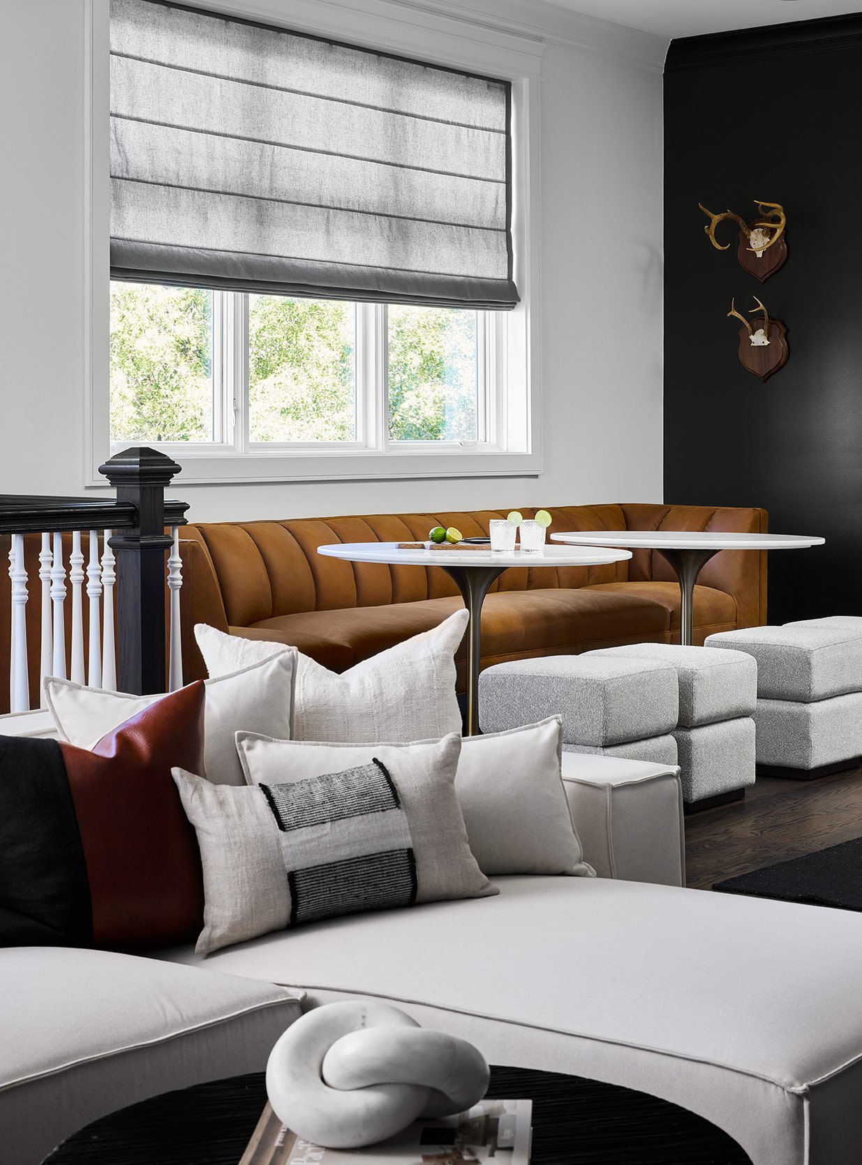
This level of the home was designed to feel like a man-cave and provide additional space for entertaining guests with both a lounge area and a rec area. Since it was meant to feel like a man-cave, we wrapped the walls in a moody paint and incorporated rich leather tones to give it a more masculine feel. In the lounge space, we installed a gallery wall of warm-toned, abstract art that wraps around the corner for an unexpected touch. Across from the lounge, we added a channel-back leather banquette with two high-top bar tables to create a space for entertaining guests.
Remember the before photo of this wet bar? DGI completely transformed it with fresh paint, decorative hardware, brass shelving, and an iridescent bronze feather-look tile that gives the bar a really unique and moody feel. The crisp black cabinetry gives the bar a modern and fresh look, and the backsplash tile helps add some vintage charm that we’ve added touches of throughout the rest of the home.
Home Office
Tucked away on the other side of the floor, we designed a moody home office with an epic Zoom background.
In the office, we covered the walls in the same dramatic color as the rec room to set an overall moody tone. Then we installed a wall of bookshelves, complete with a ladder, to create an epic focal point behind the desk. The bookshelves are made of a warm wood that adds plenty of rich texture to the space. We styled the shelves with a mixture of new and old accessories to add some personality to the space. In front of the desk, we selected two cognac leather accent chairs to add a masculine, South Western touch to the space.
The accessories on the bookshelves once again add some warm, earthy vibes to the space. We also incorporated some pops of brass throughout for added warmth. The curved language and swivel base of the accent chair, along with the mid-century bankers lamp, help add a vintage, nostalgic feel to the space.
Basement Lounge
In an effort to create a really cohesive design throughout the home, DGI also carried the moody wall paneling and dramatic paint all the way downstairs into the basement lounge.
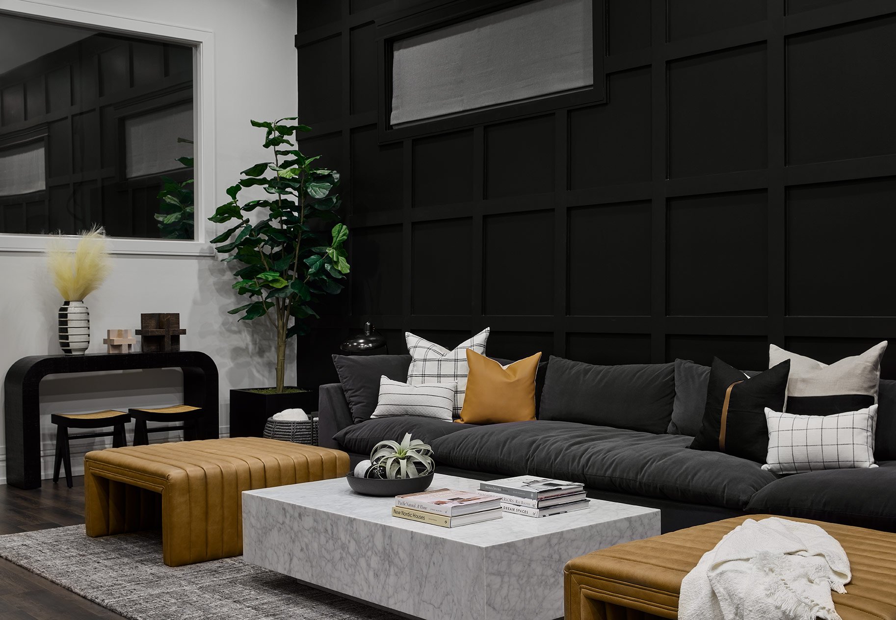
This space doesn’t feel anything like a basement thanks to the incredible ceiling height, and we took advantage of that with our design. Since we didn’t have to be concerned about the space feeling cramped, we decided to create a dramatic accent wall by carrying down the same wall paneling and paint color as the dining room and powder room. It ties all of the spaces together seamlessly while also creating a really moody feel. We designed this space to function as the ultimate lounge area for football Sundays and movie nights, so we selected an oversized and lounge-worthy sectional to frame the space.
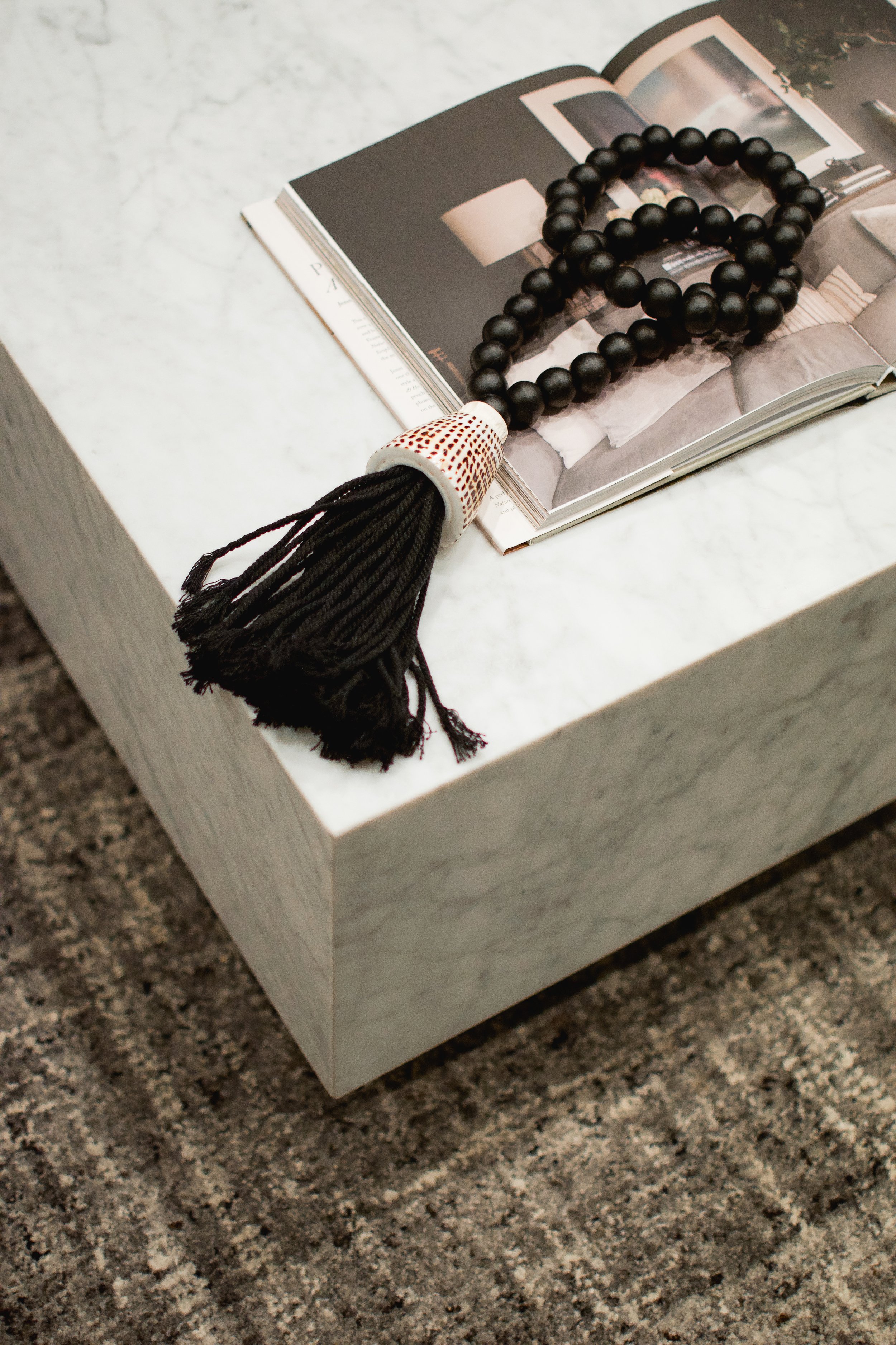
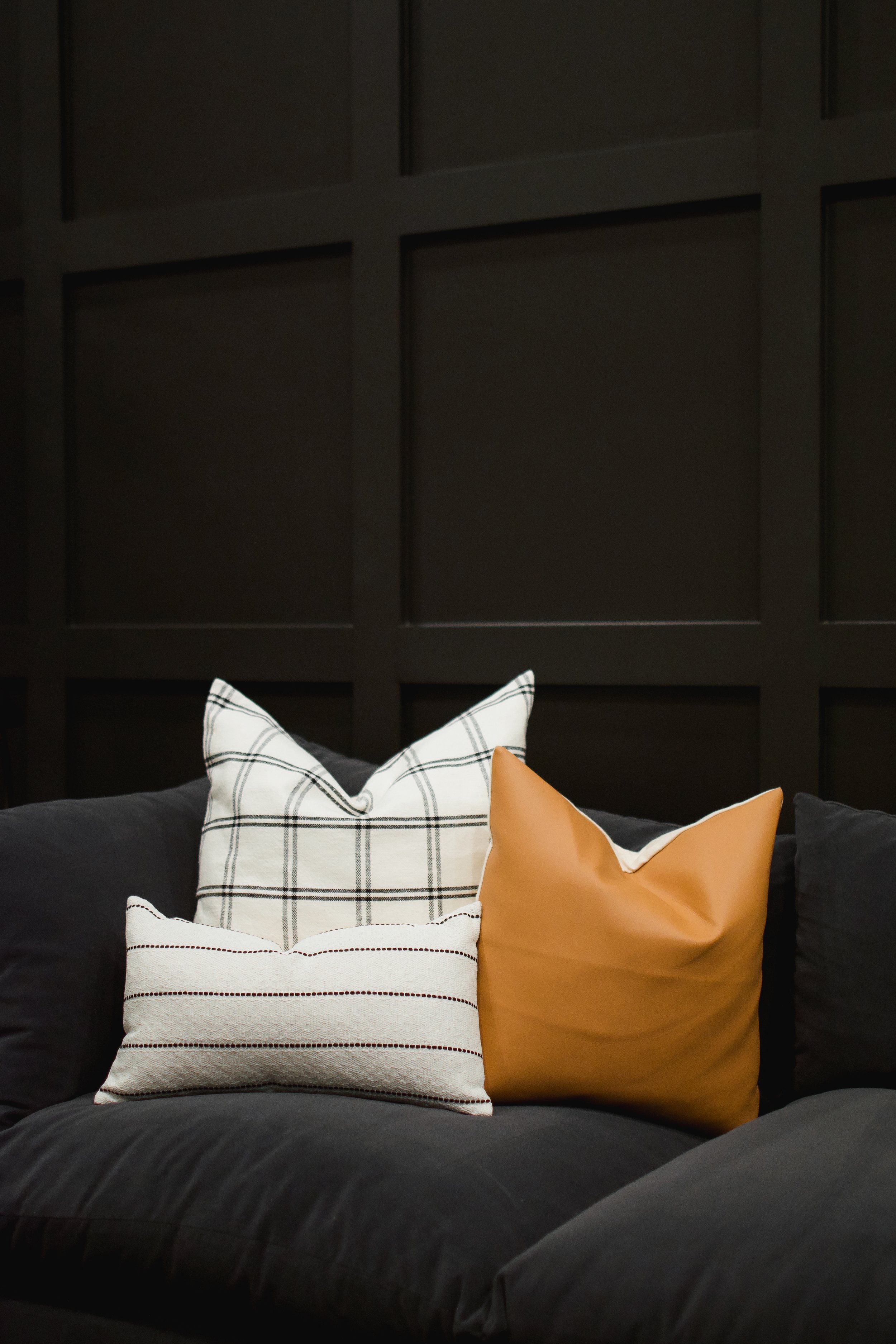
To balance out the masculine and moody vibes, we added some more feminine touches with a marble coffee table and curved console table. The accent pillows incorporate plaid and cognac leather that lean into the classic, southern touches seen throughout the rest of the home. And we carried a touch of cane texture into the basement lounge through two stools that are tucked under the console table.
Conclusion
That brings us to the end of this home tour, which always feels a bit bittersweet! This project was so fun to work on from the start, and we couldn’t be more proud of the design that our team executed. We brought the familiar touches of southern charm into a modern and moody design so that our clients can truly feel at home in their new city. If you made it all the way to the end, thank you so much for following along with us! It’s been so fun to reflect back on this design process with all of you. Until the next home tour…
-dgw
Photos: Dustin Halleck and Cassidy Allen

