DGI's Best: Kitchens
Welcome back to another blog roundup of DGI’s best! This time, we’re excited to turn our attention to our favorite kitchens to date. We all know the kitchen is the heart of the home, and these projects truly embody that. From a chevron-paneled fridge, to an overhead catwalk, to an adjacent homework station, these kitchens balance unique, statement-making elements with functionality and modern aesthetics.
west loop penthouse
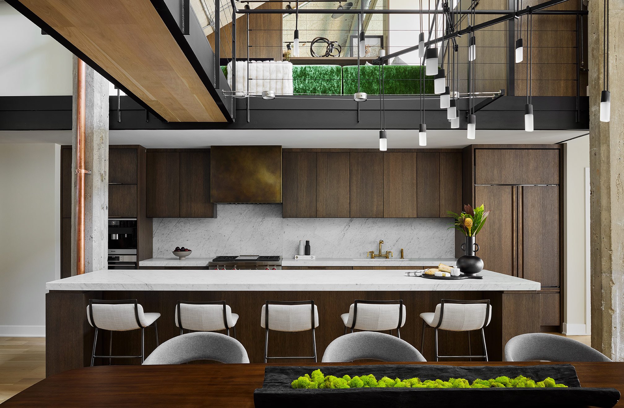
The kitchen in our West Loop Penthouse renovation will always stand out to us for a multitude of reasons. The catwalk above was a driving factor in the design of the kitchen - we created the floorplan and selected materials to truly celebrate the modern, industrial nature of it. The kitchen also features some of our most customized details to date including tailor-made finger pulls, a custom patinated hood, and wire-brushed white oak cabinetry. Another feature that makes this kitchen stand out is the use of Carrara marble countertops and living brass accents that will naturally age over time, giving this kitchen a truly timeless feel.
River North Condo
The kitchen in our River North condo renovation may be a few years old, but it’s clean and modern aesthetic is standing the test of time. This kitchen is a great example of how DGI strives to maximize functionality and space in a kitchen without sacrificing aesthetics. To maintain the clean lines and modern look that our clients desired, we opted to tuck the ovens on the inside of the island and conceal the rest of the appliances with custom cabinetry. Soft grey base cabinets, a stone slab backsplash, and matte black hardware give the kitchen a light and airy feel. The unique feature of this kitchen that makes it stand out to us years later is the adjacent homework station tucked on the other side of the kitchen’s peninsula. A dedicated space for the kid’s to complete their work was important to the young family, and DGI positioned it right off of the kitchen so that it can truly function as the heart of the home.
Michigan Cabin
The kitchen in our Michigan Cabin is special to us because we had the opportunity to be more playful and bold with our design. The intent for this project was to design a rustic “camp” style space while incorporating a modern edge. It’s not often that we get the opportunity to design a blacked out kitchen, but this was the perfect project for it! We balanced out the warm wood paneling along the walls and ceiling with edgy & monochromatic black kitchen cabinetry and hardware. At the island, we leaned into the “camp” aesthetic even more with a live edge waterfall countertop that creates a focal point in the kitchen. We opted to elevate it to bar height to help conceal any clutter on the other side of the island, which adds to the clean and modern aesthetic to the kitchen.
Lincoln Park renovation
The kitchen in our Lincoln Park renovation is one of the most spacious kitchens we’ve designed to date, especially for a city home (where the kitchens are typically smaller and confined). Given it’s size, we had the opportunity to go all out on unique, custom details including a breakfast table attached to the island and a built-in desk station. We also had the opportunity to balance different materials and finishes all in one space. We opted for a combination of white upper cabinets, white oak base cabinetry, and framed glass cabinets. At the island, we combined a live-edge wood table top with a sleek quartz countertop and waterfall edge. All of these details come together to create a light and airy kitchen with a modern look that will function as the heart of the home.
Wisconsin Lakehouse
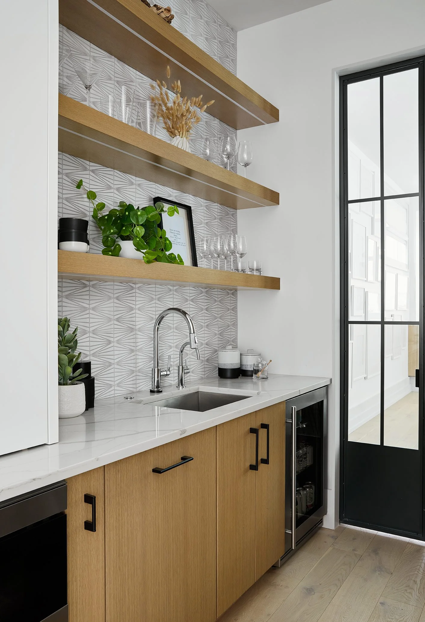
In this Wisconsin Lakehouse renovation, we completely transformed the space by creating an open floor plan and a large kitchen that is perfect for entertaining weekend guests. This floor plan change gave us the opportunity to design one of DGI’s largest islands to date, which is why this kitchen always stands out to us. We chose to really highlight the island by painting it a dark, rich grey and wrapping it in an epic quartz countertop with a waterfall edge. When entertaining, guests always seem to gravitate to the kitchen island and there will be no shortage of standing room around this one. To take entertaining to the next level, we designed a built-in bar with a prep sink along the side of the kitchen. With open shelves in the same wood finish as the upper cabinets and a matching herringbone marble backsplash, it feels like an extension of the kitchen.
Hinsdale Renovation
The kitchen in our Hinsdale renovation is modern, open, and airy, but it stands out to us because of the unique, chevron refrigerator panels that we designed along the side wall. We opted for two-tone cabinetry in this kitchen for a balanced feel, but we knew the space needed a strong focal point. So we opted to wrap the refrigerator in chevron panels that add warmth and texture in an interesting way. Because why hide appliances when they can become a beautiful focal point? Beside the refrigerator, we installed a door disguised as cabinetry that opens to reveal a hidden pantry. This helps to maintain the clean and minimal look that our clients loved. In the rest of the kitchen, we opted for sleek, minimal materials like quartz countertops and a stainless steel hood to allow the refrigerator to truly stand out.
This series is so fun because we get to reflect back on our designs, and it reminds us of the amazing work our team can accomplish. These kitchens prove that neutral does not equal boring and the possibilities for unique designs are endless in custom kitchens. We can’t wait to share all of our kitchen designs that are currently in the works AND all the unique customizations that our team will design in the future. As always, thanks for following along!
-dgw


