Everything you Want to Know About Wallpaper
INTRODUCTION
Wallpaper is here to stay, my friends. Some may call it a trend, but I call it a design staple. At DGI, we incorporate wallpaper in some portion of just about every project. Our favorite rooms to paper are powder rooms, bedrooms and dining rooms, but we certainly don’t stop there. We’ve papered family rooms, bathrooms, and even ceilings. Today, I’m answering all of your questions related to wallpaper, and hopefully inspiring you to take the leap and install some in your own home!
THERE ARE NO RULES, ONLY TIPS
In my opinion, when it comes to wallpaper, there are no rules. Wallpaper is incredibly versatile. It can become the art and focal point of a space, or it can be a textural backdrop setting the scene for the rest of the room. Just like choosing art for your home, you need to gravitate to something that excites you, because one way or another, it’s going to make a statement in your space. For the purpose of this post, I’m going to refer to it as “wallcovering” from here forward, because there are so many different materials that it can be (not just paper!). Here are some of my favorite tips to keep in mind when choosing a wallcovering:
Vinyl vs: Paper/Textile:
The first thing you need to think about before looking for a wallcovering, is what kind of abuse is it going to take? If you’re designing a space that is high traffic (think hallway or family room), you may want to consider going with a vinyl or commercial-grade paper. This doesn’t have to limit you…a lot of options actually come in both vinyl and paper/textile, so you will still have plenty of choices. Going with a vinyl just gives you an extra layer of protection and will keep your wallcovering looking fresh for months and years to come. If your space is a little safer (bedrooms, powder rooms, or ceilings), you can get away with a more standard paper or textile wallcovering.
Pattern vs: Texture
While this question is more subjective, I’m happy to give a little guidance on this topic. Generally, we choose textures (for example, grasscloth, cork, or textiles) when the wallcovering is going to have art or sculptural lighting in front of it, and we don’t want it to compete with those elements. We also choose textures most of the time in bedrooms in an effort to keep things soft and calm. Patterns, on the other hand, are great for accent walls, ceilings, or small spaces (yes, I know that seems backwards). In general, if you’re using a pattern, you don’t want to muddy it up with artwork or other dramatic elements, you want to let it be the focal point. Choose a space that doesn’t have a lot going on already and use the pattern to inject some style and personality to the design.
Light vs: Dark
This is another category that is pretty subjective, but in general, there are some tips to keep in mind. When you think about a space, think of it in layers. For example, in a bedroom, you have the wall behind the bed as a backdrop, and then the bed, nightstands and bedside lights layering in front of it, with bedding on top of the bed, and additional pieces in front of those. The wallcovering, in all cases, always comes first as the base layer. Use it to set the stage for the layers in front of it. If you want to introduce some contrast into your space and you have darker furnishings, go lighter with the wallcovering and vice versa if you have lighter furnishings. If you want a moody look, with less contrast and more texture, go dark and layer some darker wood tones in front. If you want to wallcovering to add depth to a space without calling too much attention to itself, go lighter and tie into the other colors in the space.
Accent Wall vs: Entire Room
There are certain rooms that typically just want all of the walls covered, including dining rooms and powder rooms. Otherwise, accent walls can be a great way to create a focal point in a room or introduce a wallcovering without overwhelming the space (or yourself). Some great spaces for accent walls are behind a bed, a media wall in a family room, a hallway (if you’re feeling extra bold, try the ceiling!), or incorporated into built-ins.
Removable vs: Permanent
Removable wallpaper is such a blessing. Those of you who rent your homes, if you want to mitigate the white walls and make the space feel more personalized, install an accent wall of removable paper! They peel off completely clean and also hold up well while you want them. For home owners who want to lean into some wallpaper but aren’t sure you want to keep it forever, this is another great option. The only time I would push to go permanent is if the design of the room really depends on it, or if you’re doing a room that gets humid (like a bathroom).
How to choose the right rooms?
Really any room is a good candidate for wallcoverings, but here are some tips on where to start. Identify key focal points in your home and think about using a wallcovering to add some drama. For example, in your front entryway, a long hallway, or a large wall in a family/living room. Anytime you have a room with intricate molding (wainscoting or even framed panels), it looks beautiful if you celebrate that and balance it out with a wallcovering. Use the framed panels as a border and let the wallpaper become a piece of art! Or wallpaper above the wainscoting and really make the room feel finished. In bedrooms, we love to bring in soft, textural wallcoverings to add interest and depth to the space without adding too much visual clutter…those rooms want to be calming. As a general rule of thumb as well, powder rooms are always BEGGING to be papered. More on that in the next bullet. Lastly, if there are any unique architectural niches, add a little surprise with a fun pattern!
Powder Rooms - where to begin?
Just do it. Wallpaper the powder room. Don’t ask questions, this is the one room in the home where there are literally no rules…just find something that makes you really happy and just do it. Dark, light, patterned, textured…we’ve done them all and have fallen in love with each and every one.
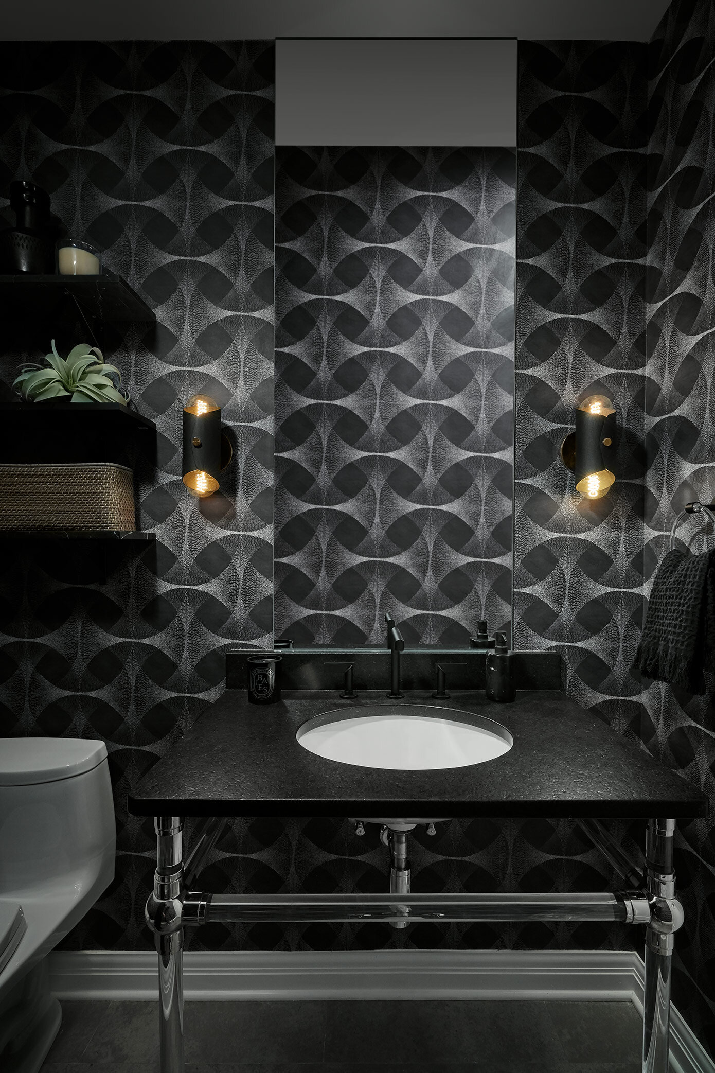
In this powder room, we went bold! We pulled in a dark, patterned paper with incredible depth to it. To really celebrate it, we did a custom floating, frameless mirror running from the vanity to the ceiling, so that there were no interruptions, only the paper continuing to wrap around the room.
This powder room had a beautiful existing vanity that we wanted to make pop, so we went for a black tone on tone wallcovering that introduces the most subtle pattern when the light hits it.
In this family, we designed a custom built-in along the back wall to house the family’s antique cash register. To complete the vignette, we framed the sides and installed a custom hand-painted wallcovering that mimics a plaster wall to give a nod to the antique nature of the piece and add rich texture to the room.
In this dining room, we installed a warm gray grasscloth above the wainscoting to give a classic, clean look and let the light fixtures and artwork be the focal point of the room.
This powder room was made extra dramatic with a graphic, marble veined wallpaper with pops of blue and metallic touches to give an edgy, unexpected twist.
In this bathroom, we did an all black, monochromatic shower, and pulled in this black and white marbled wallpaper to add some contrast. This bathroom is one of our favorites, but certainly not for the faint of heart! :)
We knew we wanted to add paper to this long hallway, but we also wanted to incorporate a gallery wall, and didn’t want to compete with the frames. By wallpapering the ceiling instead, we added some personality and texture to the space while still letting the gallery wall feel balanced.
There’s nothing we love more than a rich texture behind a bed,
We rarely bring patterns into bedrooms, but make an exception for kids rooms or, as in this case, for soft, dreamy mural walls.
This West Loop condo had concrete accents on the ceiling and columns, but we wanted to elaborate on that and carry more concrete texture behind the custom media wall. These handpainted concrete panels add a fun twist to the standard concrete wall and make the home feel more cohesive and finished.
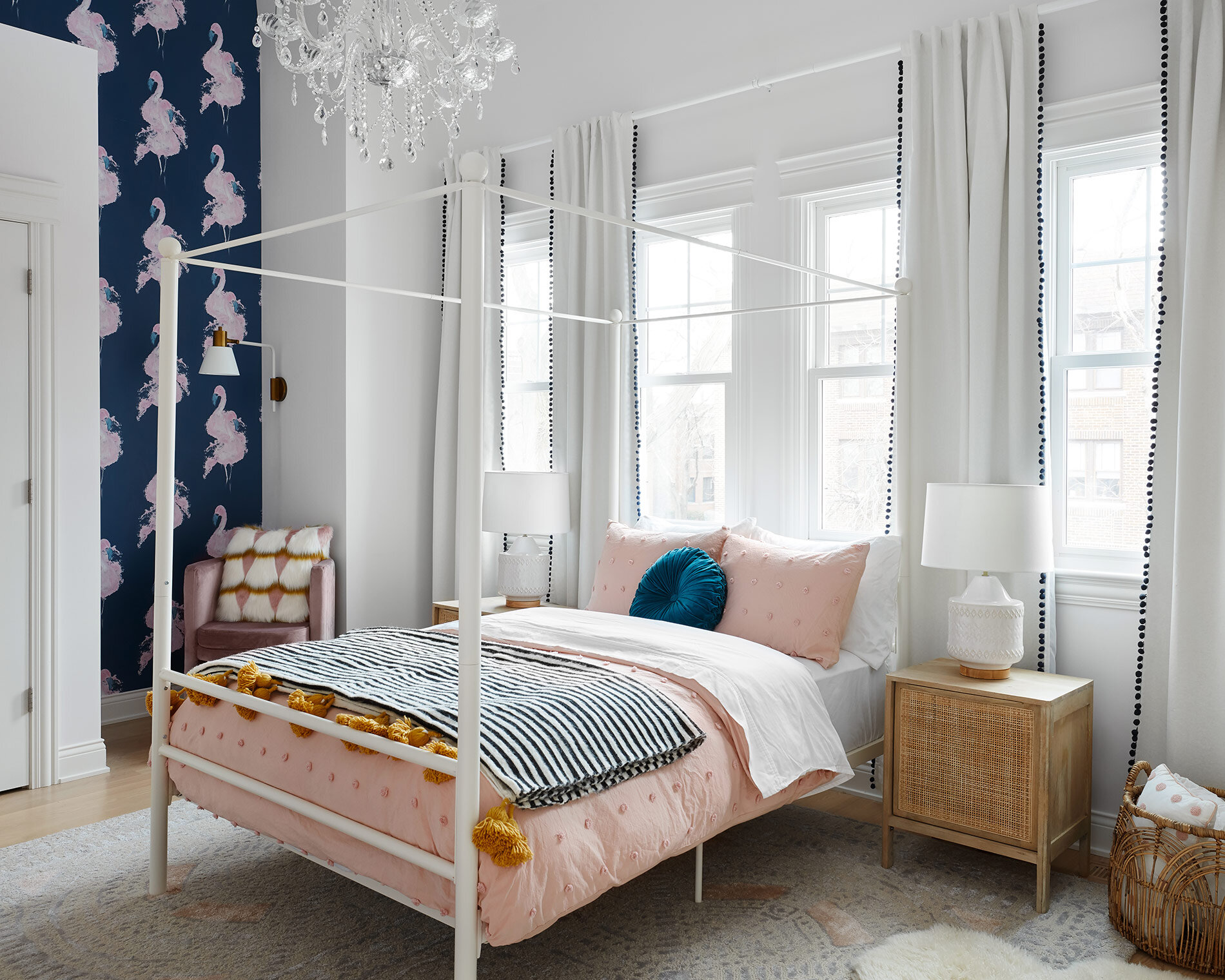
This little girl’s room had a carved out niche beside her closet that was perfect for a little reading chair and a fun, playful wallpaper.
Ultra-luxe ultra-suede made this bedroom incredibly decadent and soothing.
In this dining room, we wanted to chandelier and artwork to be the focal point, but felt that painting the wall would feel flat. A subtle textile wallcovering adds a touch of texture and depth to the space, creating the perfect backdrop for the black and white art and chandelier to pop against.
This guest bath was more commonly used as a powder room than a main bathroom, so we were able to do something slightly more delicate in here. This gilded cork wallpaper brings in a soft, inviting texture and creates the perfect backdrop for the starburst mirror to really shine.
I hope you guys found this informative! Go forth and wallpaper, and be sure to send us photos of your transformed space!
-dgw


