Home Tour - Bohos in Paradise
Introduction
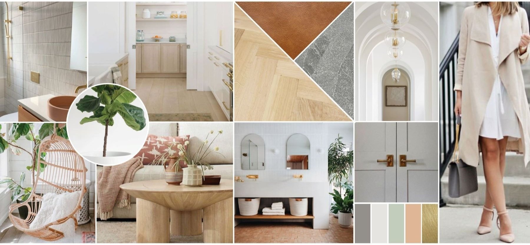
Vacation homes are always fun to work on because it gives us the opportunity to be a bit more playful and creative with the design. The clients on this project wanted their Michigan property to feel like an extension of their modern home in Chicago, with an earthy and boho touch that felt fitting for a lakehouse. With only hardwood flooring and plumbing locations roughed on the existing property, DGI was essentially handed a blank slate to design from start to finish. Our team designed the floor plans and construction finishes, as well as all of the furnishings and decor throughout the home with a modern and boho palette inspired by the moodboard below. We’re so excited to share the final results with all of you in this home tour!
The Process
When DGI was brought onto the project, the house was a blank slate with only plumbing roughs, a fireplace located, and herringbone hardwood floors installed throughout.
We present 3D renderings of our designs for every project that we work on because it allows our clients to completely visualize the space before any construction begins.
The REVEAL
We’re so proud of the result of this home. It has a completely unique feel with a modern boho look that is perfect for a Michigan lakehouse. Now let’s jump into the tour!
Foyer
The main floor of the home featured incredibly tall ceilings that we wanted to highlight throughout the design. So at the entry of the home, we designed a clean and modern gallery wall that creates a strong focal point and immediately draws your eyes up to celebrate the ceiling height. We selected decor with pops of rusty orange and sage green to introduce accent colors that would be carried throughout the rest of the home.
Kitchen
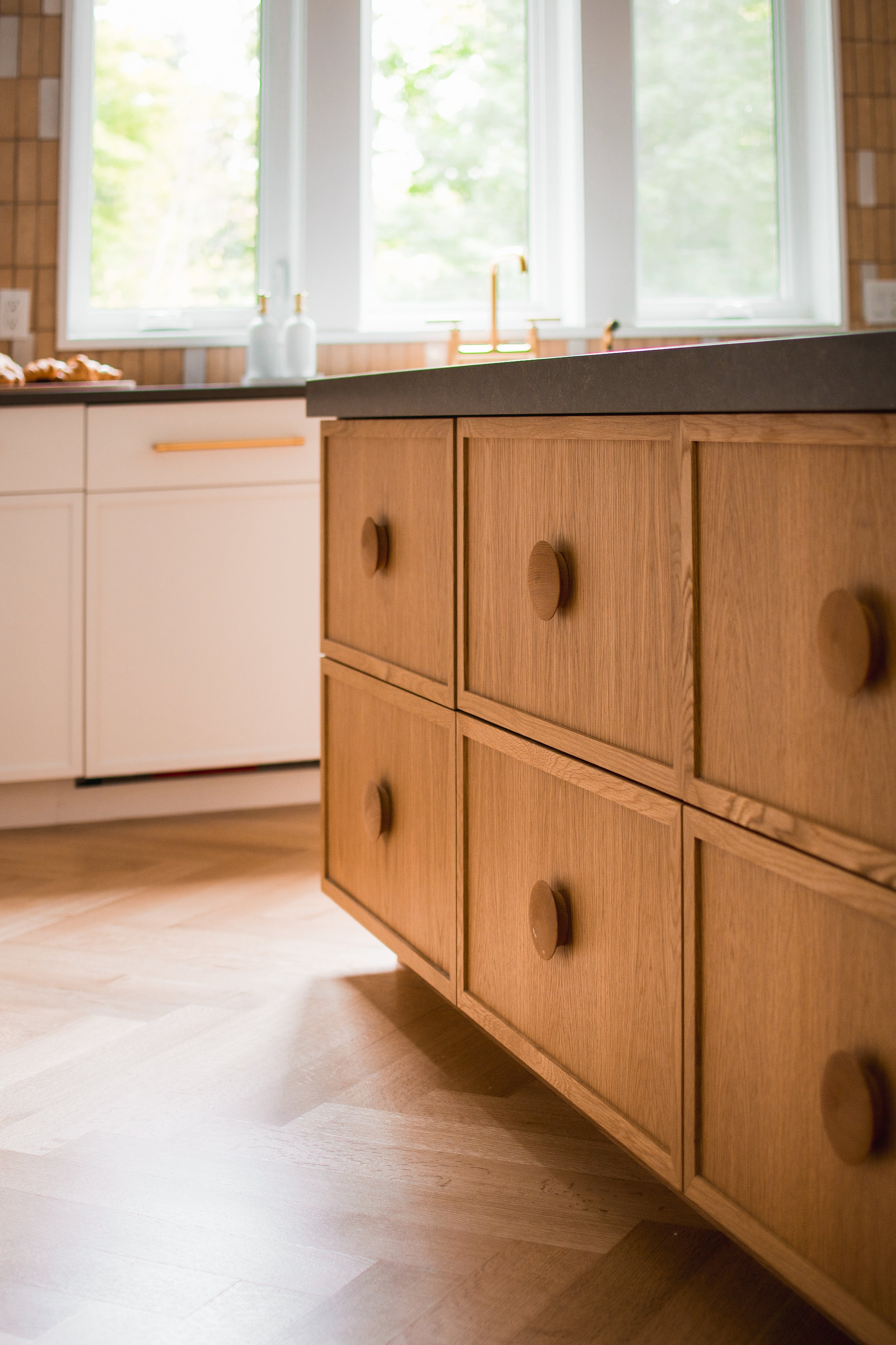
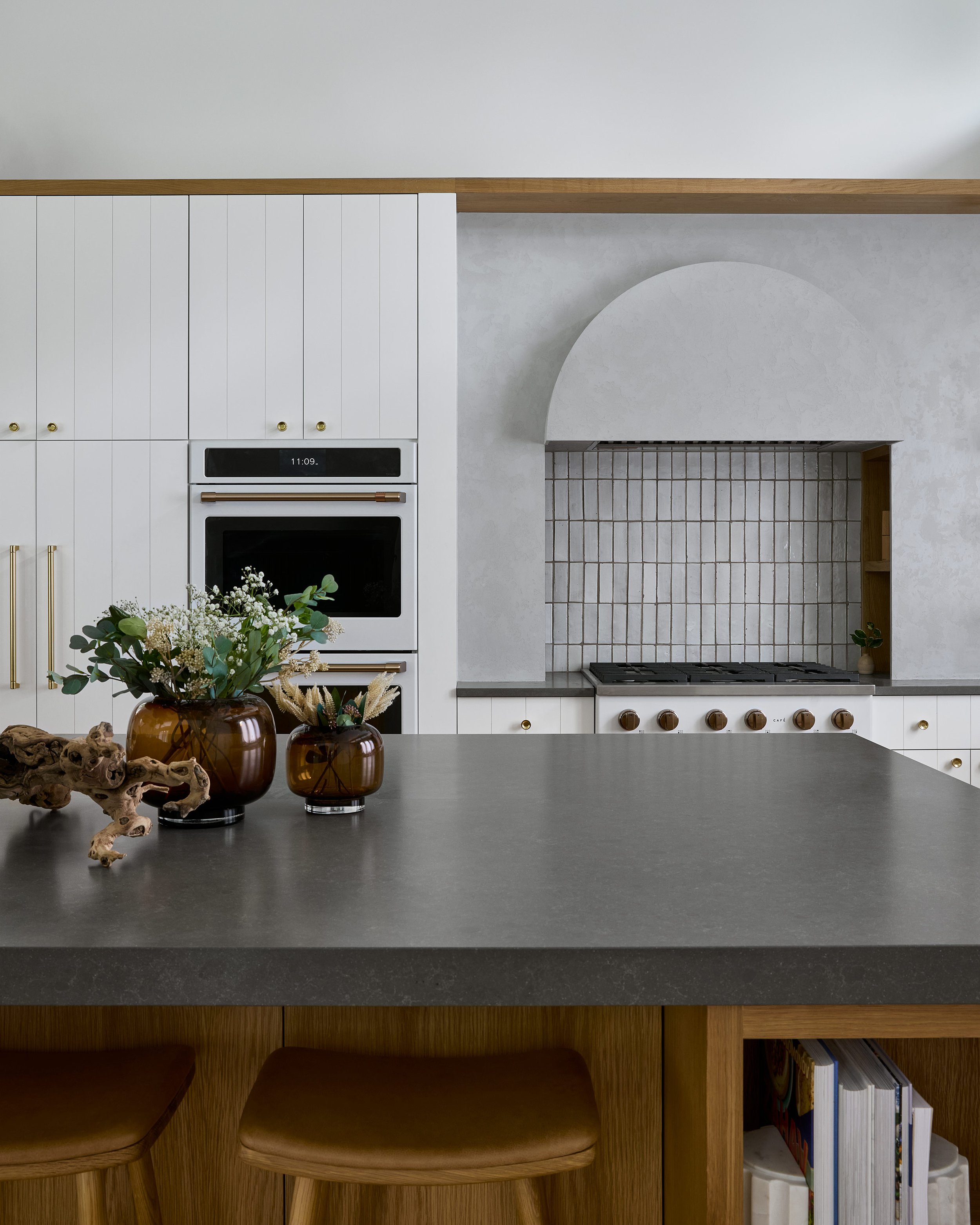
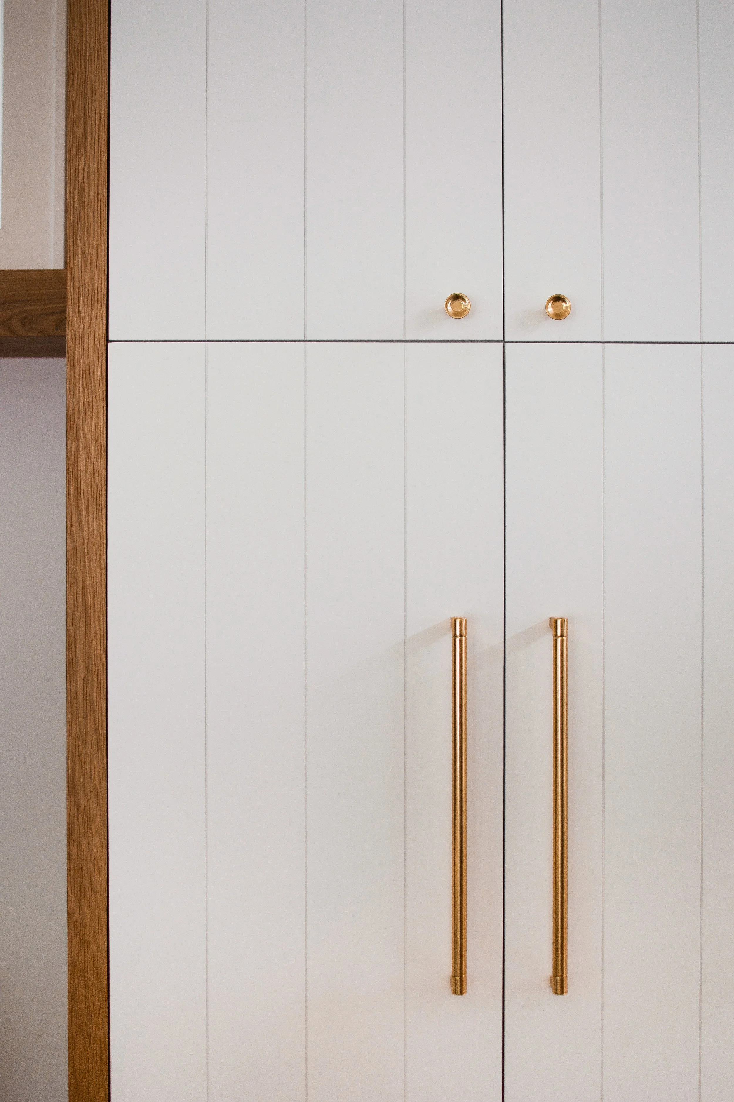
The kitchen design was all about incorporating depth through natural textures, seen in the wood cabinetry, plaster hood, and hand-made Moroccan zellige backsplash tile. Rather than carrying the cabinetry up to the 14-foot ceiling, we opted to create a unique, plant ledge to incorporate some pops of greenery. We used some creative storage solutions in the kitchen that would give it a clean and modern look that our clients loved including appliance garages, a pantry with pull-out shelving, and extra deep island drawers with adjustable pegs to store pots and pans. The plant ledge above the cabinetry once again draws your eyes up to celebrate the ceiling heights, but it also draws your eyes all the way around the open concept space, acting as a ribbon that ties the kitchen, dining, and living room together seamlessly.
Dining Room
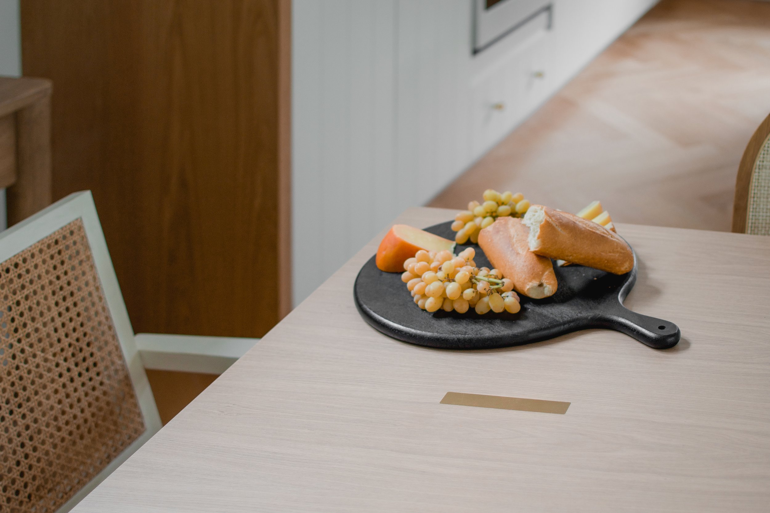
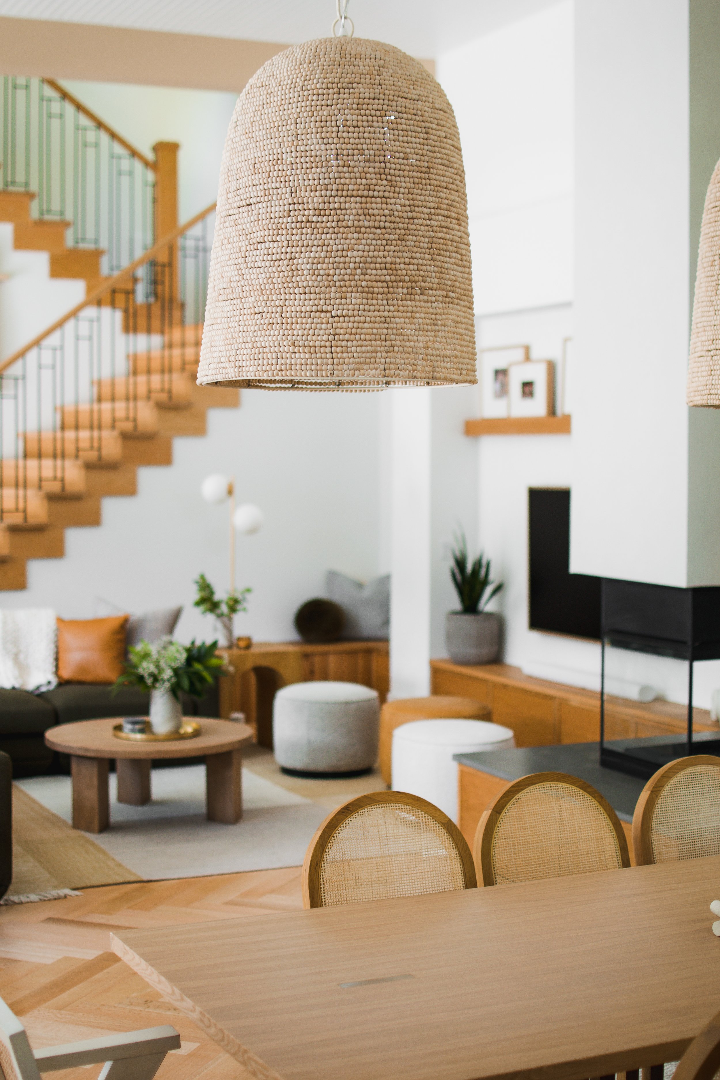
In the dining room, we installed oversized beaded light fixtures to create a focal point and give the space a beachy, boho feel. We selected a light wood dining table with brass inlays and dining chairs that incorporate the same arches and natural cane textures seen in the pendants and other details throughout the home. We also coated the double-sided fireplace in the same plaster finish as the kitchen range hood to tie the spaces together with a cohesive feel.
Living Room
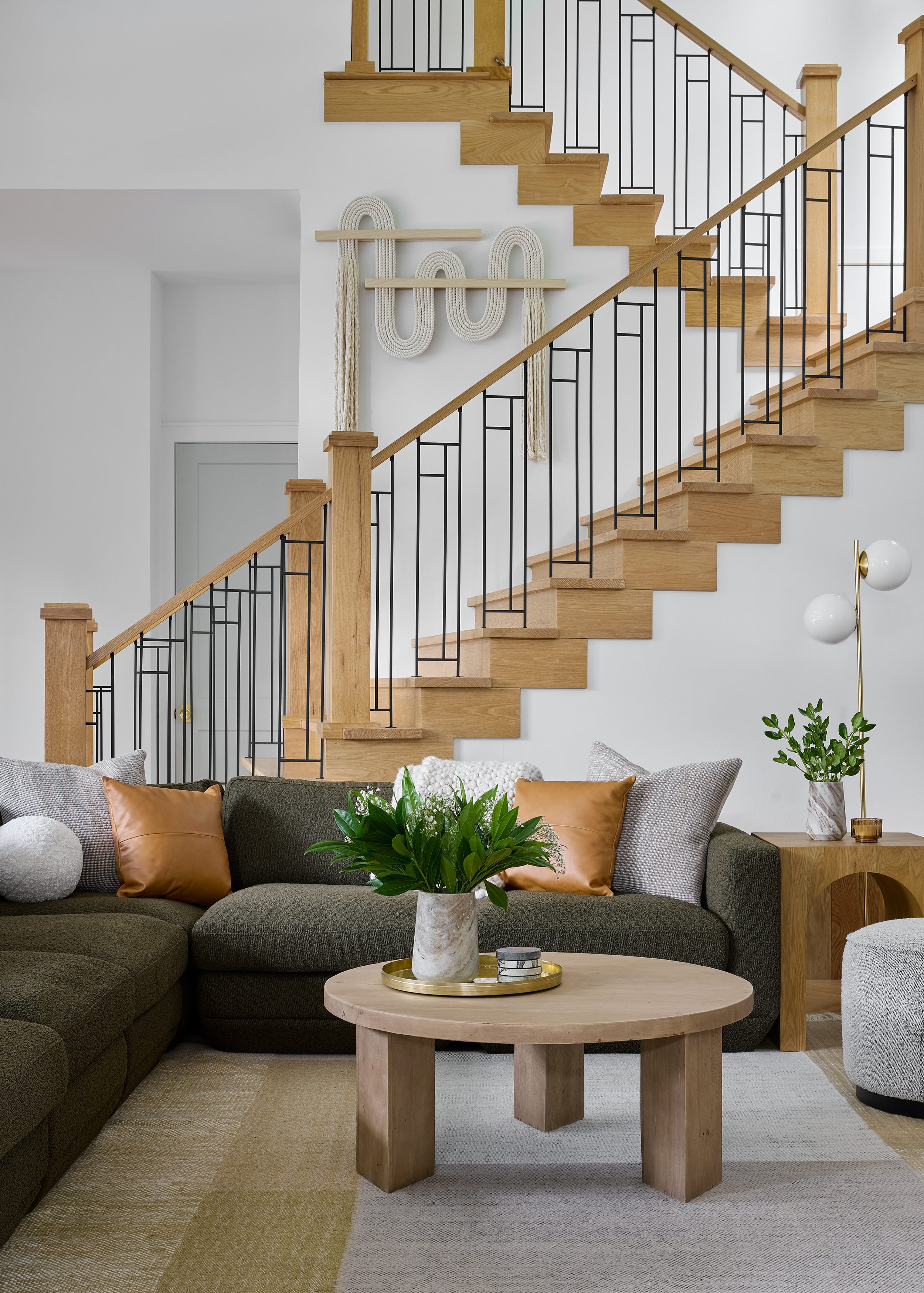
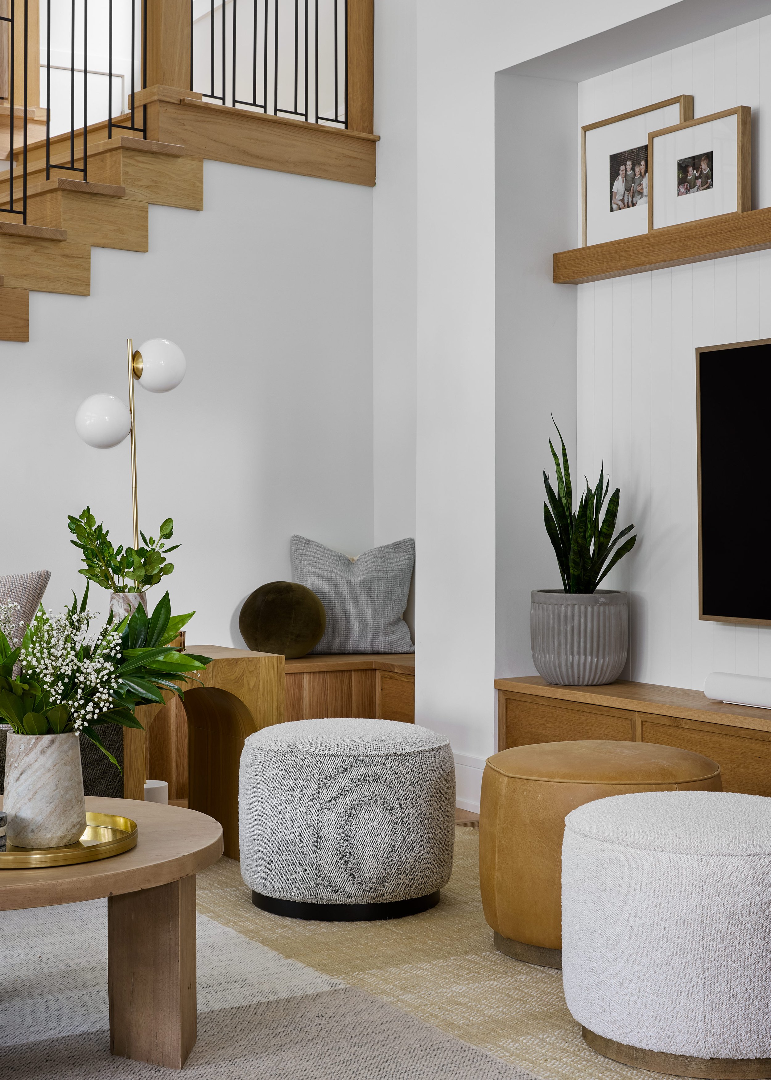
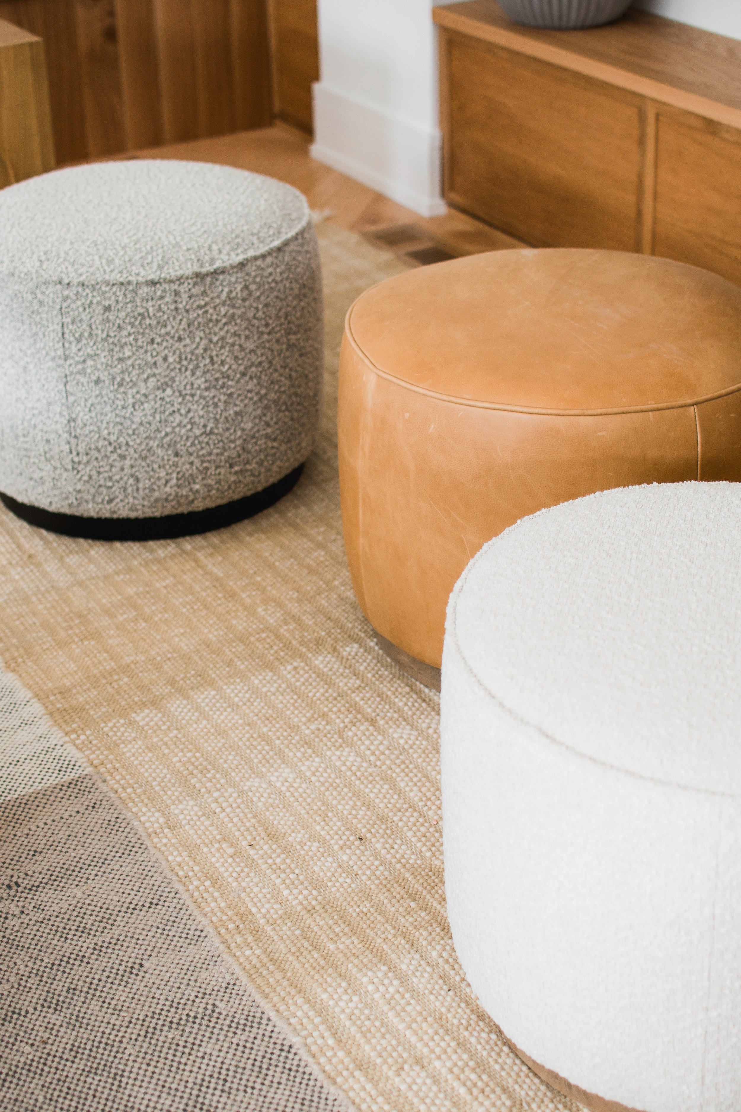
On the other side of the dining room, we designed a living room for the family to relax and lounge in. The focal point of the living room is a dark green bouclé sectional that frames the space perfectly and introduces a playful pop of color to the space. One of our favorite features of the living room is actually the staircase leading up to the second floor because it was built out of the wood from trees on the property. We wanted to give the space an inviting and casual feel, so we incorporated flexible seating with three matching ottomans in mismatched textures and colors. Finally, we carried over the same vertical paneling from the kitchen cabinetry to the media wall to tie the whole main floor together.
Adult Lounge
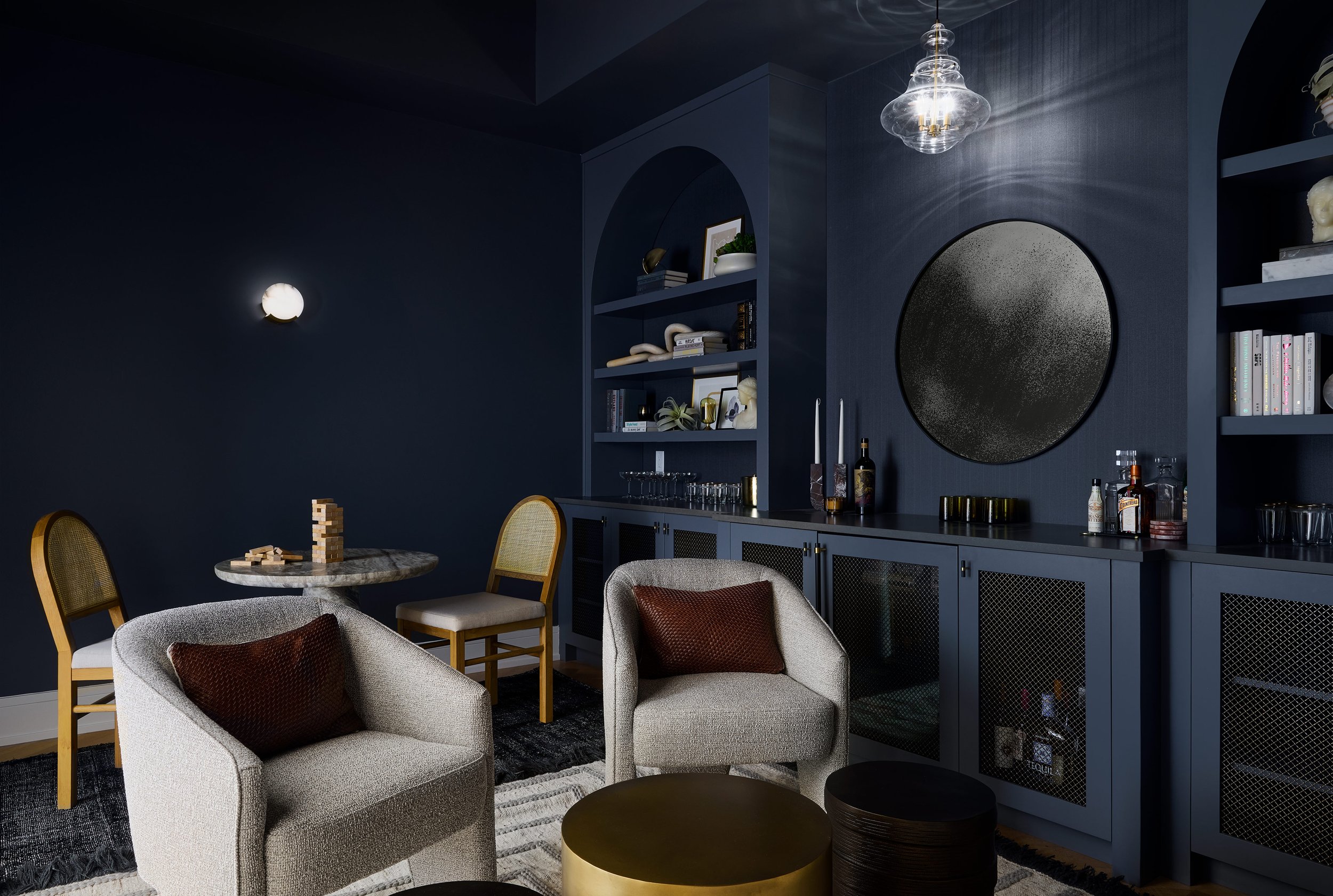
The lakehouse would be a space for entertaining all summer long, so it was important to our clients that we incorporate designated areas for both the adults and the children to enjoy the home. This space was originally open to the primary bedroom and was a bit awkward and empty, but we had a vision to close off the walls and create a moody adult lounge with a built-in bar that would be perfect for entertaining guests. We framed the space in an arch opening to carry in the curved language from the rest of the home, and tied arch detailing into the custom built-ins as well. Then we swept the entire room in a dark navy blue paint for a monochromatic look. The adult lounge feels like an extension of the rest of the home, carrying in the same natural textures and patterns, but with a darker and moodier twist.
Primary Bedroom
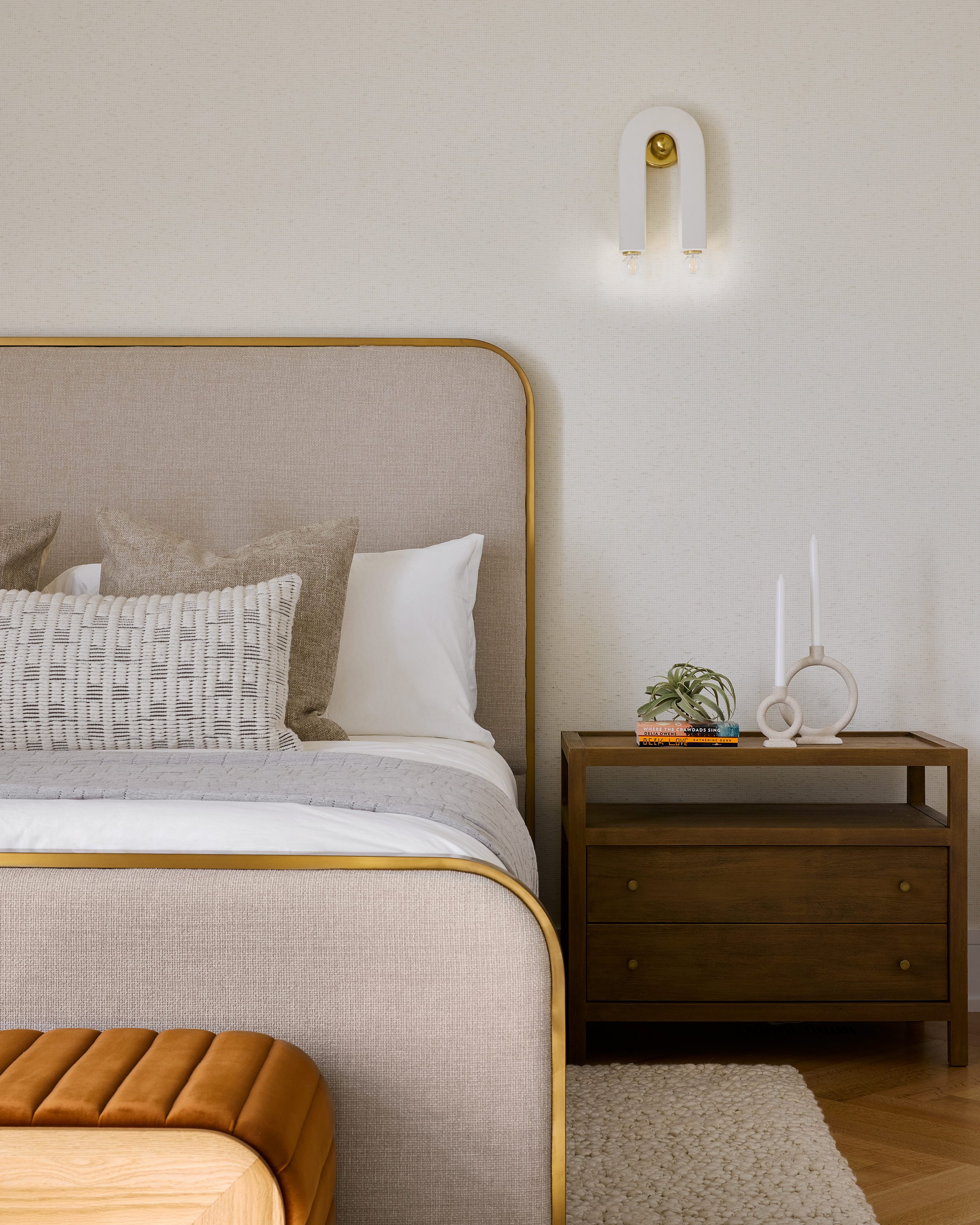
The primary bedroom was intended to feel like a serene escape for the owners, so we opted to keep the walls light and bright in this space. We added a subtly textured wallpaper along the back wall, and brought in some warmth with a gold wallpaper on the recessed ceiling that helps to draw the eyes up and around the space. Never forget about the fifth wall! We selected an upholstered headboard with delicate brass framing and curved edges to create a soft and inviting focal point in the space. Then we layered in lots of playful textures through accent pillows, area rugs, and other furniture to complete the simple and serene design.
Primary Bathroom
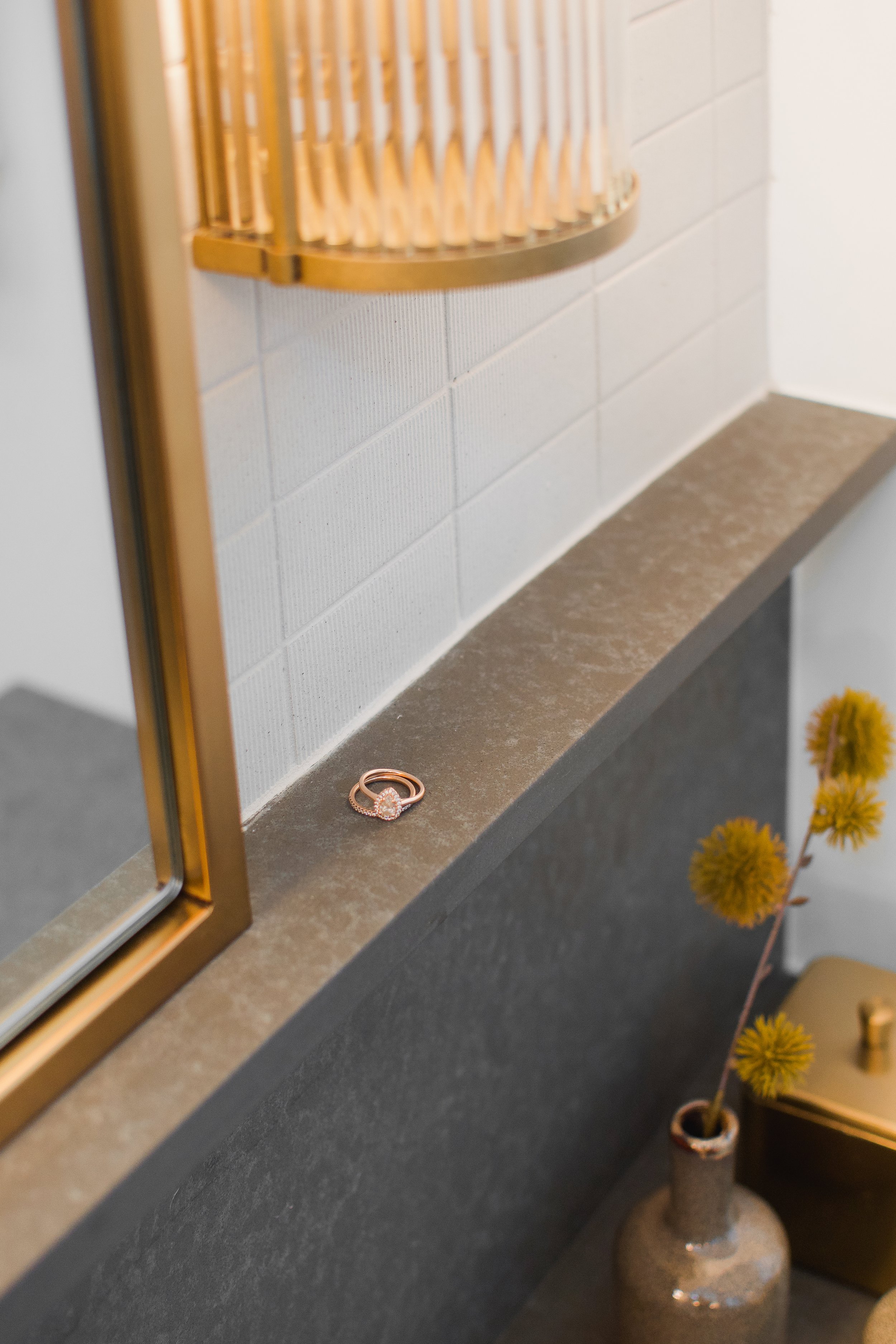
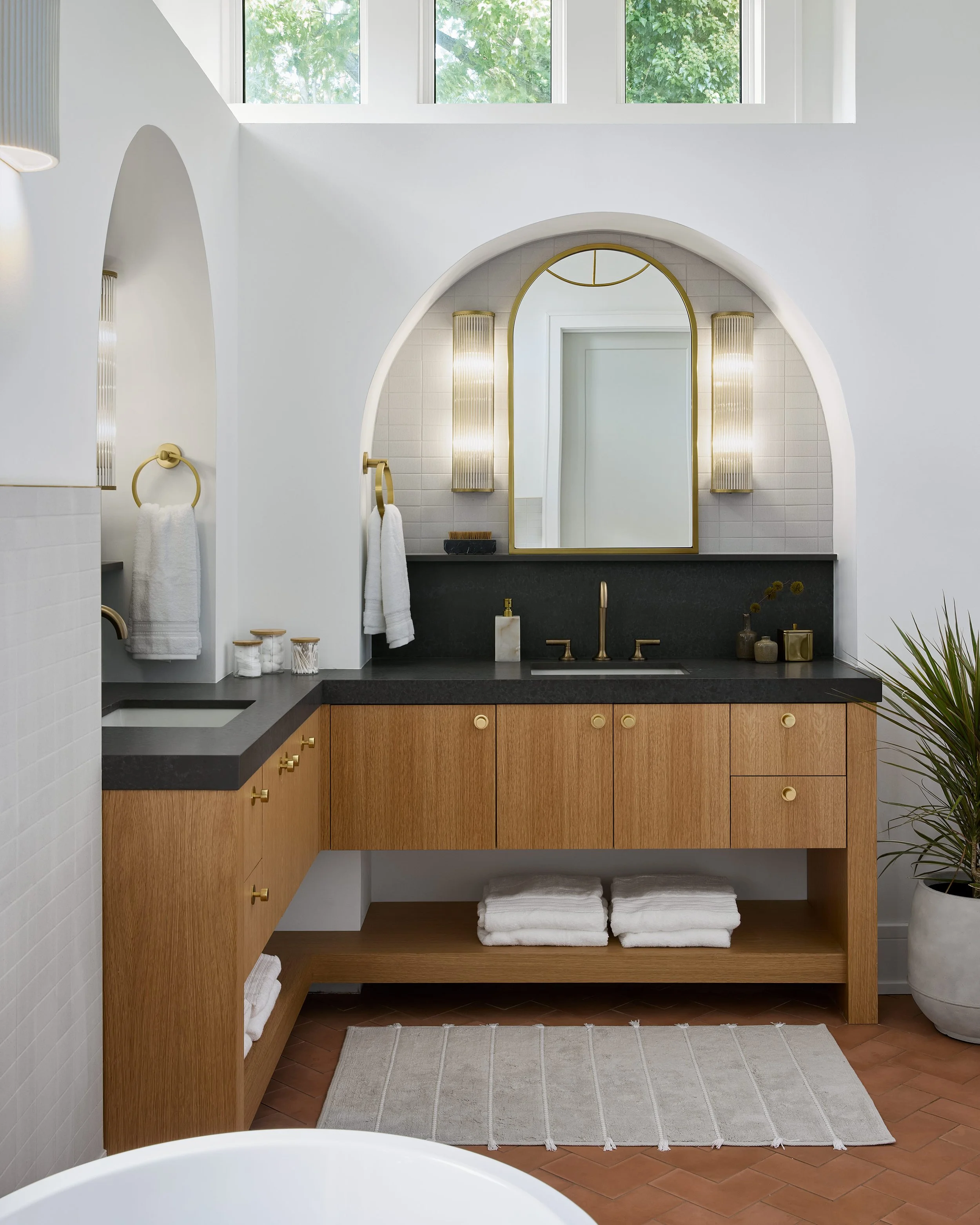
The primary bathroom features a completely unique design that we absolutely fell in love with when it came to life. Because plumbing roughs were already located when we were brought onto the project, we were married to a corner vanity unit. But it gave us the opportunity to get creative with the design, and we opted to frame both sides of the vanity out in arches. This creates such a unique look in the space that we wanted to highlight with delicate tiles and fluted sconces. We decided to carry the countertop stone up onto the wall to create a backsplash and a ledge for jewelry and other small items for added functionality. We installed herringbone terracotta tile on the floor to mimic the herringbone hardwood flooring throughout the rest of the home. Finally in the shower, we designed a bench and shampoo ledge using the same stone from the vanity countertops. Then, we installed simple white subway tiles that change dimension halfway up the wall to create a unique and textured look.
Kid’s Lounge
Upstairs, we wanted to create a really special lounge and recreation space for the kids to enjoy. So we designed a rock climbing wall that leads into a hideaway nook above the stairs for the kids to climb into and curl up with a book. Outside of the nook, we selected a cozy sectional and large leather ottoman to create a space for lounging and watching TV. We selected furniture with durable and high quality materials that would stand the test of time in this recreation space.
Guest Bedroom
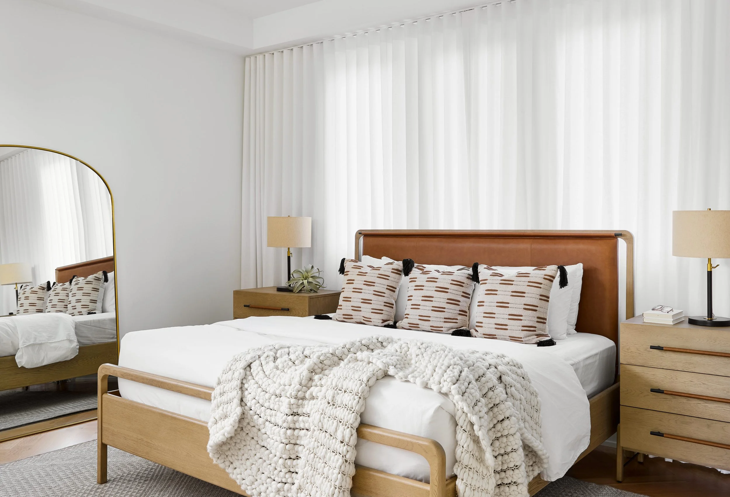
On the other side of the kid’s lounge, we designed a guest bedroom with an open, airy, and inviting feel. To create a soft backdrop for the bed and nightstands, we opted to install custom wall to wall ripplefold drapery in a gauzy white fabric that adds a subtle texture and lots of functionality to the space. In front of the drapery, we placed a queen bed with a leather headboard and white oak nightstands to add plenty of warmth to the space.
Guest Bathroom
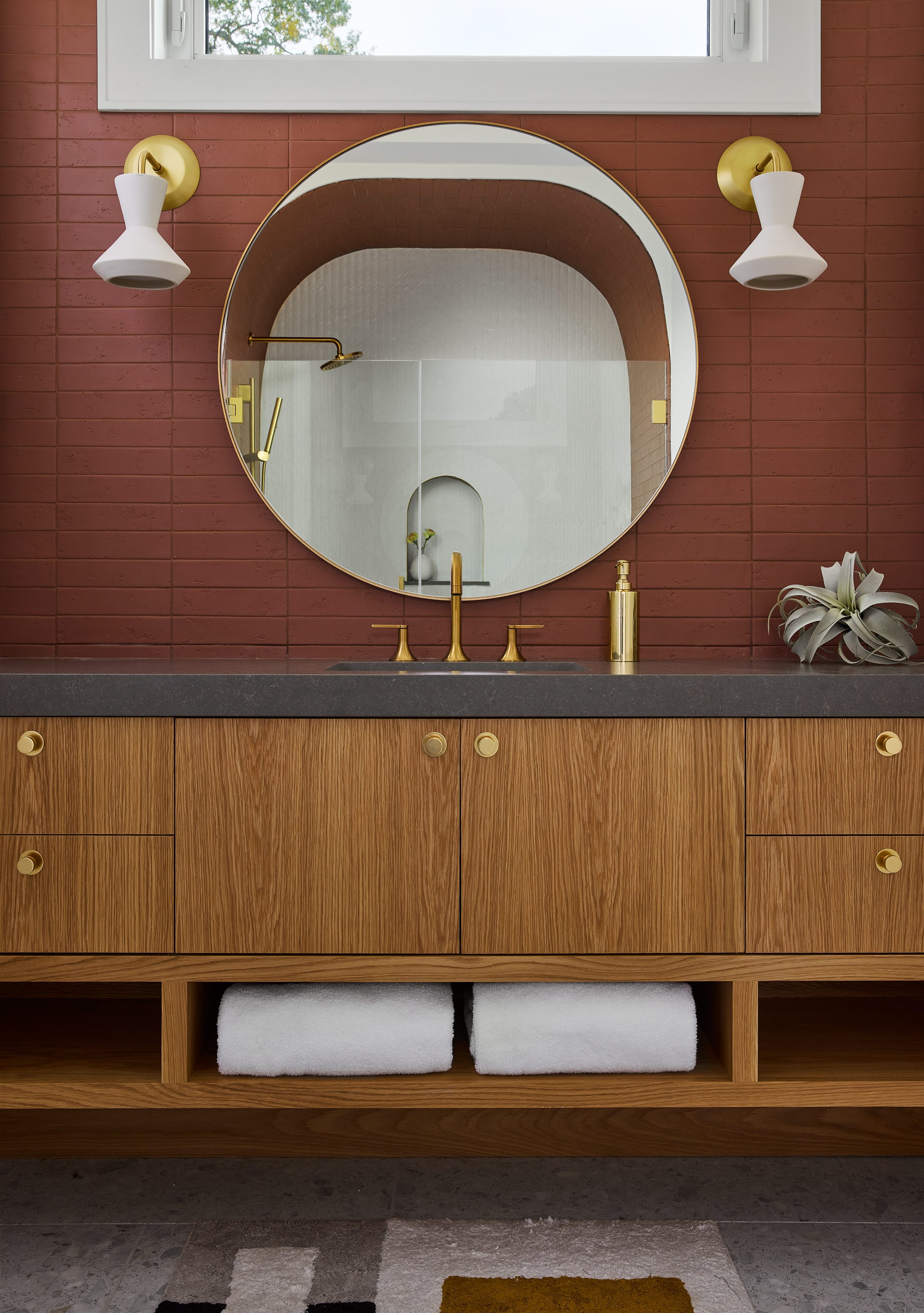
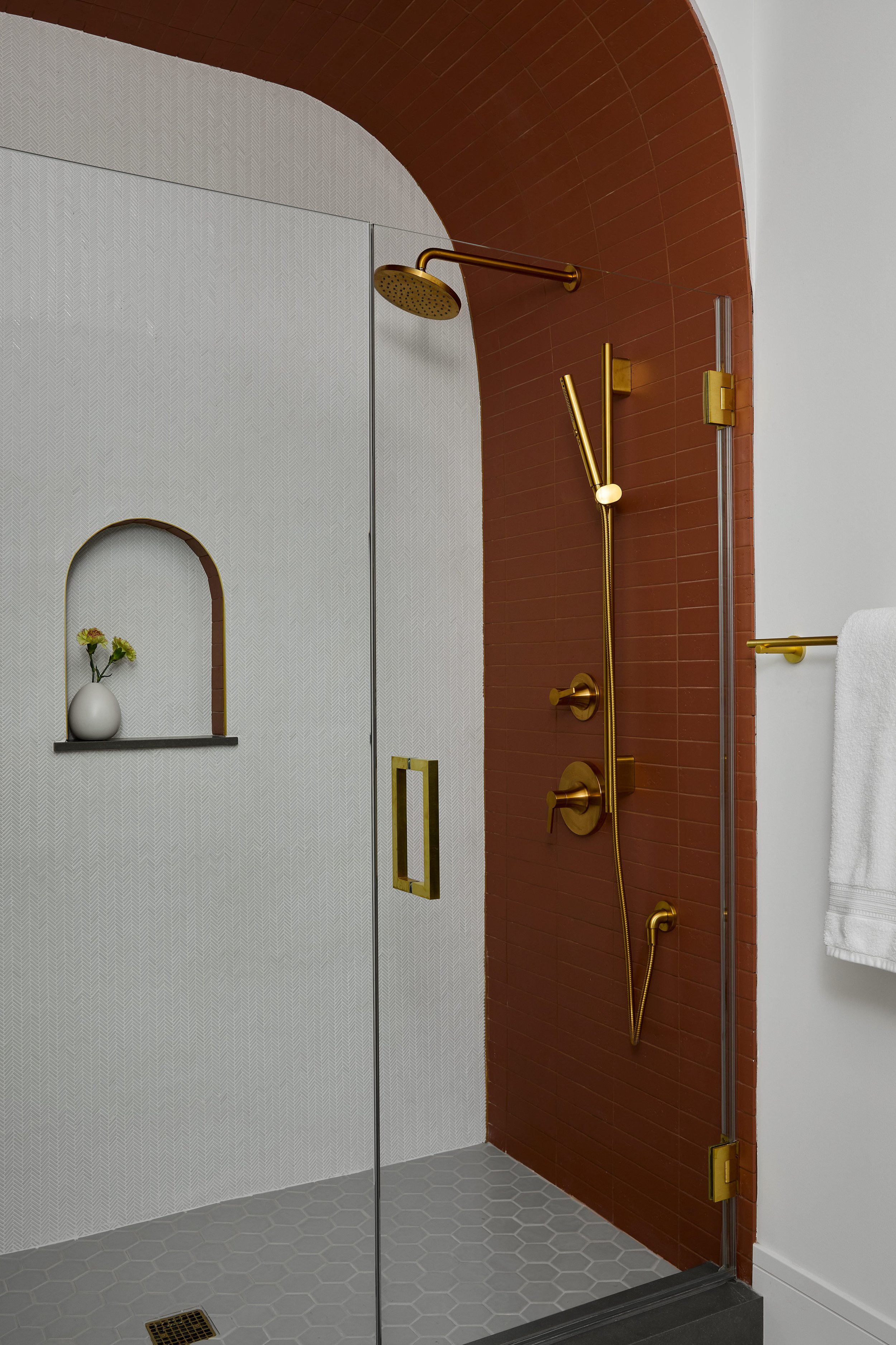
We really wanted the guest bathroom to stand out on its own, while maintaining a cohesive feel with the rest of the home. We achieved that by installing red brick tile in a stacked orientation on the walls of the bathroom. The tiles have a subtle texture and variation between them that help maintain an earthy feel. In the shower, we carried in the curved language seen throughout the rest of the home with a unique, arched shower frame and shampoo niche. Then, we selected brass plumbing and light fixtures to pull in warm tones that feel consistent with the guest bedroom.
Pool Bath
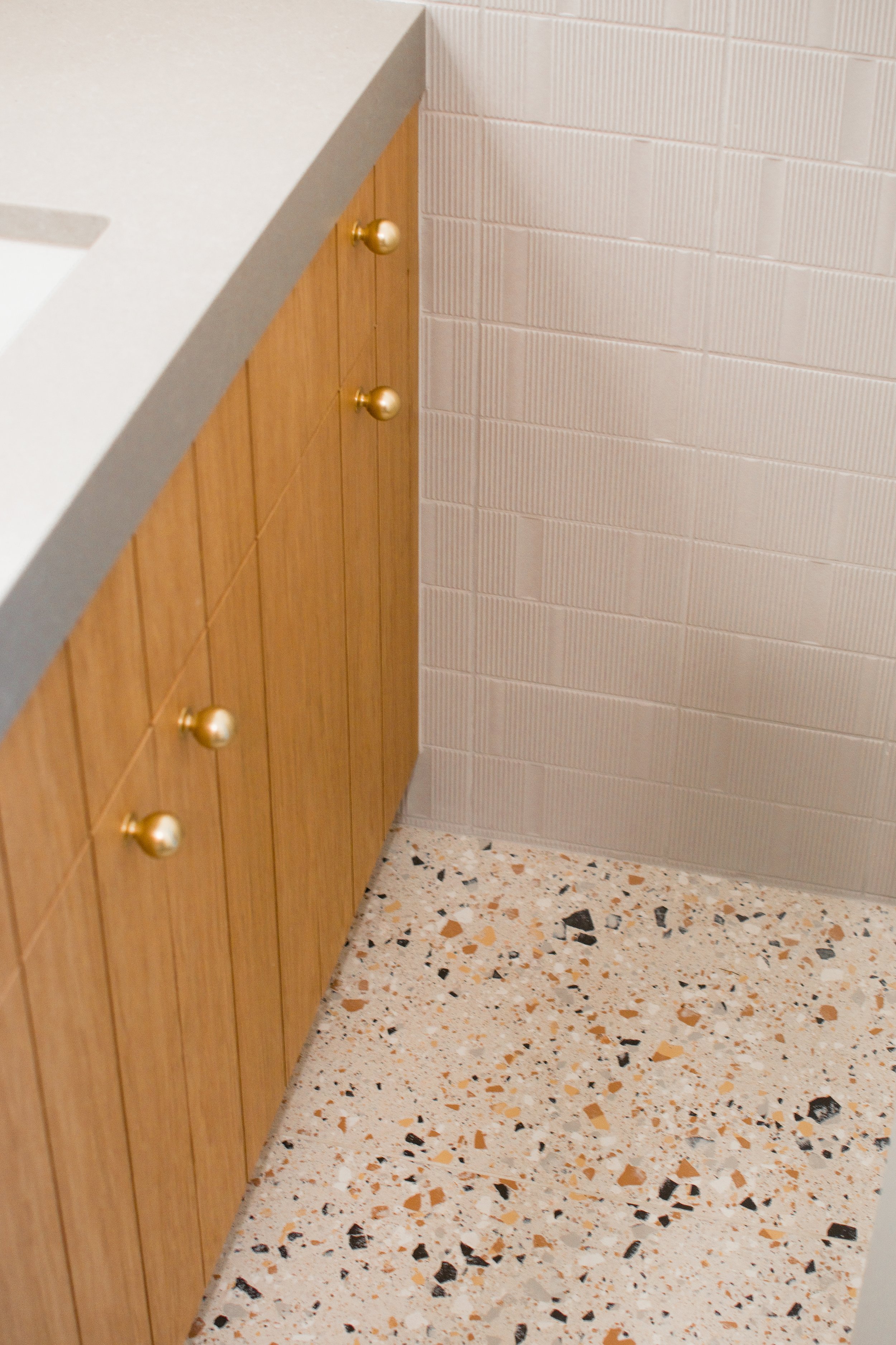
We designed a pool bath right off of the backyard on the main floor of the home. It was important to incorporate really durable materials in this high traffic space, so we opted for terrazzo style flooring. At the custom vanity, we carried in the same vertical plank profile seen in the kitchen cabinetry, this time we finished it in a beautiful white oak. We added custom hamper pullouts inside of the custom vanity to allow guests to drop their pool towels. We completed the design of the bathroom with wood-look tile in the shower that gives the space a beachy, spa-like feel.
That completes the full tour of this Michigan lakehouse. We are so proud to reveal all of the details behind this project, and we hope you enjoyed following along!
-dgw

