Home Tour - Expect the Unexpected
Introduction
If you know DGI, you know we are experts in clean, neutral design. But every once in a while, a space calls for a bold statement and pops of color. We love to push boundaries for the right spaces! This was definitely the case when this project came across our inbox. Our clients had just purchased their first home together in Lincoln Park. It had been recently renovated before purchasing, so it had some amazing bones. However, they were looking to us to design a space that felt elevated and more in line with their personal style. They loved a modern look with lots of bold contrast, unexpected colors, and abstract textures. Today, the home is complete and we couldn’t be happier with the result. So, let’s jump right into our newest home tour.
The moodboard that we created at the start of the design process introduces rich pops of color, bold contrasts, and abstract textures. These elements became super important in the design, and this moodboard became the guiding piece that we referred back to throughout the design process.
BEFORE
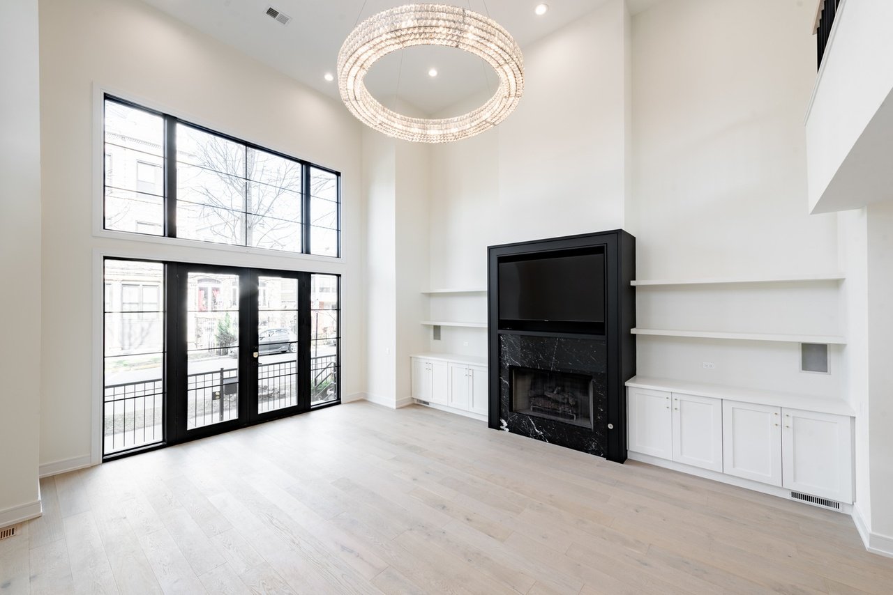
As we mentioned, the home was recently renovated and was the perfect blank canvas to work with. When we initially walked through the home, we immediately noticed the need for more impact in the living room, dining room, and bedroom.
The existing living room at the front of the home featured incredible double-height ceilings, and we knew these needed to be celebrated with a statement-making fireplace design to draw the eye up.
Over in the dining room, there were some great built-ins and light fixtures, but we wanted to tailor the space to better fit our new client’s taste.
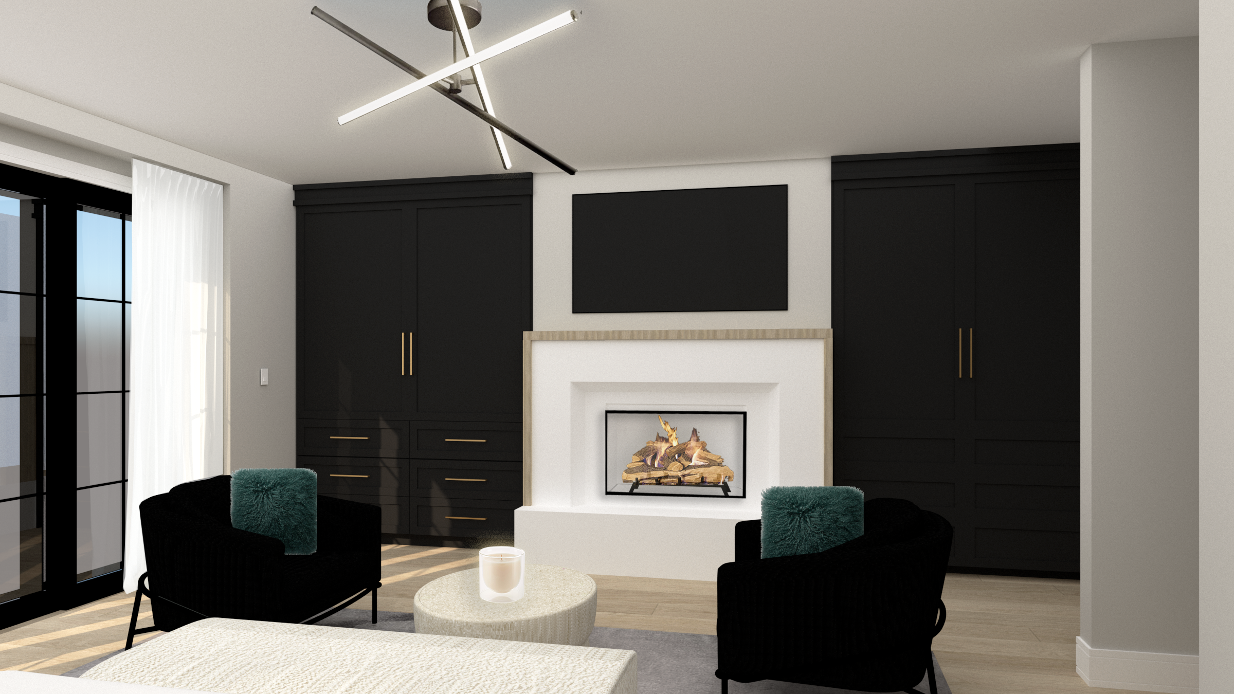
Upstairs in the primary bedroom, we had a ton of space to work with and an existing fireplace. We immediately knew the space could use some custom built-ins and an accent wall to truly elevate it to the gem it deserved to be.
THE PROCESS
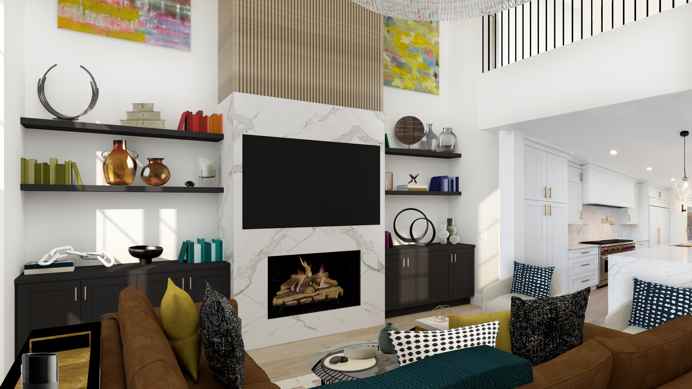
The living room design definitely makes an impact at the entry of the home. We proposed a refresh at the fireplace to draw the eye upwards to celebrate the dramatic ceiling height. Then, we incorporated some bold contrasts (influenced by the moodboard) with black cabinetry, a white marble-look fireplace surround, and pops of colorful accessories.
In the dining room, we proposed a bold wallpaper to elevate the existing built-ins and to create a unique backdrop for modern, sculptural dining furniture.
In the primary bedroom, we designed custom built-ins that provide even more closet space for our clients. The large bedroom footprint called for a seating area at the foot of the bed that gives the space a modern, hospitality feel.
The Reveal
Now it’s time to reveal the final result of this home remodel!
The living room of the home is almost unrecognizable. It is the first space guests see at the entry of the home, so we wanted to create an impact and celebrate the incredible double-height ceilings. We decided to achieve that by remodeling the fireplace to add more contrast, texture, and drama to the space. We opted for sleek white bookmatched slabs and balanced it out with black built-ins on either side. To draw the eyes up even more, we added fluted white oak above the porcelain. It adds the perfect touch of warmth and texture to the otherwise sleek and modern design.
Our clients love to entertain guests, and we kept this in mind as we designed the living room. We wanted the space to feel playful yet elegant. It needed to be conducive for entertaining yet comfortable enough to lounge in because it is the main living area in the home. To achieve this, we opted for a large L-shaped sectional to frame the room. Across from it, we incorporated two swivel chairs that rotate 360 degrees to maintain a flow throughout the open-concept main floor. We selected pieces with lots of texture and abstract patterns to add that playful touch.
The massive open shelves on either side of the fireplace called for some fun accessories and styling. We selected colorful pieces that pop against the white walls and add plenty of texture and dimension to the space.
To add even more dimension into the living room, we opted for a layered coffee table look. The coffee tables introduce staggered heights, interesting textures, and a pop of blue glass into the seating area.
One of our absolute favorite features of this living room is the two pieces of commissioned artwork by Matt K. Nguyen that we installed on either side of the fireplace. The goal for the artwork was to create a statement with abstract, colorful art that can be seen from both stories of the home. Matt is a local Chicago artist, so we sat down to walk through the moodboard and design direction for the space, and he curated two pieces that our clients absolutely love! Much like DGI, Matt primarily works with neutral tones so these colorful pieces were a first for him. They are the perfect finishing touch for the epic fireplace wall!
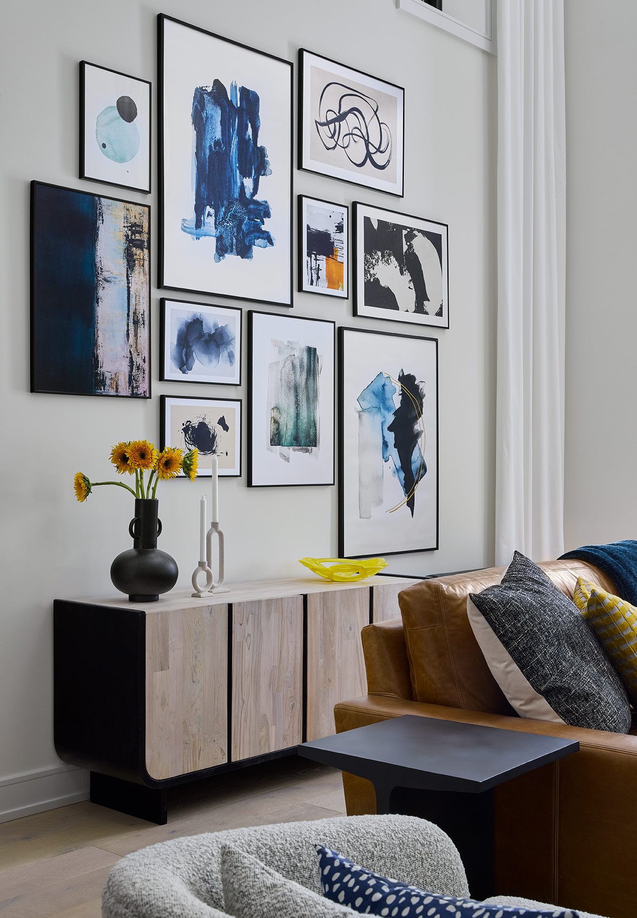
On the other side of the living room, we designed a gallery wall and drop-zone as you enter and exit the home. We selected a white-wash teak and black metal credenza. The sculptural form and organic texture plays off of the other furniture in the living room while creating a functional catch-all space. To frame the room, we installed ceiling-mounted, fixed drapery panels along the back wall. The ripplefold style and clean, white fabric soften up the living room in a sleek and modern way.
Along the back wall of the living room, we needed to create a backdrop for the warm leather sectional and the sculptural credenza. We wanted to carry over a similar look and style to the rest of the space without competing against the fireplace. So, we opted to install an asymmetrical gallery wall of colorful, abstract prints. It incorporates the playful textures and colors seen throughout the room in a clean and modern way.
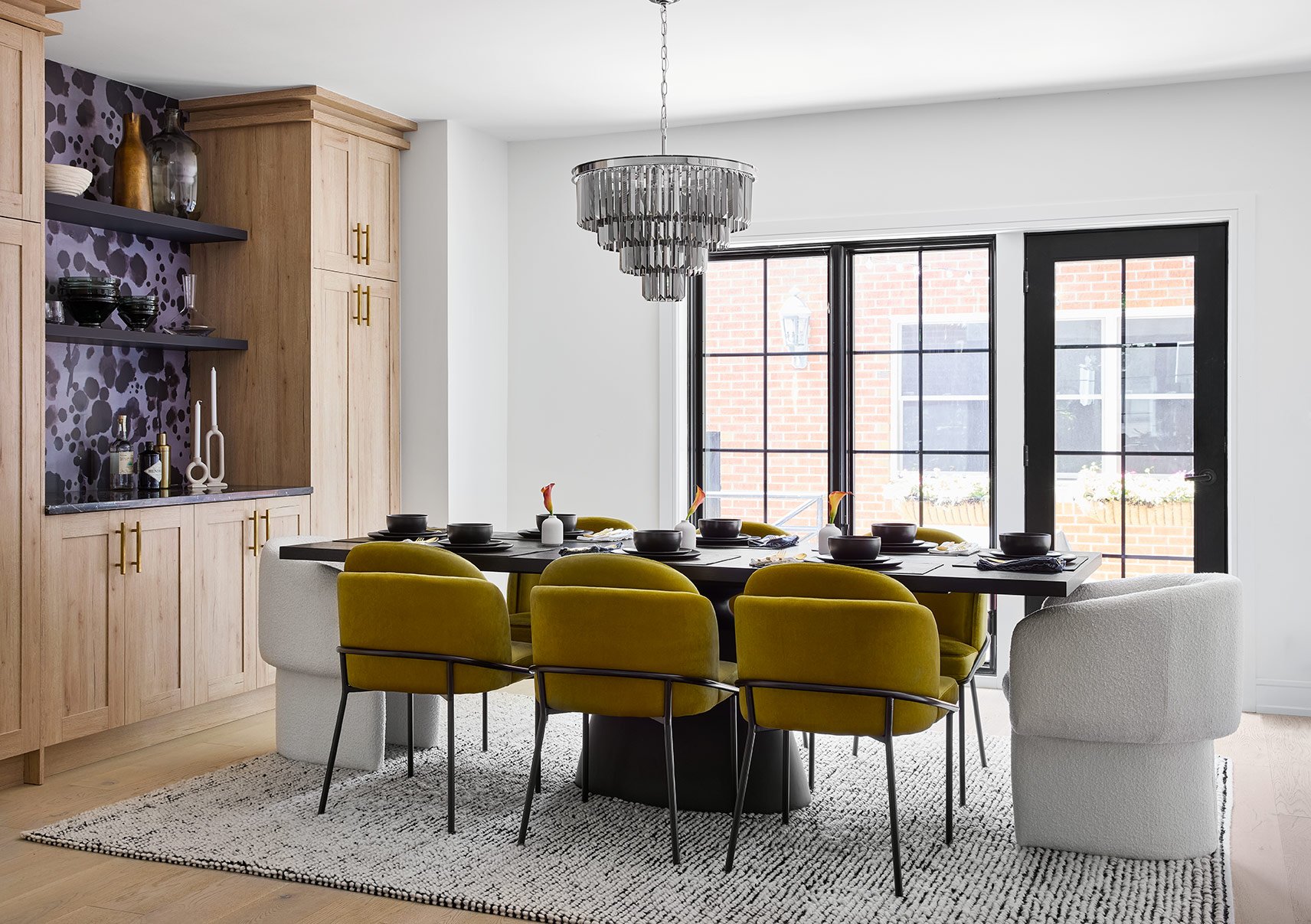
Over in the dining room, we introduced some more sculptural furniture and bold pops of color. The overall intent for this space was to elevate the existing built-ins and chandelier to feel more aligned with our client’s aesthetic. It was also important to create a cohesive flow between the open-concept spaces, so we carried over the same ochre tones seen in the living room accessories to tie the spaces together.
To add even more interest to the space, we selected two unique, boucle arm chairs and positioned them at the heads of the dining table. The sculptural form and unexpected texture help to ground the dining room zone.
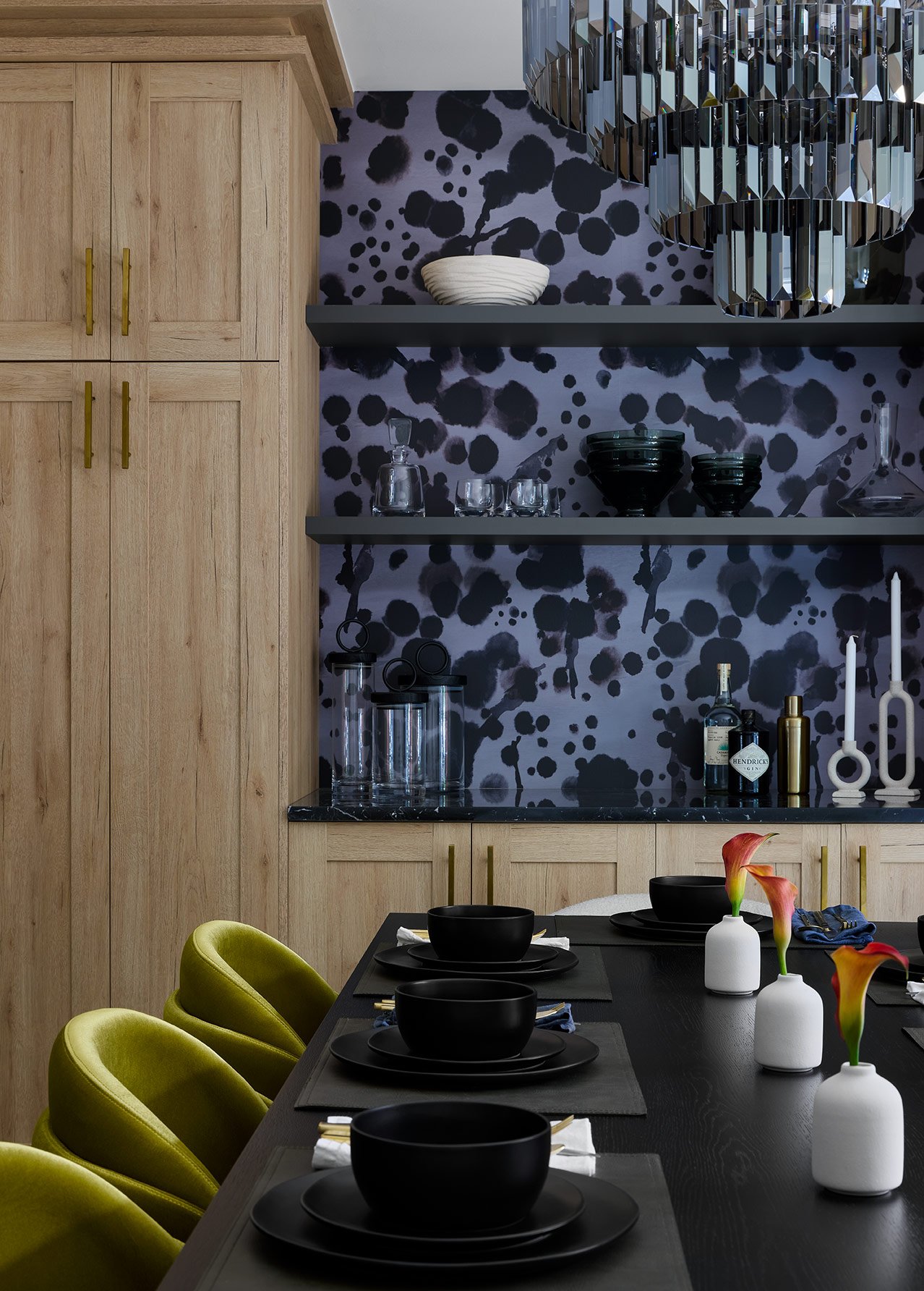
The existing built-ins were a great feature in the dining room, but they were lacking that pop that our clients love. So, we opted to add a dramatic touch by installing an abstract wallpaper behind the open shelves. The tones and textures of the wallpaper mimic the artwork seen in the living room for a cohesive feel between the spaces.
The selection of ochre, velvet dining chairs was influenced by the moodboard, and they add a rich pop of color to the dining room. The velvet texture gives them a modern, luxe feel that helps to elevate the space. And the black metal frame on the chairs pairs with the black dining table to add plenty of depth and contrast to the dining room.
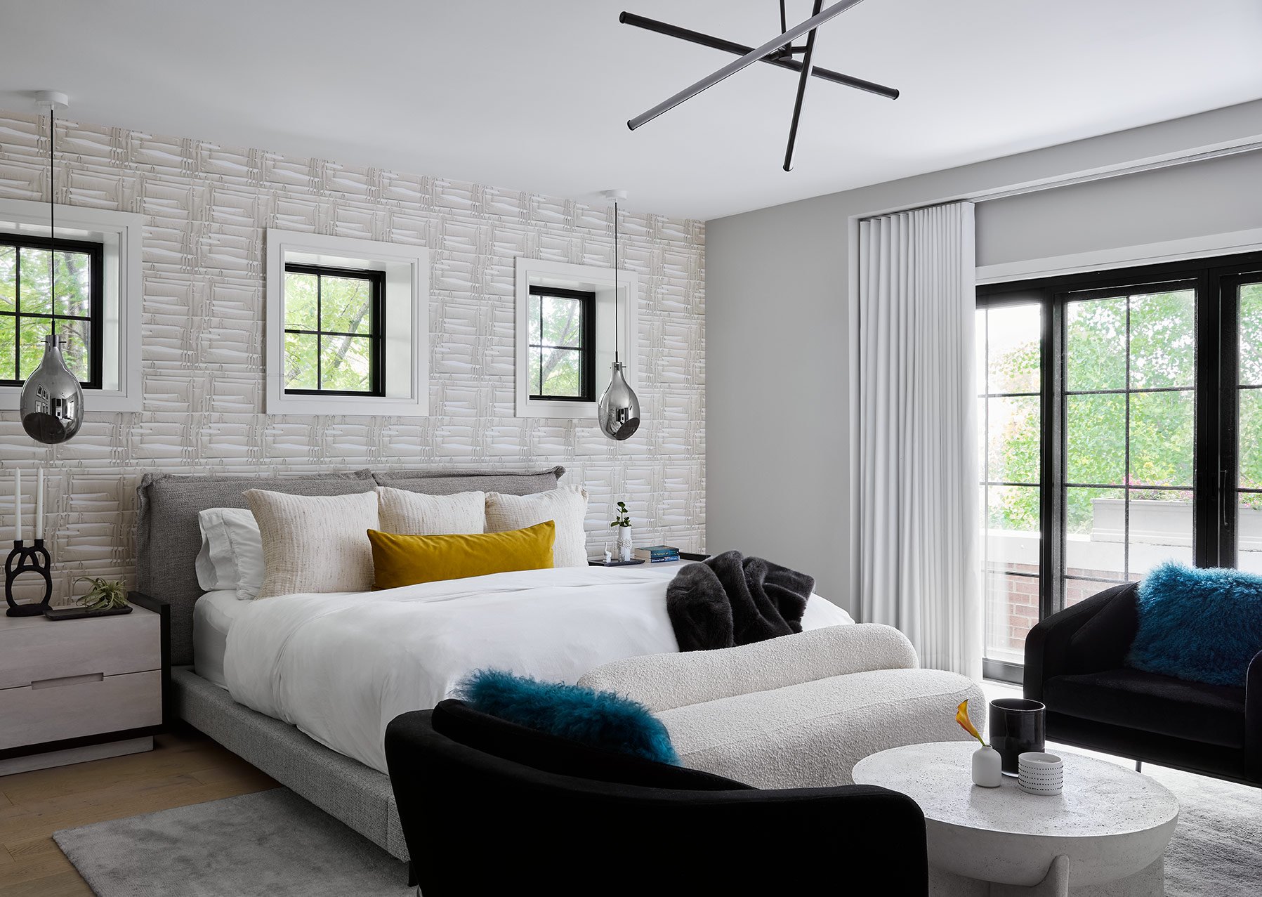
Heading upstairs into the primary bedroom, it was important to design this space with a hospitality feel. Our client loves to travel and wanted her bedroom to mimic the clean, luxurious feel of a hotel room. So we opted for an overall bright palette with luxurious textures, sculptural furnishings, and pops of color to achieve her goal.
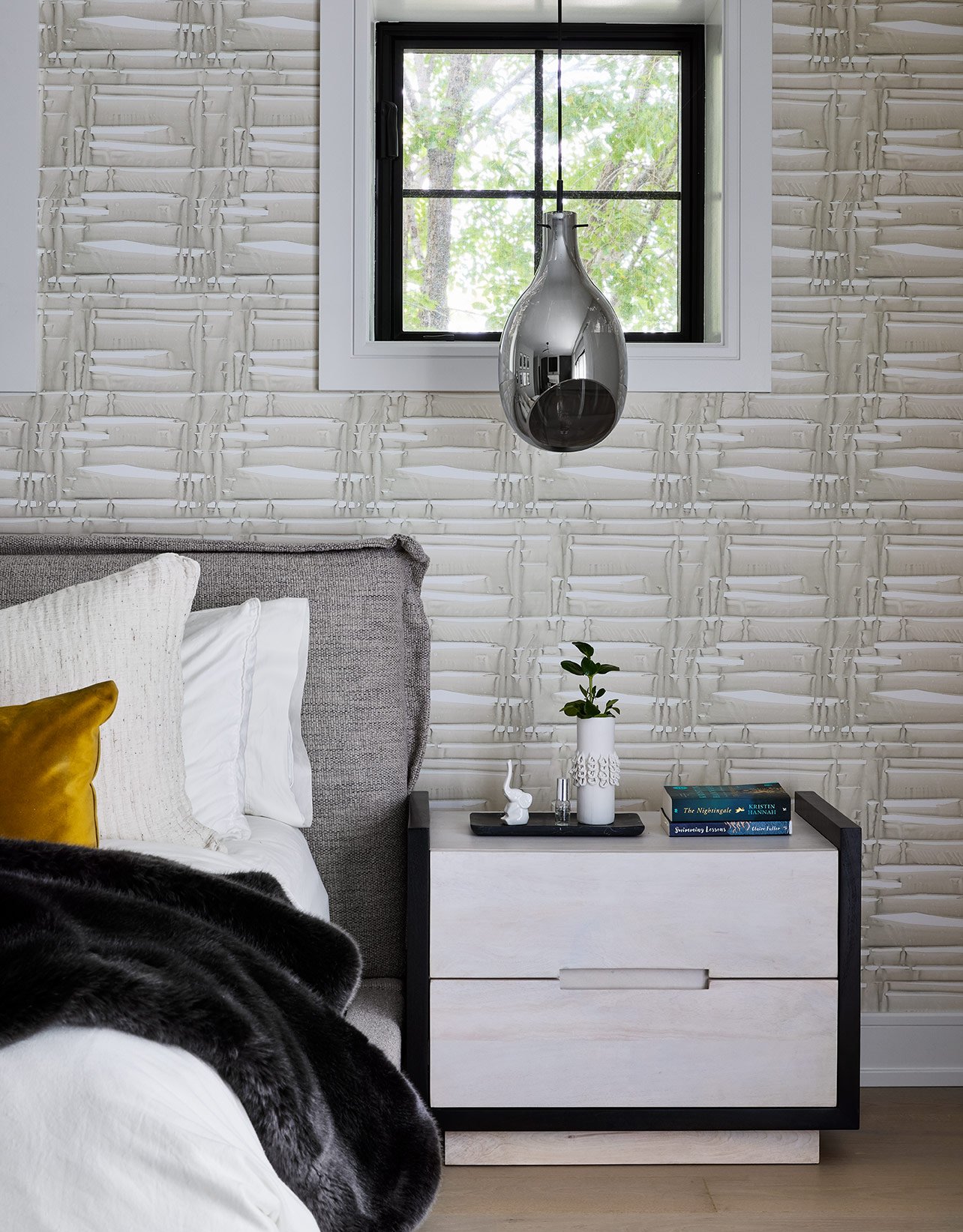
Behind the headboard, we installed a graphic, textured wallpaper from Angela Simeone to elevate the space. It creates the perfect backdrop for the hotel-look bedding and sculptural wooden nightstands. We opted to drop smoked glass pendants above the nightstands to keep them clear and uncluttered and achieve that clean, hospitality feel. Finally, a faux fur throw and velvet accent pillows introduce luxe textures to the bedding.
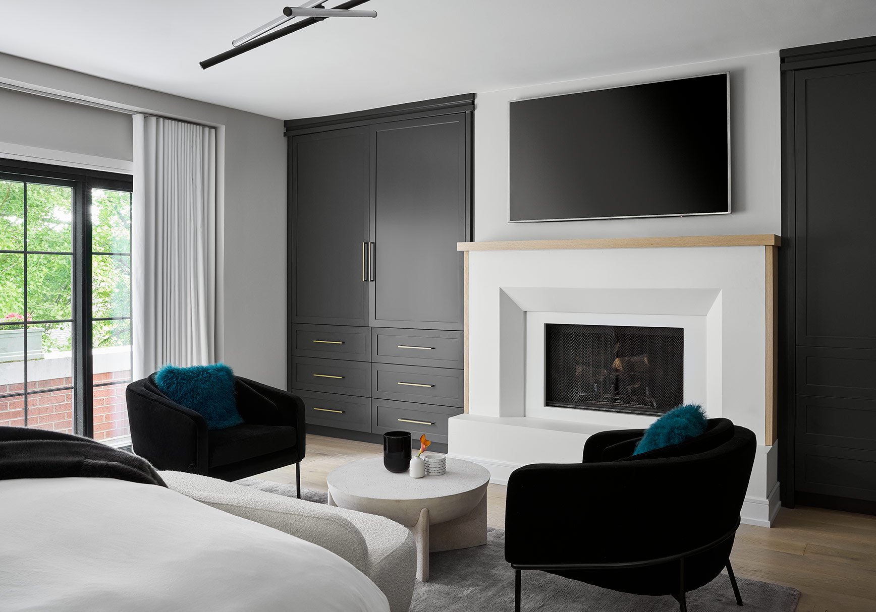
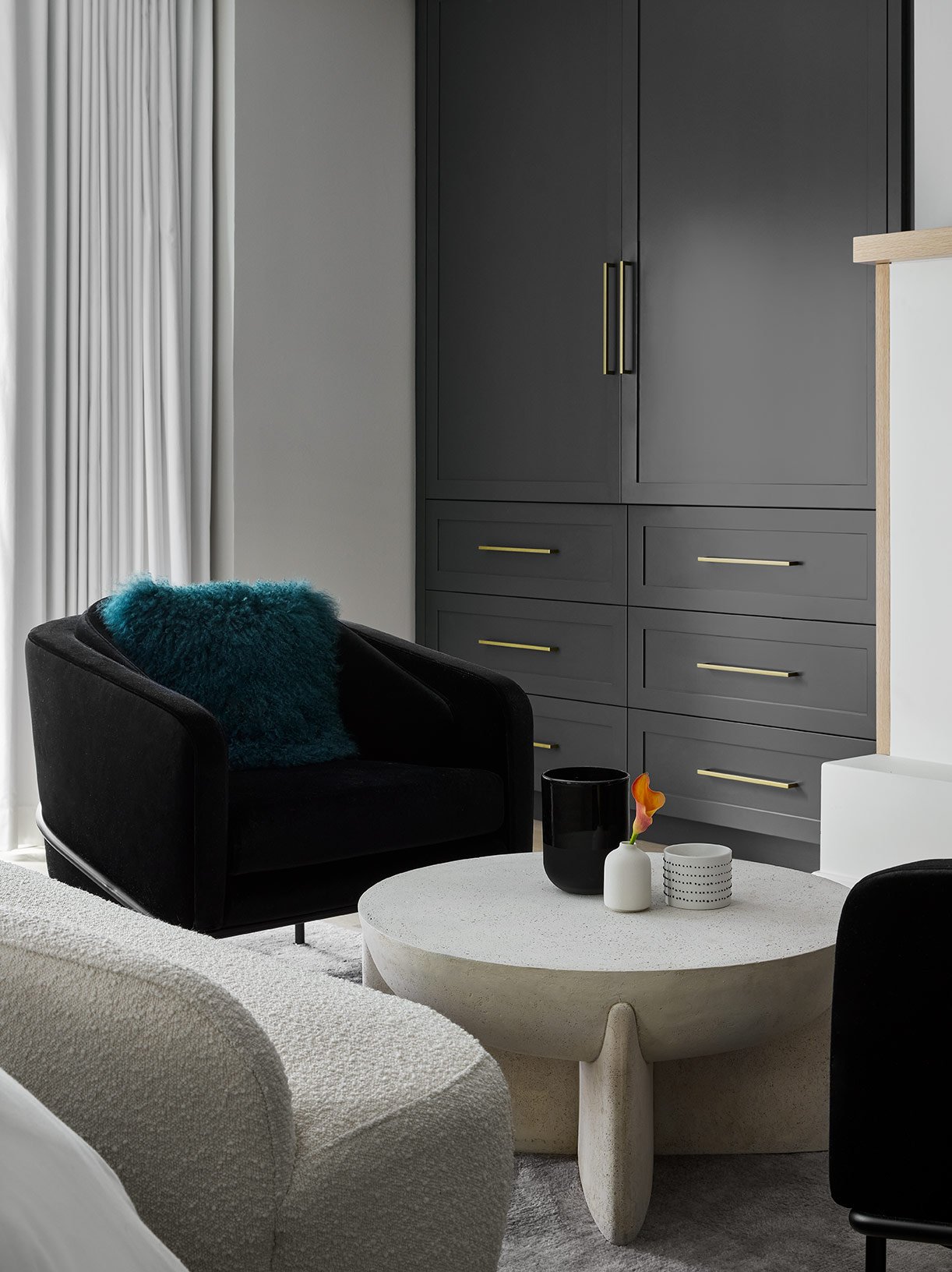
Across from the bed, we elevated the existing fireplace design with custom built-ins on either side. Our clients needed additional closet space in their bedroom, so these built-ins serve as the perfect storage solution. We opted for a combination of cabinets with hanging rods and drawers for optimal functionality. And we decided to paint them a rich grey color to add some depth and dimension to the otherwise bright bedroom design.
At the base of the bed, we had enough space to incorporate a seating area with two accent chairs and a coffee table. The seating arrangement furthers the hotel-like feel of the bedroom, and we opted for rich fabrics like velvet and boucle as well as sculptural shapes to give the space that modern, luxurious feel.
We’ll close out this home tour on the sweetest note possible! This project is extra special to the design team because of this full circle moment. Our designer, Jordan, was pregnant with her first baby while she was working on the design of the home. Now the home is complete, and Jordan came back from maternity leave just in time to celebrate the final results! So, she brought baby Natalie along on the photoshoot to see the design her mom was working on while she was growing.
Thank you so much for following along with this home tour! We absolutely loved getting to design this home with fun pops of color and unexpected textures, and we hope you enjoyed the final result as much as we do.
-dgw


