Home Tour - New Kids on the Block
INTRODUCTION
The day that we installed the furniture on this project, we lost count of the number of cars that stopped in the street to stare, and admire the neighborhood’s newest addition. We had the honor and privilege to work with the sweetest young family to create their dream-home….for themselves and their new Cavapoo puppy. Originally brought in to furnish and decorate the home, our role on the project quickly expanded to selecting architectural finishes and fixtures to ensure the entire home felt customized and tailored to the client’s unique aesthetic.
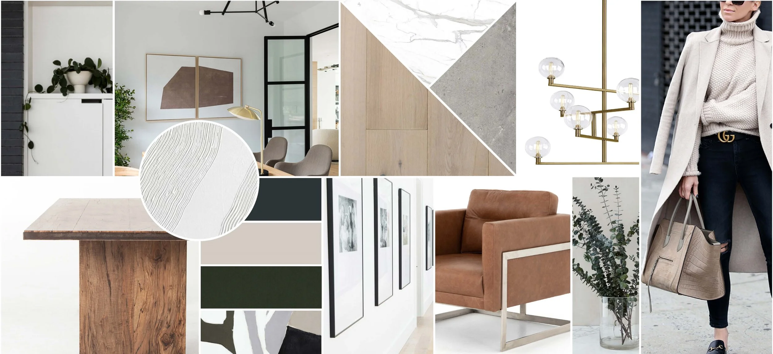
The moodboard captures the crisp, modern lines that we incorporated into the project, balanced with warm, earthy tones and sculptural light fixtures. The home is open and spacious, so it was important to make each space special, while also keeping everything cohesive and unified.
THE PROCESS
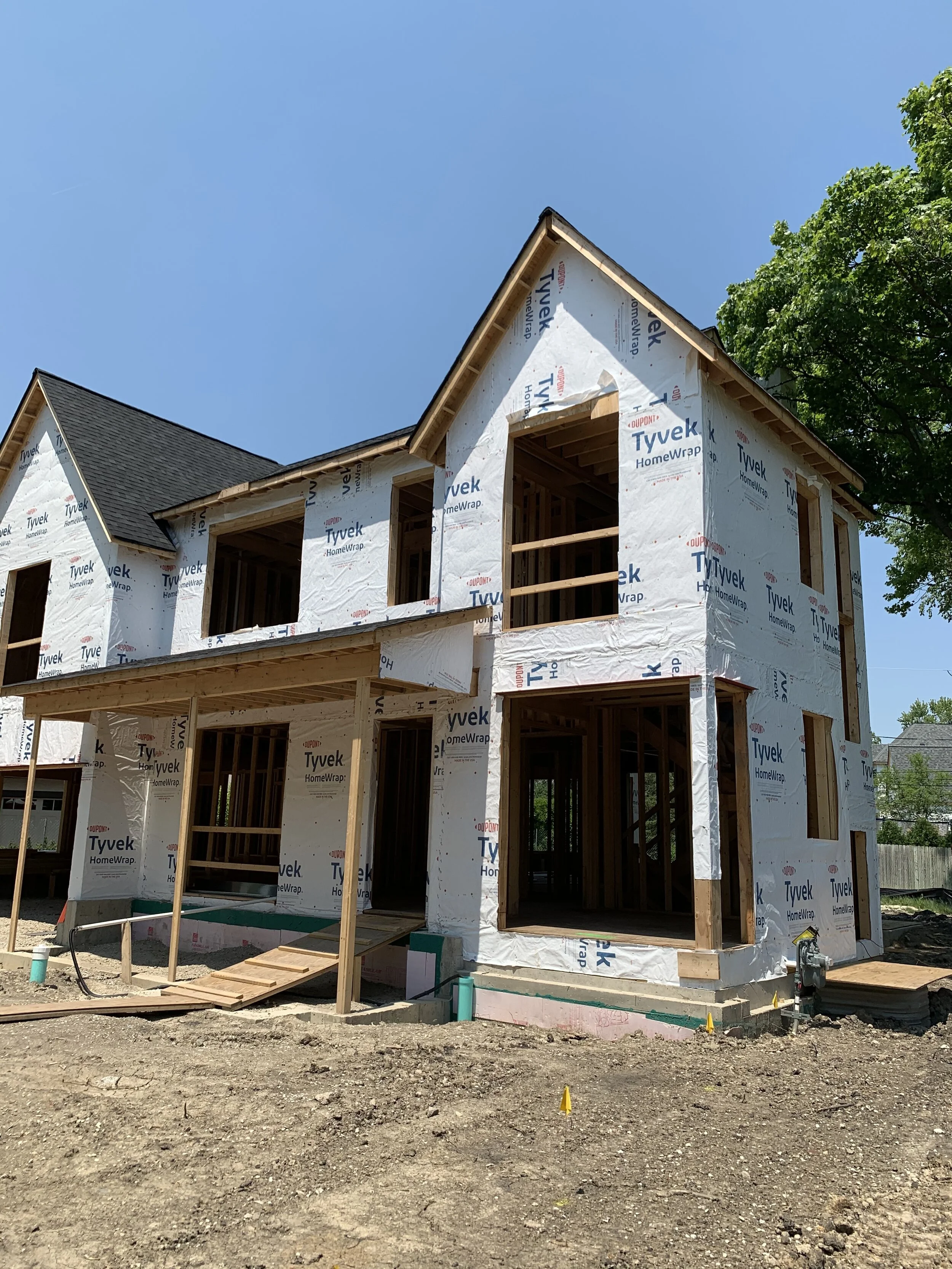
New construction projects have a special level of excitement because the possibilities are endless. There are no pre-existing conditions to conform to, and the space can truly be personalized to the client’s unique needs. Architect, Louis Banks, designed an open concept floorplan with a formal dining room and home office at the front of the house, and a large living room and kitchen towards the back. Large windows around the house allow tons of natural light to pour in, and gave us the opportunity to really showcase some special moments to those passing by and admiring the home.
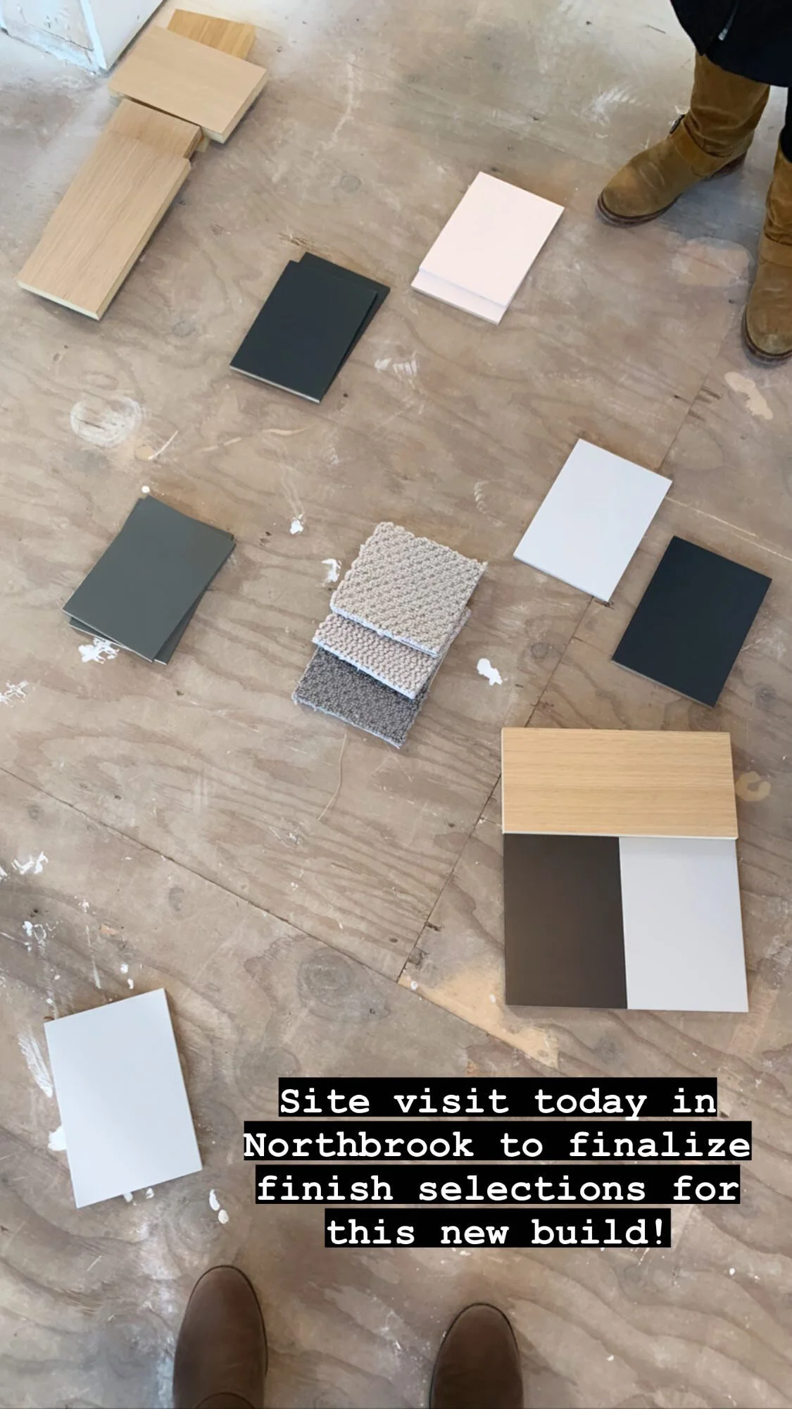
When selecting finishes for the house, we focused on keeping things light and bright, while also ensuring that everything selected had natural textures, and was durable and safe for high use and abuse (always important when there are kids around!).
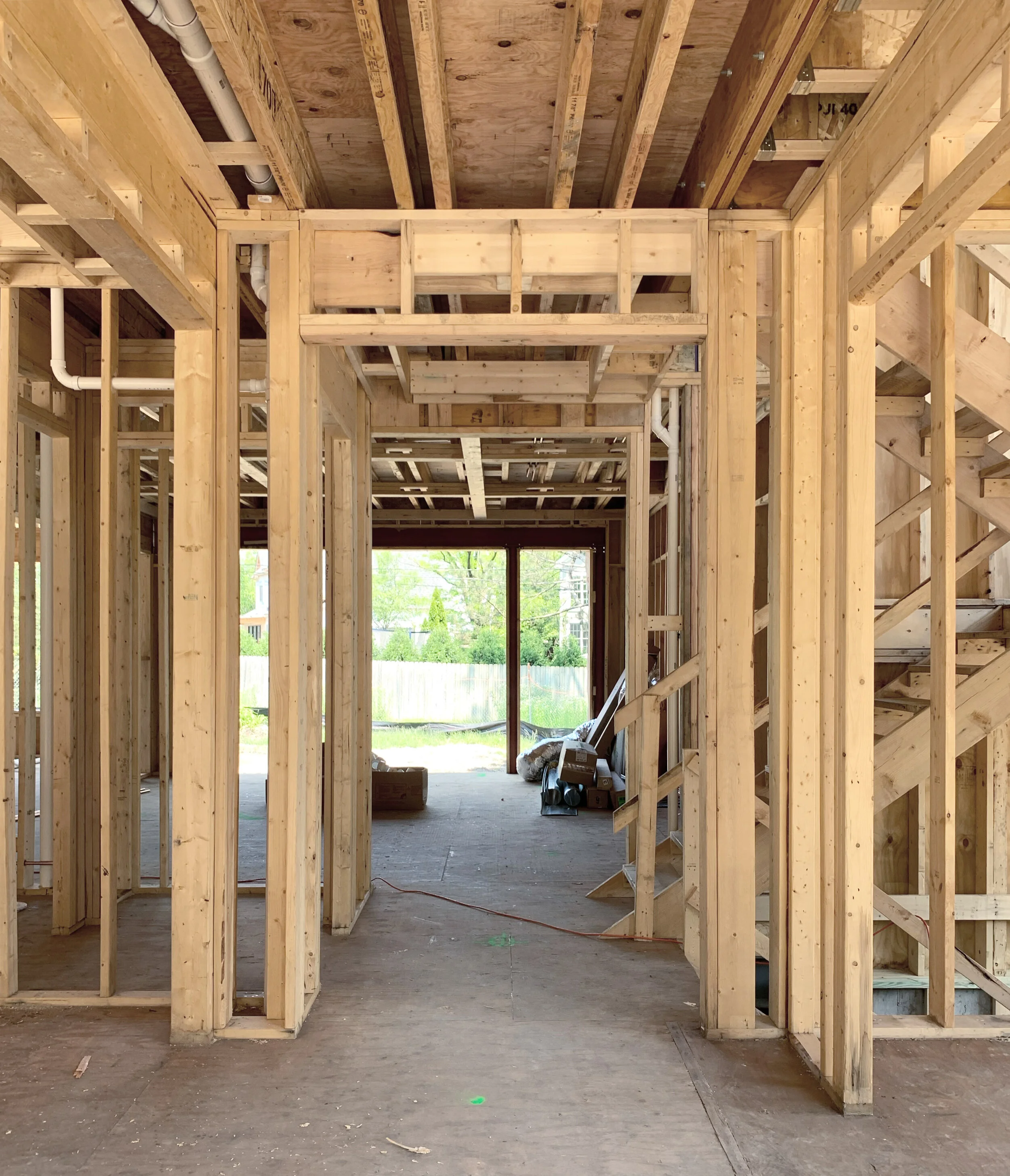
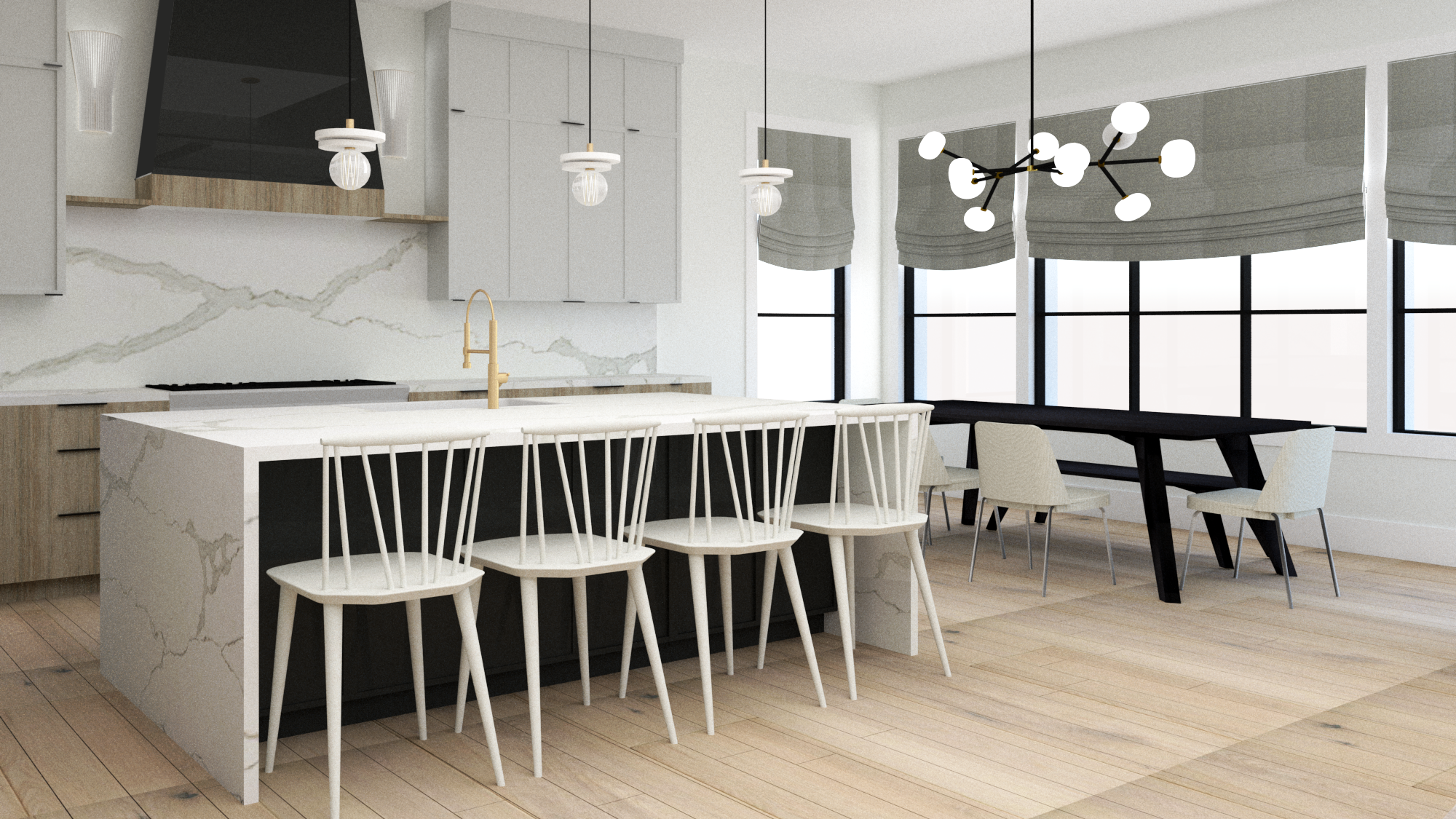
With new construction, it’s more important than ever to prioritize 3D-renderings, because it is so much harder for clients to visualize what’s to come when they aren’t even able to stand in the room. Often these decisions are made when framing is just beginning, in order to finalize plumbing and electrical locations before drywall goes up. Here’s a peek at a few of the renderings we shared to communicate the vision for the design, and how the palette, fixtures and furnishings come together in their future home.
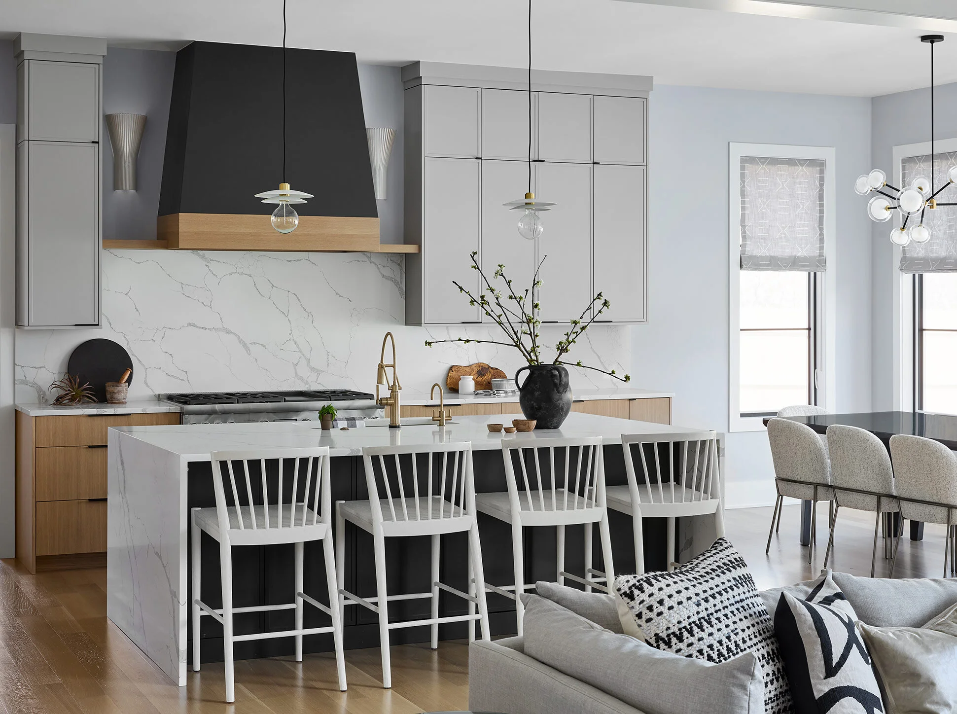
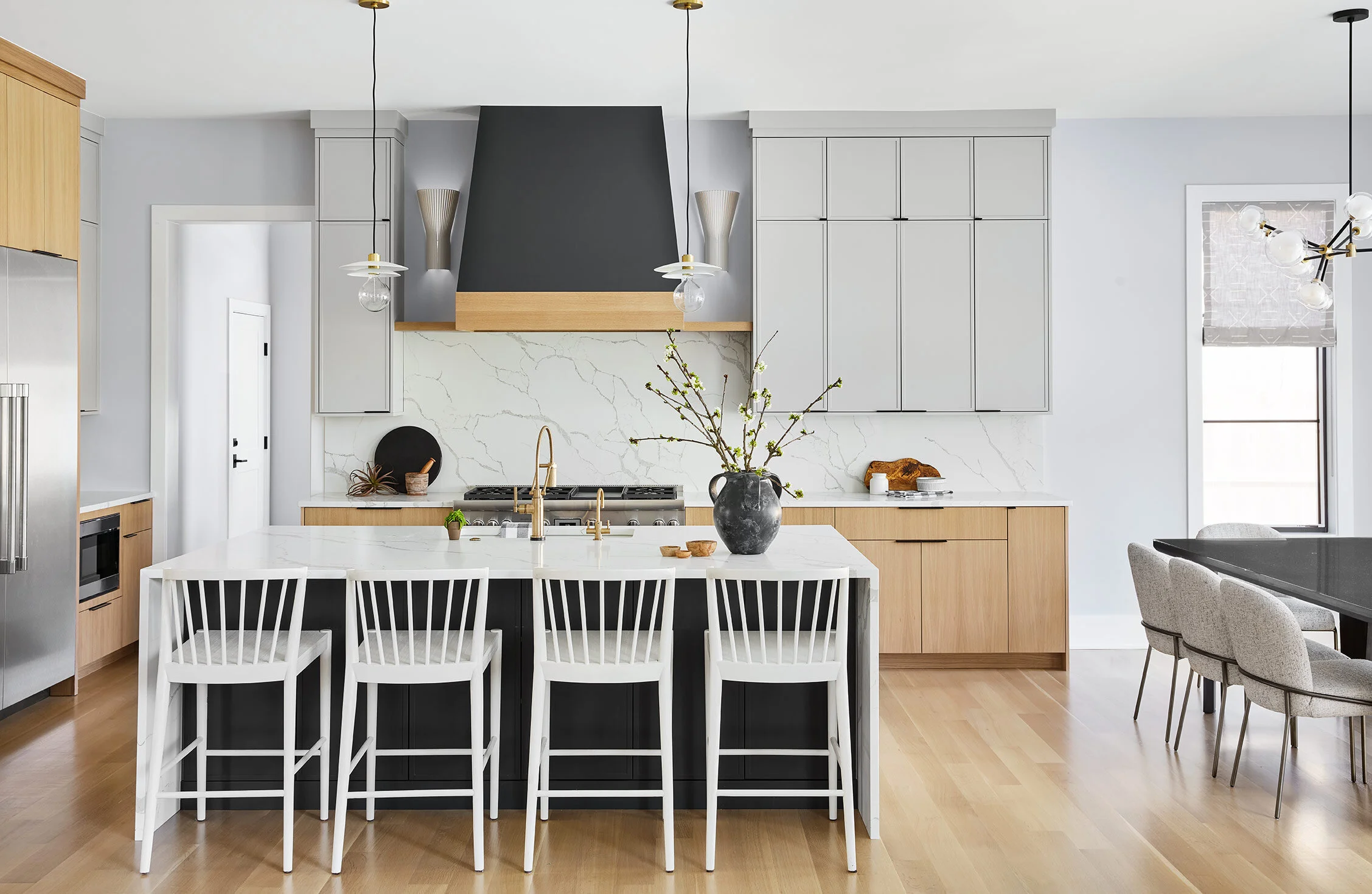
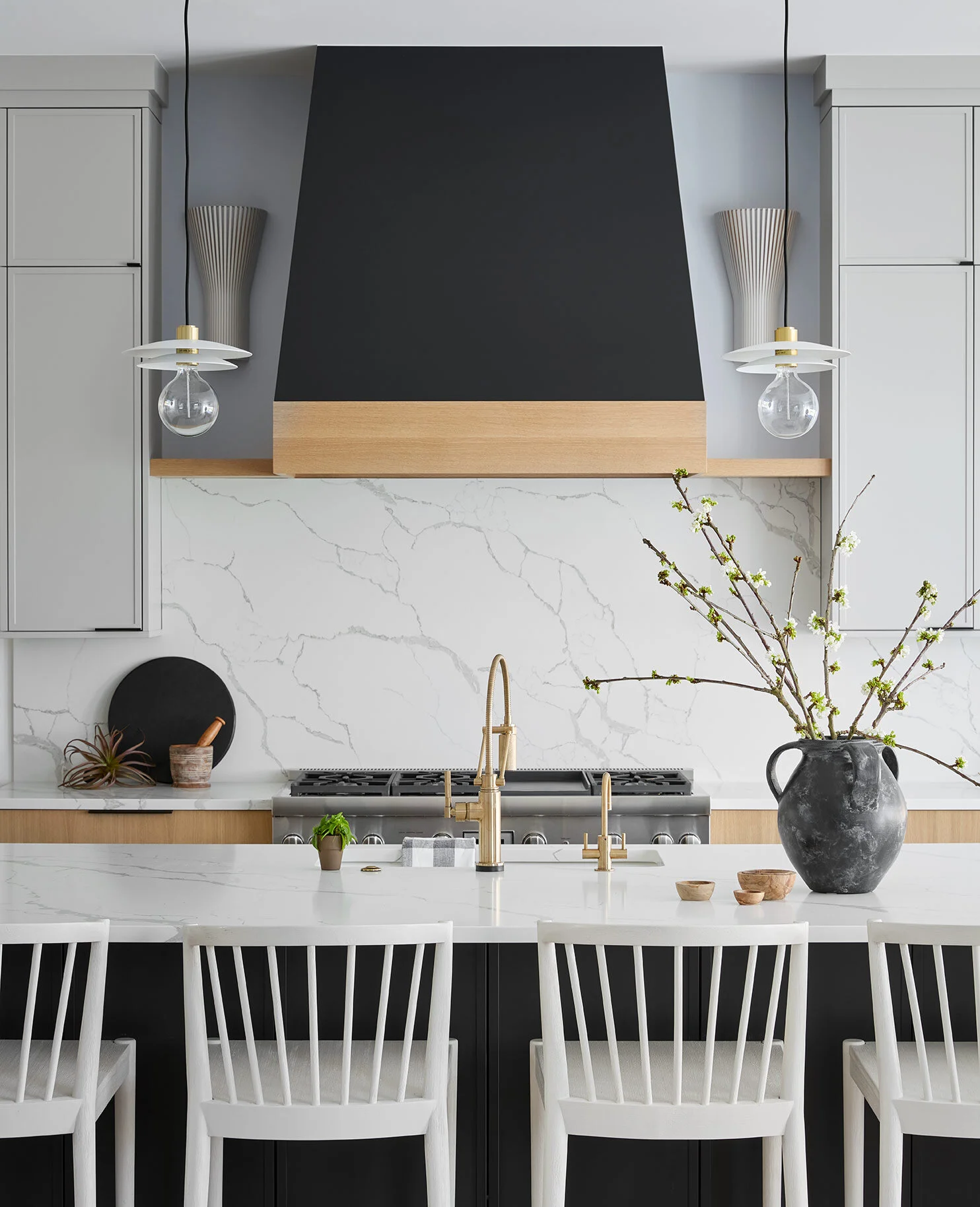
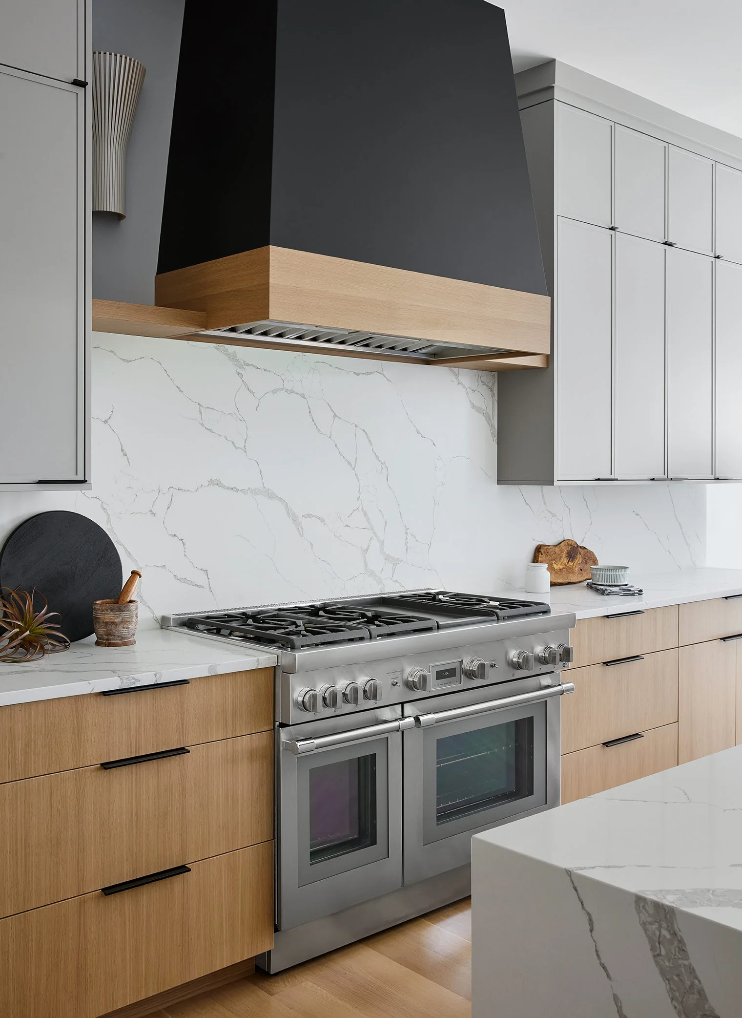
In the kitchen, we wanted to go with a dramatic quartz backsplash for easy cleaning and maintenance, and a modern, clean aesthetic. It was important for us to choose a quartz with a dramatic veining to fill the space and add some interest without making the space feel cluttered.
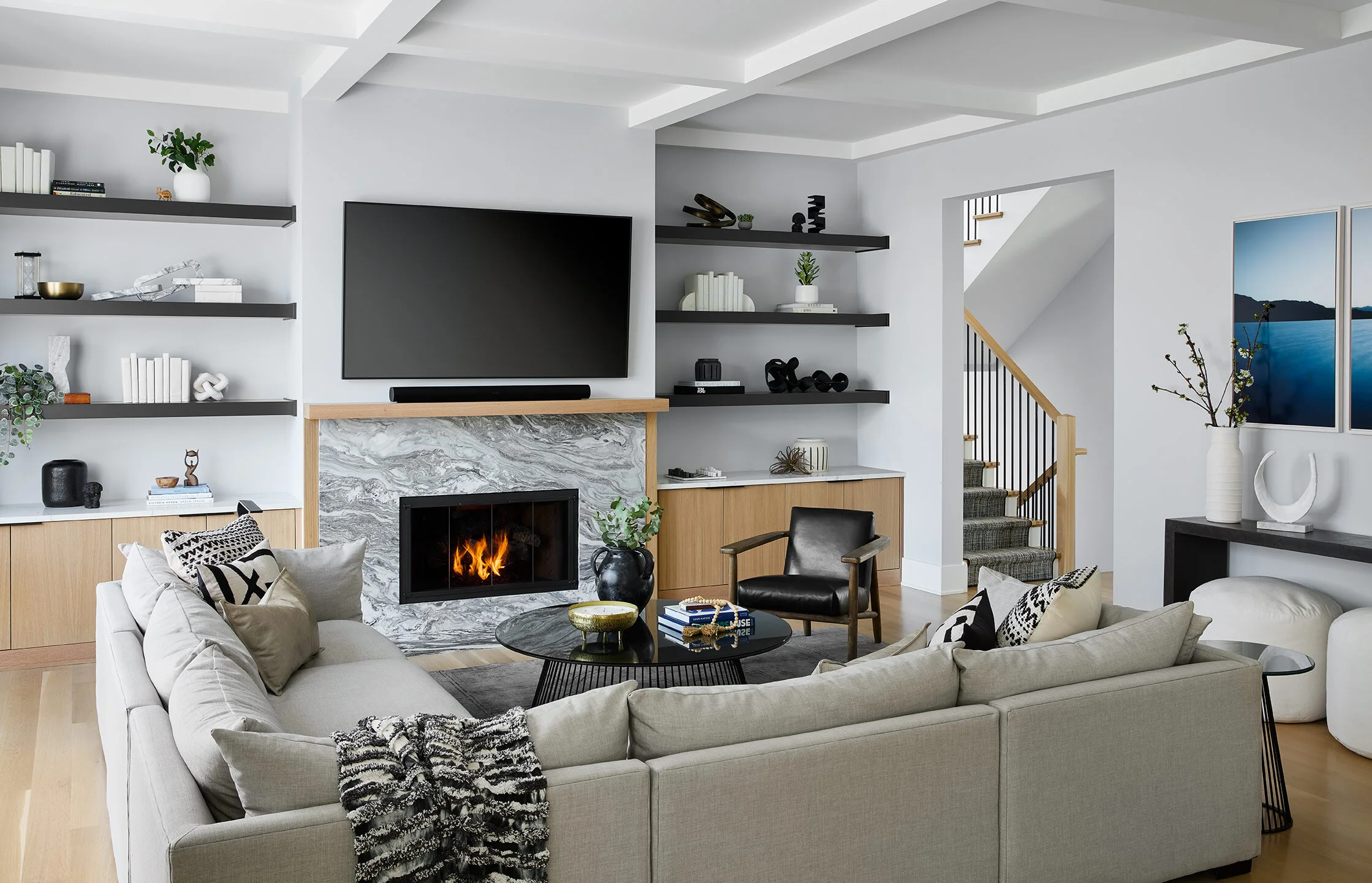
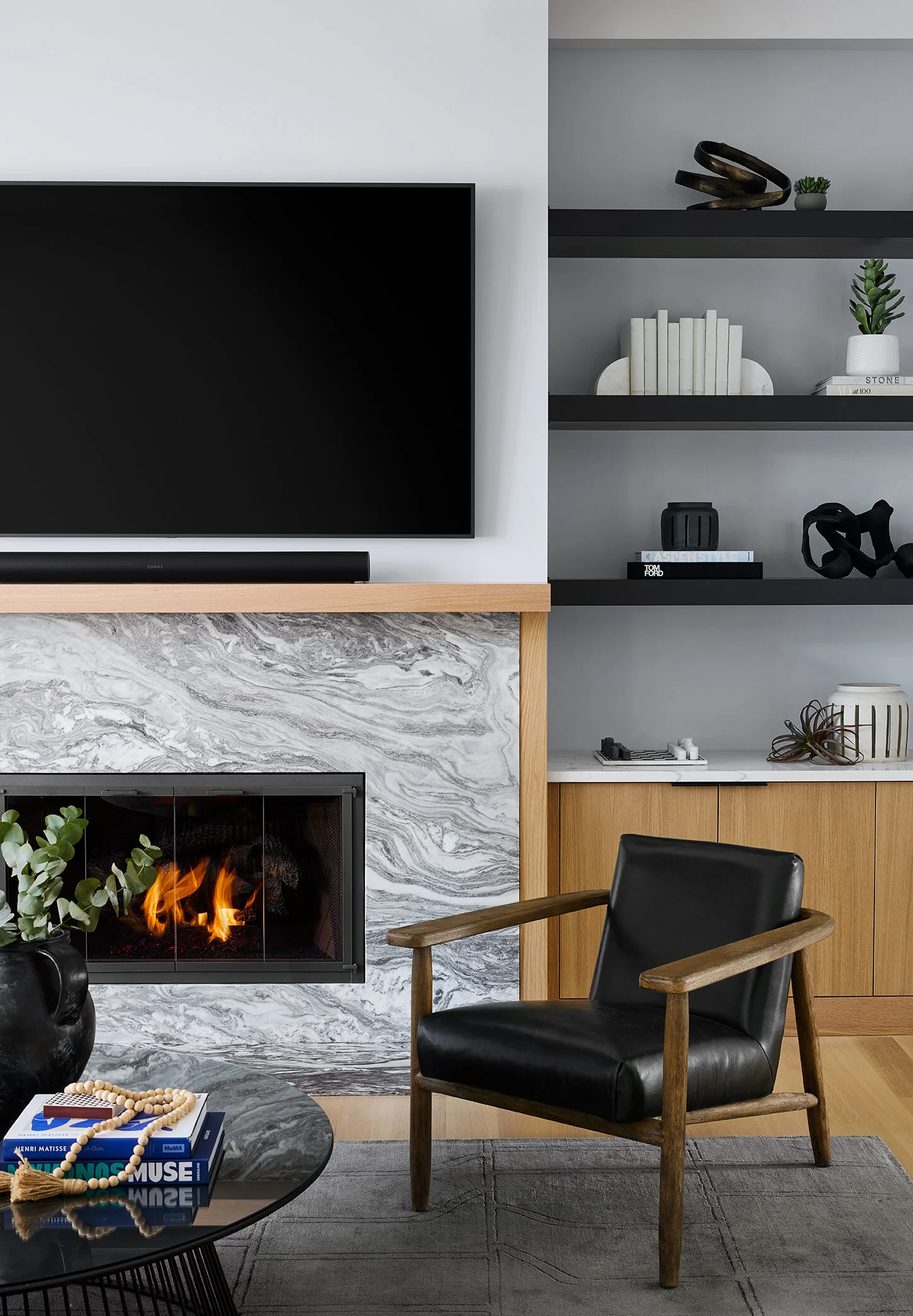
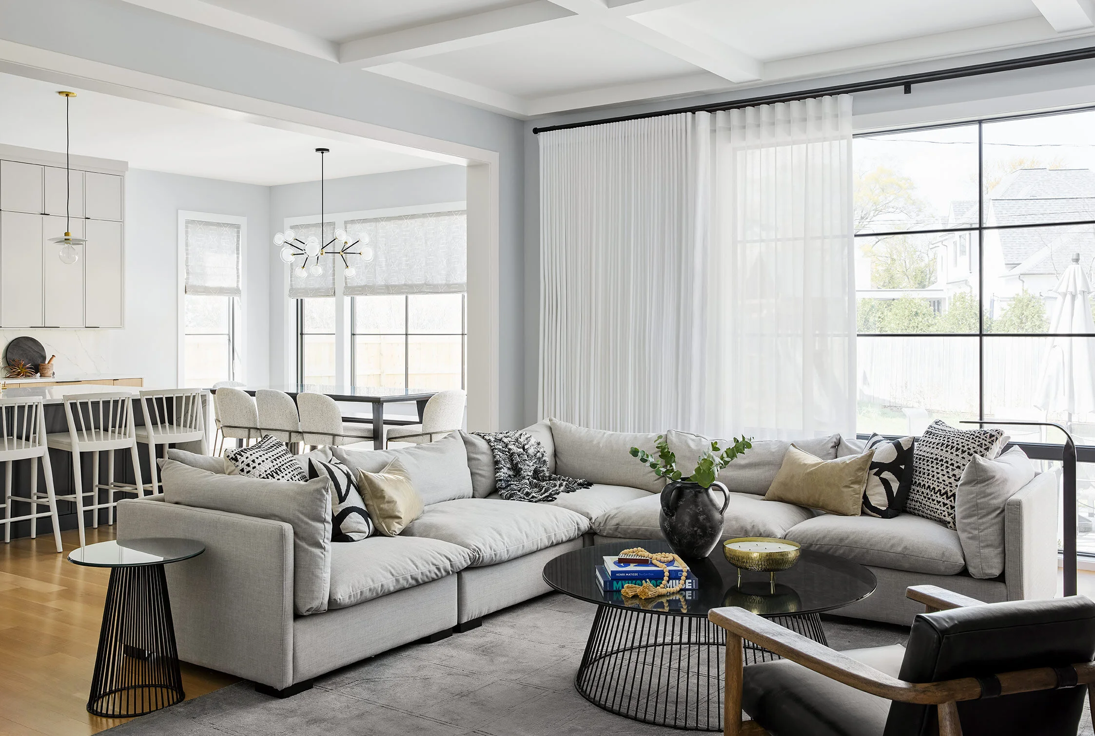
The living room is open to the kitchen, so we chose to define the zone with an oversized corner sectional and accent chairs. The fireplace wall is the showstopper. We opted to paint the shelves dark to match the kitchen island and hood, and pulled a rich, brown and white marble in for the fireplace front to add some earthy texture and drama to the space.
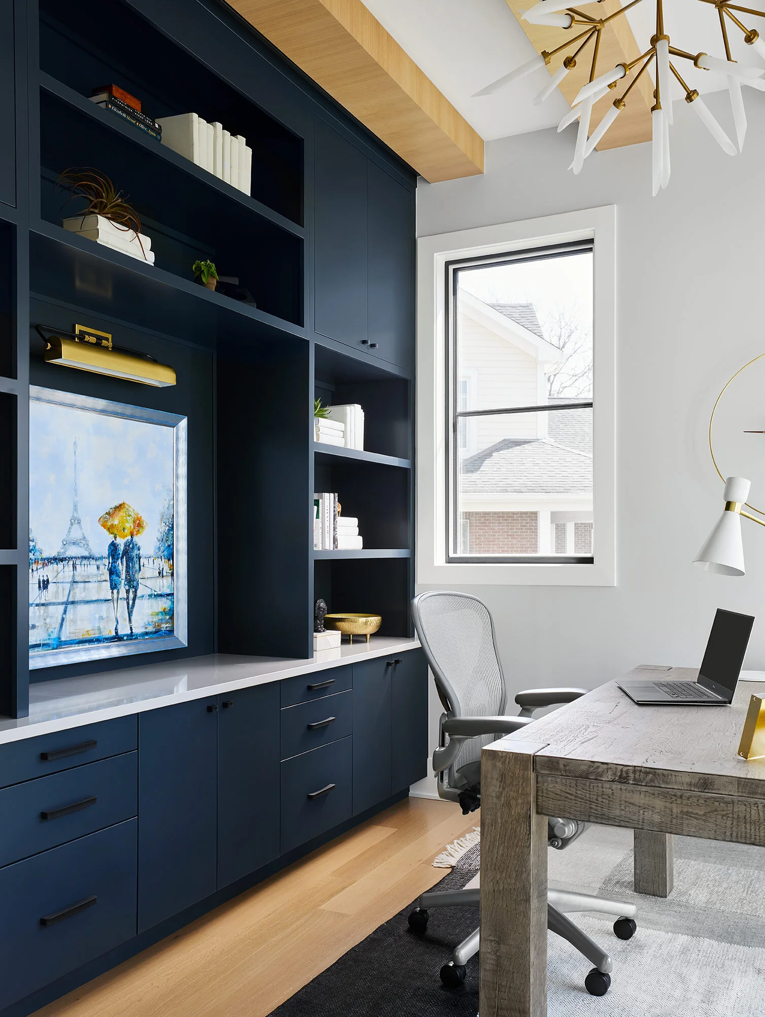
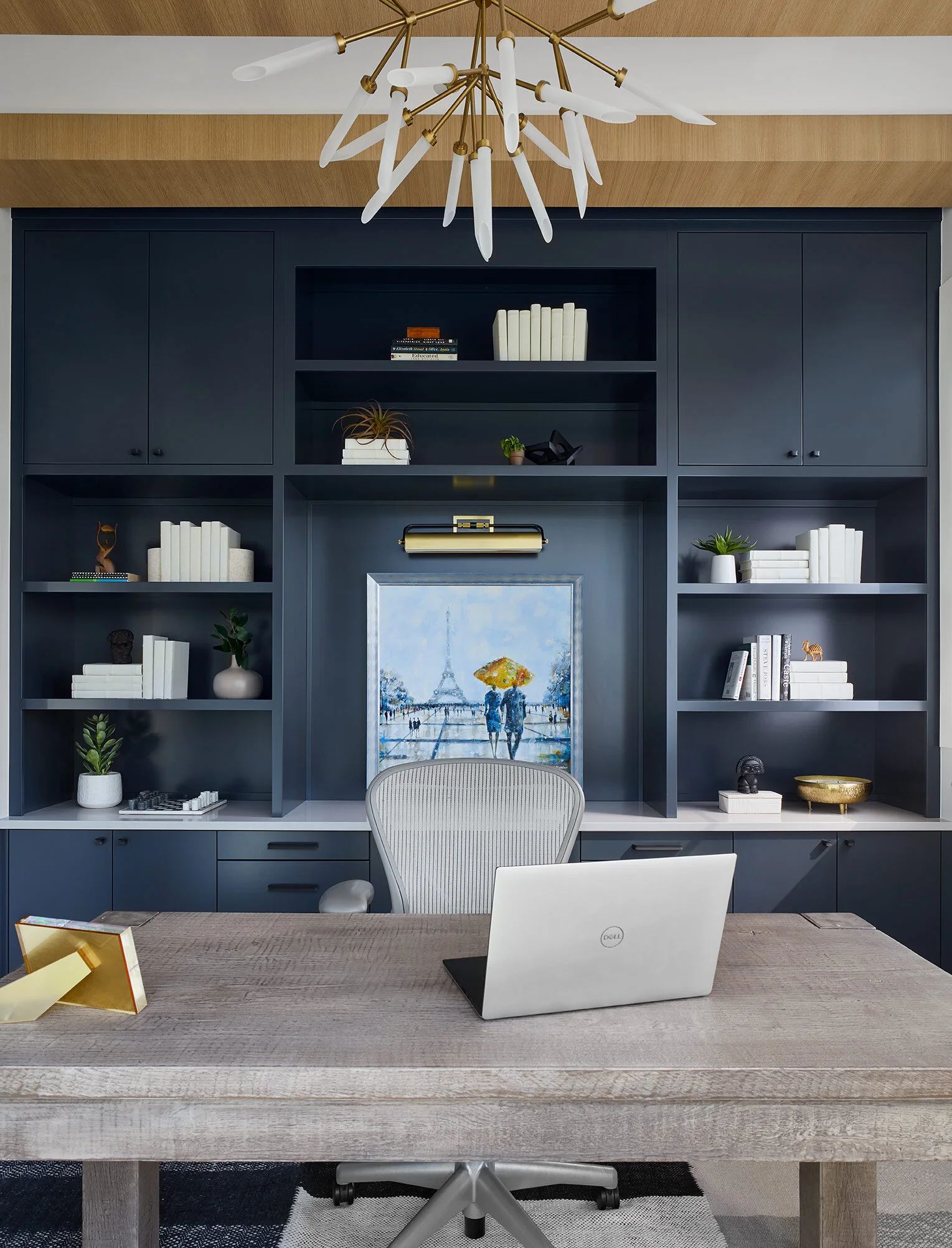
The office is at the front corner of the house, and is wrapped in windows. We chose to balance out all the light pouring in with a dark and moody accent wall of built-ins with the desk floating in front, looking out towards the front yard.
THE REVEAL
Nothing made us happier than the evening after we got the furniture moved in, and gave our clients a tour of their new dream home. The resulting space is the perfect balance of crisp, clean lines and rich, earthy textures, creating an inviting and cozy feel while still maintaining an open and airy vibe.
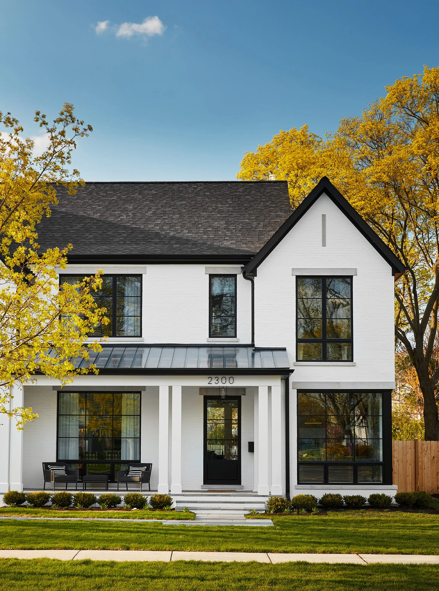
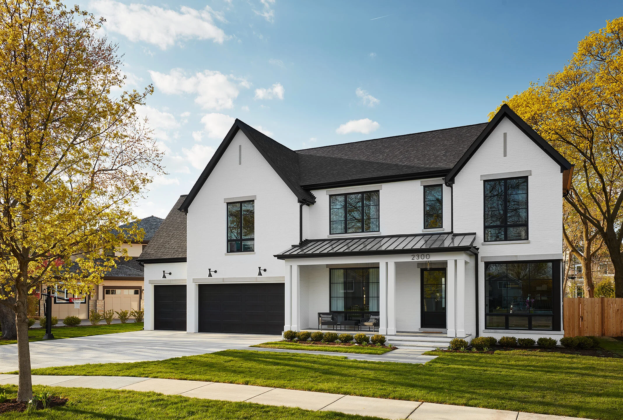
This house has multiple levels of curb appeal. Architect Louis Banks managed to celebrate both to exterior of the house and the interior all from the street with large windows framing the dramatic home office and dining room. White painted brick contrasts the crisp black windows and doors for a truly timeless look.
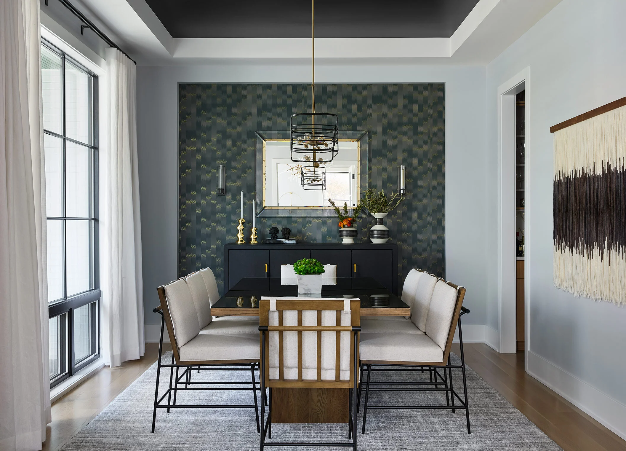
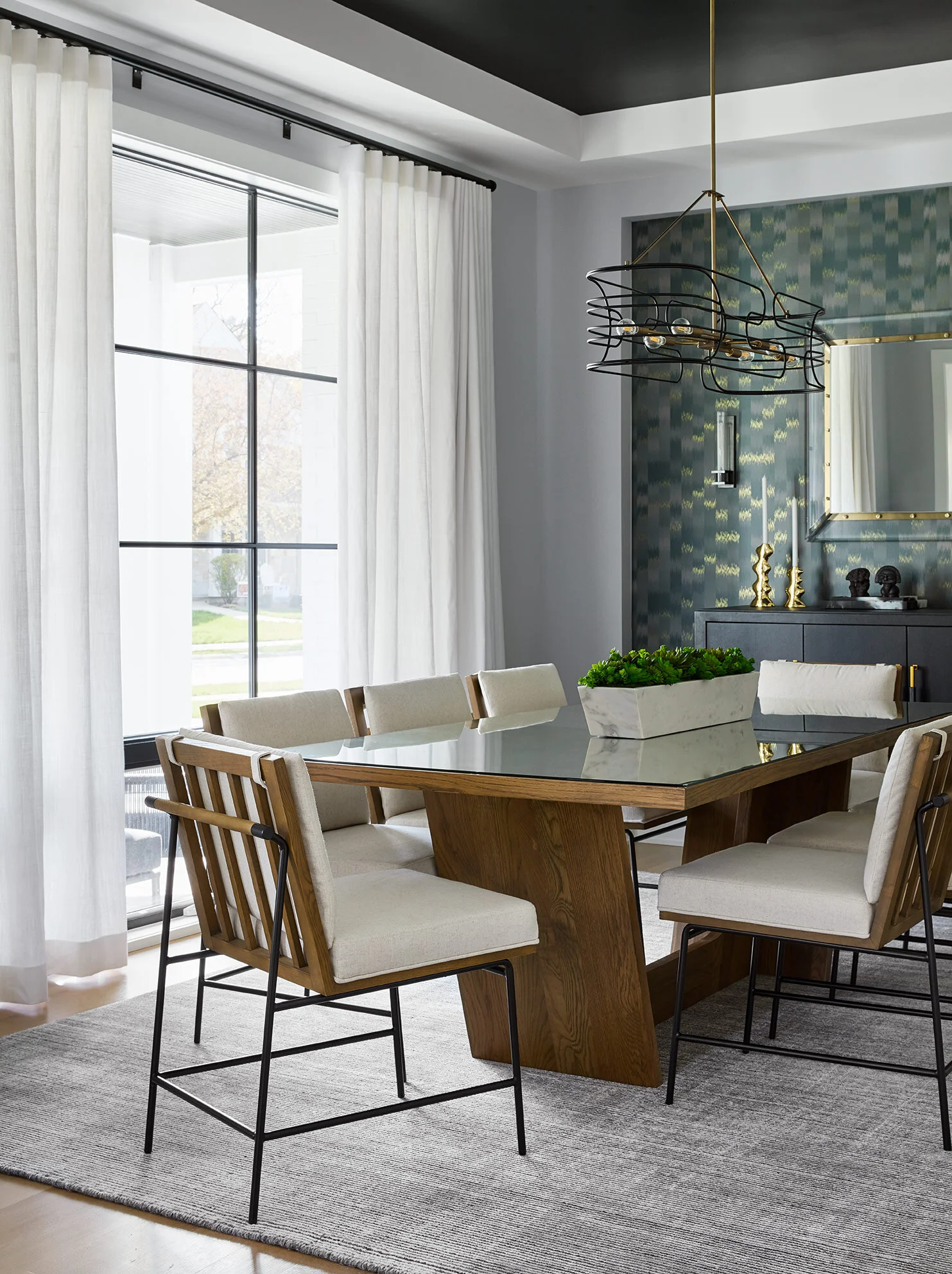
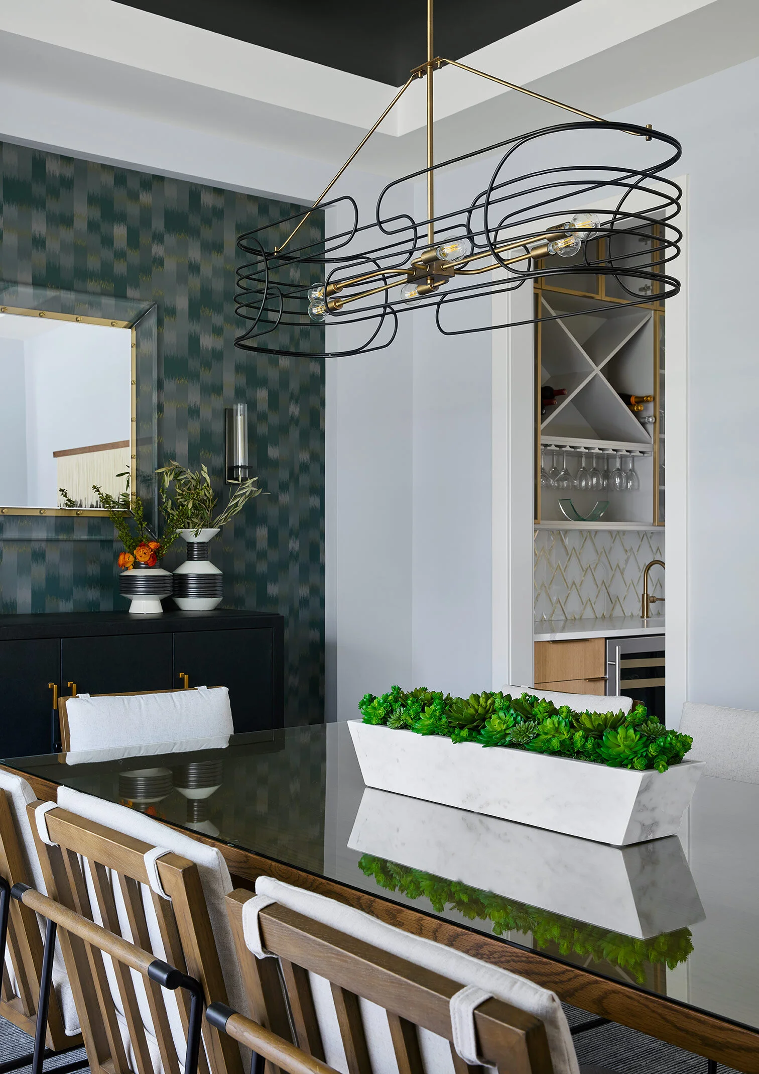
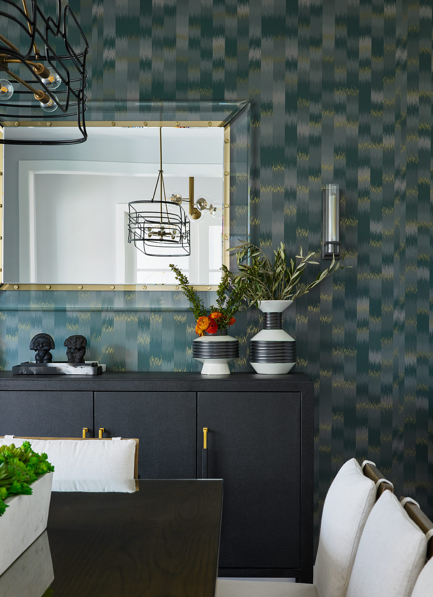
The formal dining room is the first thing you see when walking in the front door, and we wanted to make an impact. A bold green wallcovering along the back wall adds depth and dimension to the room, while a dark, forest green paint in the tray ceiling above draws the eye up and around.
Warm wood tones and sculptural furniture balance out the moodier accents and create an inviting, earthy aesthetic.
A minimal yet sculptural chandelier pulls more texture into the room while mimicking the lines in the chairs.
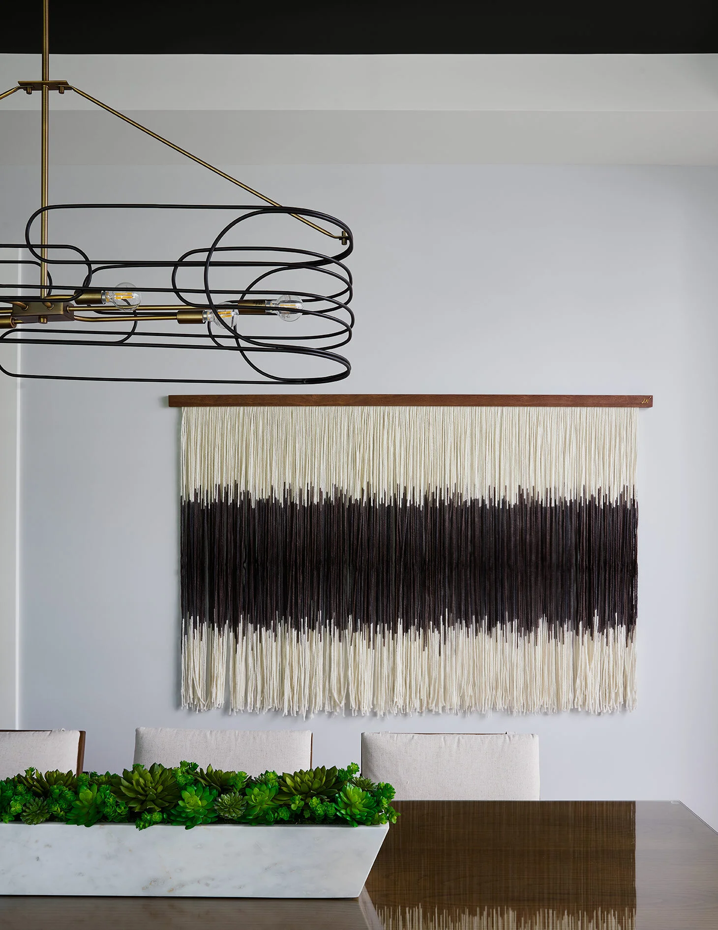
Along the back wall, we knew we needed a strong piece of art to ground the space, as it’s visible from the street out front. A large Lauren William’s tapestry was the perfect piece to add movement and a subtle bohemian touch to the room without overwhelming the space.
A black textural credenza and a Lucite mirror complete the space with crisp, clean lines.
Opposite the dining room, the home office also pulls in some moodier paint colors to add depth and drama.
These built-ins provide ample storage, and just enough space for styling to create the perfect Zoom-background in this new world.
When designing the kitchen, it was important for us to carry in the soft, earthy aesthetic while also creating a space that feels clean, modern and timeless.
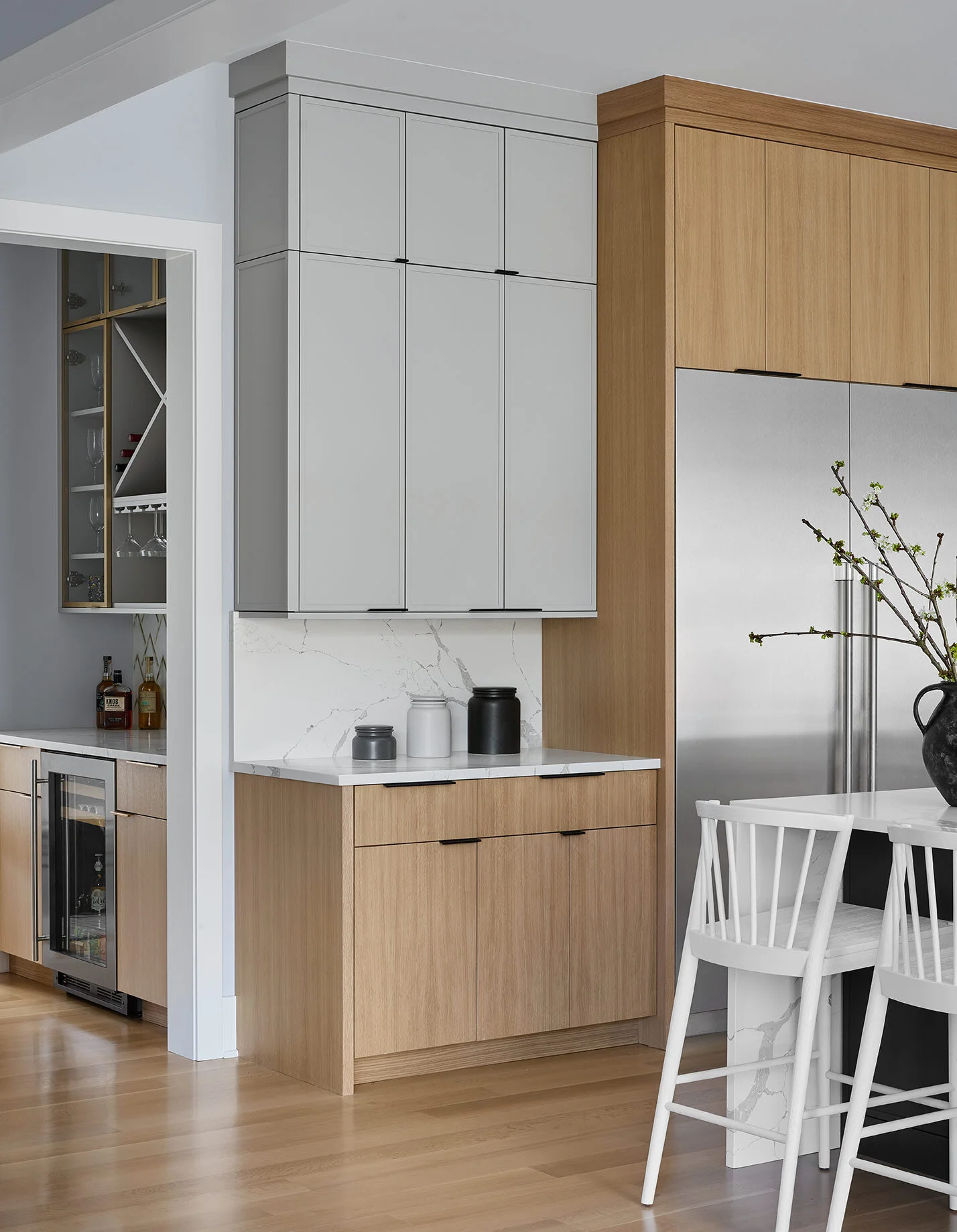
Wood base cabinets match the floors and draw the eye up to the light and airy gray uppers. A thin, minimal profile adds texture to the upper cabinets while still maintaining a modern aesthetic.
The large statement hood is painted a charcoal color, matching the island cabinetry to add depth and break things up. Sconces on either side pull in a delicate texture and mimic the lines in the counterstools.
In the butler’s pantry, we carried in the same tones and opted for glass cabinets with brass framed doors to make the area feel even more special.
Minimal black edge pulls add just the right amount of contrast to the cabinets without breaking things up too much.
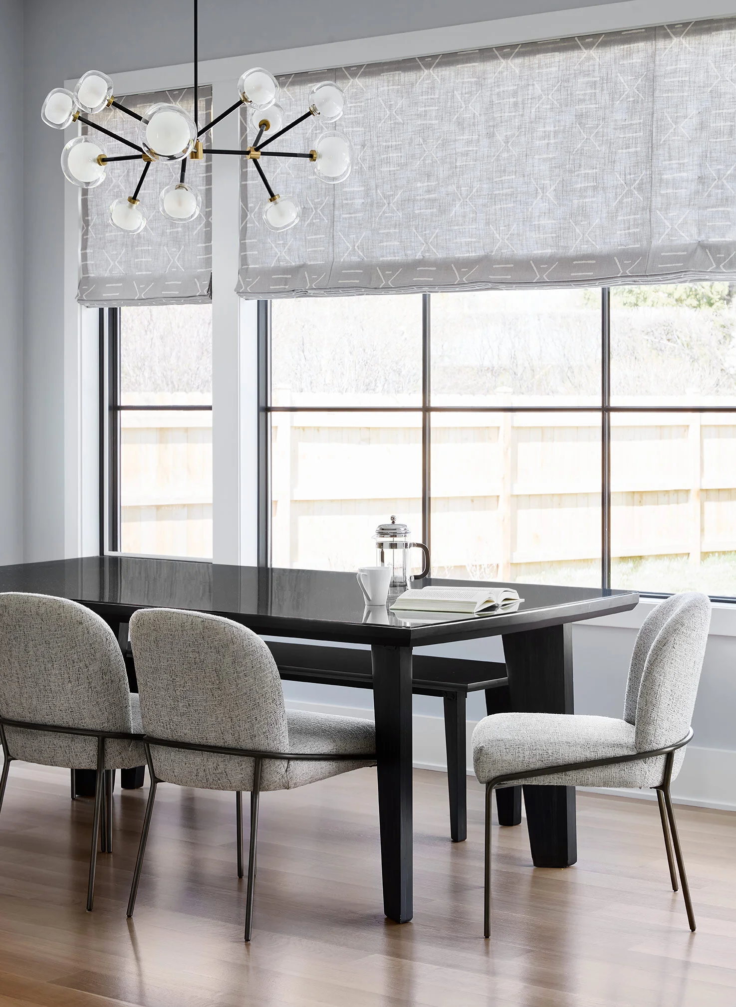
In the adjacent breakfast area, we pulled in a black, sculptural wood table with a coordinating bench and upholstered chairs with a modern tube frame. The chandelier adds an artistic touch to the space while the mudcloth Roman shades pull in the subtle bohemian aesthetic that was introduced in the dining room.
The open living room has so many delicious layers to it. A corner sectional defines the zone, while built-ins along the back wall create a dramatic focal point.
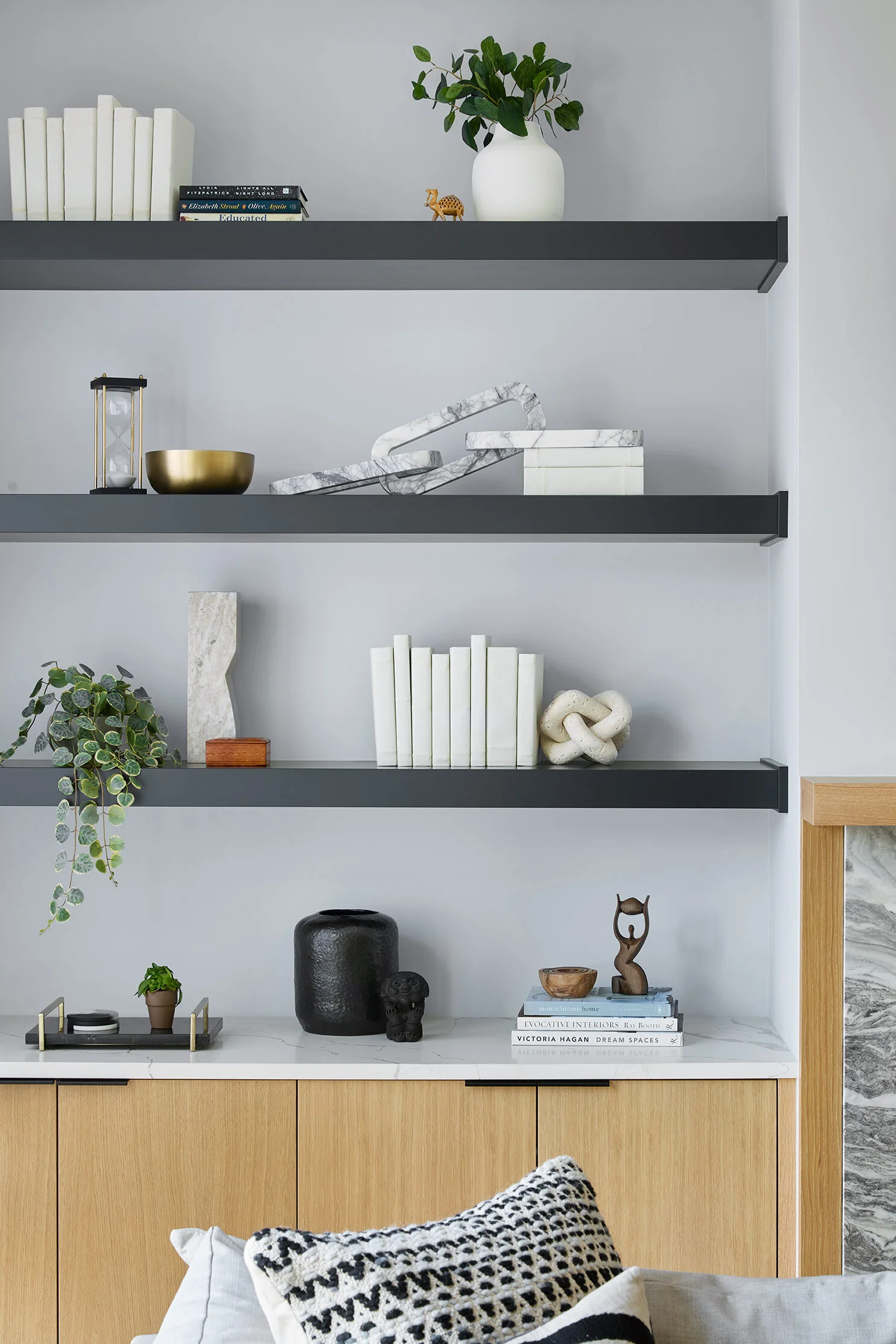
Black floating shelves add contrast to the room while the same wood tones from the kitchen are carried into the base cabinets. We opted to wrap the fireplace stone in the same wood to define the area and mimic the lines in the coffered ceiling above. A rich, swirling marble pulls in the perfect amount of earthy texture.
To round out the seating area, we pulled in a sculptural black leather chair that is comfortable for conversation and interesting from all angles.
We accessorized the shelves with sculptural, neutral pieces, and layered in white linen-wrapped books to add texture. All of the materials that are seen throughout the rest of the home are represented in a smaller scale in the accessories here to keep things cohesive.
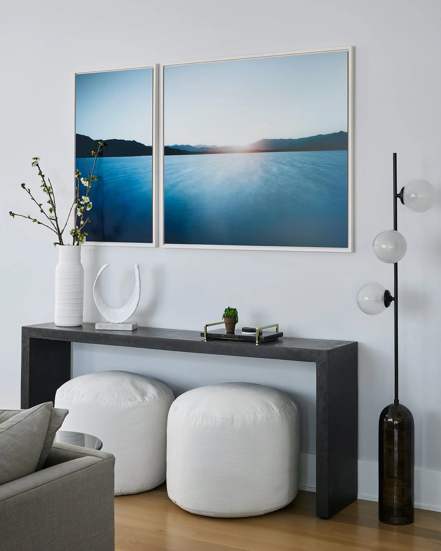
A concrete console table houses two poufs, available for additional seating or ottomans when needed. Above the table, the client’s existing artwork pulls in more earthy, rich blues and creates a dramatic focal point.
Double-layer ripplefold drapes create a soft backdrop for the living room. Black wire accent tables mimic the texture of the counterstools and pull in some contrast without weighing down the space.
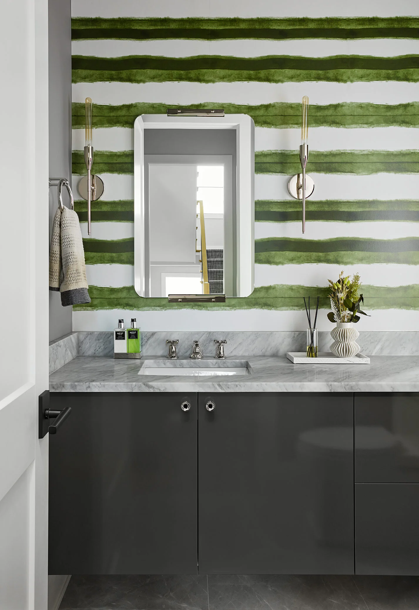
Powder rooms are always out favorite spaces to go bold. We pulled in the earthy greens from the other areas with a bold striped wallcovering and balanced it out with a high-gloss lacquered floating vanity.
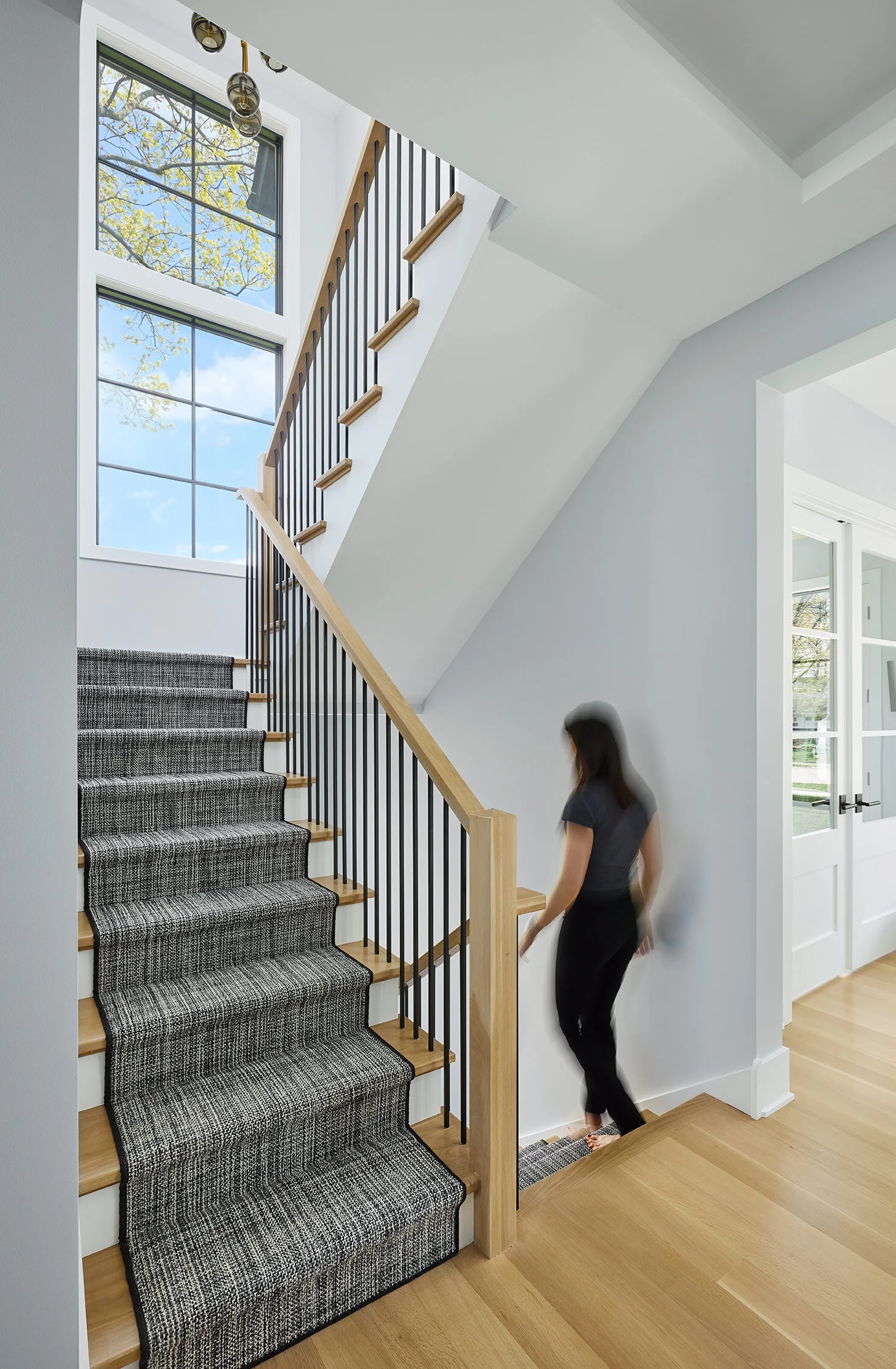
A black and white textural runner softens the staircase and pulls in some rich texture.
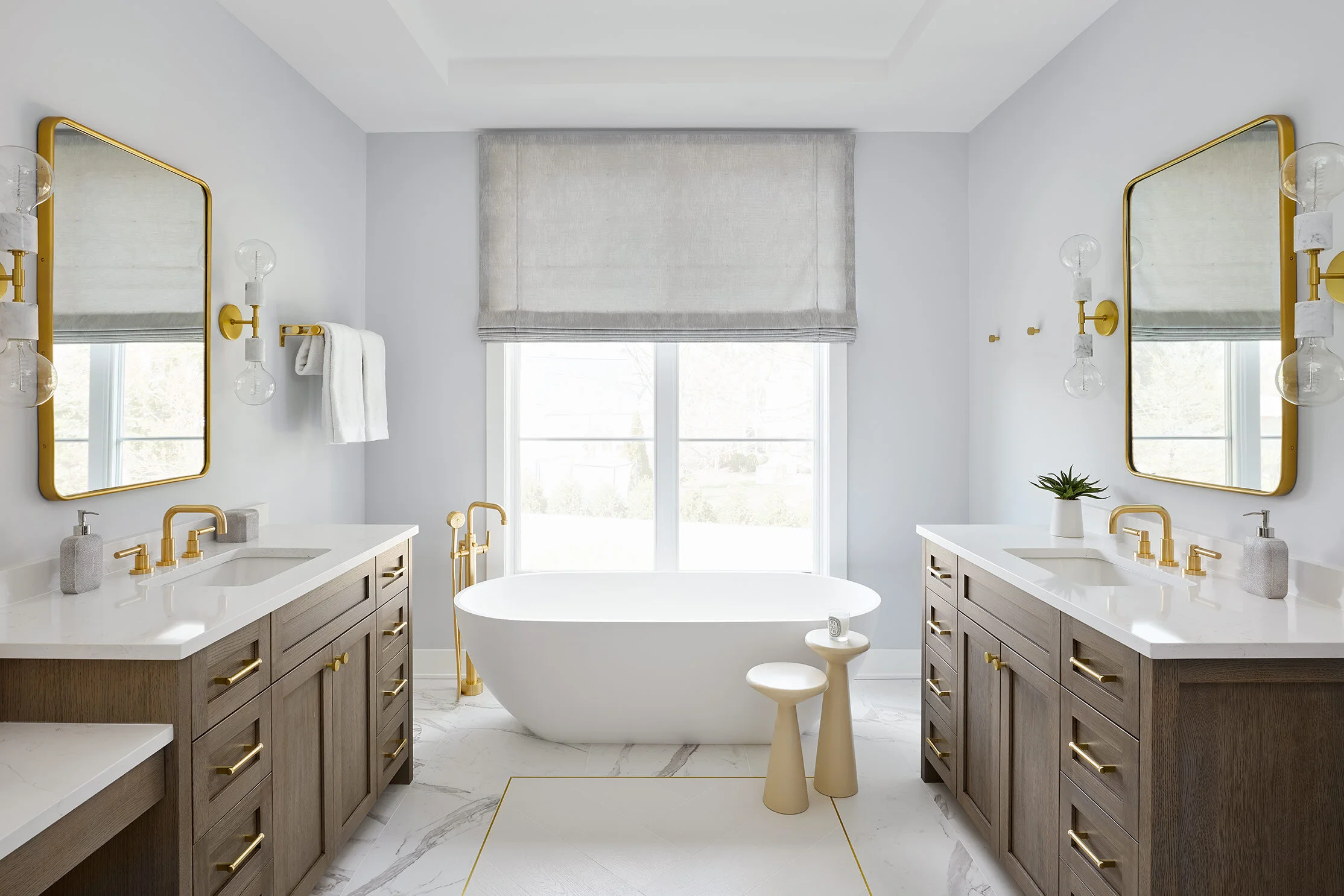
Upstairs in the primary bathroom, his-and-hers vanities frame a sculptural, floating bathtub. To celebrate the stunning layout, we framed a chevron tile inlay with brass strips to create the look of an area rug in the room and help break up the space. Warm wood tones in the vanities and brass and marble accents throughout pull in the earthy textures from downstairs and warm up the space to make it feel extra luxe and inviting.
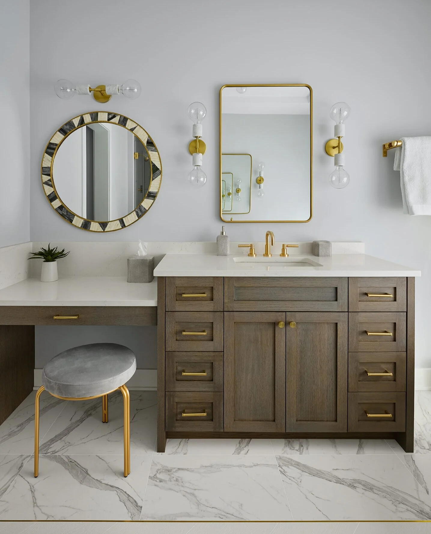
At the makeup vanity, a geometric mirror adds a pop of drama in the room.
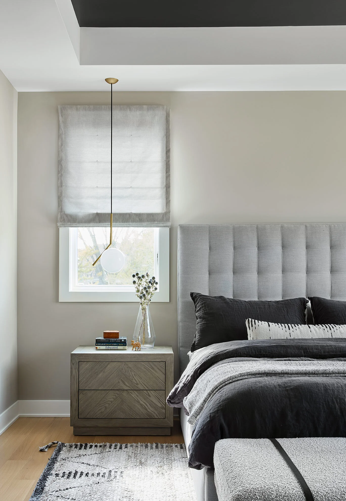
We kept the primary bedroom simple and soothing. We incorporated the client’s existing headboard and contrasted it with dark indigo linen bedding. The area rug and accent pillow pull in similar textures and patterns to create some interest while still keeping the space calm and serene. Pendants hanging beside the bed allow for easy access to light while keeping the nightstands clear and open.
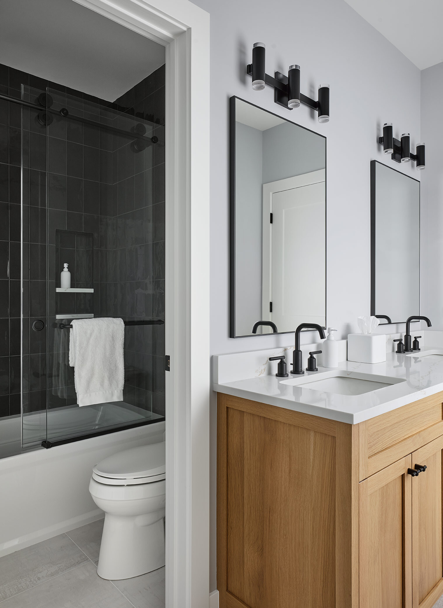
A Jack-and-Jill bath joins two of the bedrooms, and we chose to go bold with charcoal accent tiles in the shower, adding a moody touch. The wood vanity is contrasted with black hardware and fixtures to keep it warm yet edgy.
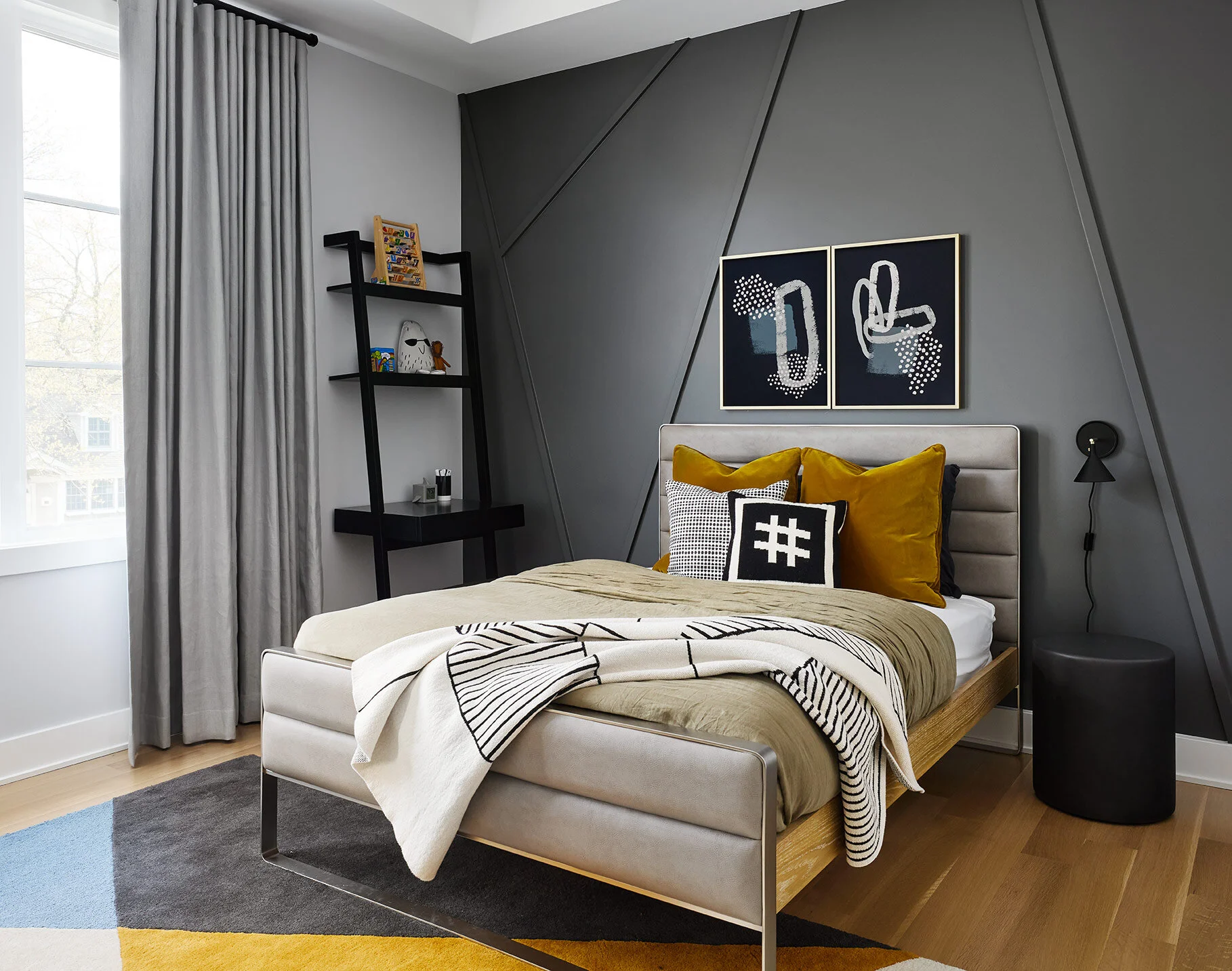
We love when we get the opportunity to design kid’s rooms…they deserve special spaces too! In this young boy’s room, we incorporated an abstract trim layout on the back wall to add a playful touch to the room. Pops of ochre and blue contrast the moody gray wall and balance things out.
We are so happy for this family to enjoy and grow into the home over the years. It’s truly one of a kind and we absolutely love how everything came together. Hope you enjoyed the tour!
-dgw
Architect: Louis Banks Design Build
Builder: Tom Len Custom Homes
Interior Design: Devon Grace Interiors
Photographer: Dustin Halleck

