Home Tour - With a Twist
INTRODUCTION
If you’re at all familiar with Chicago real estate, you know the standard layout of most single-family-homes is a formal living room up front, a dining room behind it, followed by a kitchen and family room. Our team was ecstatic about this project from day one, because the first thing our clients said, was that “they didn’t want a regular living room up front”, but instead wanted a library/cocktail area. We were sold.
The house our clients chose had some really beautiful existing conditions that we wanted to celebrate, like an open, curving staircase, exposed brickwork, and beautiful, large fireplaces. It also had some things they didn’t love, like a primary bathroom with a bizarre layout (including a huge opening between the bathroom and bedroom), and an oversized concrete island counter with an industrial-looking leg supporting it. Our role was to add their own unique character to the space, enhance the existing conditions that we all loved already, and make the space more functional for their growing family.
Pour yourself a cocktail (or a coffee if you must) and enjoy our latest home tour!
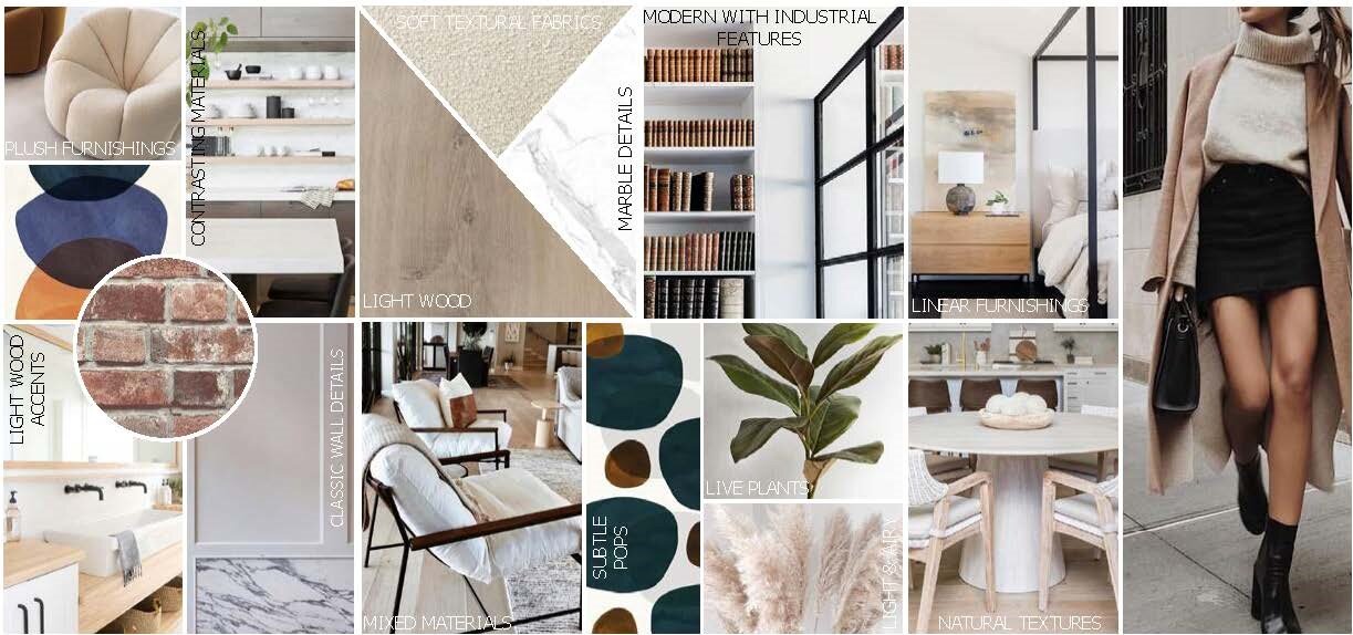
Like most couples, our clients didn’t always agree when it came to design decisions. We found elements that they both responded well to, and made those the core concepts of the design, like black iron detailing and sculptural furnishings, and then layered in elements that they each individually loved, such as pops of bold colors and some classic architectural details.
THE PROCESS
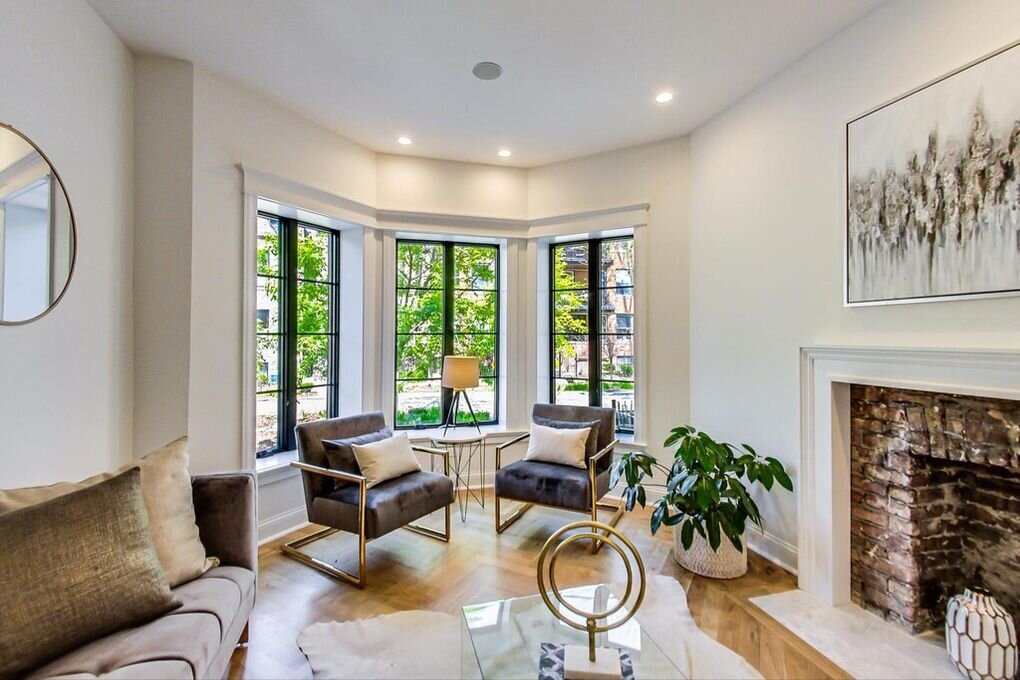
The bones we were beginning with were incredible. This home has beautiful exposed brick, and industrial yet modern black metal details, including a large storefront window in the living room and a floating metal and wood staircase. We wanted to make each room in the house feel unique and special, while still tying into each other with a cohesive aesthetic throughout. We also wanted to break up the white walls and incorporate some moody, bold pops of color, and chose to do so with navy tones pulled throughout the home.
Our clients wanted to transform the front living room into a library/cocktail area. We knew we wanted to keep the exposed brick fireplace, but chose to incorporate some built-in shelving and a bold, moody wall color to add a cozy feel to the space.
The staircase is incredible in this home, and is directly adjacent to the dining room. We knew this needed to be celebrated and kept a focal point in the house.
The kitchen had great cabinetry and a functional layout, but our clients wanted to replace the countertops and add warmth to the space with a new cabinet color.
The family room is huge, and our clients wanted to make this room a lot more functional for their growing family. We needed to incorporate storage for coats and shoes, a pantry area, a breakfast banquette, and also a large sectional that the family can curl up in to watch movies together.
The primary bathroom had beautiful materials, but the layout just wasn’t functional for our clients. The existing space had a toilet and shower down two steps in a lowered portion of the bathroom, a double vanity crammed right next to the door, and a large tub squeezed in beside it. The most unusual part, was the large opening beside the vanity, providing anyone in bed a clear view directly to the toilet…we needed to change that asap.
We always present renderings of our designs to our clients to help them visualize what we’re proposing and bring the presentation to life. Here are a few from the presentation:
In the library, we went with a tone-on-tone aesthetic, sweeping a bold navy across half the room, including custom built-ins that we wrapped around the fireplace, and layering in navy accent chairs in the bay window.
In the dining room, we carried in the materials from the staircase and anchored a mirror along the side wall to reflect the staircase and expand the room even further.
The primary bathroom got a big adjustment. We started by closing the hole in the wall, and relocating the vanity to be underneath the window, where the tub used to be. In it’s place, we moved the toilet so that in the lower level, we were able to create a wet-room with a steam shower that houses the tub inside of it for a true spa experience.
THE REVEAL
This design came to life even better than we had imagined. We incorporated a ton of custom built-ins throughout the space to add storage while also incorporating unique design elements.
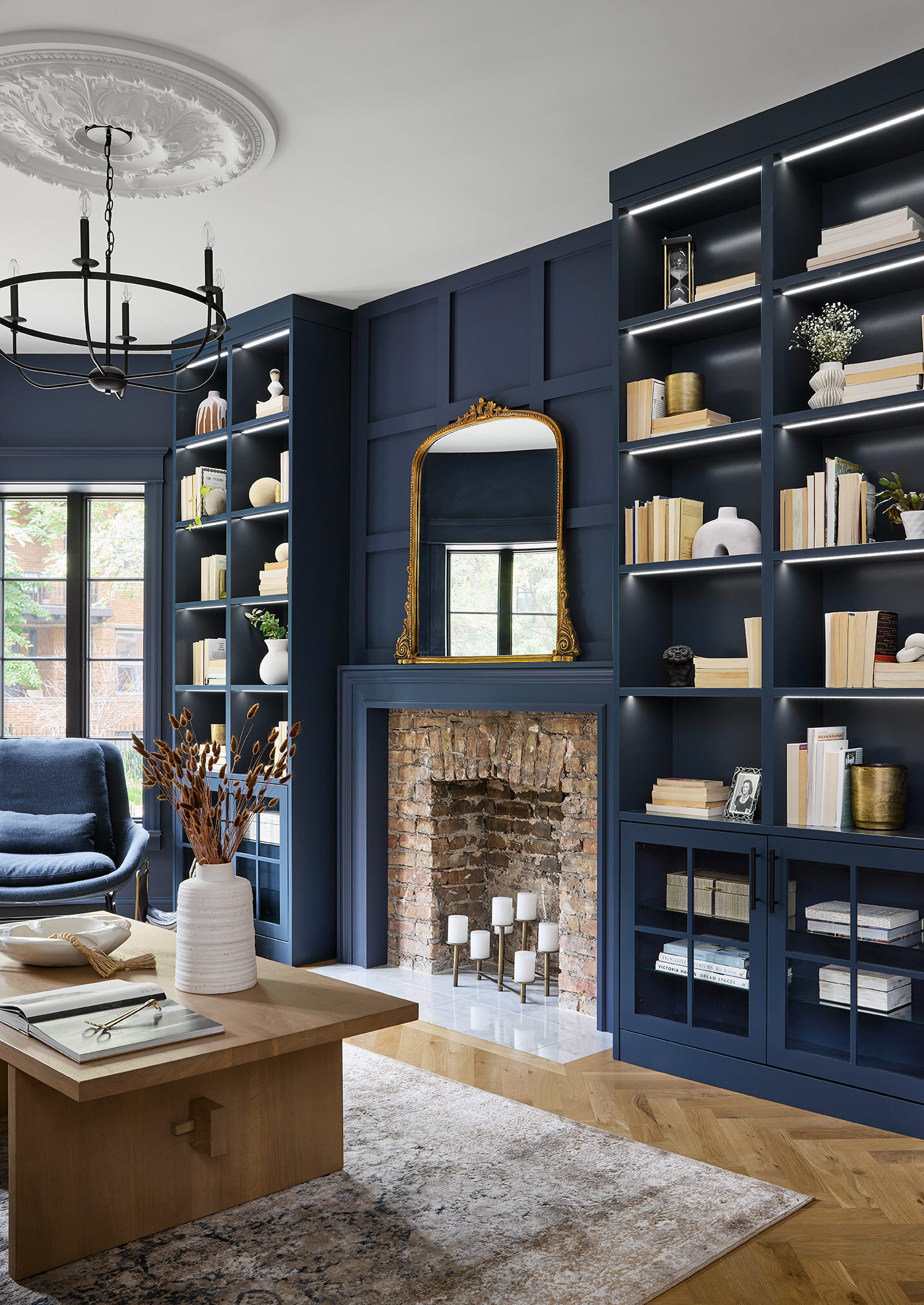
The front library/cocktail room was transformed into a moody, warm and inviting spot. Perfect for curling up with a book and Old Fashioned.
We incorporated modern, sculptural furnishings while also carrying in some more classic architectural details like the paneling on the walls, and a rosette on the ceiling.
Above the fireplace, we carried the same paneling across to marry the built-in bookcases on either side and make the entire wall feel integrated.
LED strip lighting in the shelves brings the space to life and balances out the dark, moodiness of the wall.
All of the materials in this space come together to create a warm and cozy environment. The deep blue tones also help celebrate the warm, rich tones of the existing brick fireplace.
Adjacent to the library, we went completely neutral in the dining room to let the spaces each stand out on their own. We made sure to carry in similar elements like the black metal detailing and warmer wood tones to ensure they feel cohesive.
Clean lines replicate the language from the staircase and let the sculptural accents in the library stand out.
An oversized mirror between the wall sconces mimics the lines from the windows on either side of it, and reflects the curving staircase, bringing it to life in the space from any angle. We opted to black-out the niche behind the dining room to carry in some of the drama of the front library, while still remaining neutral, and tucked in a cabinet that relates to the mirror.
In the kitchen, we removed the concrete countertop and replaced it with a graphic porcelain countertop with a thick mitered edge. An asymmetric waterfall down the end of the island creates a modern, clean transition while also introducing a graphic backdrop to the family room. We added warmth to the kitchen by painting all of the white cabinets a warm, greige color and swapping in brass hardware. The lights above the island were swapped out for leather wrapped brass pendants that tie in perfectly with the cabinet paint color.
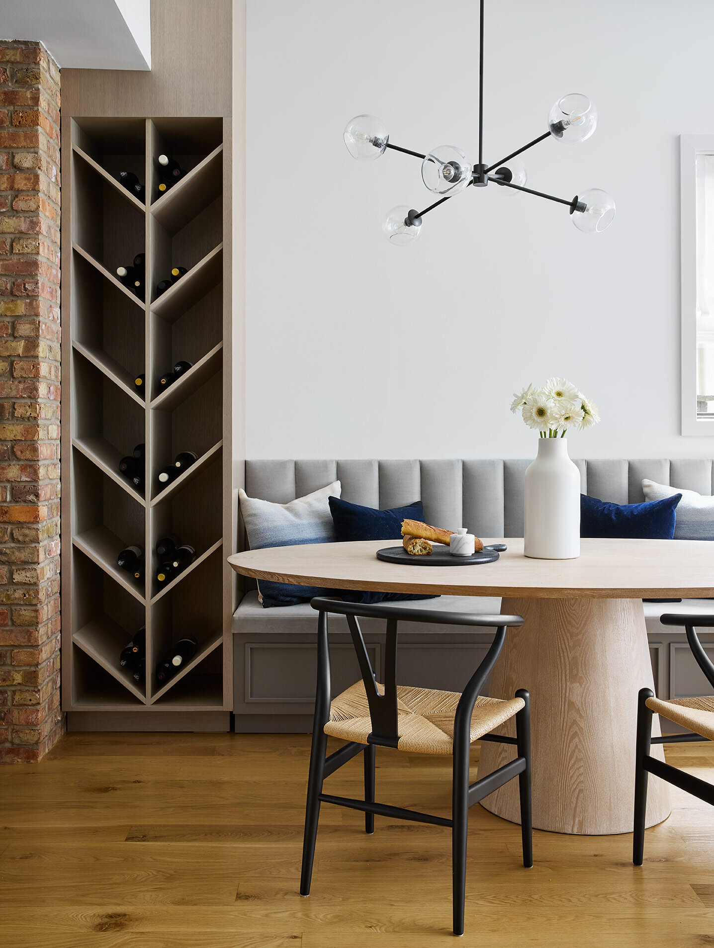
In the oversized family room, we stole some real estate to create a breakfast banquette and wine storage. The floors in the front of the house are a chevron pattern, so we carried that into the design of the wine storage to add a unique touch. Next to that, we incorporated a built-in banquette with a channel-tufted back and a modern, pedestal style table with wishbone chairs.
There was still plenty of room leftover in the family room to tuck in a large U-shaped sectional for our clients to relax in. We opted to keep the walls white back here but pulled the navy tones in from the living room in a textural fabric on the sofa.
Flanking each side of the fireplace, we designed massive rift-cut white oak built-ins that provide storage for coats, shoes, kid’s toys and even a pantry for food storage. With that, we were still able to incorporate plenty of open shelving to accessorize and add some texture to the room.
Custom built-ins are all about making a space as functional as possible for a family. On the left is a coat closet with shelves for shoes and accessories. Underneath the open shelving, we incorporated both drawers and cabinets for kid’s toys to be hidden away in.
On the opposite side, we hid the cable box and subwoofer for the TV. In order to make those function properly inside the cabinet, we incorporated brass mesh on the doors in place of the solid wood.
The fireplace also got a transformation with bookmatched porcelain slabs, creating a dramatic “V” shape and adding an elegant, classic touch to the space.
Upstairs, we wanted to carry the same language into the primary bedroom to keep the design cohesive throughout the house. On the ceiling, we incorporated applied molding in an elegant, geometric pattern .
Between the windows, a black iron canopy bed brings some drama without crowding the space, and gives a nod to the black metal linear language throughout the rest of the house. Above the dresser, we incorporated a structured gallery wall of family photos, mimicking the lines of the paneling downstairs and in the hallways.
On either side of the fireplace, we incorporated more custom built-ins to make the space perfectly functional. To the left, a bank of drawers was topped with tall cabinetry housing a coffee station, and floating shelves above for accessories. On the other side, tall cabinetry and a floating vanity with wall sconces provides the perfect place to get styled and ready for the day.
At the coffee bar, we incorporated pocket doors that push out of the way, and a roll-out shelf making the coffee station easily accessible in the early morning hours. Above the fireplace, we incorporated more applied molding to add a classic touch and tie in with the detailing on the lower level.
By relocating the bathroom vanity underneath the windows, we had to get creative with the layout. We opted to center the two sinks and pushed the storage to the outer sides, in order to take advantage of the height and frame the window. Beneath the window, we suspended a mirror from the ceiling, to again introduce some black metal detailing, and allow natural light to pour in above the mirror and enhance the user’s experience.
What used to be a sad toilet and shower area, transformed into a spa-like wetroom. Wood-look tile creates a warm, inviting cocoon around the freestanding tub, while moody concrete tile wraps the shower portion of the wet room.
This project was incredibly unique and special to our team. There were some risks taken in the design and we love nothing more than when the clients trust our vision and love the end result. We hope you all enjoyed the tour!
-dgw
Photos: Dustin Halleck


