Home Tour - Transitional Elegance
Introduction
It’s extremely rare that we come across a client that has narrowed down their design aesthetic to just one style. Most often, our clients come to us with the challenge of marrying two or more styles into one cohesive space. Getting the combination just right takes the expertise of a designer, and it’s part what makes our job so special. When DGI was brought onto this project, our client had just purchased a larger condo in River North and she was looking to create a space that truly felt like her own. Originally from Bulgaria, she was drawn to the European, minimalist vibe but also loved the feel of classic, transitional spaces that incorporate a feminine touch. DGI was excited for the opportunity to take on a gut renovation that would result in a space that felt completely customized to our client’s aesthetic. We absolutely love how the combination of styles came together, and we are thrilled to finally reveal this home tour!
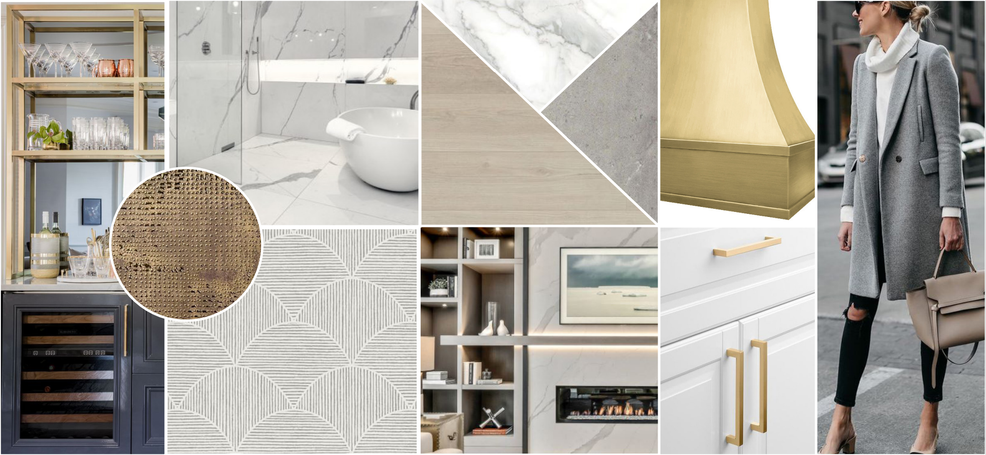
The moodboard that we developed at the initial phase of the design process pulls together clean lines, luxe textures, and warm accents in a modern yet classic way. We refer back to our moodboards often throughout the design process to maintain a cohesive feel from space to space.
BEFORE
The existing condo had so much potential (and stunning views!) to work with, but DGI knew we could drastically improve the layout. The existing kitchen was tucked away into the back corner of the space and the primary bathroom felt dark and closed off. The immense amount of natural light and the views of the city and the lake outside deserved to be celebrated from every area of the home. So it was important to focus our biggest transformation efforts on opening up the kitchen and the primary bathroom.
It’s common to see small, tightly squeezed kitchens in city real estate. This existing kitchen was closed off and U-shaped, which posed some layout challenges for our team. But we had goals of opening up a few walls to give the kitchen an entirely new, open, & airy feel that our client was looking for.
The primary bathroom also had a ton of under-utilized space to work with. We immediately envisioned a more elevated, spa-like feel for the primary bathroom that took advantage of the natural light that pours into the bedroom on the other side of the wall.
THE PROCESS
DGI proposed a brand new layout for the kitchen, which took it from a closed off U-shape to an open and airy L-shaped kitchen with a large island. We opted for white cabinetry along the perimeter to really celebrate the bright and open space.
THE REVEAL
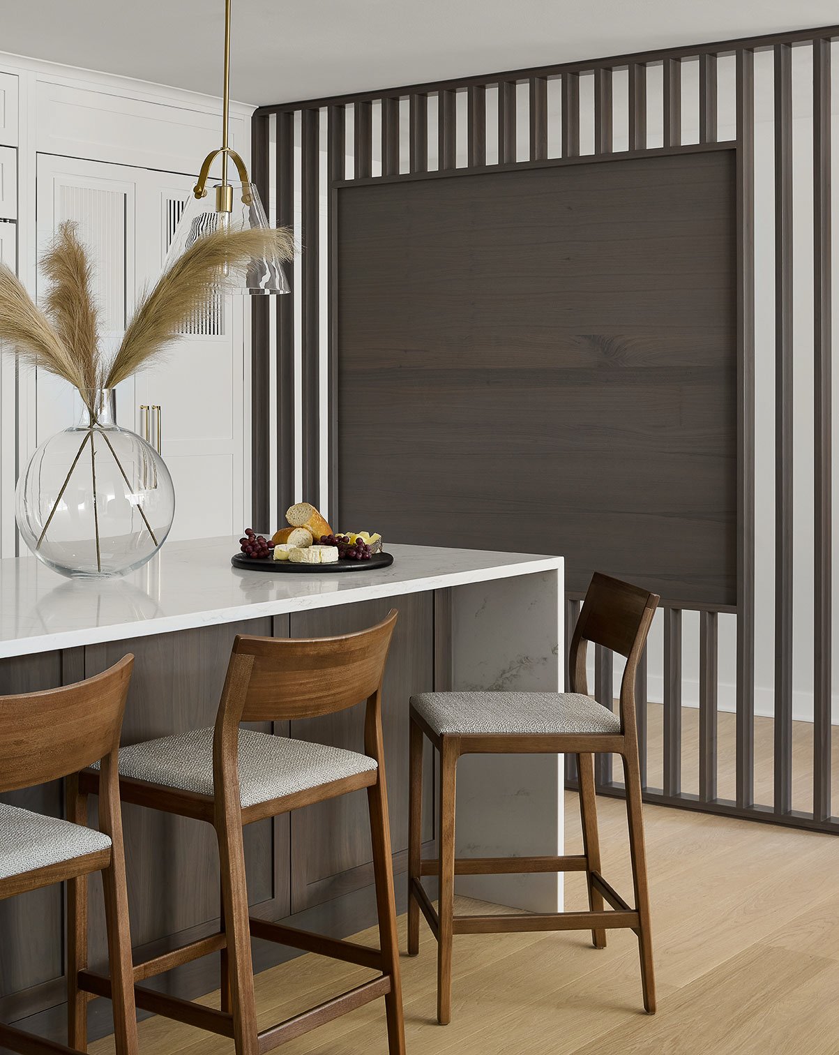
With a fresh design and floor plan, this kitchen truly feels like the heart of the home (as it always deserved to be). We eliminated the wall to create a more functional L-shaped layout with room for a large island. This created the open feel between the kitchen and living spaces that our client was drawn to. We opted for white cabinetry along the perimeter, but we decided to add some depth and contrast through a flat sawn walnut island with a custom grey stain. We anchored both sides of the kitchen with floor to ceiling cabinetry for a balanced look. On the left side, this created storage for a spacious pantry. And on the right side, we concealed the fridge and freezer with custom cabinetry panels.
At the far end of the kitchen, we used the same custom white cabinetry panels to conceal the existing HVAC and give the illusion that the kitchen cabinetry extends even further. The custom slatted detail on the upper section of the panels creates ventilation for the HVAC without creating an eye-sore in the beautiful kitchen design. DGI also designed a custom slat wall in the same finish as the island to create a visual barrier between the kitchen and entryway that still allows light to flow through both spaces.
To celebrate the new open and airy feel in the kitchen, we opted for white cabinetry along the perimeter. We went with a Shaker profile to incorporate a classic, transitional look that still feels modern and clean. Then we selected a dimensional backsplash tile with a glossy finish to bounce light around and create a beautiful texture along the walls of the kitchen. To add a really modern an elegant touch, we installed a satin brass faucet from Dornbracht and polished brass hardware throughout.
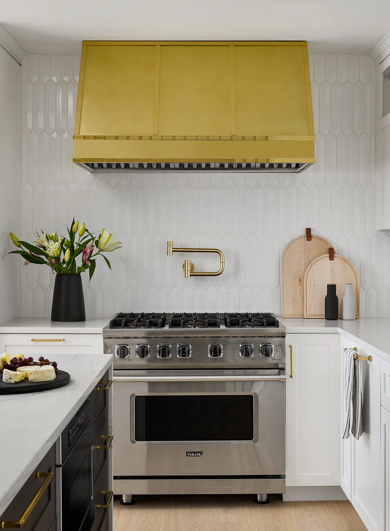
With classic and minimal white cabinets, we knew this kitchen needed a focal point. So, we designed a custom hood to create a statement along the back wall and add plenty of warmth to the light and bright kitchen.
This hood deserved a close-up headshot of it’s own. It creates a grounding element on the side of the kitchen, and the custom finish combines both the polished and satin brass accents seen throughout the rest of the kitchen to really tie everything together.
Right off of the kitchen, DGI designed custom built-ins for our client’s “must-have” wine bar. We opted to carry over the same walnut finish and shaker profile seen at the kitchen island to help it feel as if it is an extension of the kitchen. We really wanted to celebrate the views outside of the floor-to-ceiling windows beside the built-ins, so we opted to install an antique glass backsplash in the center. It helps to bounce even more light around the space, as well as extend the views of Lake Michigan and the Navy Pier Ferris Wheel even further.
Similarly to the kitchen, we decided to anchor both sides of the built-ins with floor-to-ceiling towers. The clean lines of the cabinetry and sleekness of the open shelves are balanced out by a decorative arch in the center that gives the built-ins the classic touch our client was drawn to. We completed the built-in design with sleek glass shelving to display decorative barware and accessories.
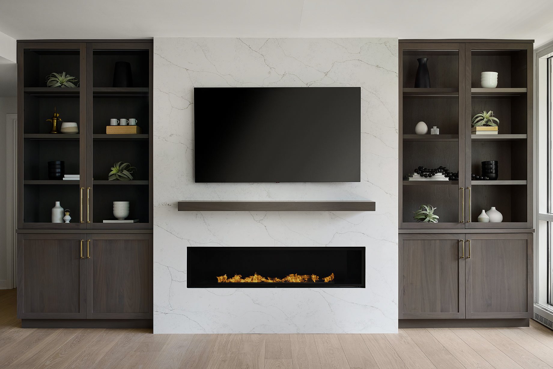
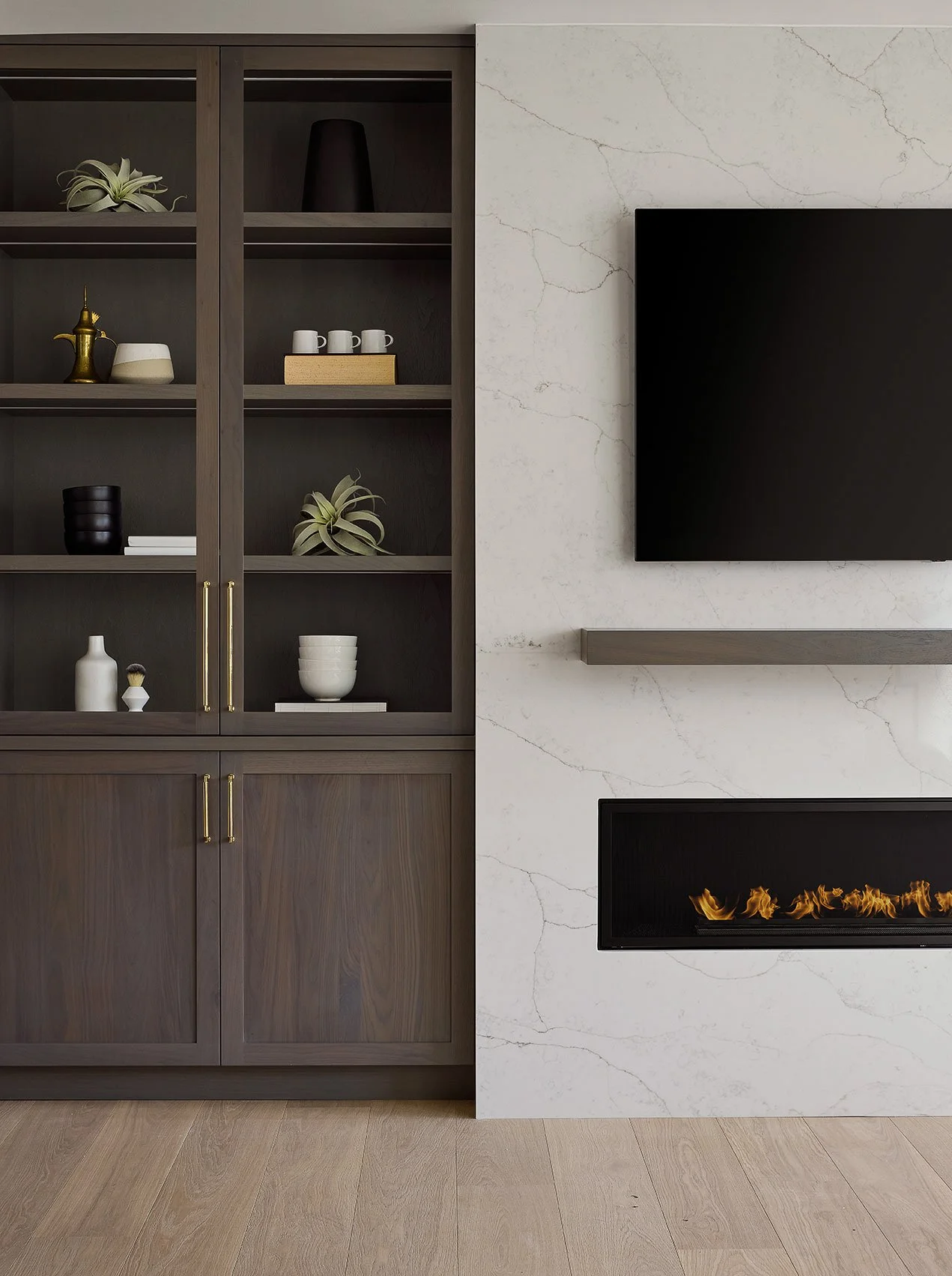
Directly across from the wine bar, DGI added a linear fireplace wrapped in a minimal stone surround, and we designed another set of custom built-ins on either side. If there are two things every Chicago home needs, it’s additional storage space and a large fireplace for the long and cold winters.
The cabinetry profile and finish mimics the wine bar and kitchen island to maintain a flow between the spaces. However, for the upper bookcases we decided to switch it up with glass cabinet fronts to display personal accessories and decor.
The stone fireplace surround is minimal in detail to achieve a modern look, and it introduces a subtle texture to the living room with it’s delicate veining. Inside the bookcases, we integrated LED strip lights to illuminate accessories and books even more.
The powder room design really pulls all of the spaces together, combining a modern aesthetic with elegant tones and textures. We designed a floating vanity in the same walnut finish seen throughout the home. This time, we opted for a more minimal profile and a mitered edge marble countertop to add that modern feel. Then we installed a geometric marble floor tile and a luxe wallcovering to introduce rich textures that add a touch of elegance. The brass faucet from Dornbracht adds a pop of warmth with clean lines and a minimal look, while the polished nickel light fixtures add a classic sparkle.
The primary bathroom is the definition of “spa-like”. Our client really wanted the space to feel light, airy, and minimal, and we achieved the look through natural textures and clean, continuous lines throughout the entire bathroom. We opted to add a window along the top of the left wall that allows natural light to flow into the space for an airy feel. The fluted, wood-look tile introduces a natural warmth to the bathroom. There’s nothing more classic and elegant than marble veining, so we decided to wrap the rest of the space in a Statuario-look tile in a large format to give it a more modern feel.
DGI was able to achieve a luxurious feel without compromising our client’s modern aesthetic through an elevated platform that allowed us to design a wet area for the shower and free-standing tub. It was designed to feel like one, continuous space, so we installed a single fixed-glass panel in the shower area for the most minimal look. Rather than a niche, we opted for one continuous ledge along the back wall for bath soaps and other shower products.
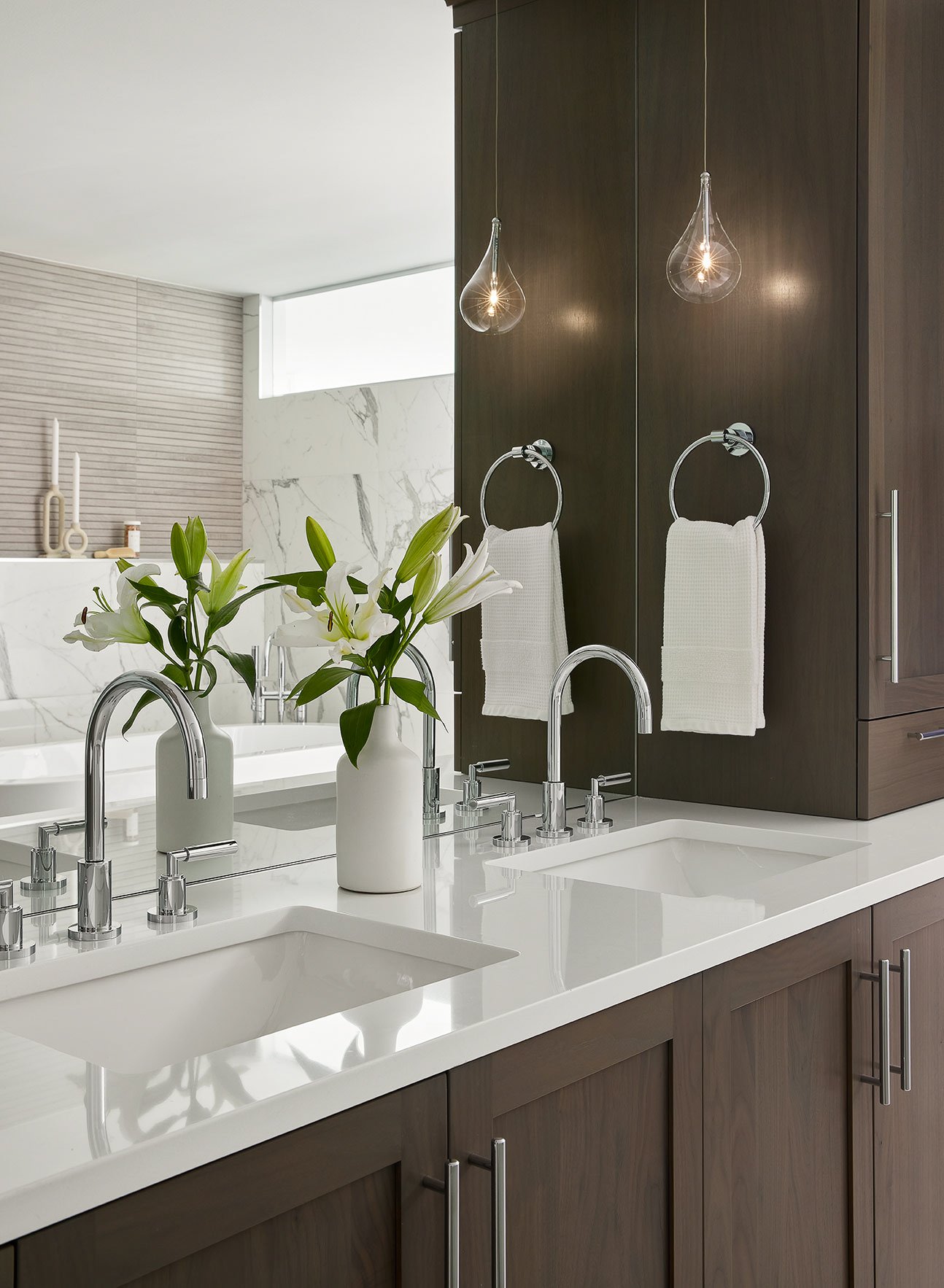
A spacious double vanity with towers anchoring both sides gives the bathroom ample storage space. Are you surprised? We carried in the same cabinetry finish and profile seen throughout the rest of the condo for a seamless flow between the spaces.
Minimal white countertops and polished chrome plumbing fixtures by Dornbracht give the vanity a sleek and modern touch. We opted for a custom mirror to fit perfectly between the vanity towers for a seamless look. Sculptural pendant fixtures add the perfect touch of ambiance without taking attention away from the rich wood tones and sleek details of the vanity.
Each project at DGI is a true demonstration of teamwork. We’re proud to celebrate Emily for leading this beautiful design, merging multiple design styles and transforming layouts to create a space that is completely tailored to our client’s personal needs and aesthetic. After months of design and construction, we are so excited to finally reveal the photos of the finished space! It is even more luxe and beautiful than we imagined.
That completes the home tour of this transitional yet minimal home in River North. We hope you enjoyed the tour of our design, which was all about combining modern and minimal elements with classic and transitional touches. Until the next home tour…
-dgw
Photography: Dustin Halleck

