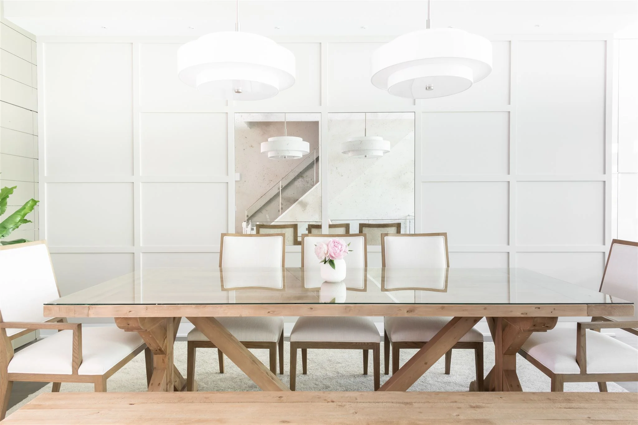
Mini Home Tour - River North Dining Room
INTRODUCTION
We have had the pleasure of working with this special client on two phases on their project at this point. When this couple bought their home last summer, we stepped in to help swap out flooring, paint the walls throughout and add in new window treatments. This year, we helped them pull the first floor together with some updated light fixtures, finishing touches in the living room to work with their existing furnishings, and a bold new dining room which is what we’re featuring on today’s blog.
THE DESIGN PROCESS
This home started with maple floors and crystal chandeliers everywhere, but had some beautiful modern elements and an incredible layout. In the first phase, we pulled in darker floors with rich, chocolaty undertones and a more muted, gray presence. During our imaging phase for the second part of the project, we learned that the client wanted to soften the ultra-modern touches of the adjacent kitchen with some modern-farmhouse elements to add some character and make a really welcoming first impression when you come up the stairs.
We reflected this in the moodboard we created with light oak wood tones, warm neutrals and interesting yet subtle geometric patterns.
When we started, the living room and dining room felt like one oversized room. We wanted to define the dining room, to allow it to be it’s own space and create a strong first impression when you come up the stairs from the front door, since it’s the first thing you see.
Our big move in this space was to add paneling to the dining room wall. There were existing planters built in on the wall separating the dining area from the kitchen, so we picked up that linear language and mimicked it with a modern take on a board and batten wall. In the center, to really expand the space and add drama, we incorporated two antique mirrors. To soften the space up, we pulled in a modern farmhouse table and chairs and added a second junction box above the table so we could have two lights instead of just one.
We presented 3D renderings of the design to our client to show them exactly how the space would feel so they can visualize it and really understand the design.
THE REVEAL
We made some adjustments to the design, studying different chair options and ultimately swapping three chairs for a bench. The final result is an inviting, bright space that commands attention when you ascend up to the first floor. The modern paneled wall is softened with the antique mirror panels and defines the space nicely between the living room and kitchen.
It always amazes me what a big impact just one space can make on a home. This dining room sets the tone for the floor and marries the modern kitchen with the modern farmhouse living area that it stands between.
Hope you enjoyed!
-dgw
Design Team: Devon Wegman and Sandra Chavez
Photography: Gene Yoon


