City to Suburbs
INTRODUCTION
This project was incredibly special to work on, because I actually had the pleasure of working with this client three years ago on her last home! This family decided to move from Lincoln Park to the Western Suburbs and needed to make some updates to their new house in order to make it work for them.
Obviously the biggest (and most enjoyable) change for them, was that the new house was so much bigger than their home in the city! We helped set up a formal dining room, a sun-filled family room and a true master suite by combining the guest room and master bedroom, allowing us to create a walk-in closet and a much larger master bathroom.
THE DESIGN PROCESS
The moodboard for this project depicts a cheerful, warm and inviting space with brass accents and fun geometric patterns and classic details.
The first challenge was figuring out how to reconfigure the master bedroom to create a larger bathroom and a true walk-in closet. We achieved this by merging the two bedrooms, shifting back the entry to the bedroom and turning the existing bedroom into a closet. We then merged one of the existing closets with the bathroom to create a larger bathroom where we’re able to fit a larger walk-in shower and a double vanity.
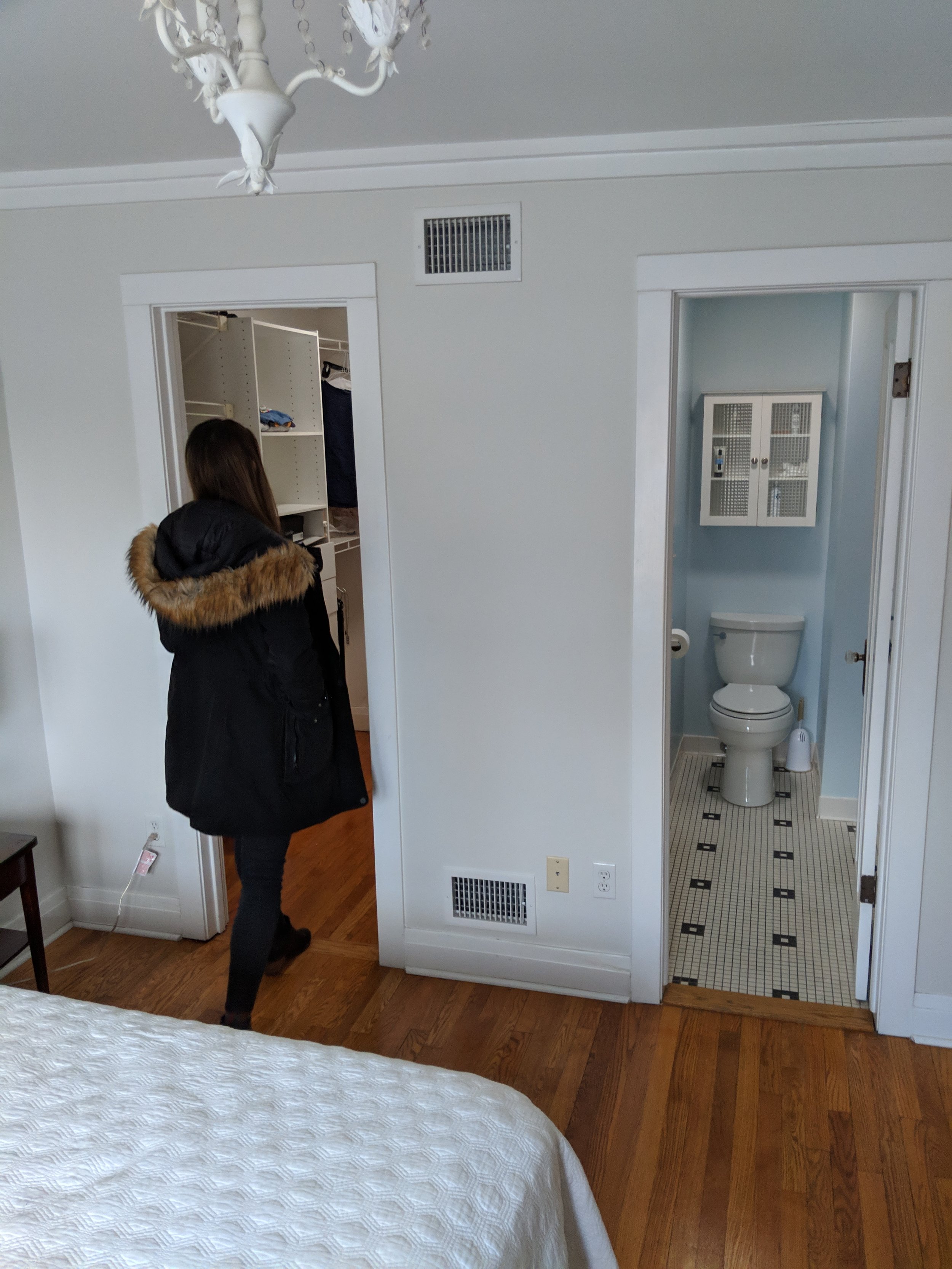
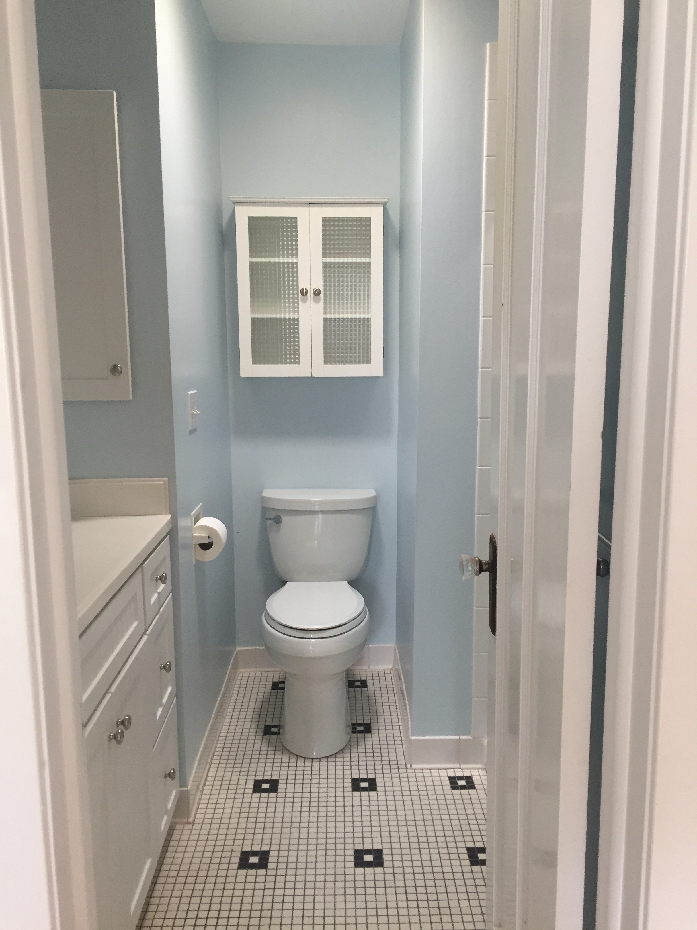
The original master suite was hardly a suite. The bedroom could barely fit a king bed, the closet was cramped, and the bathroom…
…the bathroom could hardly fit one person let alone a couple.
The existing dining room was surrounded with windows, and had a unique ceiling with beautiful beams running across it to add some height and texture to the space but it needed to be brightened up, and it deserved a longer table to really take advantage of the space.
My favorite room in the house, the family room, is sunken off the kitchen and has sunlights that flood the room with light. This room needed some contrast and needed a better layout to make it more usable.
THE REVEAL
We pulled in some fun, cheerful patterns in this space to add contrast to the otherwise light and soft bathroom. The gray and marble vanity gets warmed up with brass accents, which we carried throughout the rest of the bathroom in plumbing fixtures and door hardware.
Behind the vanity and in the shower, we installed long subway tiles to give a modern yet familiar feel and add a soft touch to balance out the bold floor tiles.
Above the vanity, there’s a skylight that floods the space with natural light. The perfect spot for doing makeup!
In the shower, we carried in large format white tiles towards the front and back and then played with the pattern of the long subway tiles on the side wall so that all of the horizontal grout lines aligned with the larger format tiles.
Every three rows, we introduced a white Schluter trim piece to break up the pattern and add some texture.
Now that the bathroom took over the existing closet, we converted what use to be the master bedroom into a large, walk-in closet.
The closet acts as a buffer space between the bedroom and bathroom and creates a true “suite” for the couple to enjoy.
In the bedroom, we pulled in a black accent wall to tie into the contrast in the bathroom and add a dramatic backdrop behind the light, white bed. Where the existing closet used to separate the two bedrooms, there was a niche left behind, which we filled with a floor-length mirror to create a true “dressing area” adjacent to the closet.
Our client fell in love with this chair during the design process and it became the perfect sitting area in the niche beside the bed.
In the dining room, we painted the ceiling beams white and added some contrast with a light gray paint on the ceiling between them. At the end of the room, a navy wall adds some contrast and breaks up the space. We carried in a light neutral rug and a dramatic, modern dining table with brass detailing. The chairs around the table are navy velvet with brass accents and we pulled in modern cane chairs at the head. To top it off, we pulled in a modern, sculptural chandelier that fills the space and adds some playful, bubbly sparkle to the space.
I couldn’t get enough of the chandelier! It’s quiet yet bold at the same time and adds the perfect amount of drama to the space.
One unique detail in this home is that there are large cutouts between the rooms, allowing for separate spaces that are also tied together. We carried the same navy accent walls throughout to create a cohesive feel and add some contrast.
This family room is perfect for both sunny days and rainy mornings. We introduced two sectionals to round out the space and create the perfect areas to curl up in front of the fire or TV. Beside the TV, we carried in the same shelves I installed in the clients last home to add some texture and styled them with some brass accessories to tie everything together.
The only thing more enjoyable than working with a wonderful client is getting to work with them twice! I’m so happy this family found their perfect home in the suburbs and can’t wait to see how they enjoy and grow in it over the years to come!
-dgw
Design Team: Devon Wegman and Sandra Chavez
Photography: Gene Yoon


