River City Apartments - Part Two
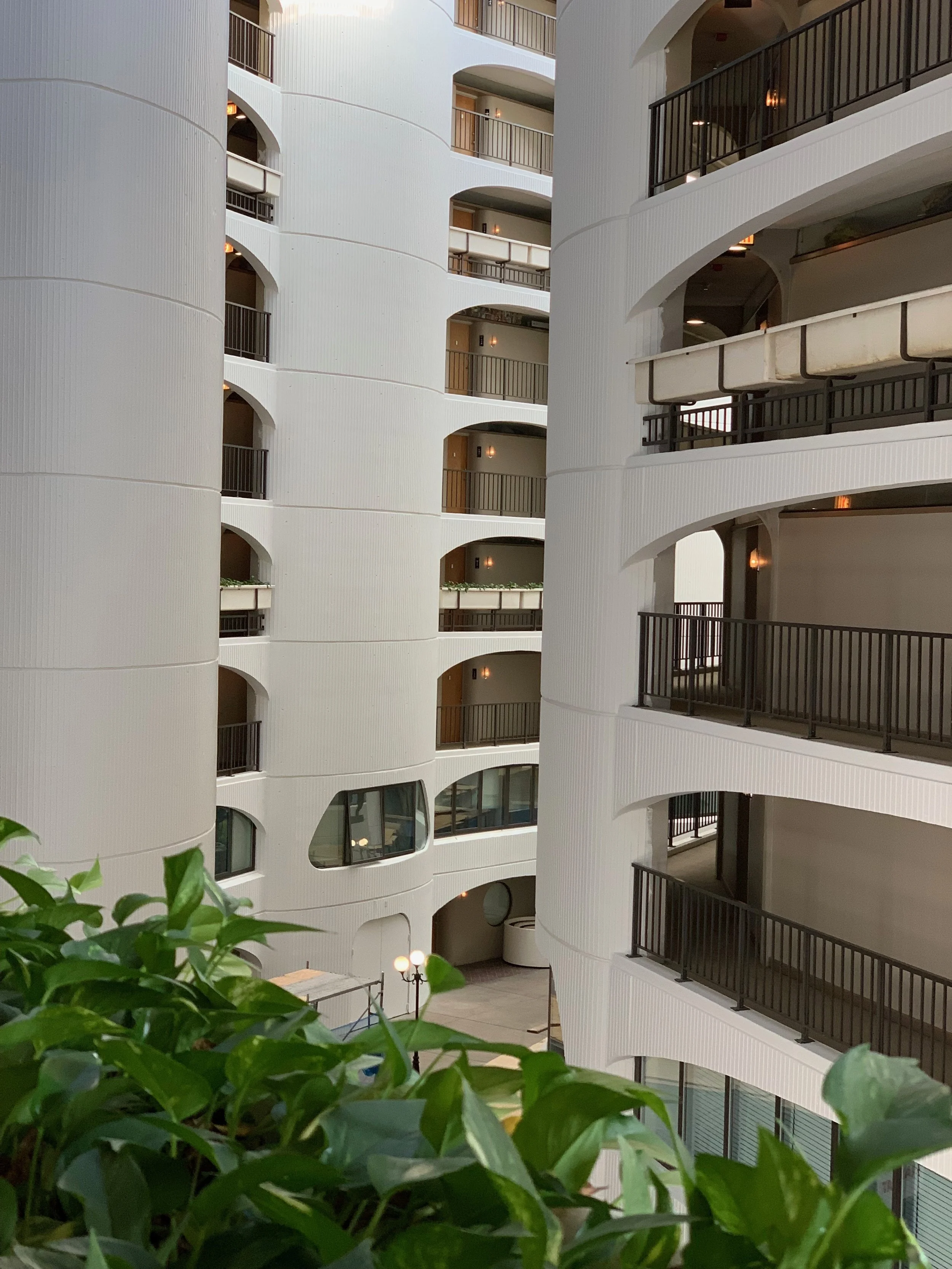
We’re so excited to be revealing the second part of River City Apartments renovation! In total, we renovated 448 apartments, with 14 different unit types ranging from studios to 1-beds all the way to triplex penthouses. Each one is incredibly unique and has its own set of challenges. In this tour, we’re taking you through one of the duplex 3-bed “Townhouses”. All of the townhouses in River City open up to “River Road”, an indoor sky lit atrium that resembles a private neighborhood.
THE CHALLENGE:
Similar to what you saw in Part One, these units were incredibly dated, crowded, and inefficient. Our biggest move, was to open up the galley kitchens and create an open concept kitchen, living and dining room.
THE PROCESS:
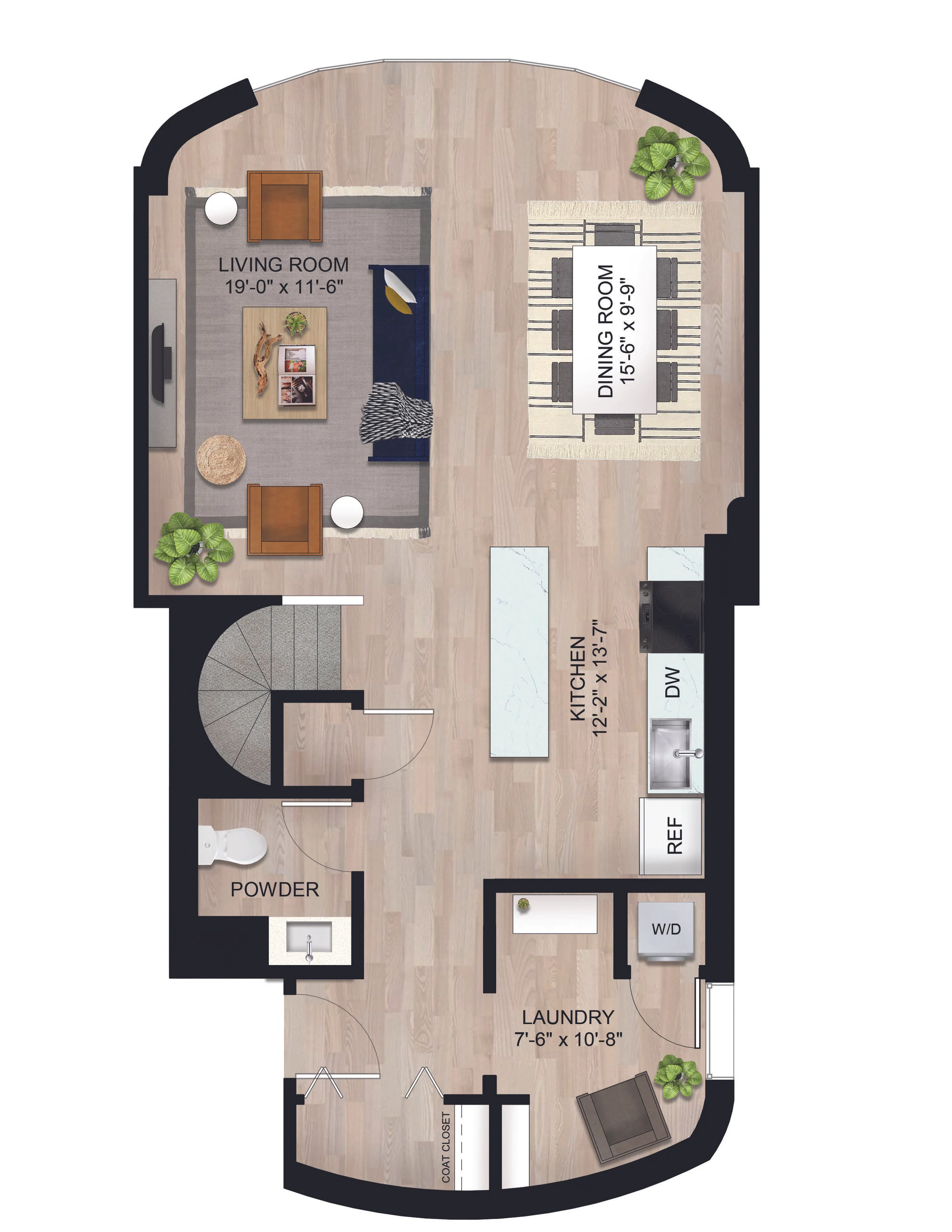
We really focused on modernizing these floorplans to create an open concept space with plenty of storage and an efficient kitchen layout. Upstairs, we removed a lot of closet doors and unnecessary walls to create a huge master bedroom with a walk-in closet and two standard bedrooms that share a bright, modern bathroom.
THE REVEAL:
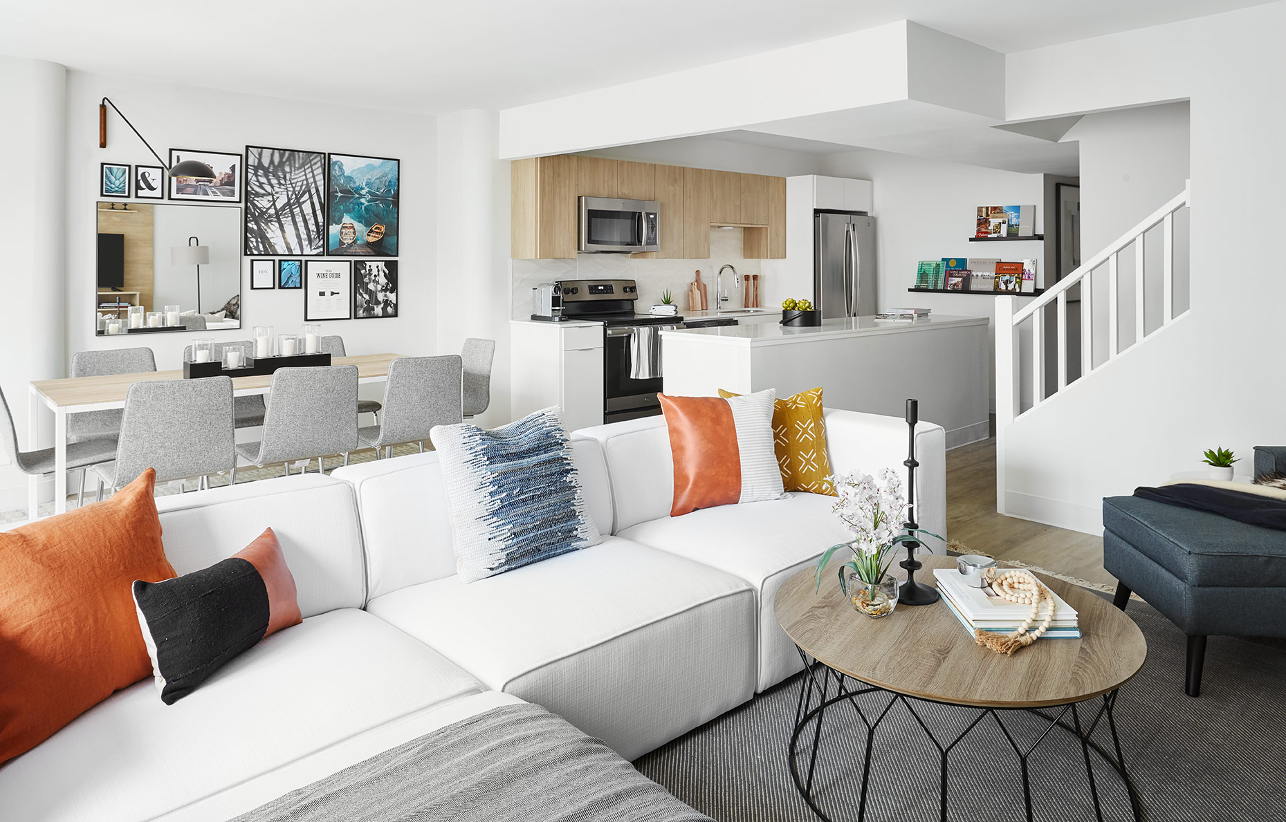
The first floor transformed into an incredibly bright, modern, and HUGE kitchen, living and dining area. We moved the soffit in order to expand the kitchen into the dining area (still leaving plenty of room for a dining table and chairs) and arranged appliances and plumbing along the back wall, with a huge island in front of it. We kept the finishes cohesive with the other units in here, but upgraded the countertops for a marble-look quartz to give a more special look in here and really amplify the lightness and airiness of this unit.
The living and dining area are huge for an urban apartment. We styled the model unit with an 8-person dining table, backed with a modern gallery wall to tie in with the other model unit’s wall, and an oversized white sectional facing the TV wall. Ordinarily, I’d shy away from a pure white sofa, but this is a model unit, so YOLO! We mounted a wooden media console on the wall to frame the TV and styled the room with warm textures, organic materials and clean, modern profiles.
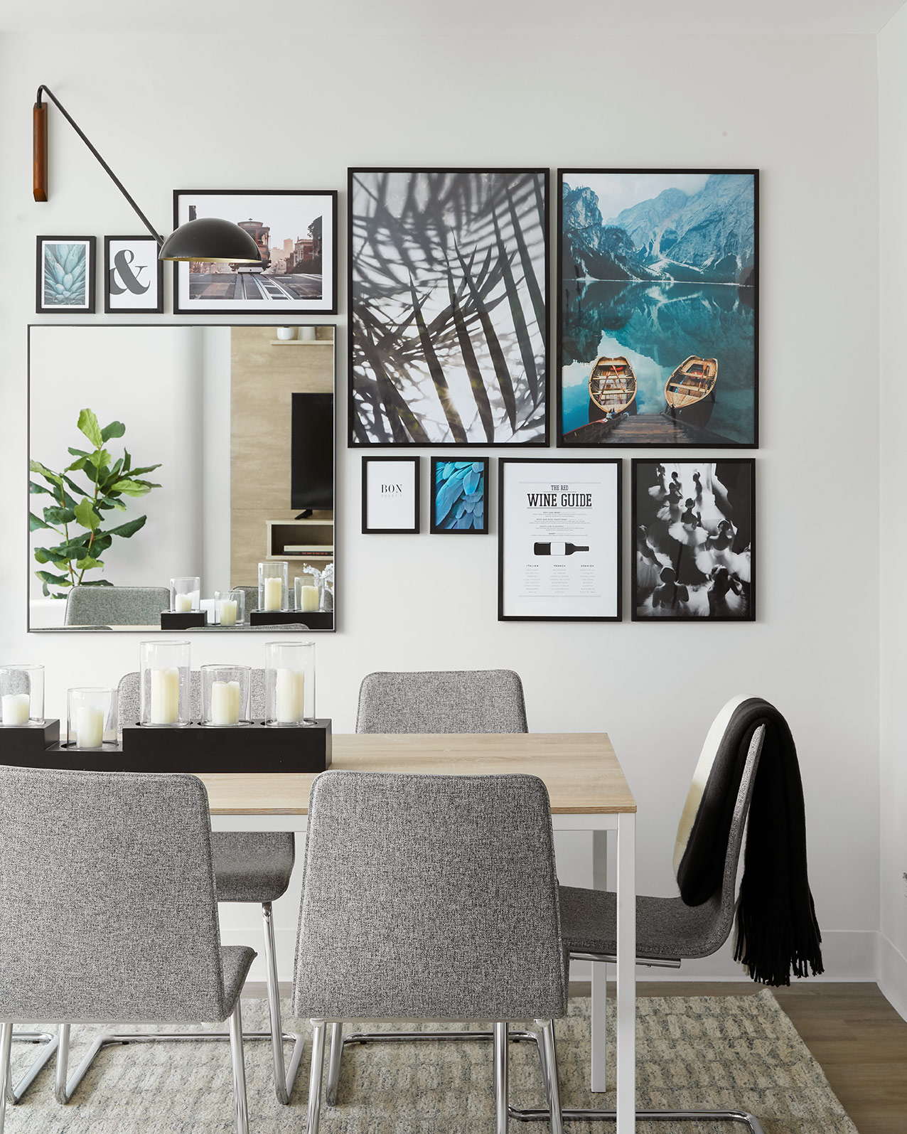
This gallery wall is one of my favorites we’ve done. We pulled in nostalgic imagery to relate to the building’s branding and added a mirror in to reflect the living room and tie the spaces together. To top it off, We added a wall sconce to arch over the dining table add another light level.
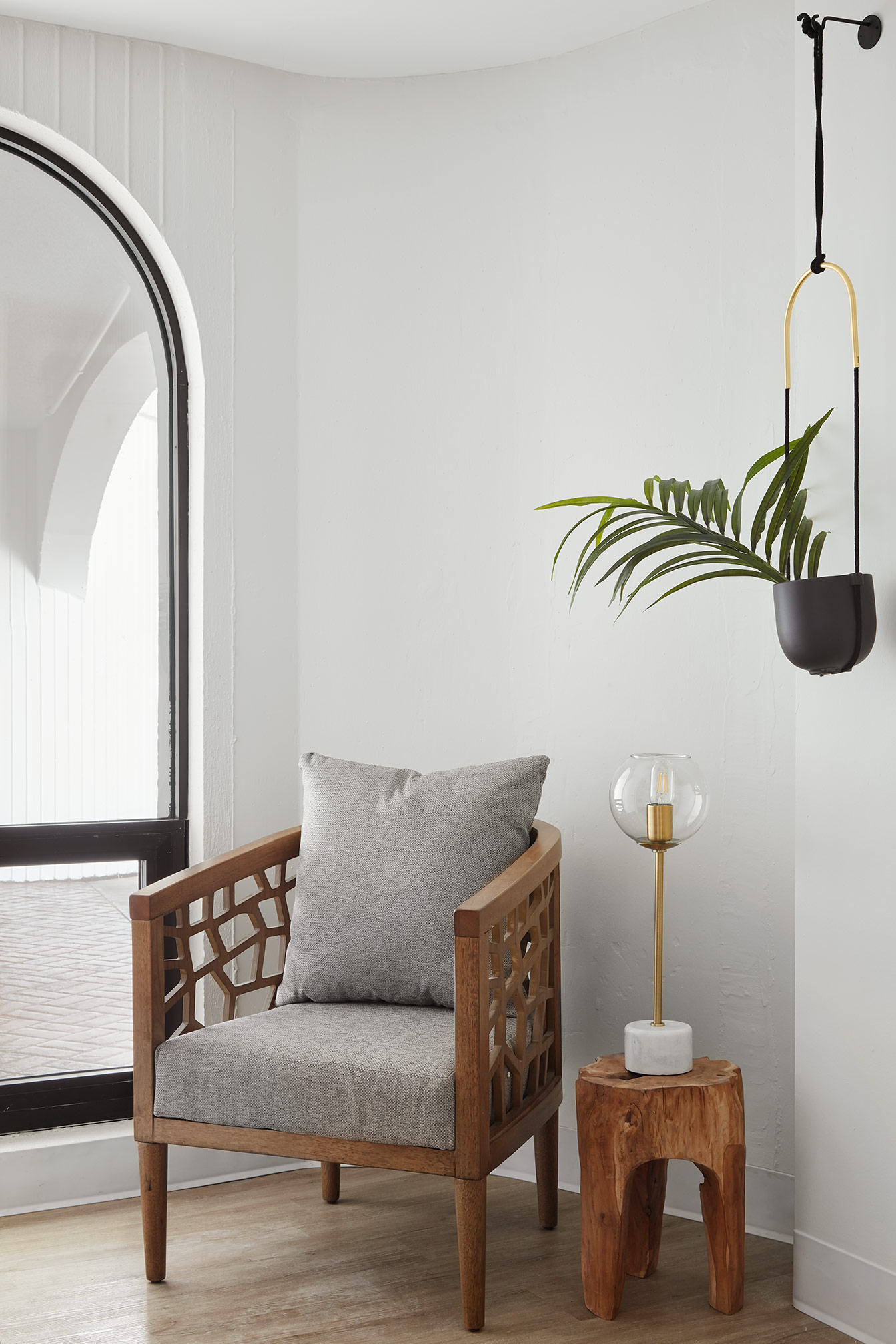
In the front of the unit, the townhouses have a laundry room with a washer dryer and space for shelving or a desk as well as room for a reading nook to create a cozy first impression from the entryway.
The townhouses also have a powder room tucked up front, where we pulled in a wooden accent tile to add an unexpected pop.
Moving upstairs, we’ve got two bedrooms, one that we styled as a bedroom and the other as an office.
The two bedrooms share a bathroom that we updated with a modern, textural tile in the shower and concrete-looking floor tiles, similar to the other units, as well as a wooden vanity with a white quartz countertop.
Completing the second level, there is a HUGE master bedroom overlooking the city skyline and river. We styled this room in the model with a king bed, a console table with a TV and a desk in the nook behind the walk-in closet. We kept this room bright and white with textural bed linens along with wood in the desk and concrete in the console table to tie into the finishes we brought into this unit.
The master bath isn’t huge, so we had to get creative to brighten it up and make it feel more spacious. We weren’t able to expand it due to existing plumbing locations, however, we opened up the wall between the vanity and the toilet to create one unified room and then maximized the space with a linen cabinet tucked behind the door where there originally was another tiny, cramped closet. Bright, natural textures modernize the bathroom and make it feel luxurious and cohesive with the rest of the unit.
I hope you guys enjoyed this tour! I had the best time working on this project and I’m so proud of how it turned out. This space has been completely updated to be relevant with today’s expectations while still tying in with Bertrand Goldberg’s original unique design. If you’re interested in touring the apartments or learning about the building further, check out the website to schedule a showing!

