Virginia Remodel
A full year after getting the initial phonecall for our first out-of-state residential project, I am SO thrilled to be revealing our home tour of the Virginia Remodel we’ve been working on. This client found us through Instagram and was such a pleasure to work with right from our first breakfast meeting. She reached out to us after she and her growing family bought a house in Virginia that needed a serious face lift. The bones of the home were absolutely beautiful, including a double-height entryway and family room, and sun-drenched bedrooms with en-suite bathrooms throughout.
THE VISION
We always strive to customize our designs for each unique client so that the home really represents the people who will be using it. For this project, we wanted to create a space that had classic details to tie in to the neighborhood and existing home structure, but modern elements to reflect the client’s own style.
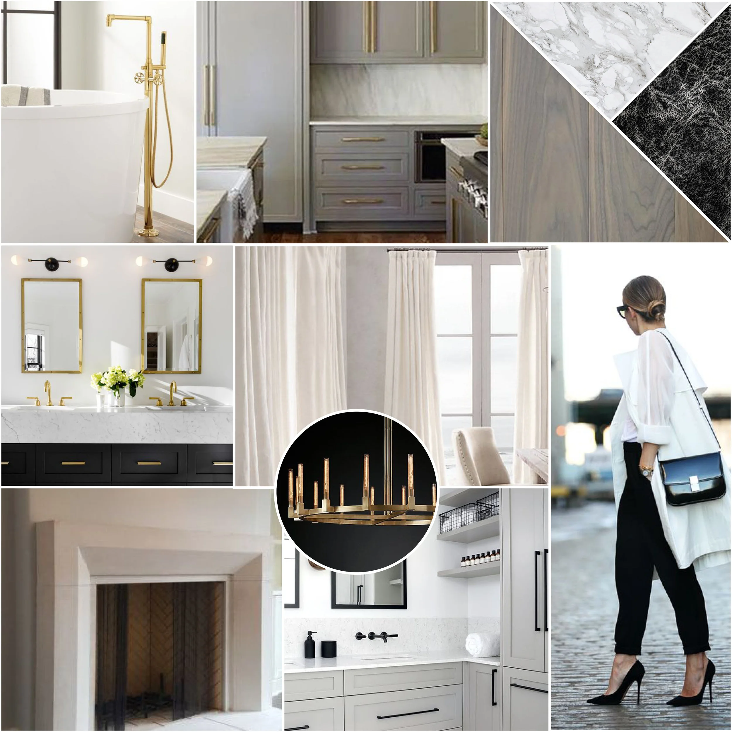
Before we got started with the design, we created a moodboard to convey the aesthetic we were aiming for to make sure our client was happy with the direction we were heading in. This client responded really well to warm neutrals and clean white and gray images contrasted with black and brass metals.
THE KITCHEN
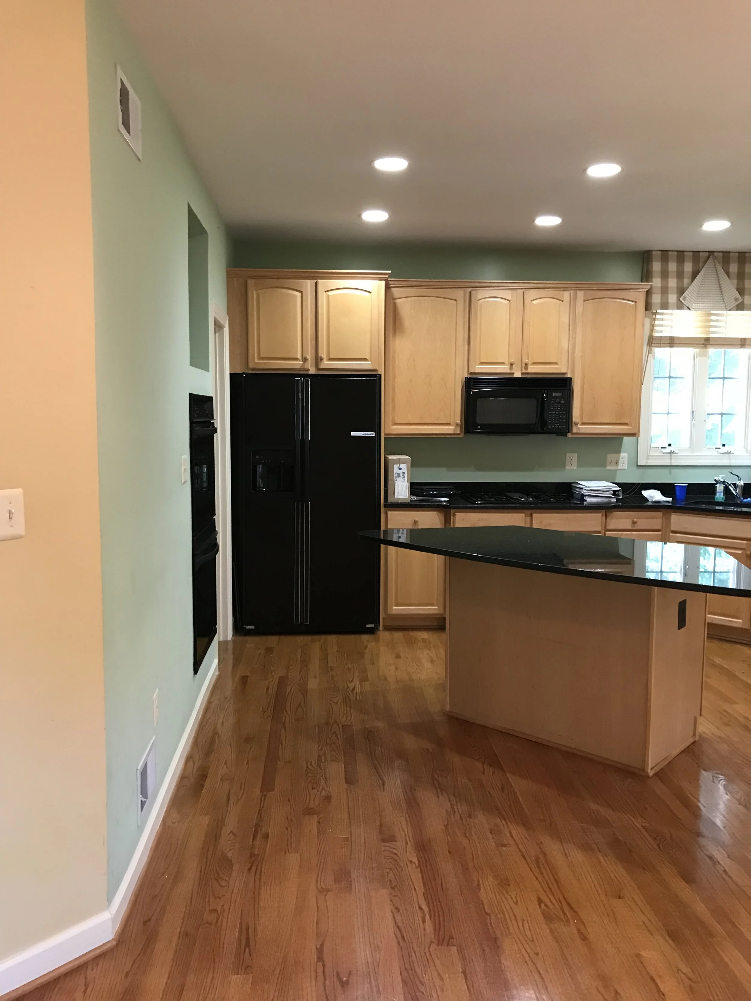
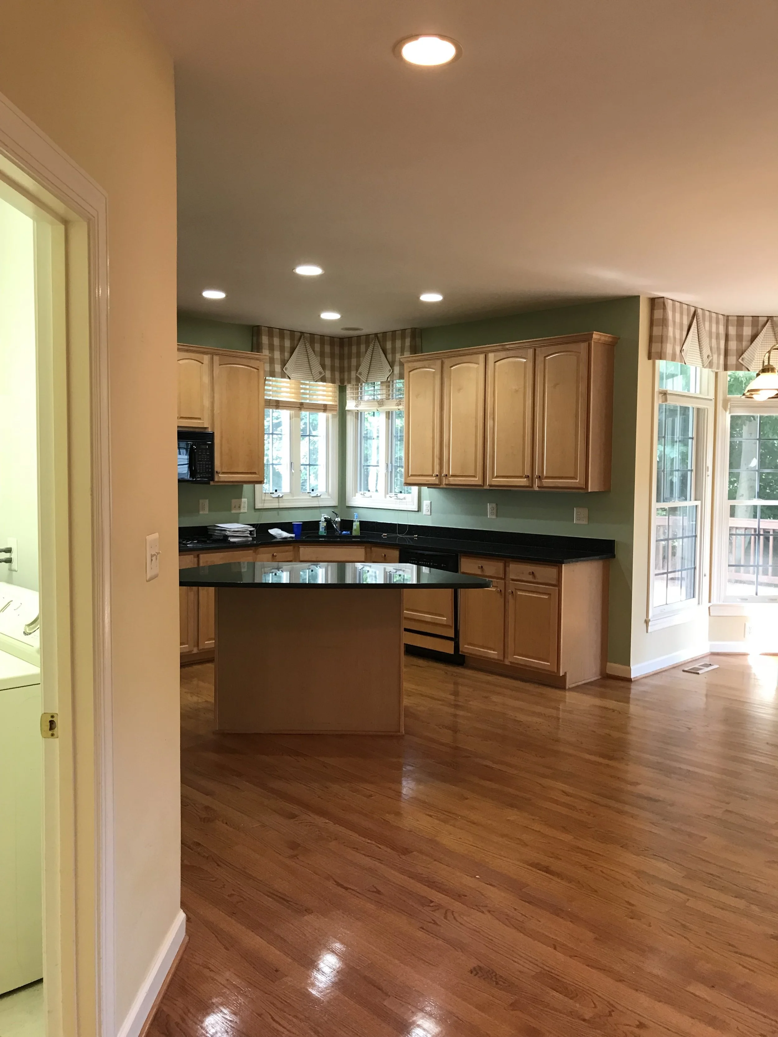
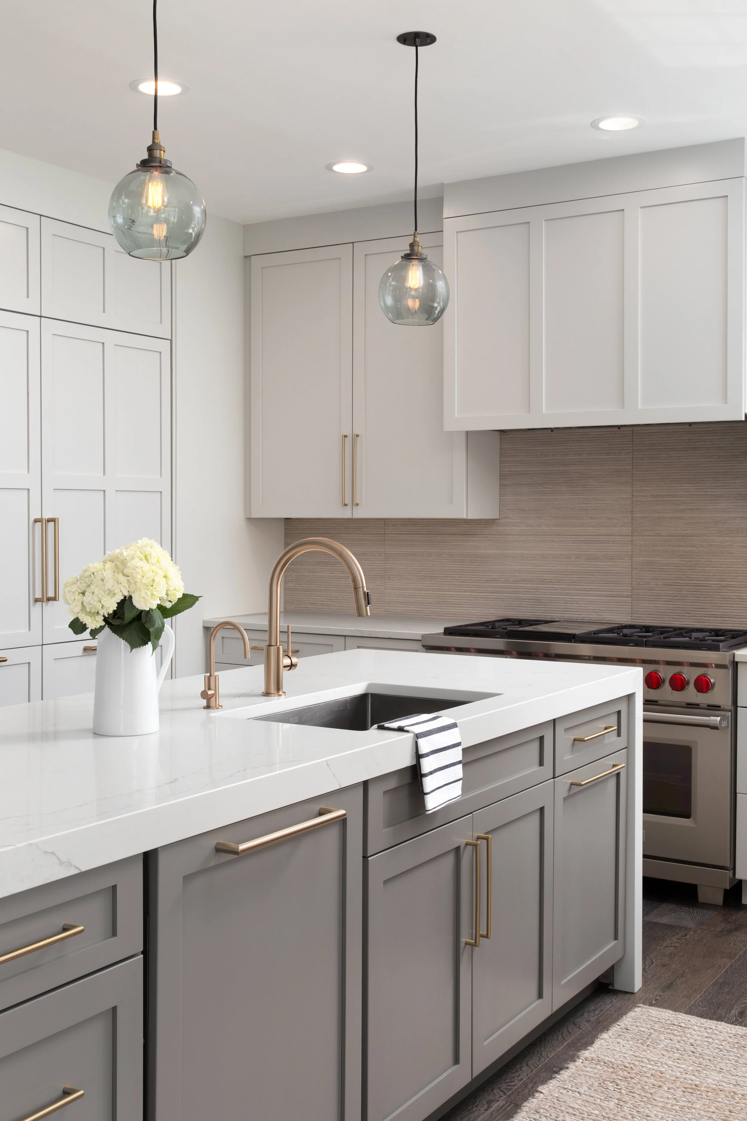
The kitchen was situated in a way that set itself up for such an amazing layout but the original setup felt undersized and more compartmentalized. Our first priority was to enlarge the kitchen layout by maximizing the space for storage and creating a space more efficient for this family’s needs. We removed the diamond-shaped island and introduced a much longer island, where we located the sink which had originally been tucked in the corner by the window, and we tucked in counter seating on the backside. Next, we removed the walk-in pantry and tucked in paneled Sub-Zero refrigerators so that they were completely out of the way and round out the kitchen layout. We relocated the pantry to a full-height cabinet area where there had originally been a built-in desk.
Before - Kitchen
Before - Kitchen
The previous kitchen layout was way too small for the area, leaving a ton of unused space that we wanted to take advantage of.
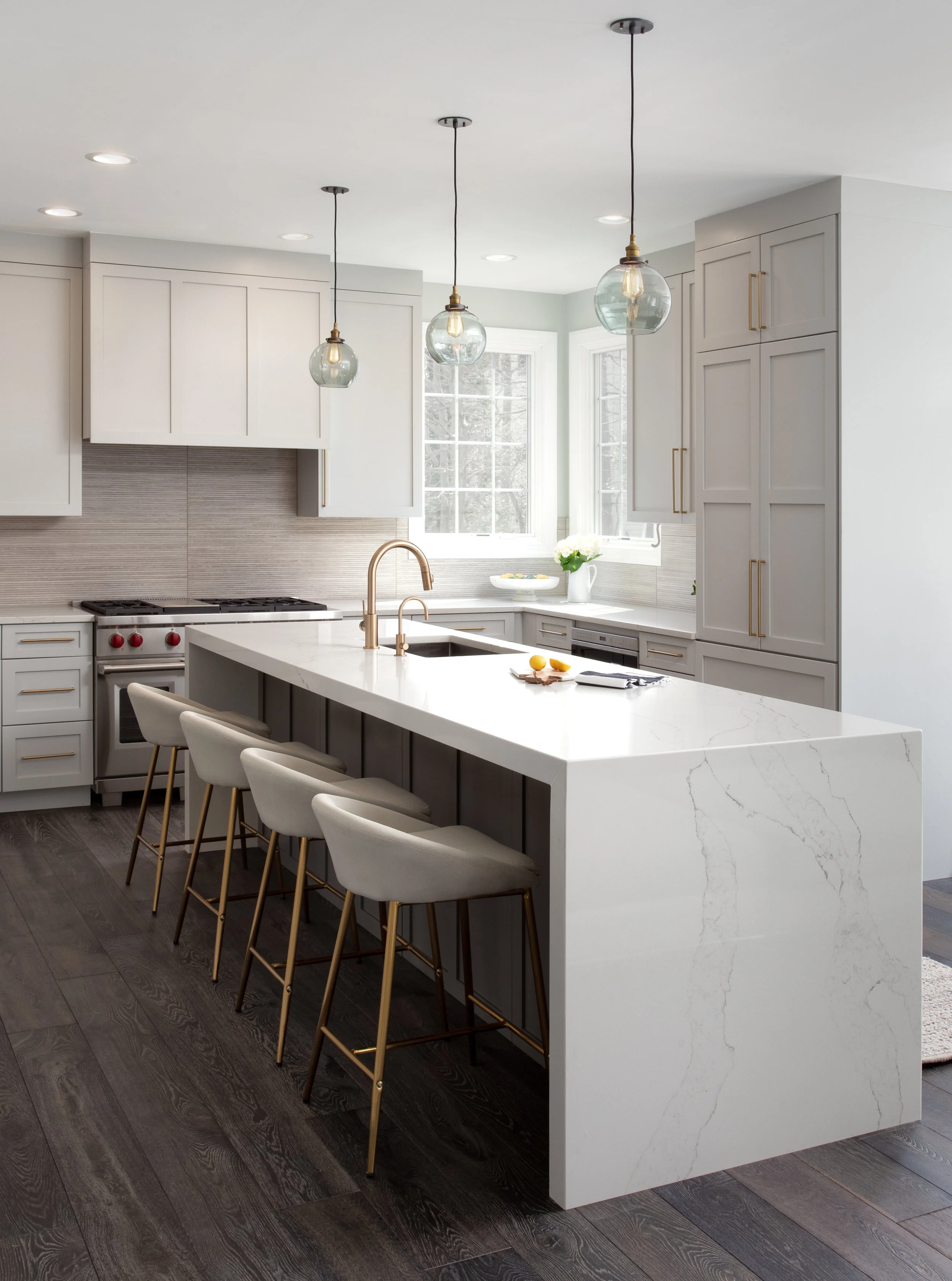
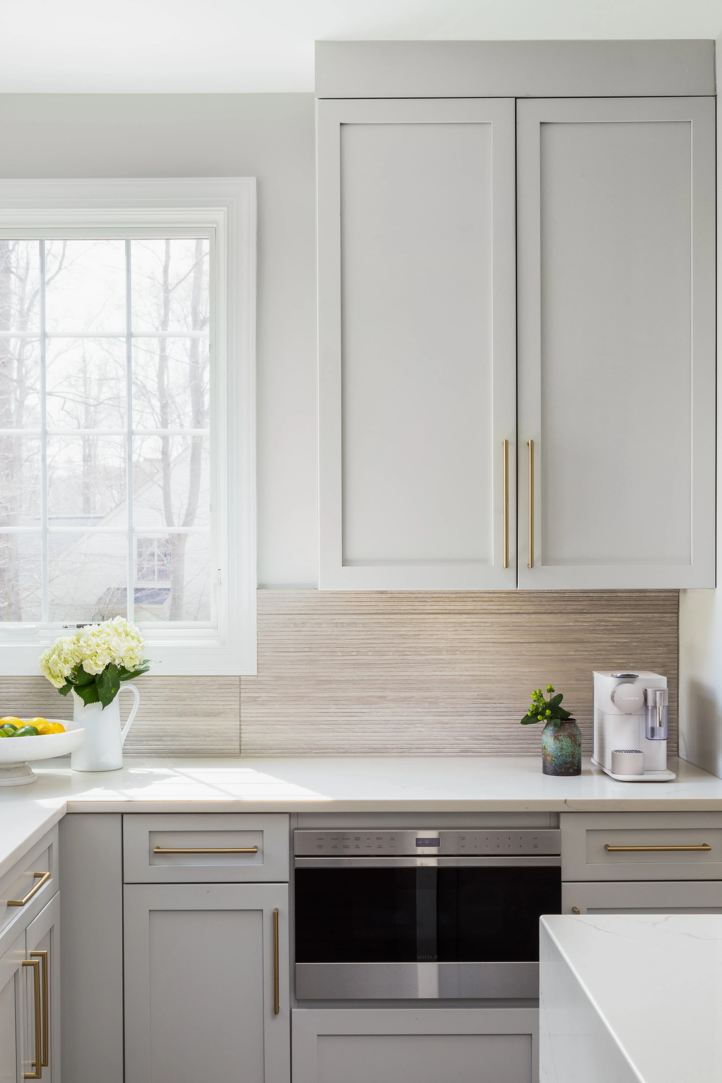
One we determined the best layout for the space, it was time to introduce the new finishes. Everything in this house originally was yellow. It felt completely outdated and needed a cooler palette to help modernize it and balance things out. We starting building the palette with dark, French Oak floors from Divine Flooring. The rich, chocolaty tones in the wood pulled in the perfect level of sophistication and warmth for the home. On top of that, we layered shades of warm grays marble textures and brass and black metal accents. The kitchen cabinets are a creamy, light gray along the perimeter with a shaker profile and a darker gray island with a waterfall quartz countertop. Brass hardware softens the palette and adds a feminine touch. We integrated all of the appliances but let the Wolf range be a focal point at the back of the kitchen with a clean, wrapped hood above it. For the backsplash, we chose a modern tile that pulls in a wood texture and adds some depth and texture to the room.
The new kitchen is bright, inviting and warm, truly representing the heart of the home.
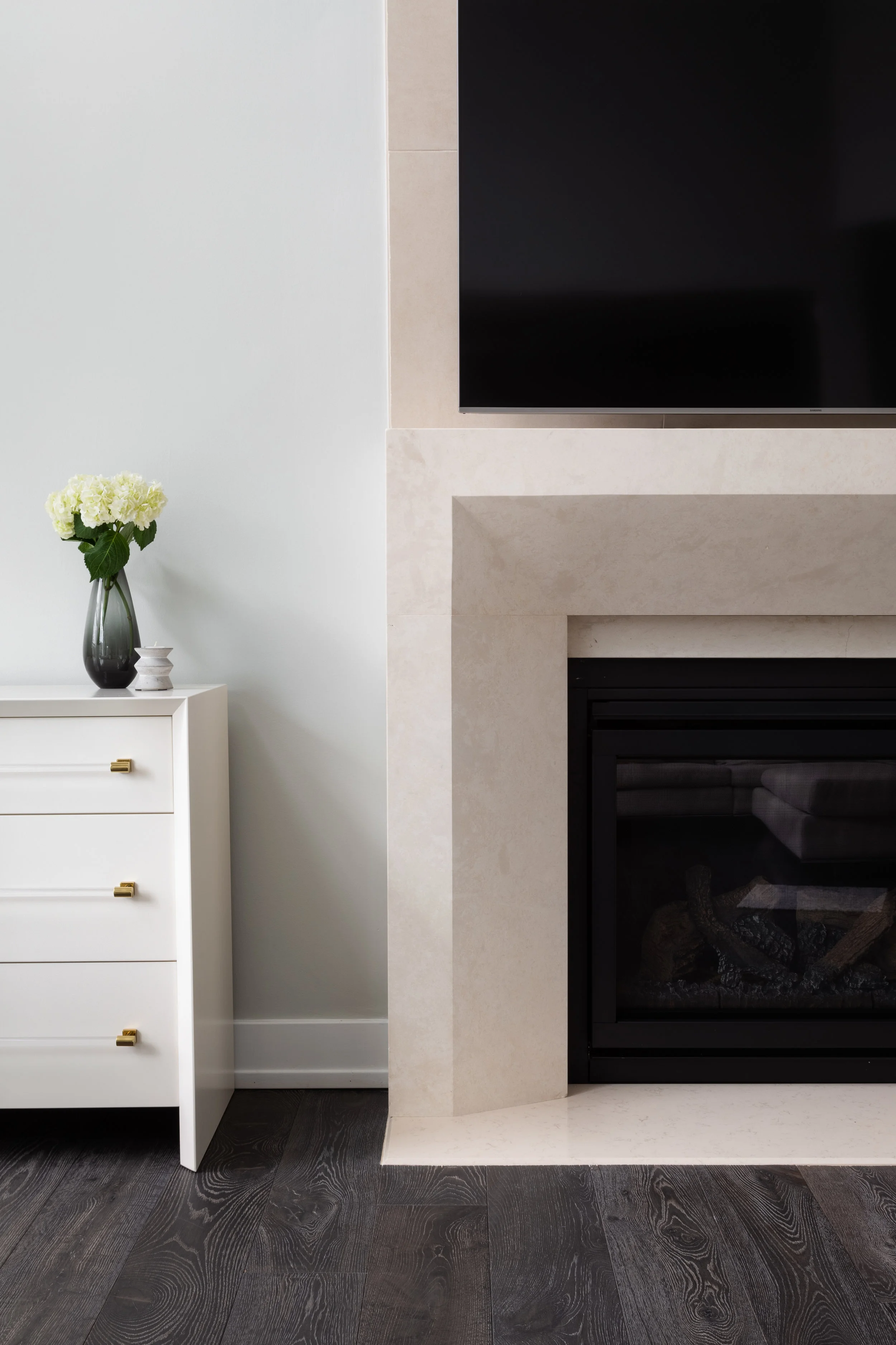
Adjacent to the kitchen is a double-height family room that truly ties the whole house together. To enhance the space, we introduced a custom stone fireplace from Paris Ceramics and carried a matching tile up to the ceiling.
We’re still furnishing this room, so we’ll reveal the full family room in a later post, but here’s a peak of the fireplace we designed with Paris Ceramics.
THE FIRST IMPRESSION
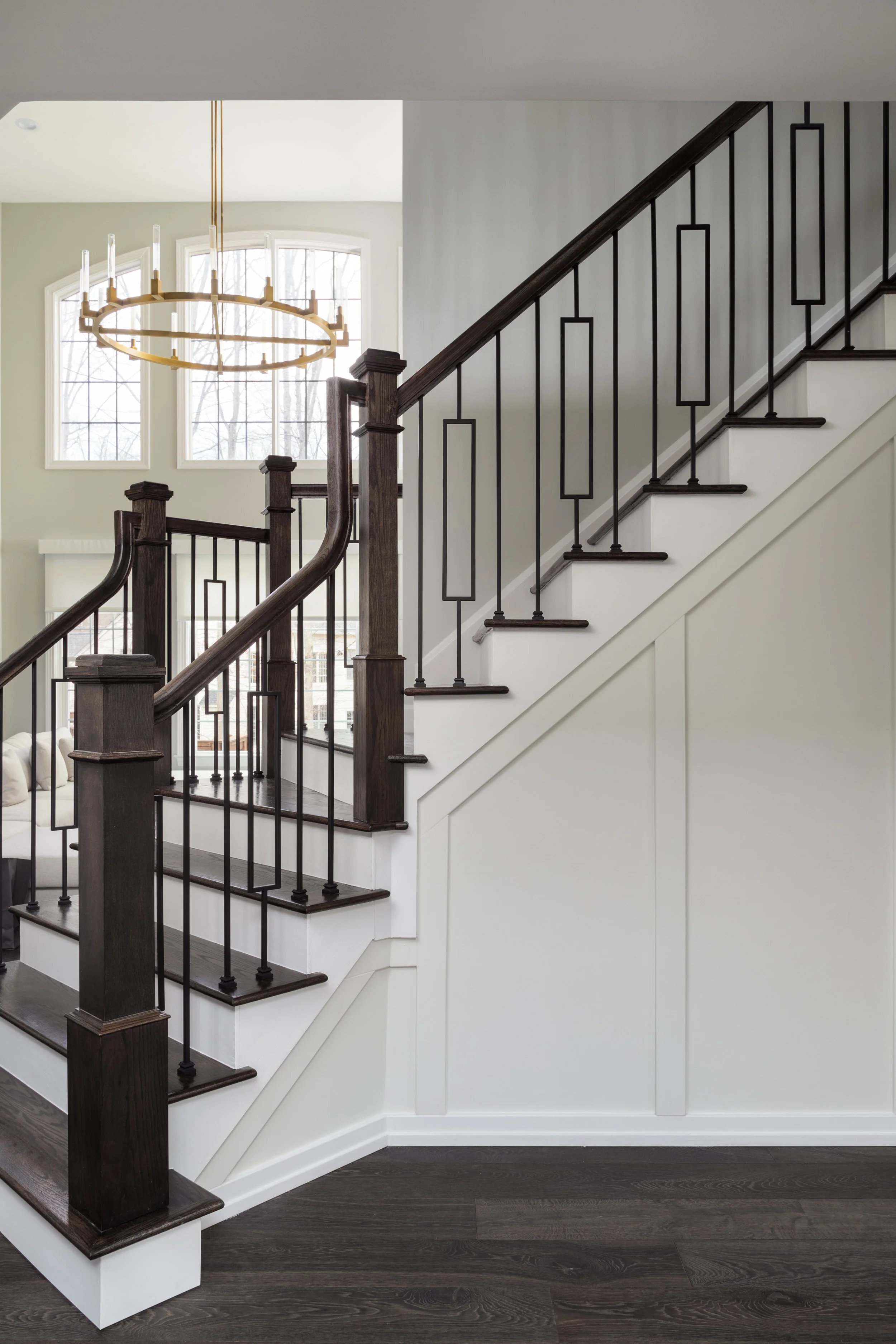
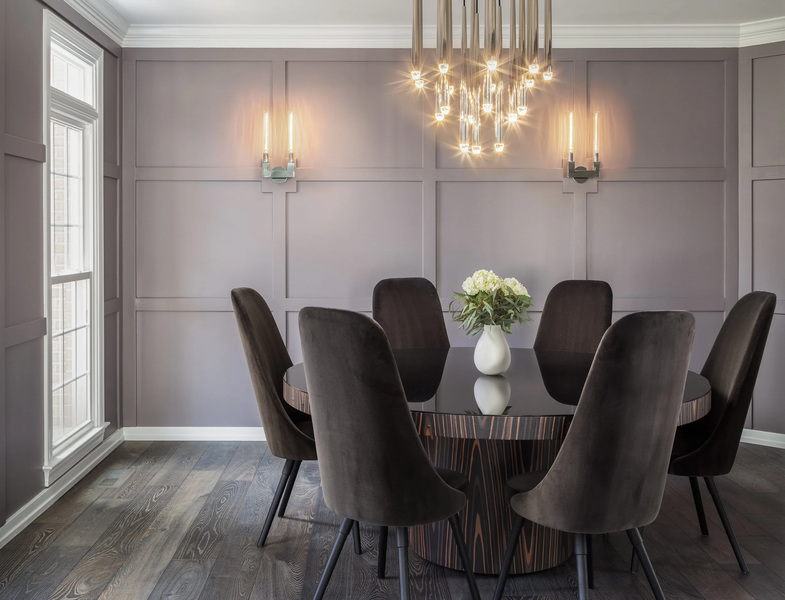
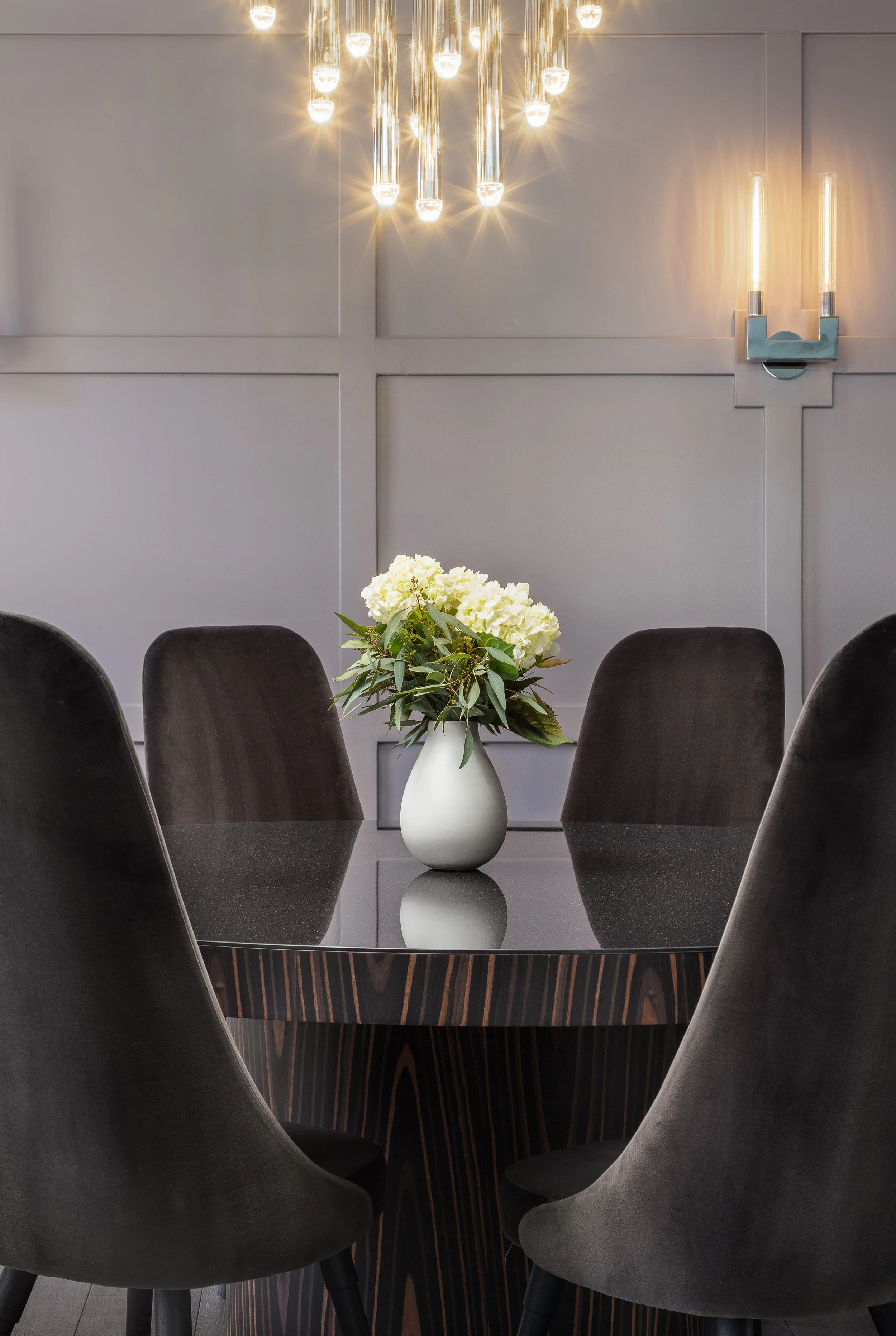
My favorite part of this house is how everything connects the moment you walk in the front door. We kept the entryway simple but paneled the wall beneath the stairs to add some texture and to tie into the elegant dining room we designed immediately next to it. In the dining room, we paneled all of the walls and painted them a rich, warm grey tone. We integrated sparkling sconces into the wall and installed a dripping chandelier above the table. Simplicity was key in this room. We wanted to add elegance without clutter and let each feature stand out on its own. The table is around ebony wood with a black mirror top, continuing the illusion of the dripping lights. To complete the room, black velvet dining chairs surround the table and add some height to the room.
THE BATHROOMS
The existing bathrooms were never anything special. Each one continued the builder-grade theme and warm, yellow palette which had to go. We kept the new design cohesive with the rest of the house, grounding the spaces with neutral grays and rich textures, but adding contrast with black and brass metals. We focused on bringing in sculptural light fixtures to add sparkle to the rooms and soften them.
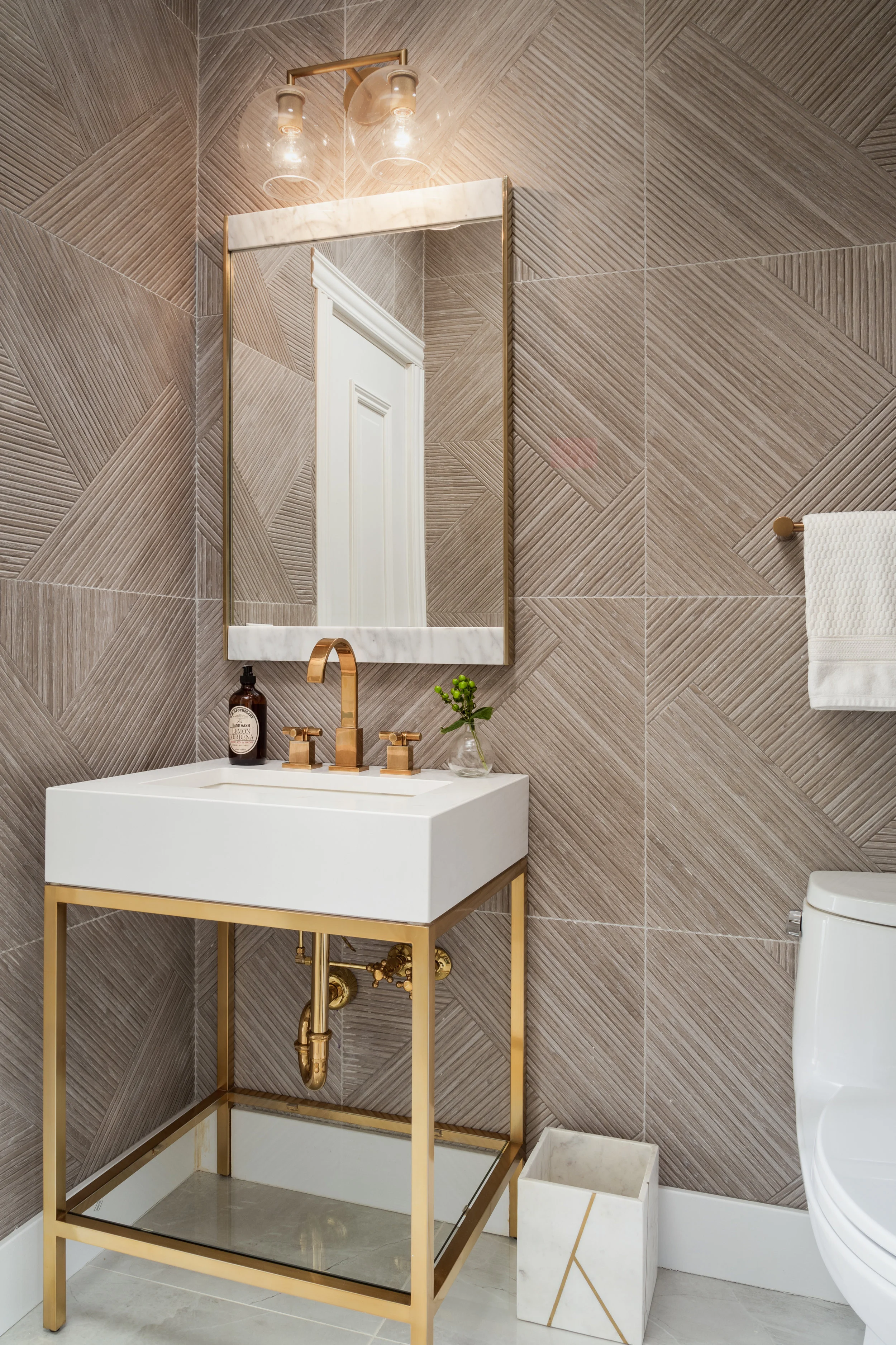
The Powder Room needed to be special. We tiled all four walls with a textural wood-looking tile that carried in the same colors and tones from the kitchen backsplash but in a more random pattern. A brass and white pedestal sink acts as jewelry in the room and is a more delicate balance from the heavy texture on the walls.
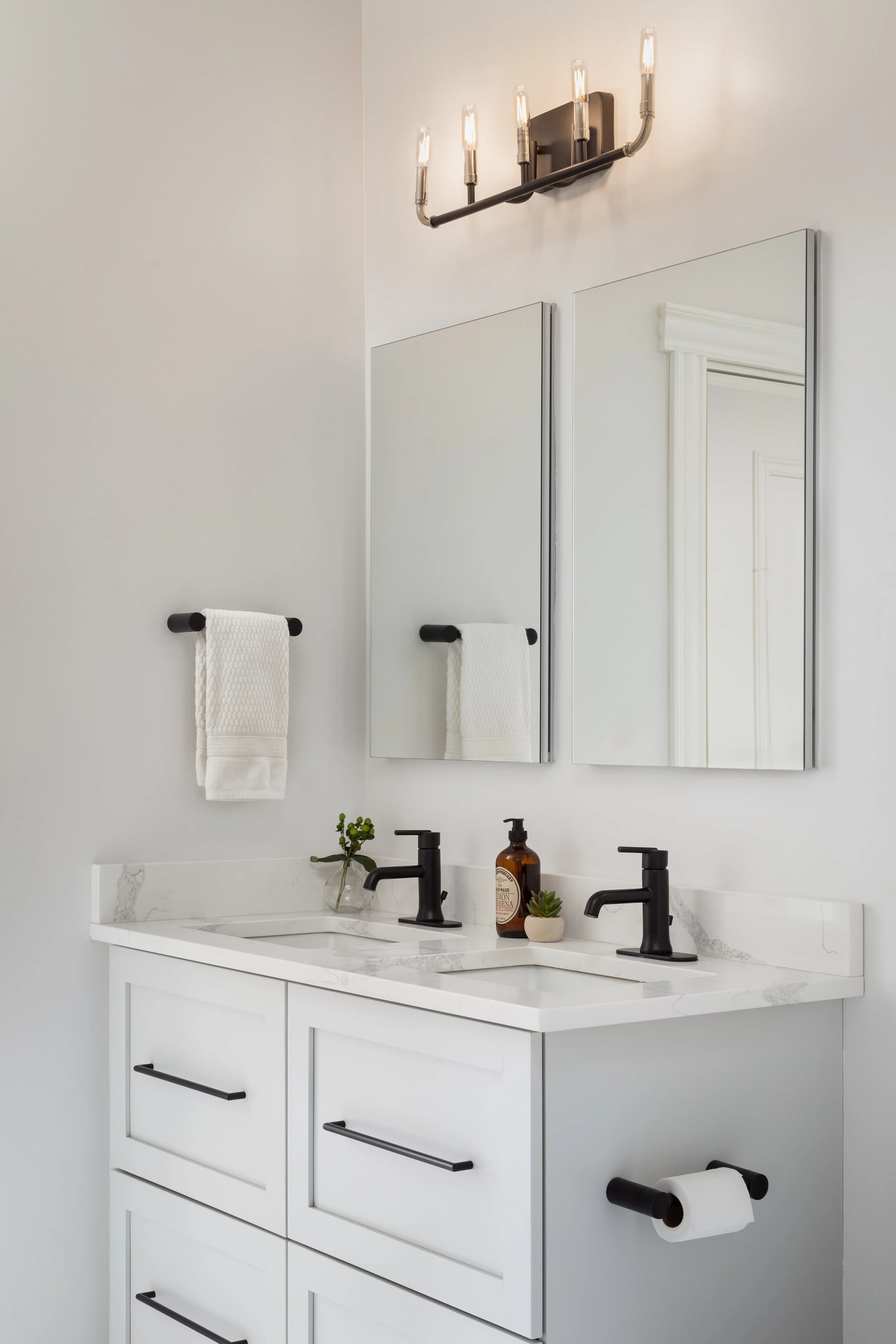
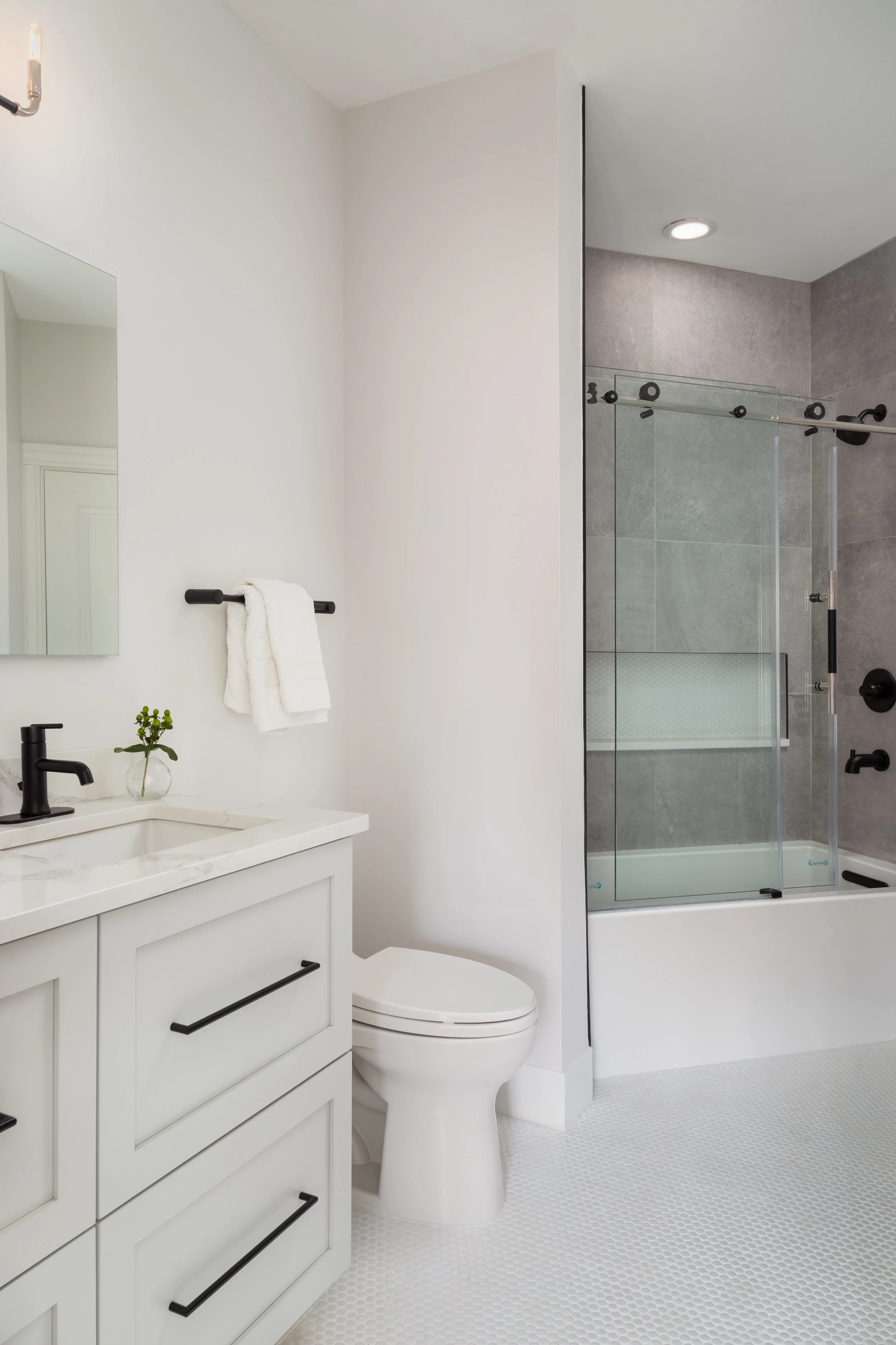
We kept the palette fresh and bright in the Jack and Jill bathroom that the two boys share. Black metal accents contrast the lighter finishes to add contrast and make it a little more masculine. We kept the cabinet profiles consistent with the kitchen cabinets to create a cohesive feel throughout the house.
Clean, white penny tiles on the floor create a subtle texture and keep the kids from slipping on a wet floor. In the shower, we tiled the walls with a concrete-looking porcelain tile to add some natural texture and depth.
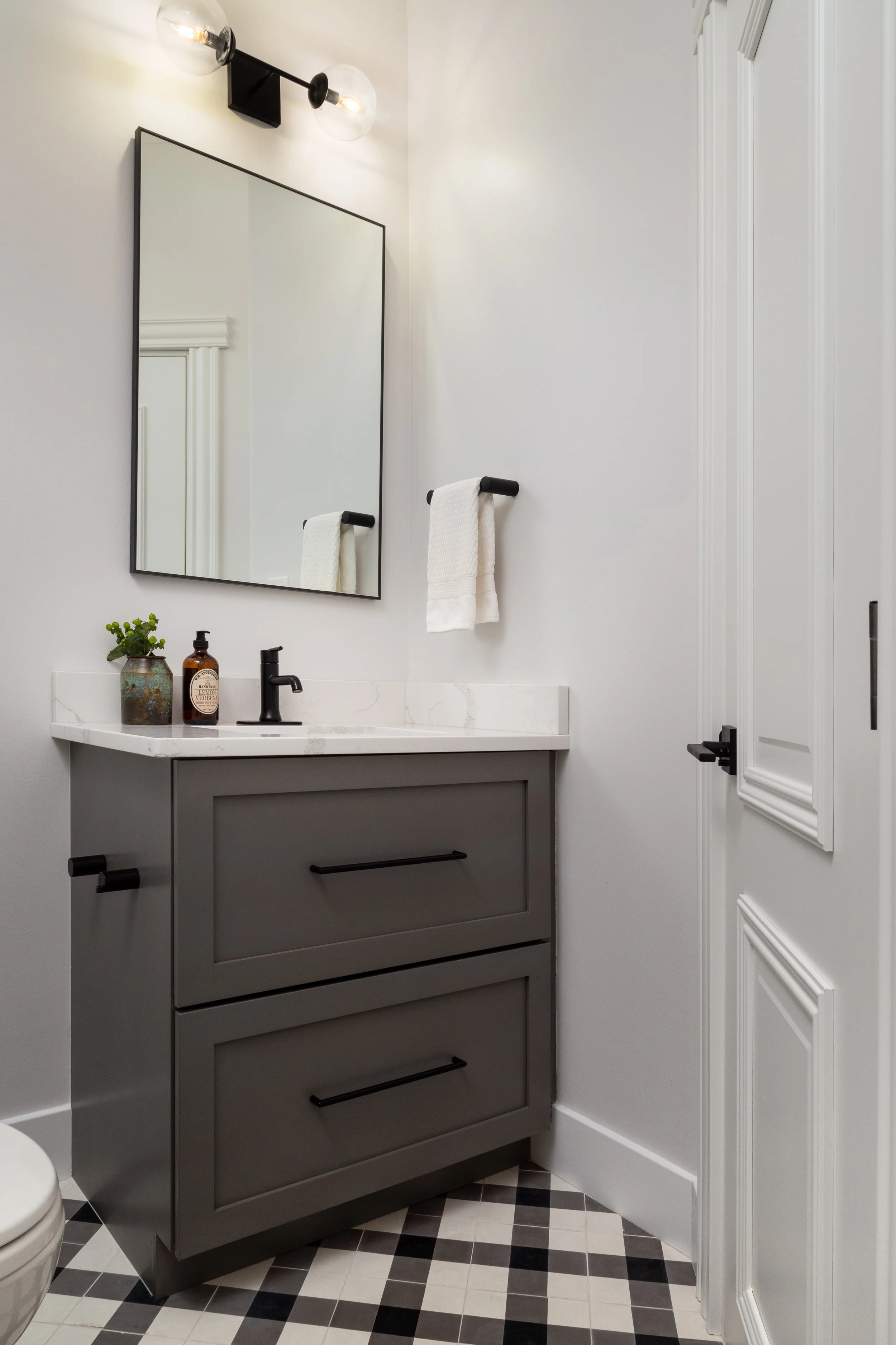
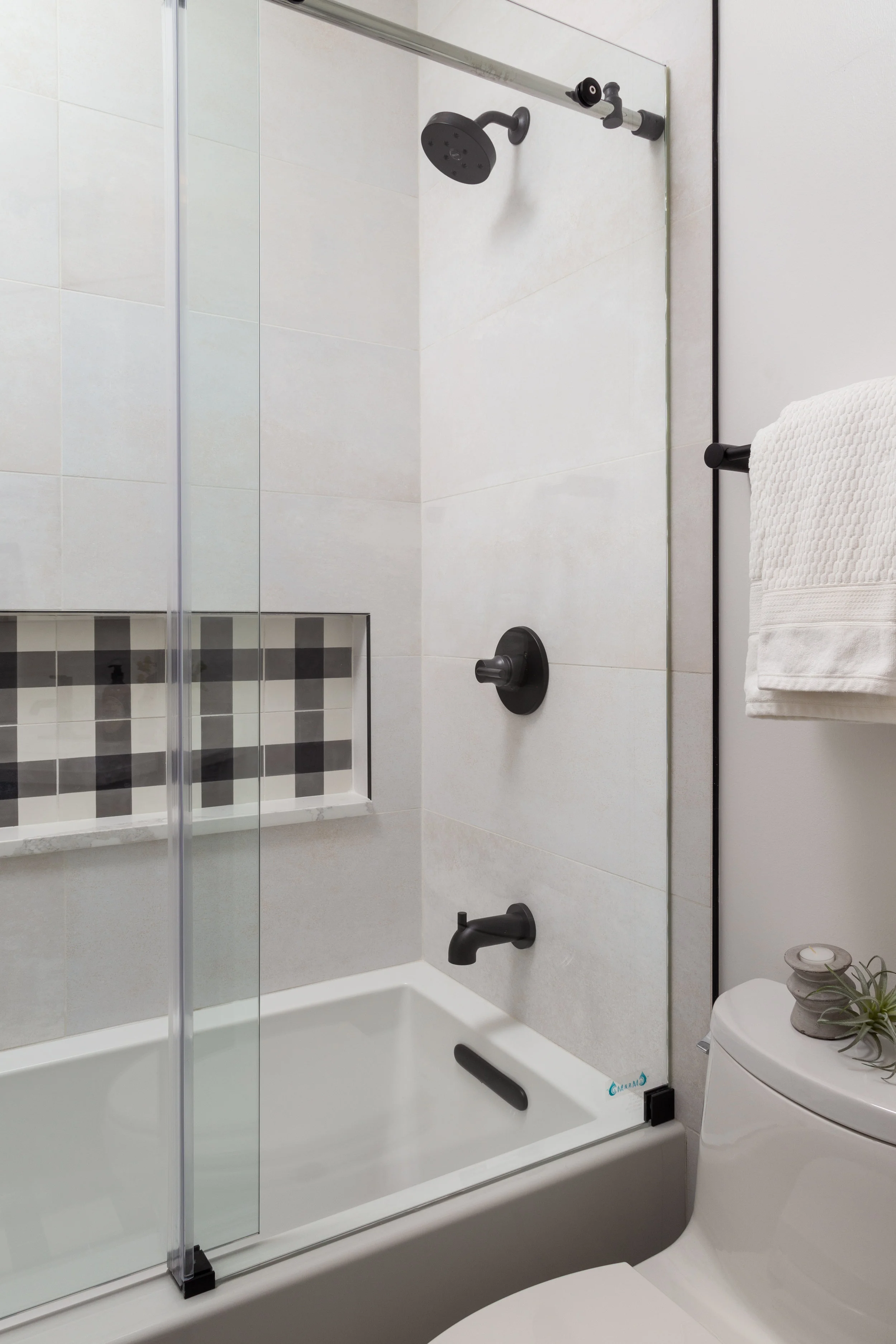
The Office bathroom upstairs is the smallest bathroom of the house so we had to have some fun with it. We pulled in a buffalo check accent tile on the floor and in the shampoo niche to add some character to the room.
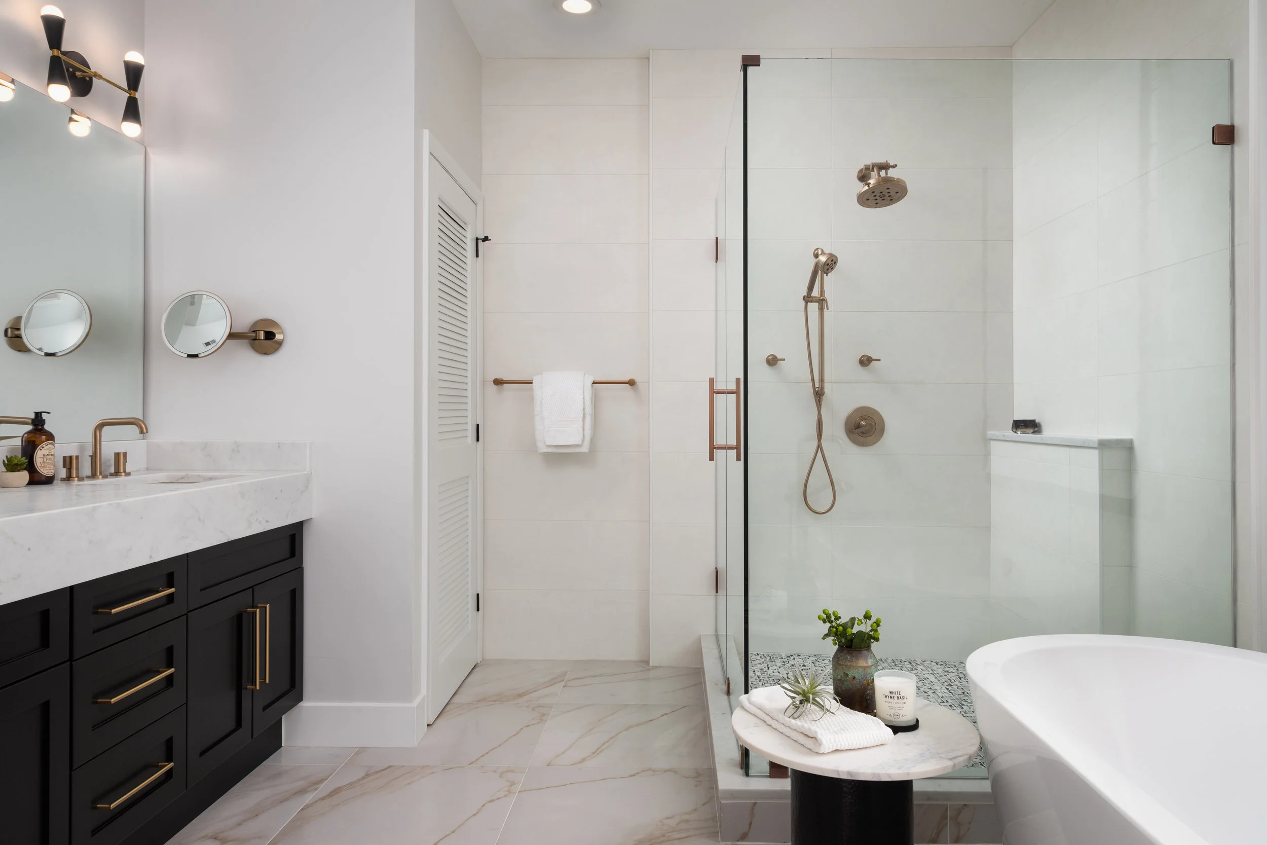
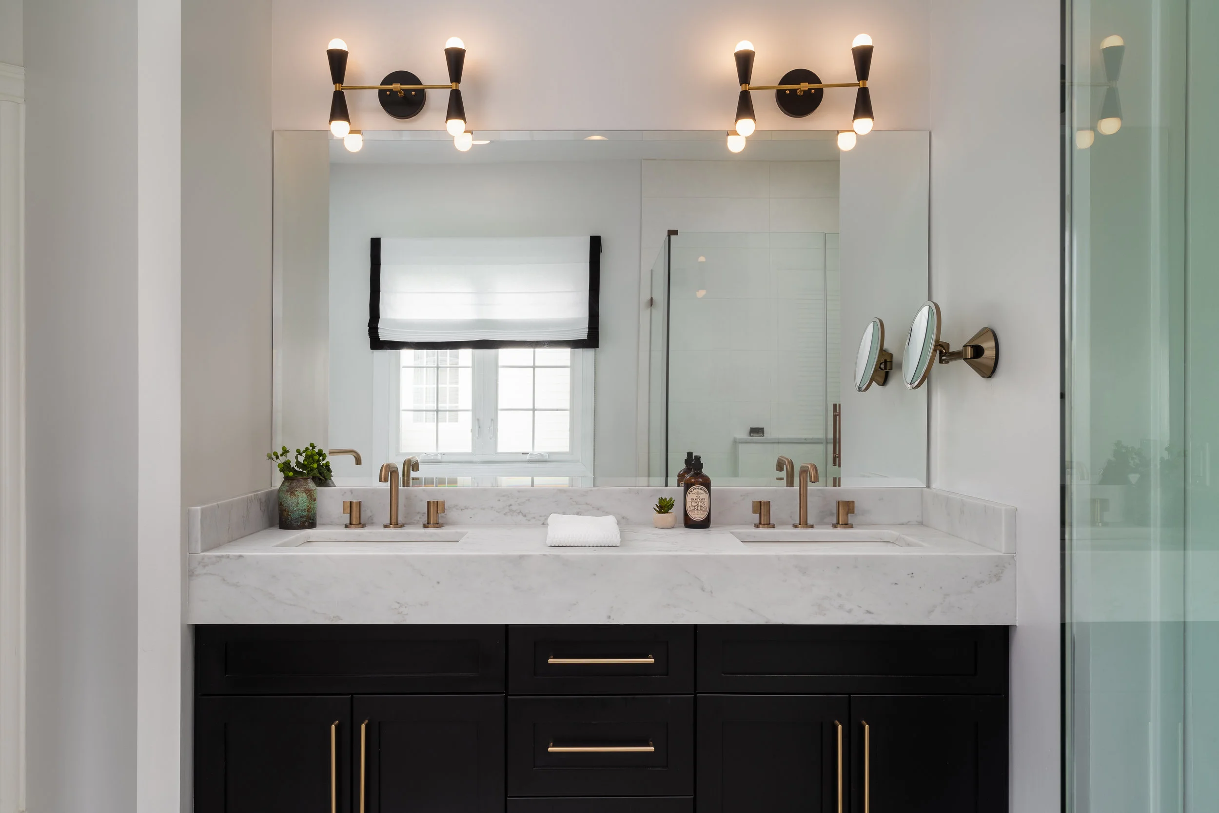
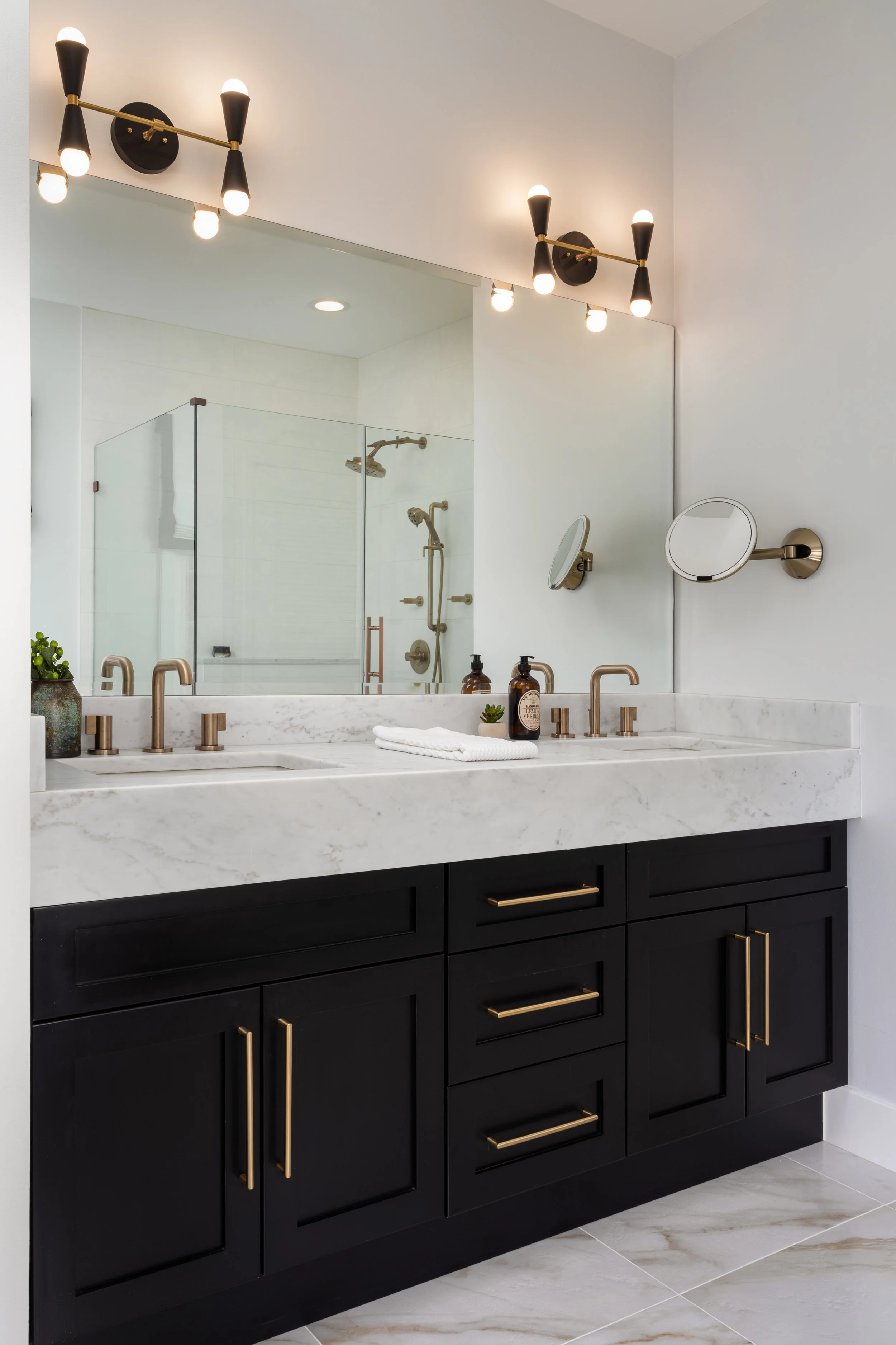
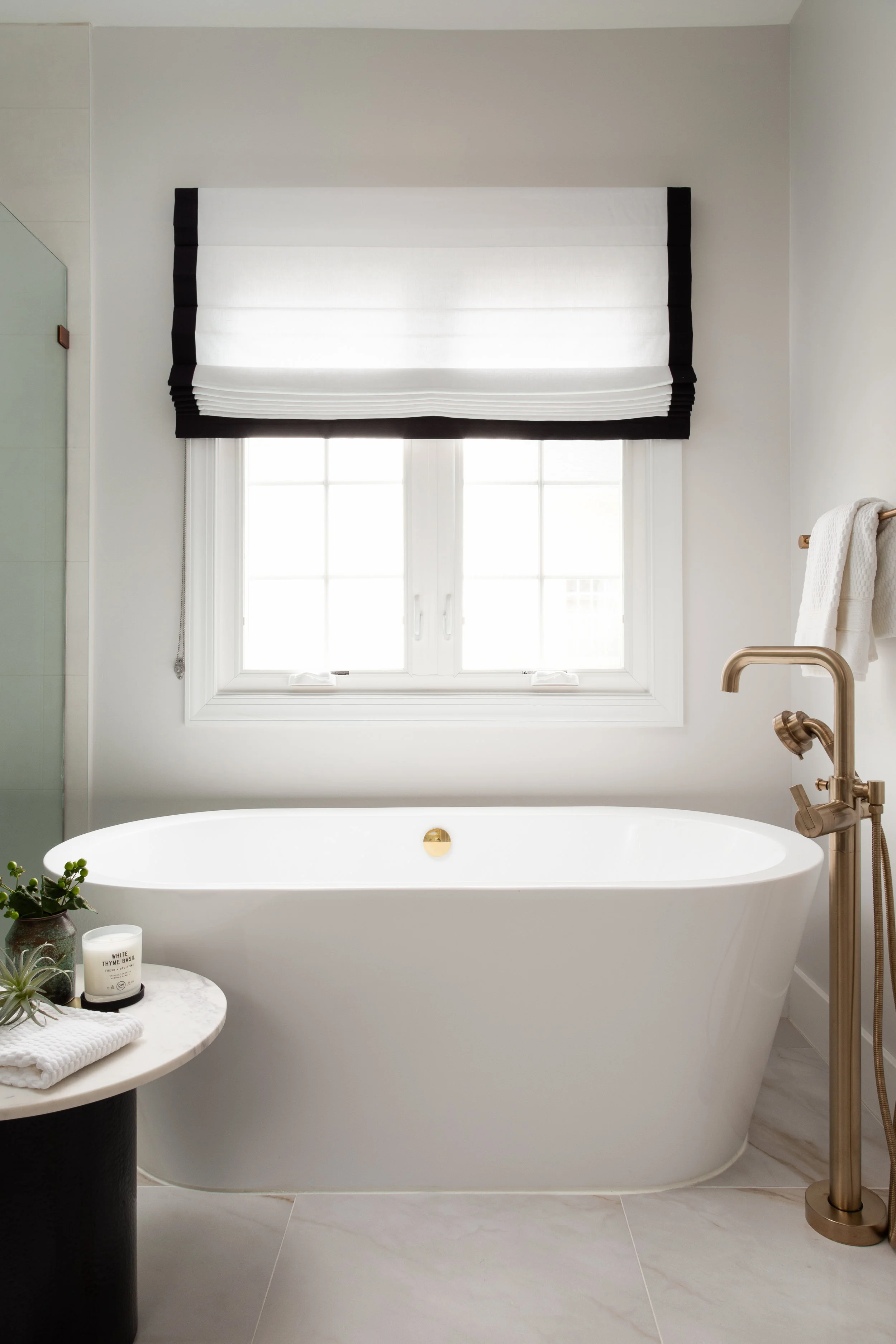
The Master Bathroom had to be the most special one in the house. We carried in a marble looking porcelain tile floor with a complementing wall tile that resembles a creamy Venetian plaster. The corner shower has a textured tile on the floor and a ledge built out on the side for toiletries. Brizo plumbing fixtures add a luxurious touch to the room.
To add some drama, we created a black vanity with a six-inch mitered countertop edge.
Brass hardware adds a warm and delicate contrast to the black cabinets.
This room wouldn’t be complete without a free-standing soaking tub beneath it’s window. We added some linen roman shades for privacy with a black border to tie in with the vanity.
I hope you enjoyed this tour half as much as I enjoyed working on this project! Nothing makes me happier than a client who loves their new home and a design that fully represents them. This one will always be special to me.
-dgw

