HOME TOUR: GETTING PERSONAL AGAIN
The past two years have been a whirlwind of transition for Mike and I. We got pregnant, brought General Contracting in house at DGI three months later, continued to grow and build the team, closed and started some dream projects, became parents, and oh yea, decided to throw our own renovation into the mix because life wasn’t chaotic enough.
We didn’t intend to keep this renovation a secret, but honestly with everything that was going on in both our personal lives and with DGI, it kind of just fell into the background and we never got around to sharing it with you all. To be honest, I didn’t even take before photos, which is so disappointing because if you could see the pink and teal glitter walls that this home came with, you would have an even greater appreciation for the transformation.
With that, it’s time to finally take you guys inside our Wisconsin home. I can’t say this was a lifelong dream, because to be honest, if you told 20-year old Devon or Mike they’d have a home in Wisconsin someday, they probably would have said, “where’s Wisconsin?” but I can truthfully say this home is a dream come true and gives us the space to relax and decompress. Working together and owning a business means we really never turn off the “work” button and that kind of stress can really stack up. When Covid hit, we made it a goal for ourselves to find a little place we could escape to when we had a family so that we could unwind together and savor life’s little moments.
Before we renovated, we spent a few weeks up there when Max was first born just so we could fully soak up those newborn days. The house hadn’t been updated in at least 30 years, so it was very outdated and had glitter and wallpaper everywhere. We temporarily moved in (knowing we’d be ripping it apart a few months later) with a folding table and chairs, a bed for us and a crib from IKEA for Max, and we absolutely loved it. But with that, we quickly started daydreaming about how we would make the space our own. It needed some layout adjustments to ensure it would function the way we needed it to, and it desperately needed a a facelift.
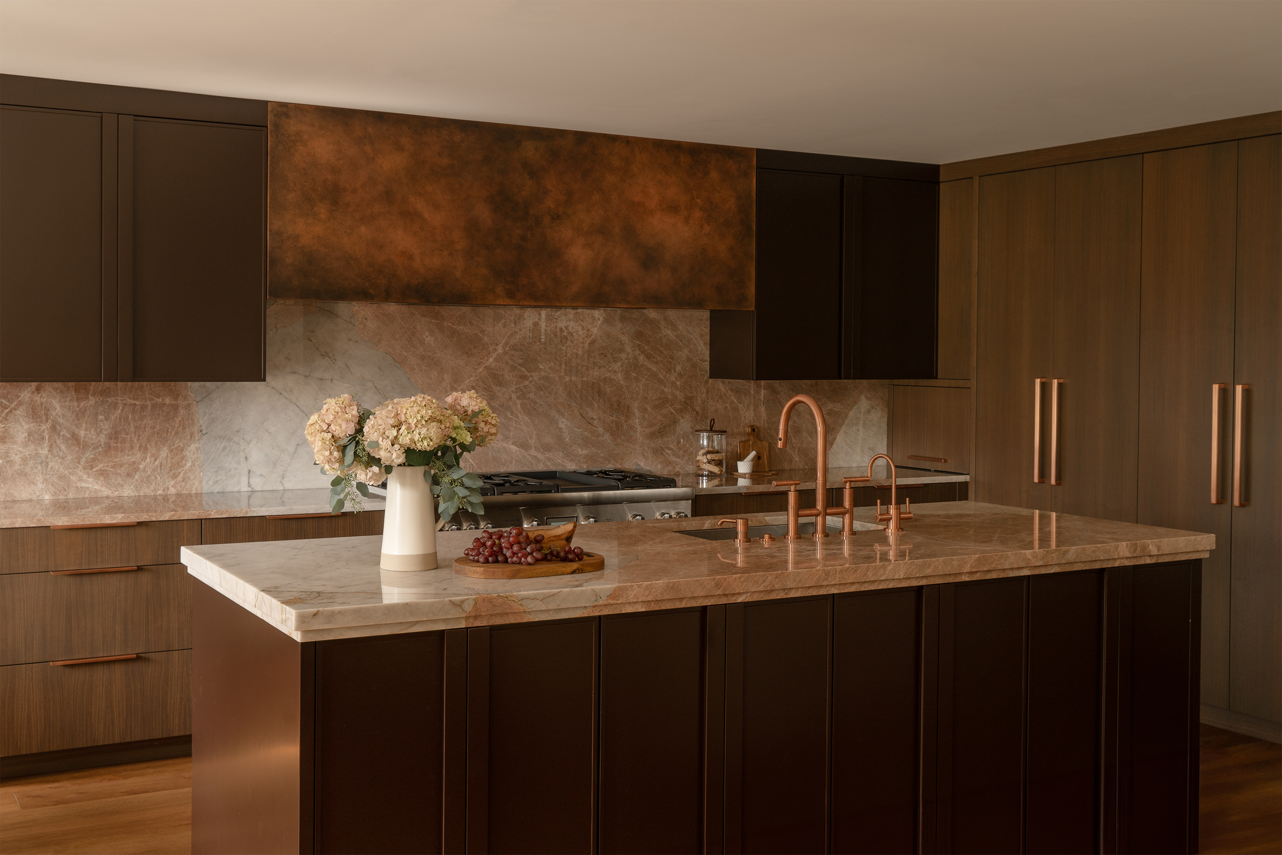
The biggest transformation was the kitchen. The previous space was small, dark and closed off and we knew we wanted to open it up to the main living area and expand it so people can hang out in it together while cooking since we planned to have visitors quite often.
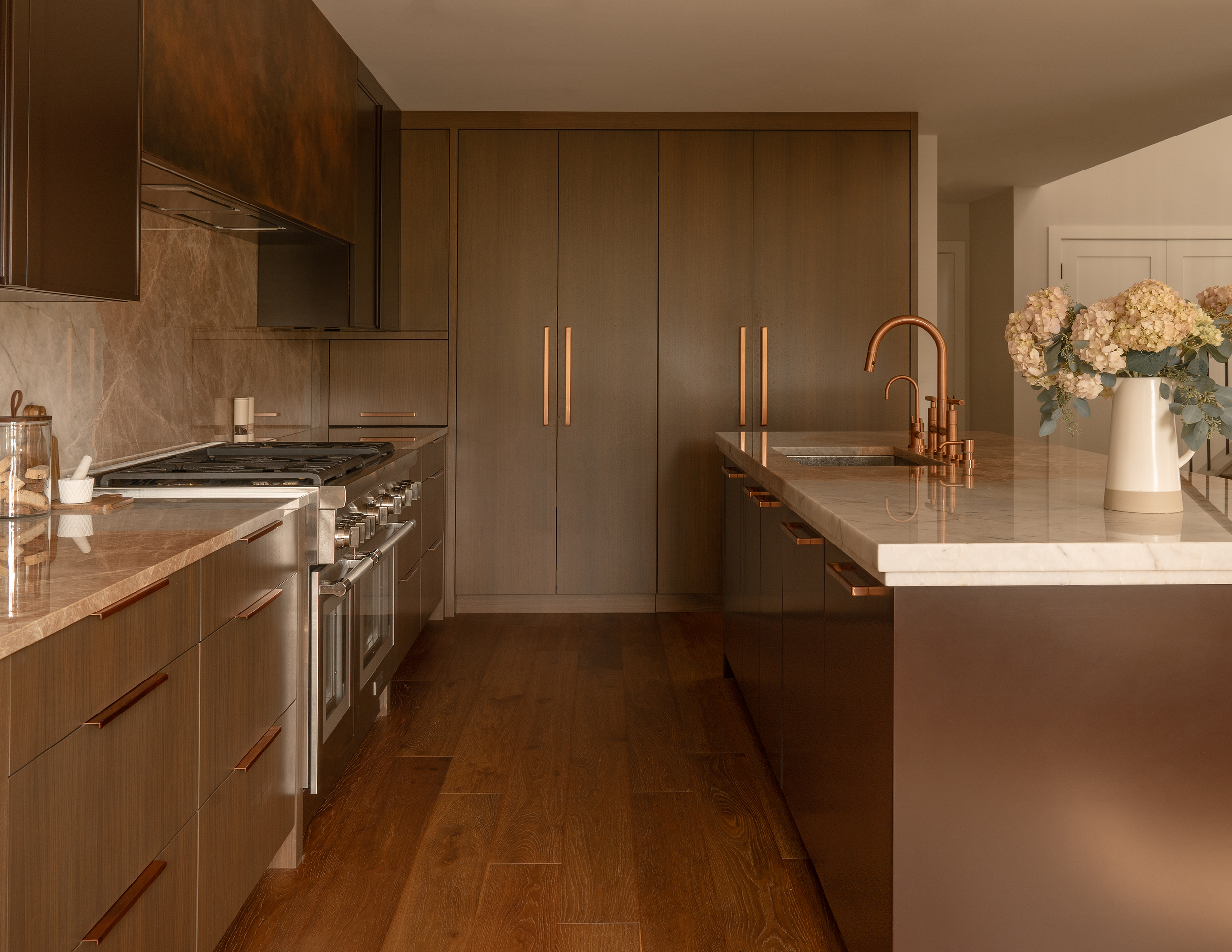
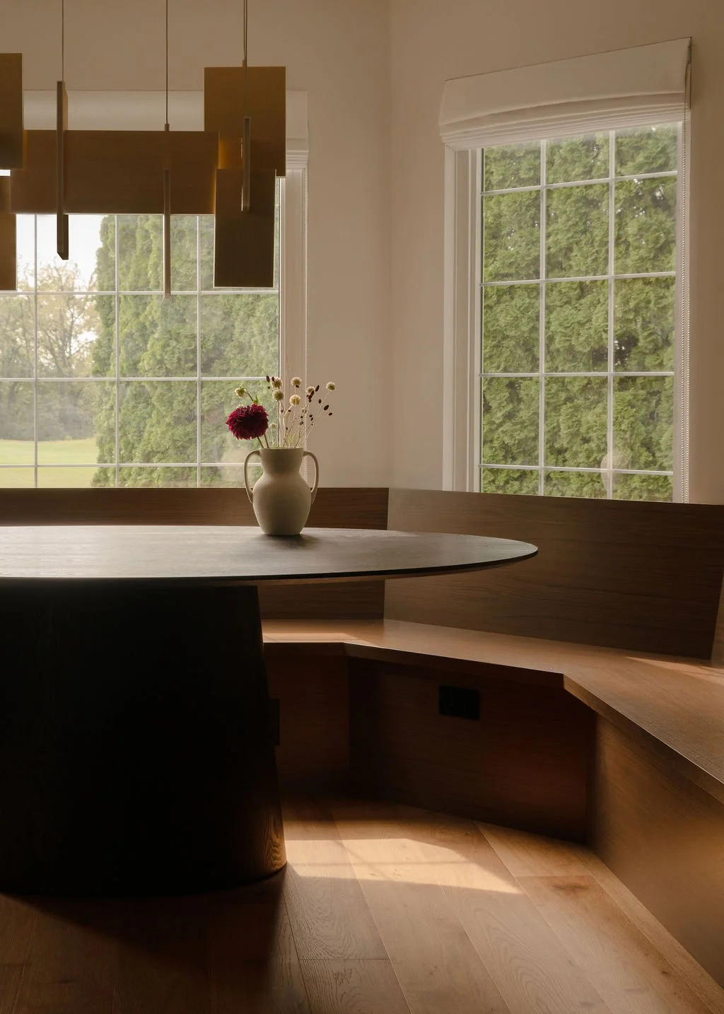
The primary suite was originally on the first floor next to the kitchen, but we knew we wanted to move it upstairs so we stole some space from there, shifted a hallway over, and deleted a stand alone pantry to expand the kitchen and open it up more. We created an L-shaped layout with a long island and opted for a banquette in the bay window instead of island seating to keep the circulation paths clear.
The kitchen is the area we gave the most attention to. I don’t know if it was the sleep deprivation from being new parents, or just a brave step outside our normal aesthetic, but we knew from the start that we wanted walnut and aubergine cabinets. With that, we picked our “cinnamon” floors from Legno Studio and Mike had heart palpitations that we were making a mistake since it was so different from what we normally would lean towards but we both were craving something rich and warm for this home. Once those decisions were made, we leaned in even more and chose brushed copper for the plumbing fixtures and hood. Above the range, we pulled in a simple copper hood shroud but had the metal patinated to give it an aged and distressed look.
When the time came to pick a stone, we didn’t even take a trip to the stoneyard. We had been so many times recently, that we both knew what we wanted…or so we thought. Mike told me he wanted to go with “Patagonia Glace” from Terrazzo and Marble. To be honest, this surprised me at first. Patagonia Glace is a quartzite that is made up of two massive chunks of stone that blend together like a puzzle. One stone is white, almost like Iceberg, and the other is a blush/pink color. I’ve wanted to use this on a project for years and never had the right fit, so naturally when Mike suggested it, I was thrilled. A few weeks later, I was approving the shop drawings and said to Mike, “Wow, I still can’t believe you want pink counters”. To that, Mike froze, and responded, “What are you talking about?” Apparently, Mike meant to suggest “Patagonia”, which is a stone that is made up of big chunks of browns, whites and blacks, and is equally incredible but VERY different. Oops. Clearly I didn’t model or render this the way we would for a client projects, and it was a wonderful reminder of why our renderings are so important! Despite the confusion, Mike trusted me and we had fun freaking our friends out and telling them we were doing a pink and purple kitchen.
It was really important to us to introduce layers and texture in this kitchen to soften it up. We added a stepped detail to the island counter to thicken it up and mimic the adjacent cabinet profiles. For the aubergine cabinets (specifically: Benjamin Moore “Wenge”) we did a thin Shaker profile but integrated the pull directly into it with a thick profile on the grip edge. This was a detail I wanted to test out and start incorporating on projects, and we actually have a few in the works with the same integrated pull!
In the bay window off of the kitchen, we built a banquette into it with a pedestal table for breakfasts, games or just a space for people to hang out while others cook in the kitchen. Eventually, we’ll install a cushion on the banquette but for now, we’re keeping it simple and clean.
What initially drew us to this home was the double-height living room. That’s something that’s always at the top of our wishlist and we knew when we found this place that it was the one. The living room is wrapped in windows and light pours into it all day. We softened the space by installing floor to ceiling taupe drapes. When they’re closed, the room feels like it’s wrapped in a soft, warm blanket. At the fireplace, we wanted to celebrate the double-height wall, so we installed a fluted wood to match the kitchen cabinets at the top and wrapped the firebox in a stepped stone to really enhance the texture.
In between the living room and the kitchen, is a dining room where we chose a hearty, durable wood table that can withstand meals with guests, games and kids. We kept furnishings really simple and chose pieces that are neutral, with clean lines and subtle sculptural touches.
My non-negotiable for this house was a cozy reading chair that I could curl up in with a book. I still haven’t actually had a chance to do that, but I am optimistic that once Max doesn’t need to be constantly chased around the house, it’ll happen! We actually used this chair on another project and I fell in love with it so much I knew it was the perfect piece for us here. It is also Max’s favorite spot to play hide and seek behind.
We kept the primary suite pretty simple and made some layout changes to optimize our needs. Since the original primary suite was downstairs and we converted that to a guest suite, we needed to make this space more functional for us. We reconfigured the layout and removed the giant 90’s Jacuzzi tub in the bathroom, opting to use the square footage for a closet instead. With that, since the bathroom shrunk quite a bit, we leaned in to warm, rich textures to make it still feel luxurious and inviting. In the bedroom, all the clothing storage is housed in the closet, so furniture is incredibly minimal with just an upholstered bed (perfect for curling up with a book in on slow weekends) and nightstands. These particular nightstands have leather upholstered drawer fronts which add such a fun, soft texture to the space.
I hope you all enjoyed this little peek inside our home! It’s definitely different than our normal style, but still carries through those classic principles we love like clean lines, earthy textures and durable, family-friendly materials. I’ll be honest, we had a few moments during construction where we panicked thinking maybe we had made some impulsive decisions in our sleep-deprived haze, but ultimately, we are so thrilled with how everything came together. Thanks for coming along for the ride!
-dgw
Photos: Sofia Barroso


