Home Tour - Getting Personal
INTRODUCTION
If I didn’t already have a huge appreciation for what interior designers do, I certainly would after going through our own home renovation this past year. In the midst of running the business and managing 20 ongoing client projects, Mike and I stumbled upon the perfect spot for our next move, and decided to embark on a renovation project of our own…why not, right?
We always knew that we wanted our next home to have a unique story to it, and to be something we could completely customize. However, I thought Mike was crazy when he showed me a listing for a 2-bed, 2.5 bath condo and said “this is it”. We were already living in a 2-bed, and the reason we even began the search was so that we could gain more space. What Mike then pointed out to me completely changed the game. This unit was in an old high school, and therefore came with some unique bones, including a double-height living space and kitchen. We ran over to the unit that same day to see if our theory was correct and confirmed that yes, we could build out over the kitchen and powder room to add a third bedroom and ensuite bathroom. We were sold.
From there, we spent the next two months fantasizing, designing, and yes…arguing…about the design for our new home.
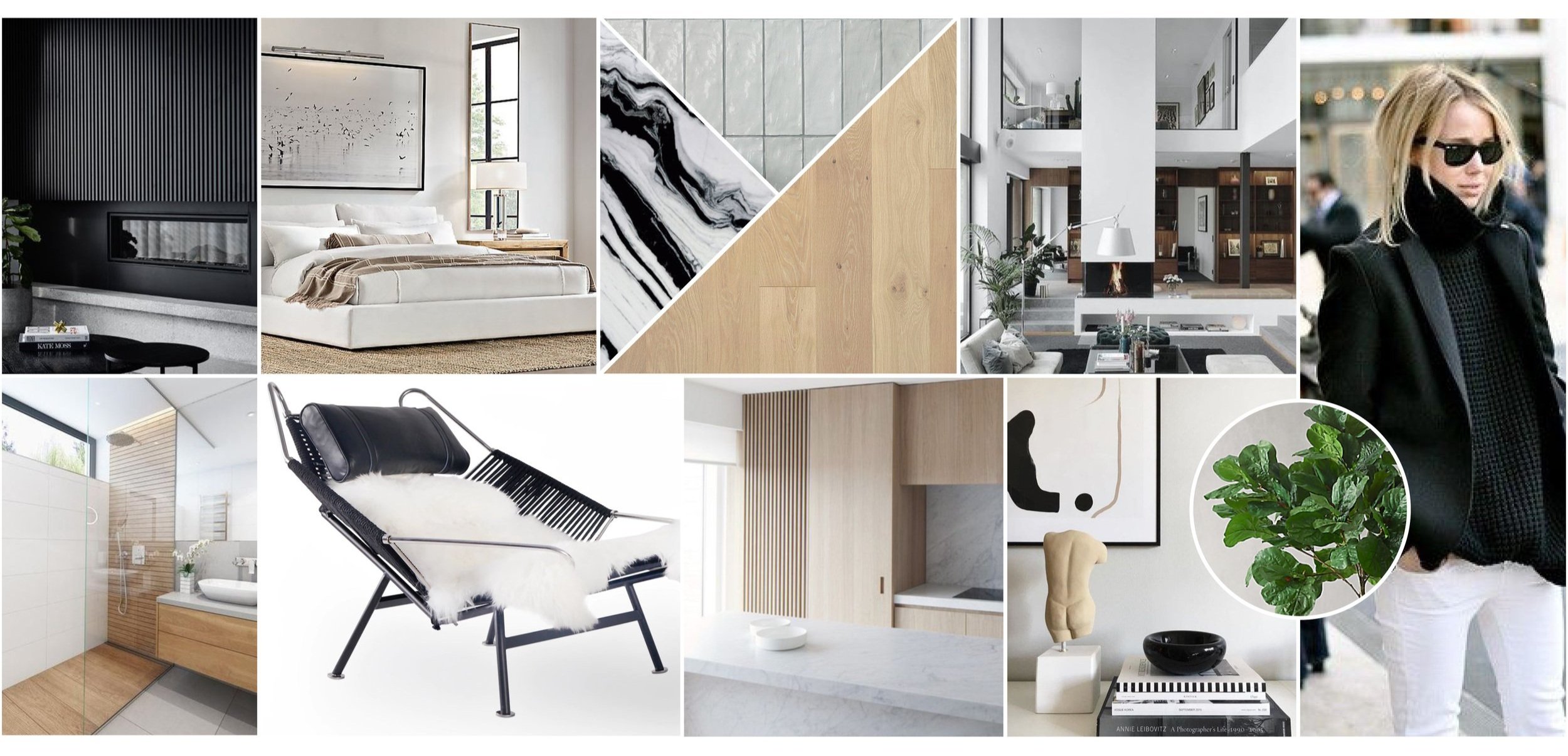
Right from the start, we agreed we wanted the palette for our home to be light, airy and textural. We wanted to incorporate natural, white oak, fluted wood details, and dramatic stone accents.
THE PROCESS
The home was in great shape when we got it, but we needed to add our own touch to it and we mostly needed to create more usable space. Above the kitchen, the empty double-height space was the perfect area to fit in a third bedroom and bathroom without sacrificing any space.
The laundry was originally behind a barn door in the kitchen, and we wanted to enclose it into it’s own space. We also needed to replace all the windows, and decided to take the opportunity to enlarge the third window by the stairs so that it would be the same size as the other two.
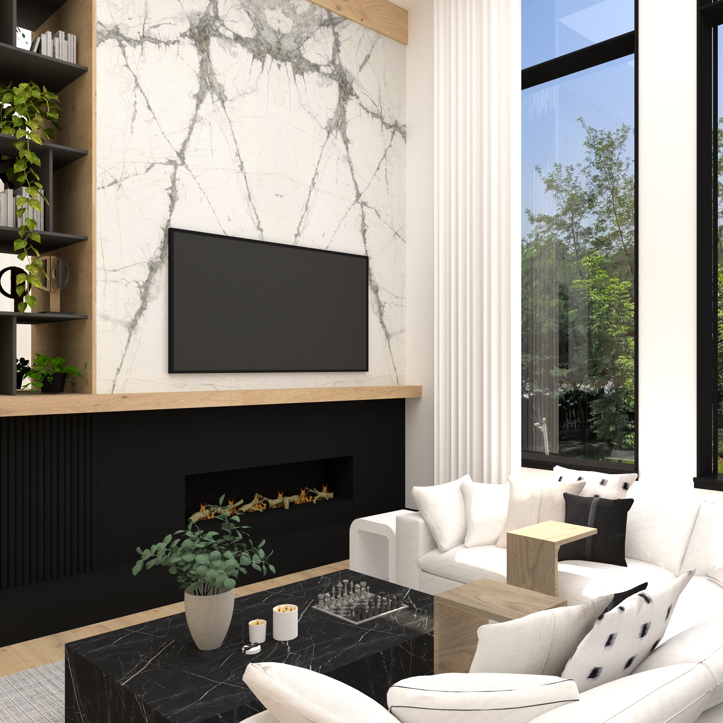
The first thing we designed, which was the sounding board for the rest of the home, was the fireplace wall. We had to keep the firebox in it’s current location, because we were working around chimneys from the units below us, so we created an asymmetrical layout with the fireplace and tv on one side, and storage on the other.
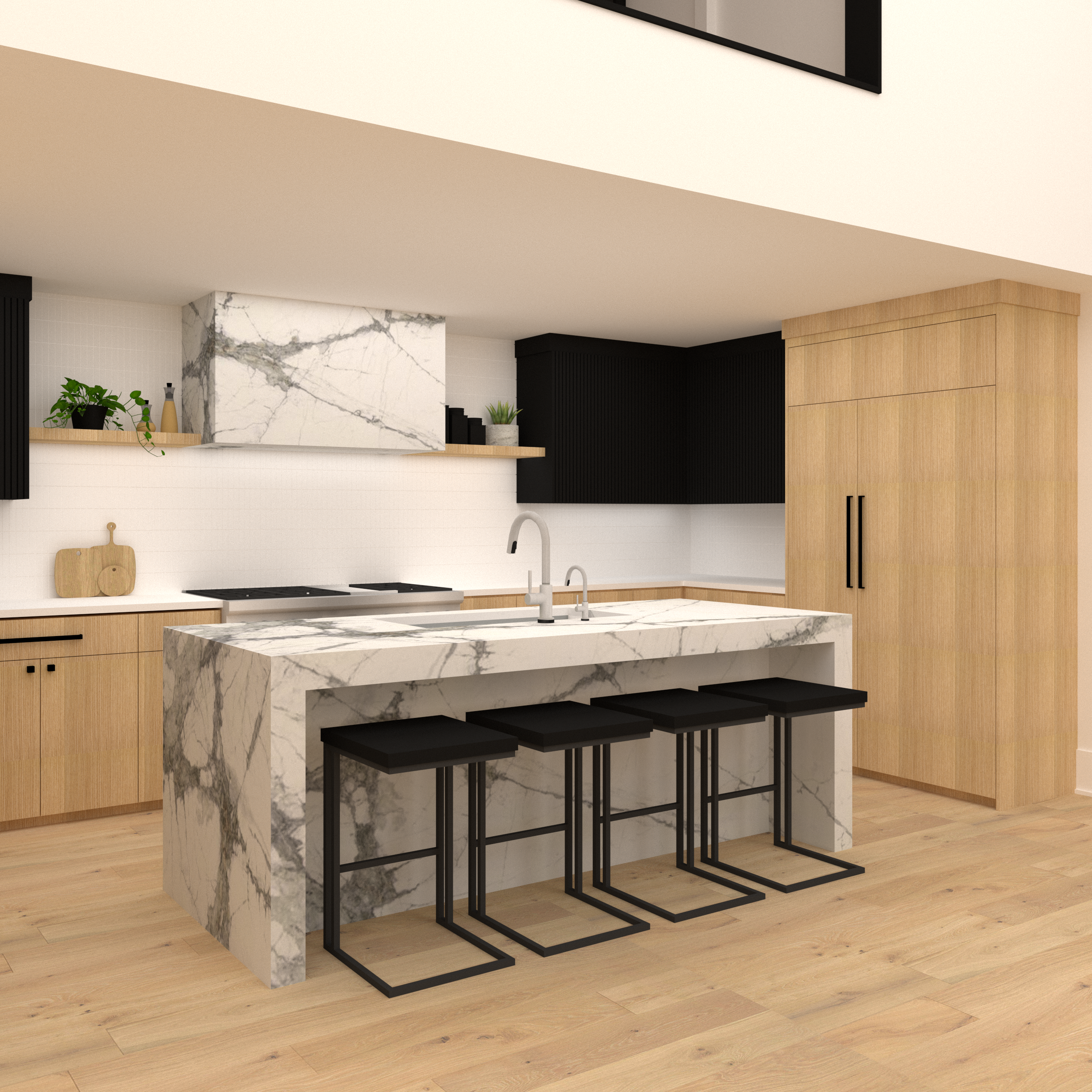
We went through a few different iterations for the kitchen. The original one, shown here, had an island and symmetrical cabinets mirrored on either side, with open shelves tying them into the hood. We decided we needed more of a work-surface, so instead made the island into a peninsula, and made the hood into more of an oversized focal point…you’ll see the final version in the photos.
In the bathrooms, we wanted to carry in the same materials and textures in unique ways.
2021 started with hammers swinging! The original unit was in decent condition, so we donated all of the cabinets, countertops, appliances and light fixtures to Evanston Rebuilding, so that they could get a second life and not end up in a landfill.
For the next eight months, we experienced a renovation the way our clients do, and ran over every chance we could get to see the progress and daydream about what’s coming…and stress out a little too.
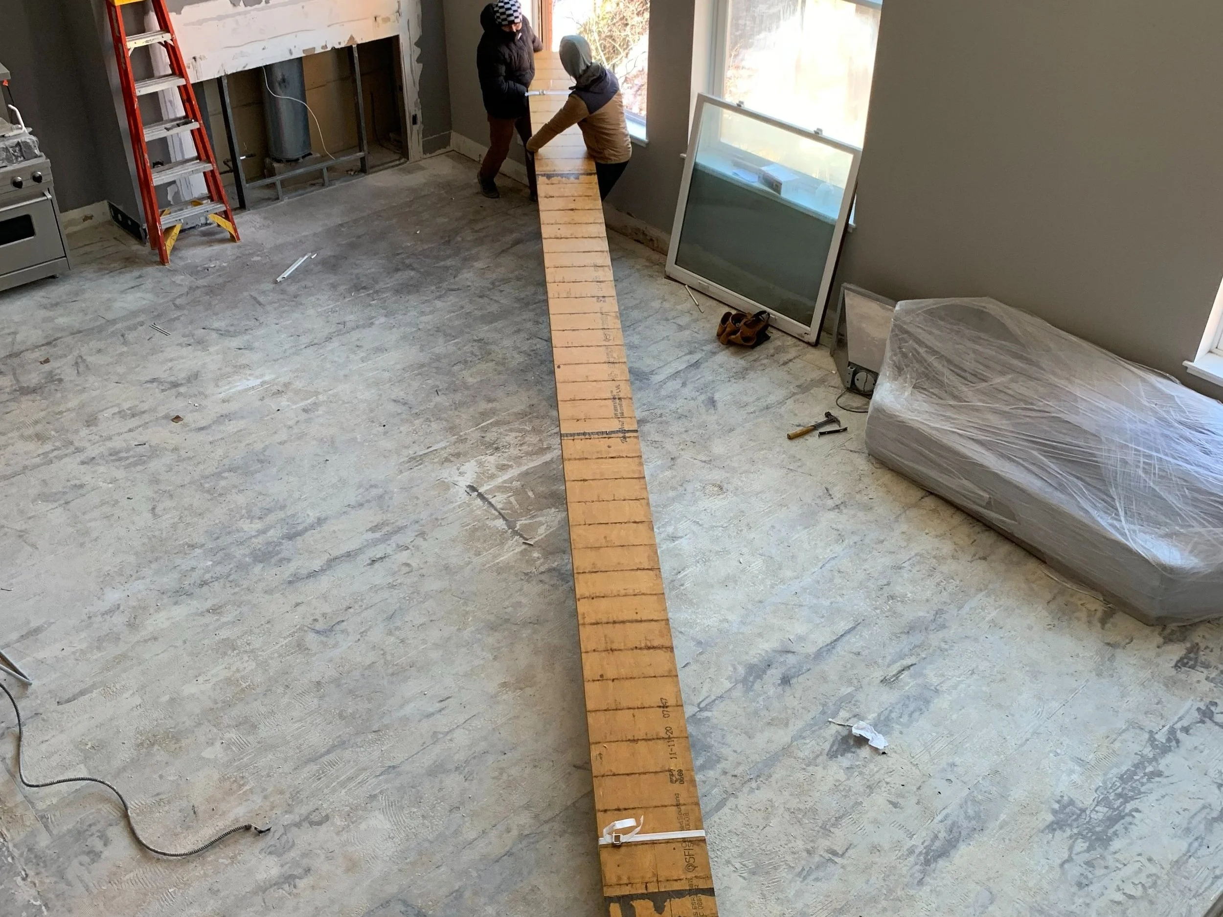
In order to build the new bedroom and bathroom above the kitchen, we needed to crane a beam in through the windows. Our neighbors were thrilled.
Once the beam went in, things moved quickly and we got to finally experience what it felt like from the new bedroom.
Because it’s an interior room, we added a big picture window to the bedroom that allows plenty of natural light to pour in.
Once construction began, we layered furniture and décor into the design. The one thing we knew we wanted from the start was a comfortable, deep sectional with room for both of us to completely lay out.
Behind the living room area, we incorporated a large dining area with a sculptural chandelier suspending down above it.
THE REVEAL
Time for the reason you actually came here…the photos!
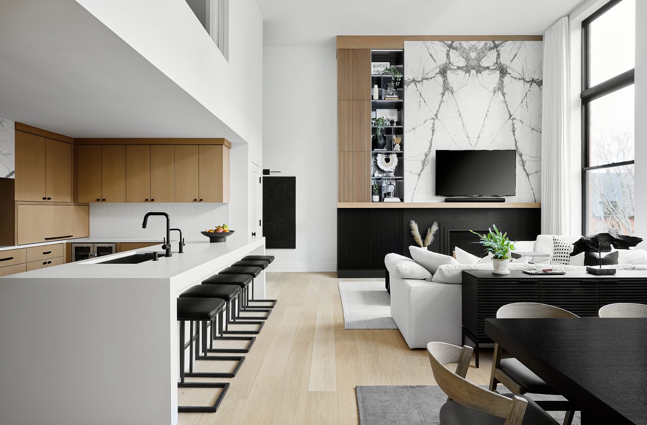
This main living area is the truly the heart of the home. The living and dining room are filled with natural light from the double-height windows, and the kitchen feels like an extension of the space. We get asked about our floors all the time and have actually put these on a few projects since ours because we love them so much. We chose a natural white oak Boen floor from Legno Studio…engineered of course (and if you have questions about the difference between engineered and solid, DM me and we’ll chat). This is the first thing I see when I leave our bedroom every morning and I still pinch myself that our dream came true.
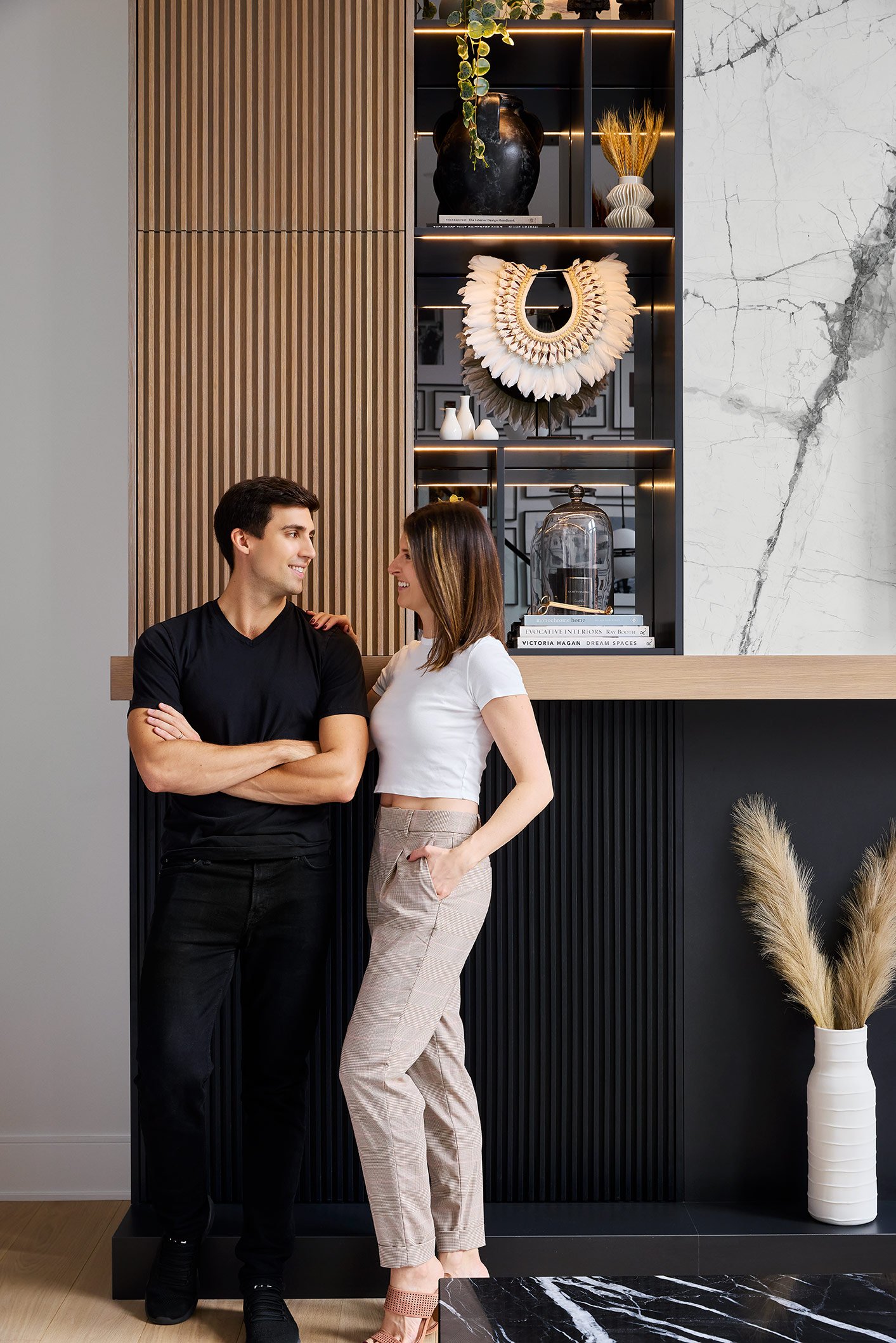
The focal point of the living room is the dramatic fireplace wall. We chose a book-matched stone to go behind the tv and a satin black porcelain to wrap the fireplace beneath the mantle. We carried the black across the bottom with 4-foot wide fluted wood cabinets because you can NEVER have enough storage in the city.
When we were at Terrazzo Marble picking our countertop and fireplace slabs, we fell madly in love with a black marble and instantly knew it was perfect for our coffee table. We had Beckerworks create a custom plinth table with the stone to fit our sectional perfectly and carry in dramatic stone veining to the seating area.
At the fireplace, we knit a few different elements together in one cohesive design. On the right side, bookmatched stone slabs create a focal point behind the TV, while black porcelain frames the fireplace and ties in with the black cabinets beside it.
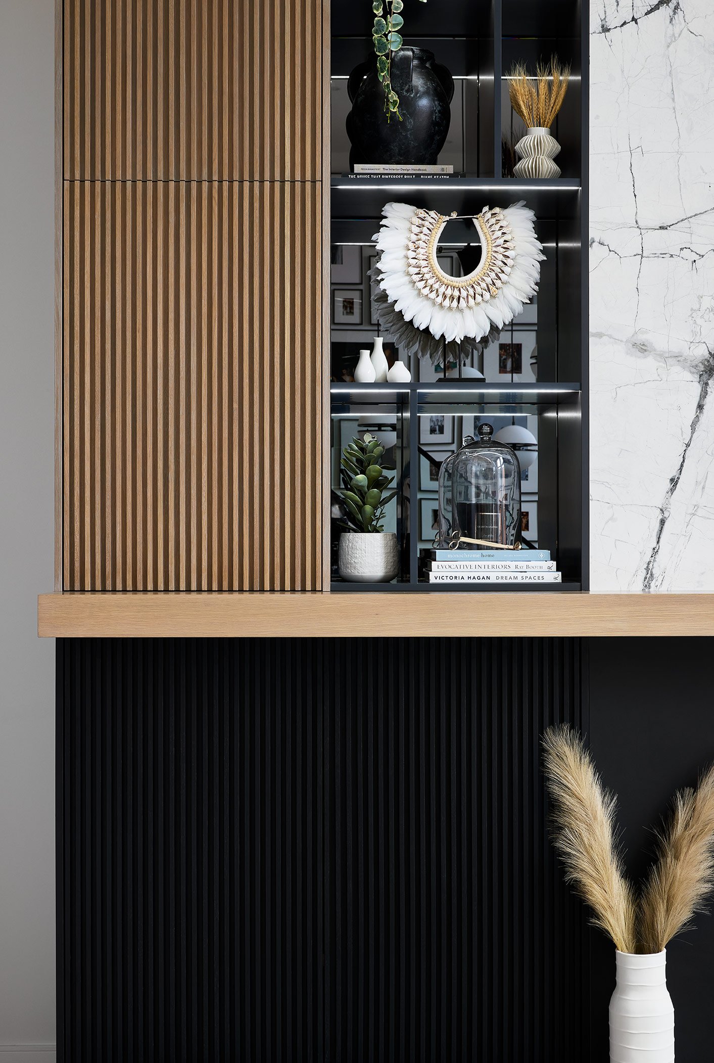
On the left, we carry fluted wood cabinet doors from the floor to the ceiling hiding extra storage and carrying in some natural texture. Below the mantle, the cabinets carry across 4-feet wide, while at the top, we took them 2-feet wide and then transitioned to open shelving with gray mirror backs. Slim, linear lights illuminate the shelving at night and highlight all the accessories that we styled in them. And by we, I mean Mike styled them while balancing on a 15-foot ladder and I directed him from the safety of our sofa. (Love you honey!)
It’s Oksana created custom linen drapes for the space to carry the eye all the way up to the ceiling. They create a soft backdrop for the cozy, loungey sectional.
We kept the furniture low profile in the living and dining room so the spaces feel unified and modern. Here, you can see that third window that we raised…now it’s the same height as the other two and feels much more unified!
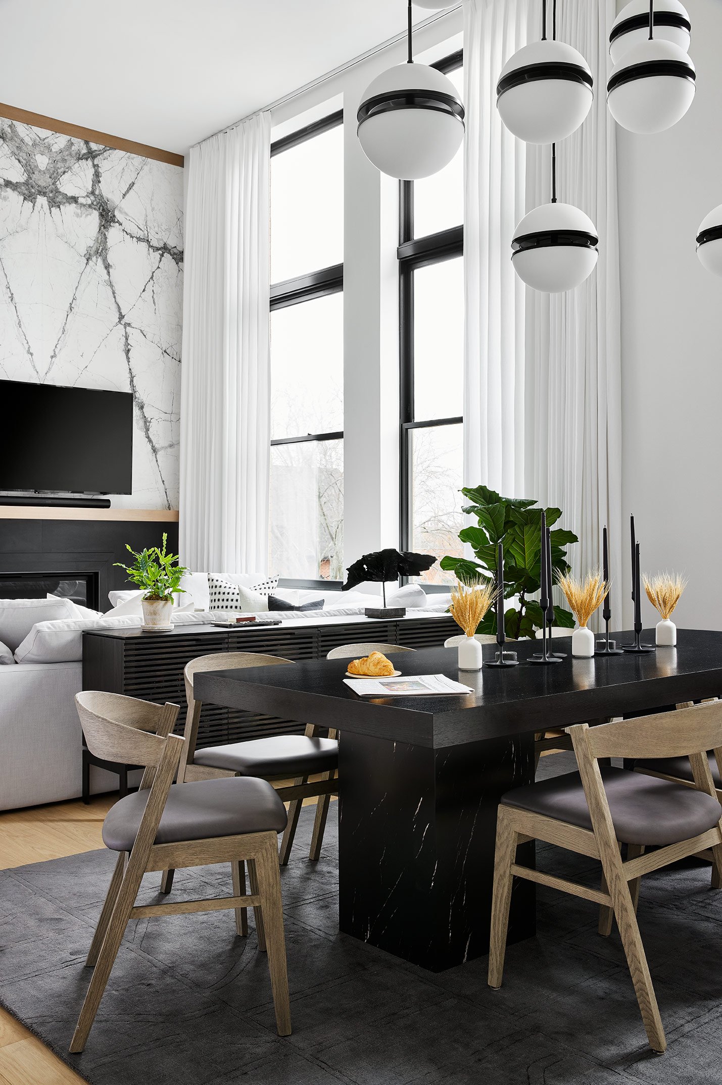
Above the dining table, we dropped oversized, sculptural globes that act as a light fixture to bring the ceiling down a bit above the table, but also become an art installation in the space.
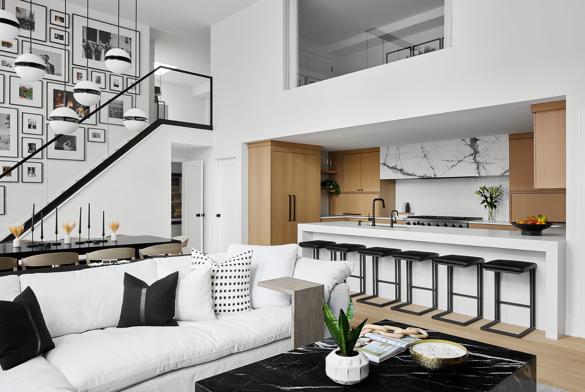
One of our favorite parts of the design is the gallery wall that we curated above our staircase. We filled almost every inch of the wall, and that’s the only place we have personal photos in the whole home. Today, it’s full of pictures from our wedding and honeymoon, but over time we can swap the frames out so it’s ever-evolving.
The dining table incorporates the black marble from the coffee table in it’s pedestal legs and a rift-cut black stained oak top to maintain a simple, modern aesthetic. Also, for those of you who follow our stories on instagram and voted for the croissant and book shot…here it is ;) We called an audible last minute and swapped the book for a newspaper. Mike still thinks it’s cheesy.
Above the kitchen, we incorporated an oversized picture window in the third bedroom to allow natural light into the room. Blackout drapes provide privacy when guests are in the room and we’ve since learned that this doubles as a fun stage when kid’s are visiting.
The kitchen pulls in Japandi-influence with rift-cut white-oak cabinets, a simple textural backsplash and an oversized stone hood.
Mike and I HATE clutter. It was really important to us to be able to high small appliances out of site when they aren’t in use, so we incorporated two 4-foot long appliance garages on either side of the range wall.
When they’re open, we have access to all of our small appliances, and then as soon as we’re done using the, we can close them back up.
Above the range, we incorporated the same stone from the TV wall and created an oversized yet simple hood.
The backsplash throughout the kitchen is a simple ceramic tile that adds a soft texture to the space without competing with the wood and stone accents.
Beside the refrigerator, we tucked in some open shelves to provide a coffee station for easy access during busy mornings.
In an effort to tie the two floors together and not add any visual clutter, we incorporated a new glass stair rail. Yes…we are aware there will be fingerprints galore once there are kids in the home, and we have made peace with that.
Above the kitchen, the third bedroom feels like an extension of the living room with the oversized picture window. Today, this room is my office but when guests visit, the sofa easily pulls-out to an extra bed and this becomes an en-suite guest room.
The new bathroom off of the third bedroom is probably my favorite bathroom in the house. We incorporated a carved marble tile on the accent wall as a nod to the fluted wood in the living room cabinets. From there, we carried in the same wood tone at the vanity cabinets and stone from the TV wall into the countertop.
Matte black Brizo fixtures create a luxurious spa-like experience for guests.
The other bedroom upstairs is our main guest room. We retired the bedroom furniture from our previous primary suite up here to give it new life and create a space that guests can comfortably relax in when they come visit.
Are you seeing a pattern yet? We carried in the same stone for the vanity in the guest bathroom as well as a fluted wood-look porcelain tiles to add warmth to the walls. In here, we opted for a floating vanity to add a delicate touch.
The primary bedroom is actually on the first floor, and the ceilings in here are quite low. In order to make the space feel light and airy, we kept the palette simple and bright. We opted to suspend pendants above the nightstands to draw the eyes up and make the ceilings feel taller, and took that even further with tall mirrors carrying from the nightstand to the ceiling.
The palette is kept simple with natural textures and shades of white for a soothing, hotel-like feel.
Floor-to-ceiling ripplefold drapes also create the illusion of a taller ceiling and create a simple, soft backdrop for the seating area.
The primary bathroom is actually a hybrid of the existing conditions and our new aesthetic. We kept the shower as it was (the previous owners had recently renovated it, and did a great job) and also kept the white subway tile that extended out of the shower behind the vanity. In the rest of the room, we brought in the Porcelanosa Noa tile…something I’ve had on my wishlist since one of my very first projects. The tile carries in a sculptural wood look, but is completely waterproof.
We kept it simple by the tub for a truly Japandi spa-like escape. The Brizo Jason Wu tub filler adds some contrast but otherwise the tile wall is the artwork here.
At the vanity, we wanted the look of one long, linear and integrated sink, but needed the surface area between the sinks to be functional. As a solution, we integrated two sinks into the countertop and recessed the part between them just about two inches so that it stays dry, but still gives a seamless aesthetic.
Yep, this is the same home. In the powder room, we went for a completely different look. I always say, there are no rules in a powder room, you can do whatever you want in there (from a design perspective at least). In ours, we opted to black it out. The walls are wrapped in a black and brass inlay tile, the ceiling is painted black and the vanity and faucet are black. Even the toilet and the toilet paper are black…we did not hold back. Above the vanity, we incorporated an antiqued mirror with brass talons wrapping around it to give a luxe, dramatic touch and suspended one single pendant in front of it.
We are so excited to share our home with you all! Thank you so much to everyone who followed along on this journey from the start. I hope you all love the end result as much as we do!
-Devon and Mike
Photos: Dustin Halleck
I also want to give a huge thank you to some of our vendors and trades on this project:
Construction: Domain
Stone Supplier: Terrazzo and Marble
Stone Fabricator: Beckerworks
Flooring: Legno Studio
Plumbing Fixtures: Brizo and Delta and Studio41

