Home Tour - On the Catwalk
INTRODUCTION
Every Chicago neighborhood has its own unique character and spirit, and it can be a great source of inspiration behind the design of a home. DGI was brought in to gut and renovate a penthouse loft in a historic building in the West Loop. The West Loop neighborhood is rooted in industrial beginnings and a gritty spirit, so it was important to celebrate that in the design. On the other hand, we wanted to transform the outdated penthouse into a modern home tailored to our client’s exact needs. So, the goal for the design was to create a sleek and polished penthouse with nods to the building’s industrial character. This project was complex and detail-oriented, but we are thrilled with the result and it’s one of our favorite designs to date. So without further ado, enjoy our latest home tour!
The mood board set the sleek and polished tone for the design with natural materials (such as wood floors & marble counters) and sculptural furniture.
THE PROCESS
The existing penthouse had some interesting, industrial style features that we wanted to highlight, such as high ceilings, exposed metal beams and an open catwalk leading to an epic loft and roofdeck. However, the geometry and layout of the unit was awkward, and the finishes were outdated and a bit clunky. The design process started with improving the geometry and selecting new finishes and materials throughout the celebrate the raw nature of the building and add a polished, sophisticated aesthetic.
Looking back on the before photos reminds us just how much the space has transformed!
The open, metal catwalk at the center of the penthouse and the exposed cement columns on either side were unique features that we were excited to incorporate into the design. However, the awkward angles of the walls, messy lighting, and outdated floors were priorities to be updated.
The kitchen was too basic and outdated for this unique space, with maple cabinets and stainless steel countertops. So, we gutted the entire kitchen to start fresh.
The existing catwalk had a super industrial feel with an open, metal floor and cable railing details. We highlighted the catwalk in our design, but updated the finishes for a more polished and modern look.
The loft had so much potential, but the clunky track lighting, and chopped up cabinetry felt chaotic. We cleaned up these details and added more custom and integrated features to make the space feel more complete.
The primary bathroom was even more chaotic than the loft, with mirrors and checkerboard tile throughout. This space was completely gutted, and we selected more modern and luxurious materials to really elevate the space.
When it came to selecting materials on this project, we opted for natural materials that relate back to the existing space and celebrate its history. In the kitchen, we opted to go with rift cut oak cabinetry with a custom dark stain, honed Carrara marble, and living brass finishes. These natural materials are clean and modern but will patina over time, adding character and grit to tell the story of life, much like the history of the building and it’s neighborhood.
We customized the details and finishes of these materials to make them feel even more special and fine-tuned for the space. For example, the cabinetry was wire brushed to add texture and the brass hood was patinated to age it. The photos below show the process of fine-tuning these materials.
Here is a sample of the custom patinated brass hood. We then patinated the surrounding hardware and cabinetry details for a cohesive feel in the kitchen.
The hardware pulls for the kitchen also have a custom patina finish to match the hood. The hardware throughout the kitchen gives the space a custom and polished feel because they were integrated into the cabinetry. For the appliance pulls, we had prototypes created to ensure the clients fingers fit the custom pulls comfortably. The details on this project were extremely fine-tuned and detail oriented, and the result is one-of-a-kind.
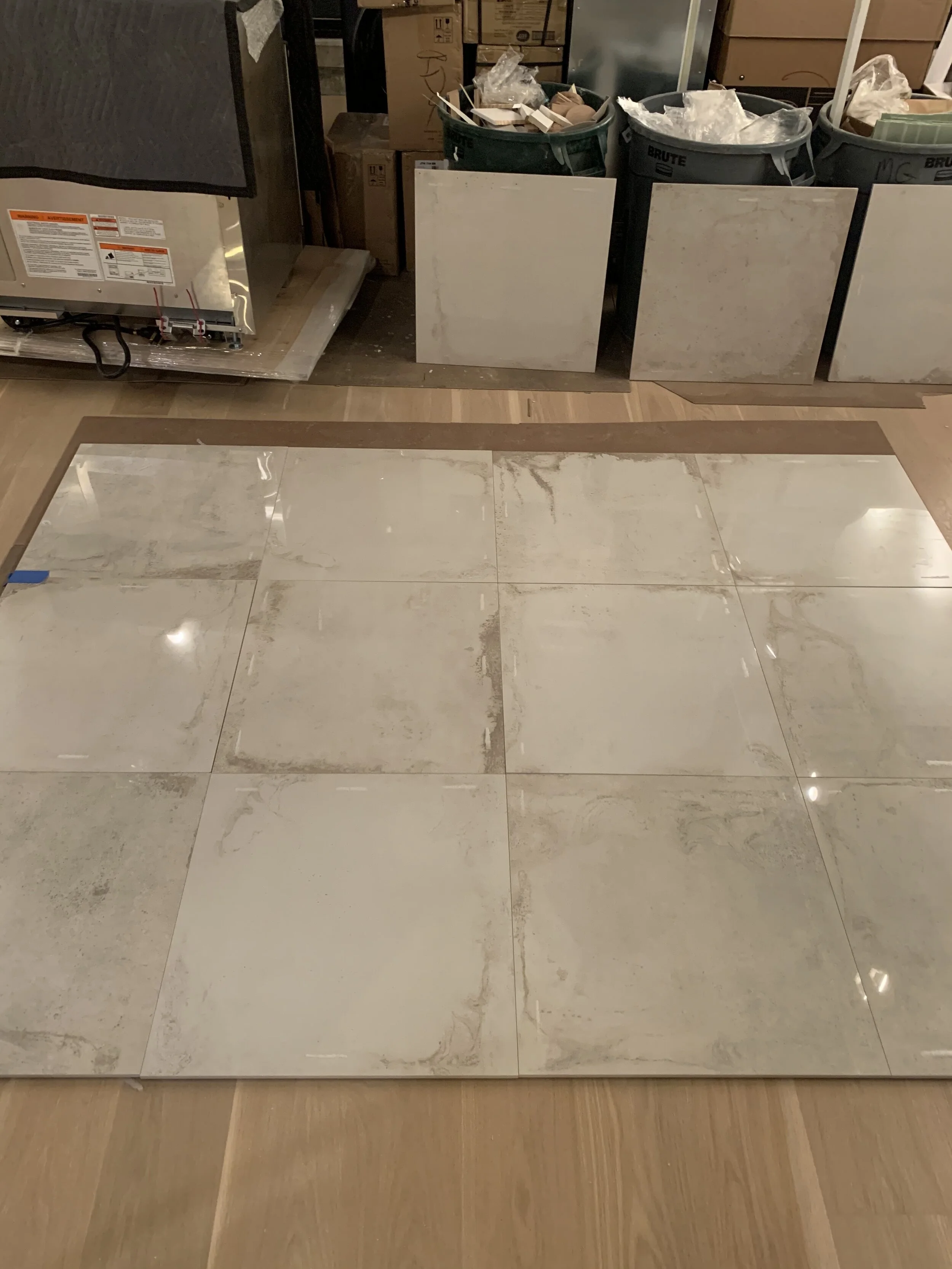
We selected and carefully laid out a wall tile that complements the existing concrete column that we incorporated into the new bar area to ensure the resulting pattern looked as natural as possible.
We say it often, but renderings are one of the most valuable ways for clients to visualize the design - especially for clients that are highly involved in the process. Here are a few key renderings from our presentation:
This rendering of the kitchen shows how the dark stained cabinetry, marble counters & backsplash, and brass details come together and complement the existing concrete and metal accents.
This rendering shows the entire open space and the new bar added beside the dining area. We used the existing catwalk as the end point for the bar, and highlighted the existing concrete column with a complimenting backsplash tile. The finish on the wine fridge tower was carried up onto the bottom of the catwalk for a continuous and sleek look. Sculptural furniture pieces were selected for a modern yet artistic feel.
The primary bathroom has a completely new look and feel. It’s bright and light, with a graphic marble counter and backsplash that feels luxurious and polished. We worked through a few options for the mirrors and sconces. Keep reading to see what the final selection was!
THE REVEAL
Finally, we are thrilled to reveal the photos of the finished design, which came together even more beautifully than we could have imagined! It is the perfect balance of sleek, modern, and polished while maintaining its industrial and gritty history.
The main floor of the penthouse is an open concept kitchen, dining, and living space. The tall ceilings are celebrated with industrial style details and architecture that draw your eyes up and around the open space. The zones flow together seamlessly because we carried similar finishes and accent tones throughout. Fresh engineered white oak hardwood floors were installed throughout for a clean and continuous feel between the spaces.
The kitchen is the first space you see as you enter the home, and it definitely makes an impact and sets the tone for the rest of the space. The sleek cabinet profiles, clean lines, and rich wood tones give this kitchen a modern and polished feel. Meanwhile, the textures of the wire brushed cabinetry and honed Carrara marble give the space a warm, inviting touch that complement the industrial elements.
The kitchen really celebrates the existing industrial architecture and details.
The countertops add a stunning contrast to the dark stained cabinetry. The white Carrara marble has a honed finish with a 2 inch mitered edge for a substantial feel. We carried the countertops up into the backsplash for a seamless look, and to really celebrate the beauty of the natural stone. Then, we opted for a living brass statement hood to add even more contrast and warmth to the kitchen. The hood has a custom patina finished for a beautifully aged appearance.
The kitchen cabinetry is rift-cut, white oak with a dark stain, and it was wire-brushed for added texture. It gives the cabinets a unique and aged feel. The vintage style faucet stands out like a work of art along the backsplash, and it is another selection that nods to the history and era of the building. It has a living brass finish to age and patina over time, adding even more character.
The brass appliance pulls on the refrigerator and dishwasher were designed custom by DGI and integrated into the cabinetry. Constructing prototypes and testing the pulls was well worth it for the stunning, sleek aesthetic they add to the space. The finish is the same custom patina to match the hood to keep everything cohesive.
This close up shot shows the intricate texture of the wire brushed cabinetry and the aged brass details that were integrated into the corners of the island. It also shows the detail of the thick, mitered edge on the marble countertops, and the subtle floating details to elevate and lighten the design. These details gives the island a custom and one-of-a-kind feel that will age timelessly.
This point of view from the stairs shows the kitchen beneath the loft and catwalk. You can the cohesiveness of these spaces now that the wood cabinet finish was carried into the loft. The lighting, cable details in the railings, and geometry was cleaned up for a more sleek and seamless feel.
Above the island, we added a metal arm from the base of the loft to suspend lighting across the kitchen. It’s a simple and clean look that lets the kitchen finishes stand out on their own. At the island, we selected counter stools with a sculptural appearance and metal strapping that complements the metal accents throughout the home. They have low backs to keep up the clean look and unobstructed views of the kitchen.
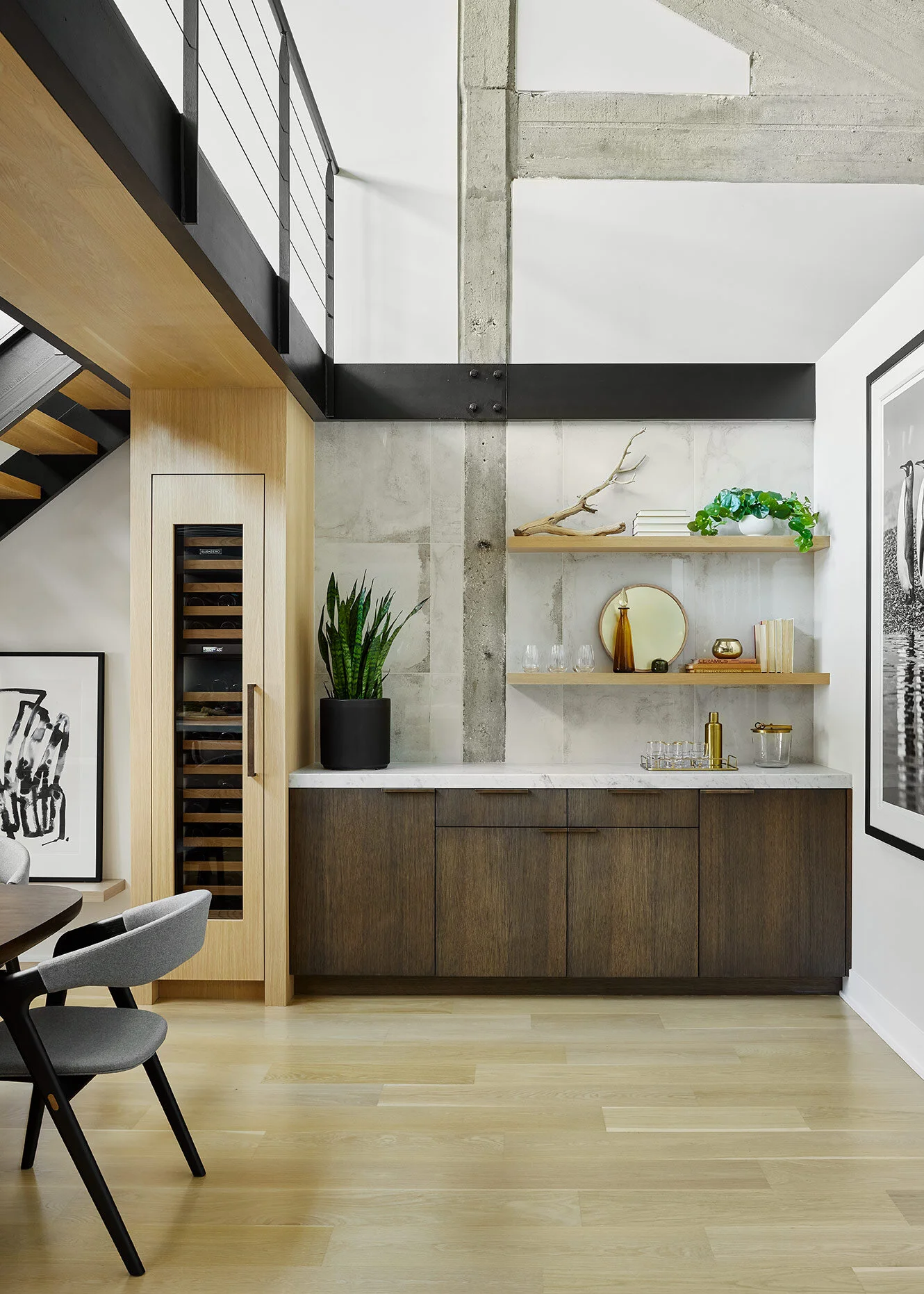
Across from the kitchen, we designed a bar for the dining room space. We used the existing stairs, metal beams, and cement columns as direction for the design of the bar. The base cabinets match the finish of the kitchen cabinets, but the wine fridge tower stands out in a lighter finish that matches the floors, which we carried onto the catwalk above it. This gives the catwalk a continuous and wrapping feel.
We selected a wall tile that complements the exposed cement column. It’s polished finish gives it a sleek feel, while its textured and graphic appearance give a nod to the industrial and gritty surroundings. We opted for open shelving above the cabinetry as an opportunity to display accessories and drinkware.
In this detail shot, you can see just how much texture and grit the cement and the tile add to the bar area, while still maintaining a sophisticated and polished aesthetic.
Tucked between the stairs and the wine fridge, we added a floating ledge to display artwork and activate an otherwise under-utilized space. Above the dining table, a modern, sculptural chandelier is suspended from the double height ceiling. The suspended fixture mimics the cable details in the stair railings beside it and almost blends into it’s surroundings while still providing a cozy glow in the evenings.
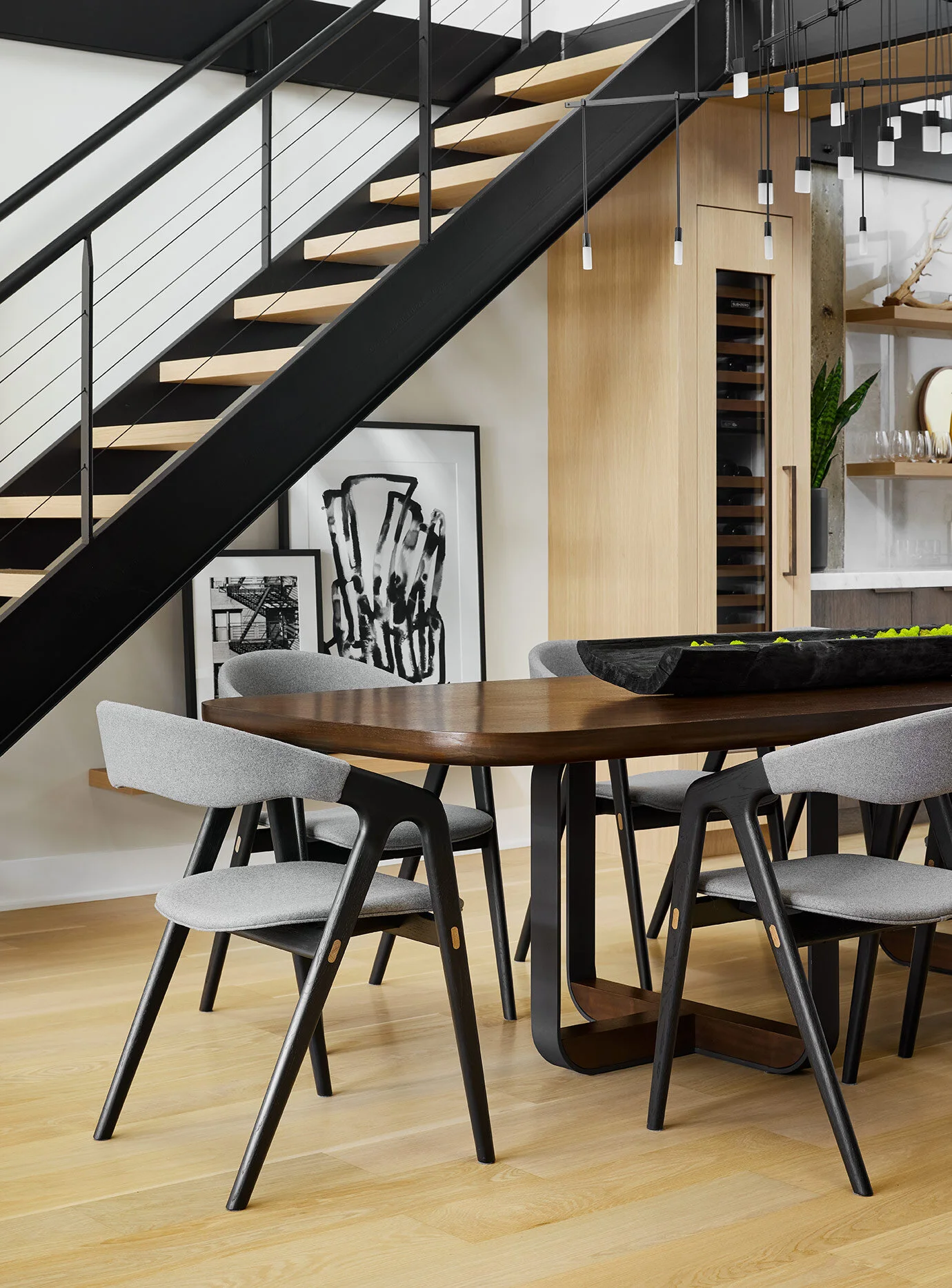
The black metal on the stairs and catwalk is contrasted by a light wood, floating stair tread. The catwalk is a defining element in the space, so the dining furniture had to be carefully selected to celebrate it. The tones of the dining table and chairs complement the black metal catwalk, while also contrasting the light wood floors, stair treads, and wine tower.
It was important to select furniture that felt modern, yet sculptural and artistic. The dining table and chairs feature unique curves, which differs from the clean lines and sharper angles throughout.
The living room provides a space to lounge and relax, while still feeling sophisticated. We opted for furniture with low profiles to celebrate the tall ceiling heights and keep clear sightlines throughout the open space. The focal point in the living room is the epic Calacatta Viola marble coffee table that was custom made for the space. It’s graphic appearance and red-wine tones command attention and add warmth to the room. The rest of the furniture was kept neutral to allow the coffee table to stand out on its own.
We designed a floating media console beneath the TV, carrying in the cabinet finish from the kitchen and bar to help the spaces flow together. However, we opted for a six-inch mitered quartzite countertop to help it stand out from the kitchen and tie in with the stone in the loft above.
The side chairs carry in the brass accents from the kitchen, helping to tie the spaces together. With their low profile, you can see directly into the dining room and kitchen from the back of the home. An aged leather adds a nostalgic touch to the space while still maintaining a modern aesthetic.
Moving along the main floor, the penthouse features a primary suite, guest bedroom, and guest bathroom.
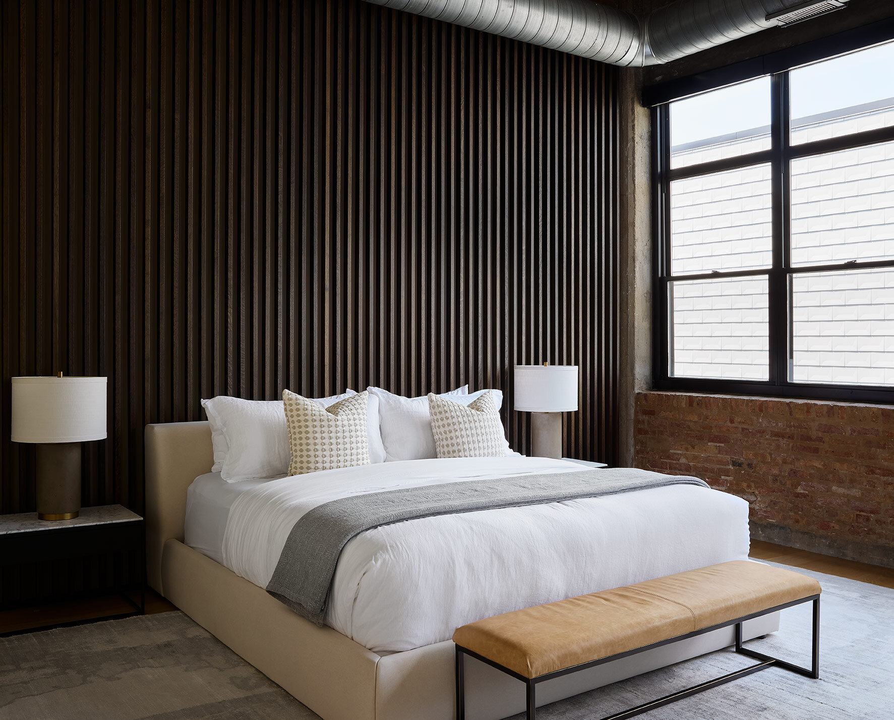
Our client was a young bachelor, so the primary suite was designed to feel masculine, understated, and hotel-like. In the primary bedroom, we kept the exposed brick, HVAC, and cement columns to celebrate the existing details and industrial character of the building. However, we opted to balance it out with sleek, modern details.
The focal point in the bedroom is the wood slat wall that we added behind the bed. It features the same stain as the cabinetry throughout the rest of the home, tying each space together. It adds texture and depth, and makes the bedroom feel more luxurious.
The clean, white bedding adds to the hotel-like feel in the bedroom. We selected bedside tables with black metal and marble to carry in these accents from the main living space. The bedside lamps feature a concrete base adding to the masculine feel and celebrating the existing cement accents.
The existing fireplace frame had the gritty feel we wanted for the space, but it was originally set at an awkward angle. So, we cleaned up the geometry of the bedroom and moved the fireplace along the back wall to sit directly across from the bed. Beside it, we carved out a nook to feature open shelves, which added an opportunity for accessories and styling.
This primary bathroom is the most luxurious space in the home. It features Carrara marble with a graphic, organic texture swept throughout the bathroom, adding to the luxurious feel. The vanity has a minimal profile and integrated finger pulls for a sleek appearance. The floors are a swirling, concrete look tile that plays on both the new organic textures and the existing industrial details throughout the home.
A six-inch, mitered edge Carrara marble countertop with integrated sinks furthers the sleek and luxurious feel of the bathroom. The polished nickel finish on the mirrors, sconces, and accessories give the space an elegant and warm touch. Once again, the faucet nods to a vintage style, with cross handles, but feels modern with clean lines and a wall-mounted installation. Every detail is fine-tuned for the space. For example, the soap pump mimics the texture of the accent tile in the shower behind it.
The Carrara marble is carried into the shower, and we opted for a dimensional, marble accent tile to break up the Carrara in an elegant way. A bench and a ledge for storing shampoo were added seamlessly along the back wall. Glass walls surround the shower for a sleek, spa-like feel.
Up close, you can see the precision on the saw-tooth profile of the accent tile. It adds a delicate depth and dimension to the sleek space.
The valve trims in the shower match the faucets at the vanity. Once again, they add a vintage yet modern touch to the bathroom.
The guest bedroom is compact, but it had two important roles. It needed to function as both an office during the week and a bedroom for visitors. The solution for this was a custom murphy bed that pulls down to act as a bed for visitors, but…
When the bed is tucked away, it spins at 180 degrees to function as a collapsible desk during the week. The shelf accessories stay perfectly styled, even when the bed is pulled down, because of the spinning feature. Check out our viral TikTok for the full visual :)
Across from the guest bedroom/office, we designed a sleek guest bath. This bathroom is a clean and modern take on the existing concrete accents featured throughout the rest of the home. A concrete-look tile covers the walls and floor. Along the back wall of the shower, we selected an with a slightly different texture to add depth and dimension. The wood vanity is finished in the same stain as the rest of the cabinetry throughout the home to keep a cohesive feel.
We also incorporated the same Carrara marble countertop with an extra thick mitered edge and an integrated sink for a modern and luxurious feel.
Upstairs, the open catwalk leads into the remodeled loft, housing both a more casual living room for entertaining and a home office.
Remember how the loft felt a bit chaotic? We cleaned up the geometry and designed a custom media/bar built-in along the backwall, and carried it up to the ceiling to help the space feel more complete. We opted for fun furniture and accessories with more of a vintage and nostalgic feel. The new chandelier centers the space and adds a retro touch.
We carried the same wood cabinetry that is seen throughout the rest of the home up into loft space. We opted for a quartzite countertop at this built-in, the same as the media console in the living room to tie the spaces together. To expand the space further, we incorporated an antique mirror backsplash to play on the nostalgic, vintage feel in this space. The accessories feel vintage and add some pops of color to the open shelves.
The vibrant green velvet stands out from the rest of this neutral home in a very nostalgic, retro way. The retro touches continue with the antique brass, articulating floor lamp behind the sofa.
Tucked to the side of the loft is a new office space and built-in desk. We carried over the same quartzite from the media/bar built-ins to maintain a cohesive flow. Then, we added a leather tile in a herringbone pattern along the backsplash to add subtle texture. The tile ties into the angled concrete ceiling above.
We walled off a corner of the loft and added a powder room to made the space even more functional. In here, we took full advantage of the nostalgic theme and decided to go all-in on a fun, retro design. The angled, concrete ceiling makes the space a bit tight, so we added a vintage LED sign that reads “Watch your head” for a fun, whimsical touch.
That completes the tour of this penthouse home. It’s always bittersweet to sign, seal and deliver a project after we’ve put so much love and effort into it! We hope you enjoyed following along with the tour! To see some behind the scenes looks of the transformation, be sure to check out the highlight on our insta.
-dgw
Interior Design: Devon Grace Interiors
Photos: Dustin Halleck


