Home Tour - Northern Light
INTRODUCTION
This project is such a special one, and we are so excited to reveal it to you all! We were originally brought in to furnish the home and design the powder room. But after we got started, our role quickly evolved into coordinating with the builders and selecting finishes throughout the entire home. As a new construction project, the possibilities were endless. We were honored and thrilled to work with this young family and collaborate with Savane Properties on the design of their dream home.
The moodboard sets the tone for the rest of the design process. We incorporated inspiration images of rich, warm tones with clean lines and subtle textures.
THE PROCESS
This home is unique because it was built on a double wide lot, so it doesn’t feel like the average Chicago home. We knew we had to really reflect that in the design. So, we kept the design very modern, open, and airy to emphasize the unique space of the home. Take a look at some renderings that really communicated our vision for the design of the materials, fixtures, and furnishings we selected.
The initial rendering that started it all: the powder room. Clean lines, subtle textures, and warm accents set the tone for the rest of the spaces we designed.
The front living room layout is epic, with double height ceilings and floor-to-ceiling windows. We selected window treatments and furniture to balance and compliment the dramatic space.
The back of the home features an open concept kitchen, dining, and family room. Ceiling details, built-ins, and furniture help to define the dining room within the open space.
The family room is also defined by ceiling details, light fixtures, and a fireplace. The room is complete with a large, cozy sectional fit for family lounging.
THE REVEAL
Now for the final results! All of the details came together seamlessly, and this home became the perfect balance of open and airy, yet warm and inviting.
The home has amazing curb appeal, and it stands out on the block because of it’s double wide lot. The large black window frames provide contrast and depth to the brick exterior.
Warm brick, crisp black windows, and modern exterior sconces come together seamlessly for a truly timeless look.
As you enter the front door, you’re greeted by a large staircase which leads to the second floor of the home. Underneath the stairs, a modern, carved wood console table and warm accessories set the tone for the rest of the home.
The entryway opens into an amazing, double height living room, complete with floor to ceiling windows and a view into the second floor above. Built-in shelves frame the inside of the room, and provide an opportunity for styling with personal accessories. The cased opening mimics the windows beside it for a cohesive flow to the room.
The client’s incredible taste in art is displayed throughout the home, but especially in this front living room. A bright, colorful art piece, commissioned by Kirsten Jackson, at an incredibly large scale is displayed above the fireplace, centering the space and creating a focal point for this living room.
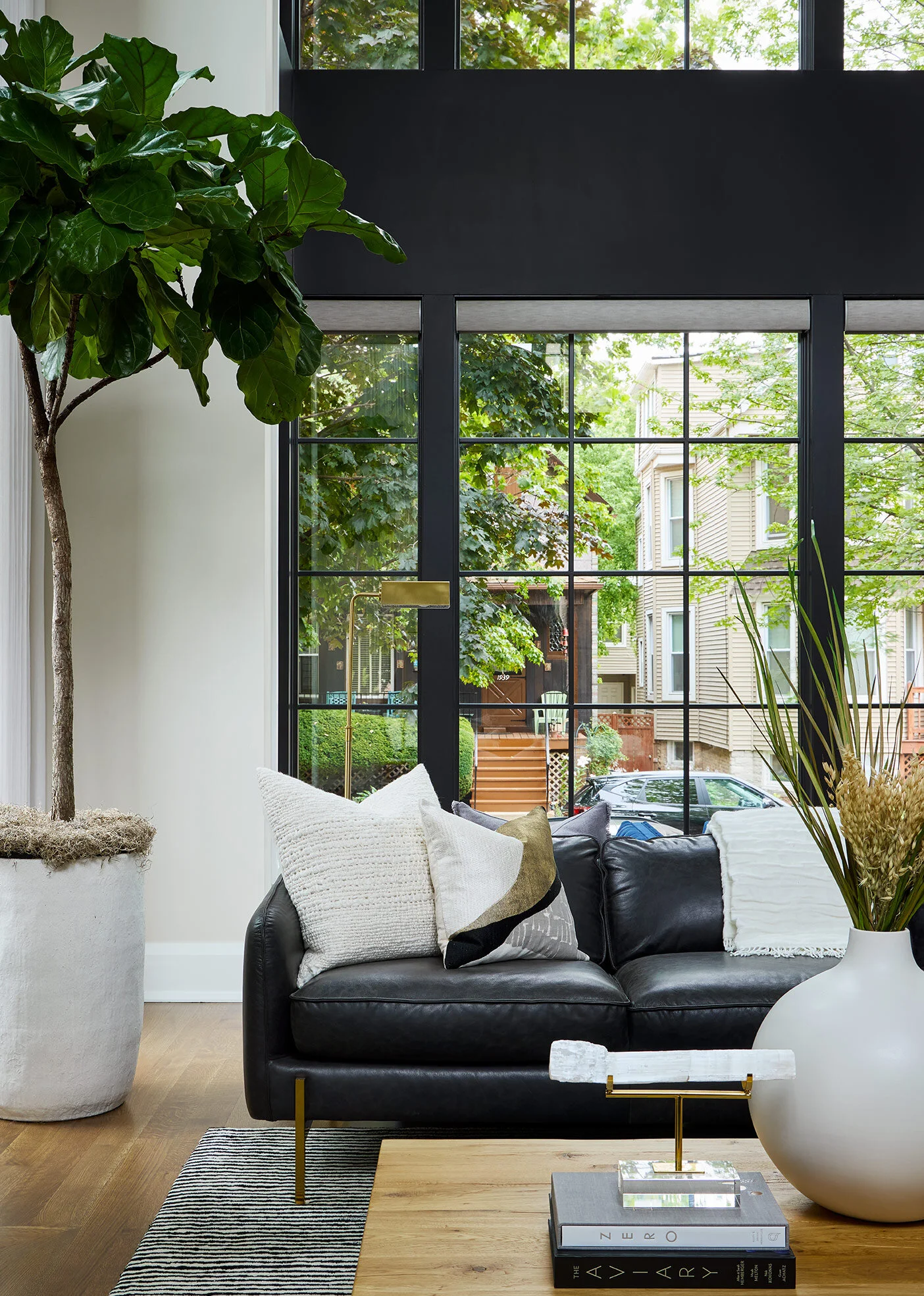
The black floor to ceiling windows are balanced out with light and airy window treatments. The paint color on the walls matches the fireplace stone, and creates a soft backdrop for the darker windows and furniture.
A modern, sculptural chandelier draws your eyes up to celebrate the extra tall ceiling heights. The matte black finish helps carry the black accents up into the open space.
Sofas with low backs were selected to emphasize the height of the room. The black leather sofas bring the black from the windows into the room and help ground the space.
On the back wall, French doors (which mimic the windows across from them) open to an outdoor terrace and seating area. The indoor/outdoor living makes this an ideal space for both entertaining guests or lounging on a perfect Chicago summer day.
Behind the black leather sofas, we tucked blue velvet accent chairs in front of the large windows. They look out onto the cozy neighborhood street, creating the perfect spot to curl up with a good book.
On the opposite side of the entryway is the main floor powder room…remember that initial rendering that started it all? The floating stone vanity creates a stunning focal point to the bathroom, and the mosaic backsplash above adds subtle, classic texture. Brass accents in the mirror and light fixtures add warmth to the space.
Heading upstairs, we designed the primary bedroom and coordinated with the builders, Savane to finalize the three bathrooms on the second floor of the home.
The primary bathroom is classic, sleek, and luxurious, and it’s one of our favorite rooms in the home. The wood vanity and brass accents add so much warmth to the space, while also adding contrast against the white countertops and light marble floors.
The vanity fills the entire wall, so there is no shortage of storage space in this primary bathroom. The backsplash tile behind the vanity adds a beautiful texture to the room while maintaining a sleek and modern feel.
Opposite the vanity, a luxurious and sleek freestanding tub creates a beautiful focal point in this primary bathroom. A stone slab wraps the wall behind the tub, and above it a glass bubble chandelier illuminates the space. Concealed behind the tub is a walk-in shower with a sleek glass shower door.
Down the hall, a Jill-and-Jill bathroom sits between two little girls’ bedrooms. We love to make the kid’s spaces feel special and customized too. So, we opted for a soft lilac vanity (with plenty of storage for two young girls) along the main wall that’s covered in a whimsical, floral wallpaper. Brass accents add warmth to the colorful space.
A third bathroom is connected to the little boy’s bedroom. So, we went for a dark grey color scheme and a navy blue vanity to define his space. We opted to create a large niche wall in the shower to display a geometric accent tile. The navy vanity adds some color to the cool, neutral space. Polished chrome and matte black accents add a modern touch to the space.
Heading back downstairs and past the front living room, the back of the home is a completely open-concept kitchen, dining room, and family room. The modern, open, and airy feel is continued into this open space.
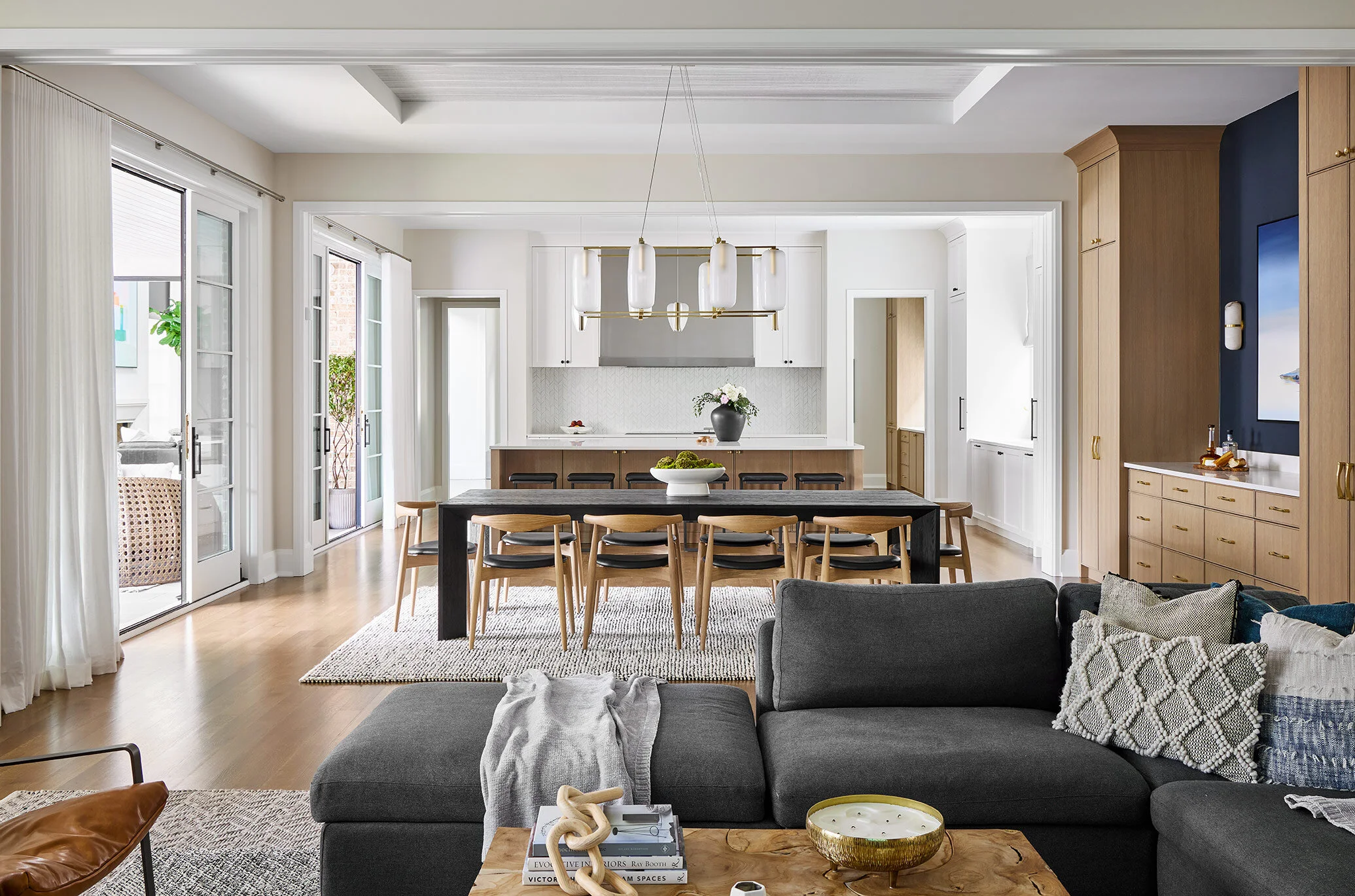
This point of view, from the very back of the home, shows the entire open space. Each area feels cohesive and flows into the next, but they remain defined and stand out on their own. The floors, paint color, and soft wood tones carried throughout help the spaces flow together. Ceiling details, light fixtures, and dark furniture help define each space as it’s own.
Two sets of glass sliding doors along the wall off the kitchen and dining room lead onto the outdoor terrace. When the doors are left opened, it creates an ideal indoor/outdoor living space.
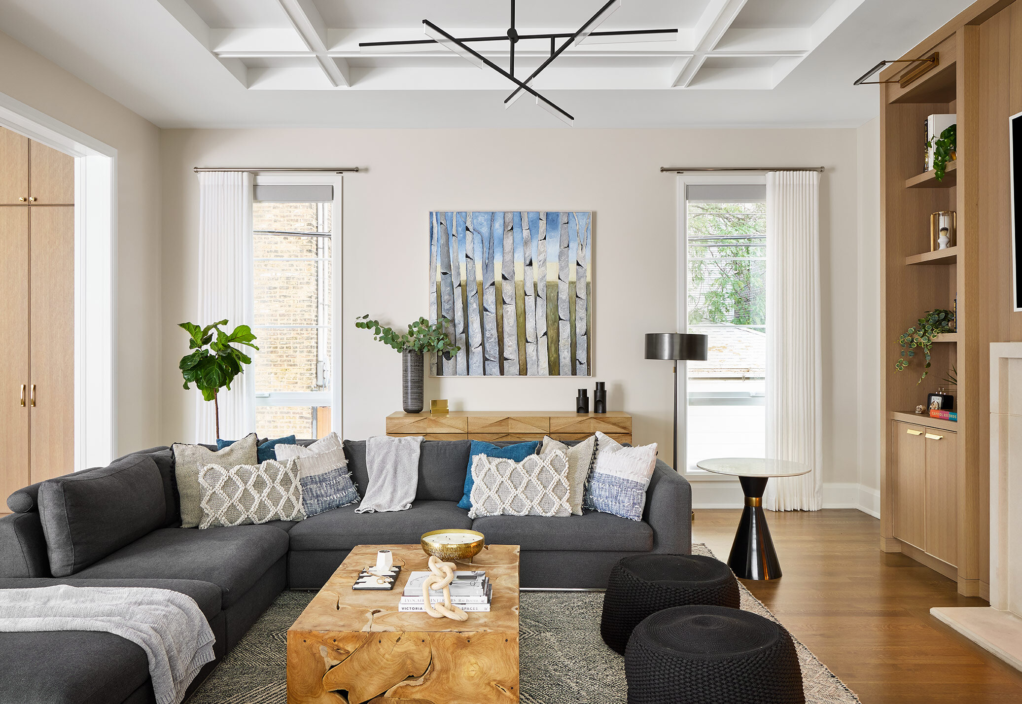
A large, charcoal grey sectional was selected for this family room to create a space that’s perfect for lounging by the fireplace. We centered the client’s artwork along the back wall, and selected some throw pillows to carry the blue tones into the rest of the space.
A large fireplace and built-ins create a focal point in the family room. The wood finish on the built-ins matches the finish on the kitchen island and dining room built-ins to tie all the spaces together. The fireplace carries in the same stone from the front living room, which adds to the cohesive feel of the home.
The ceiling detail and light fixture above the family room helps to define the space. When the fire is lit, this room has serious ambiance.
Next to the family room is the spacious dining room with a large dining table to fit their whole family and their guests. The black wood dining table adds depth and contrast, and helps carry in the black accents throughout the rest of the home.
Textured wallpaper was added to the ceiling in the dining room to help define the space. A brass chandelier adds warmth and a modern touch.
The built-ins along the back dining room wall also help to distinguish the space. They still feel cohesive in the open space because the finish matches the kitchen island and family room fireplace surround. We also carried the same wood tone into the dining chairs to keep things cohesive. We added navy paint between the built-in towers to add depth to the space.
On the other side, the dining room opens into the light and bright kitchen. The large kitchen island provides additional, casual seating for the family.
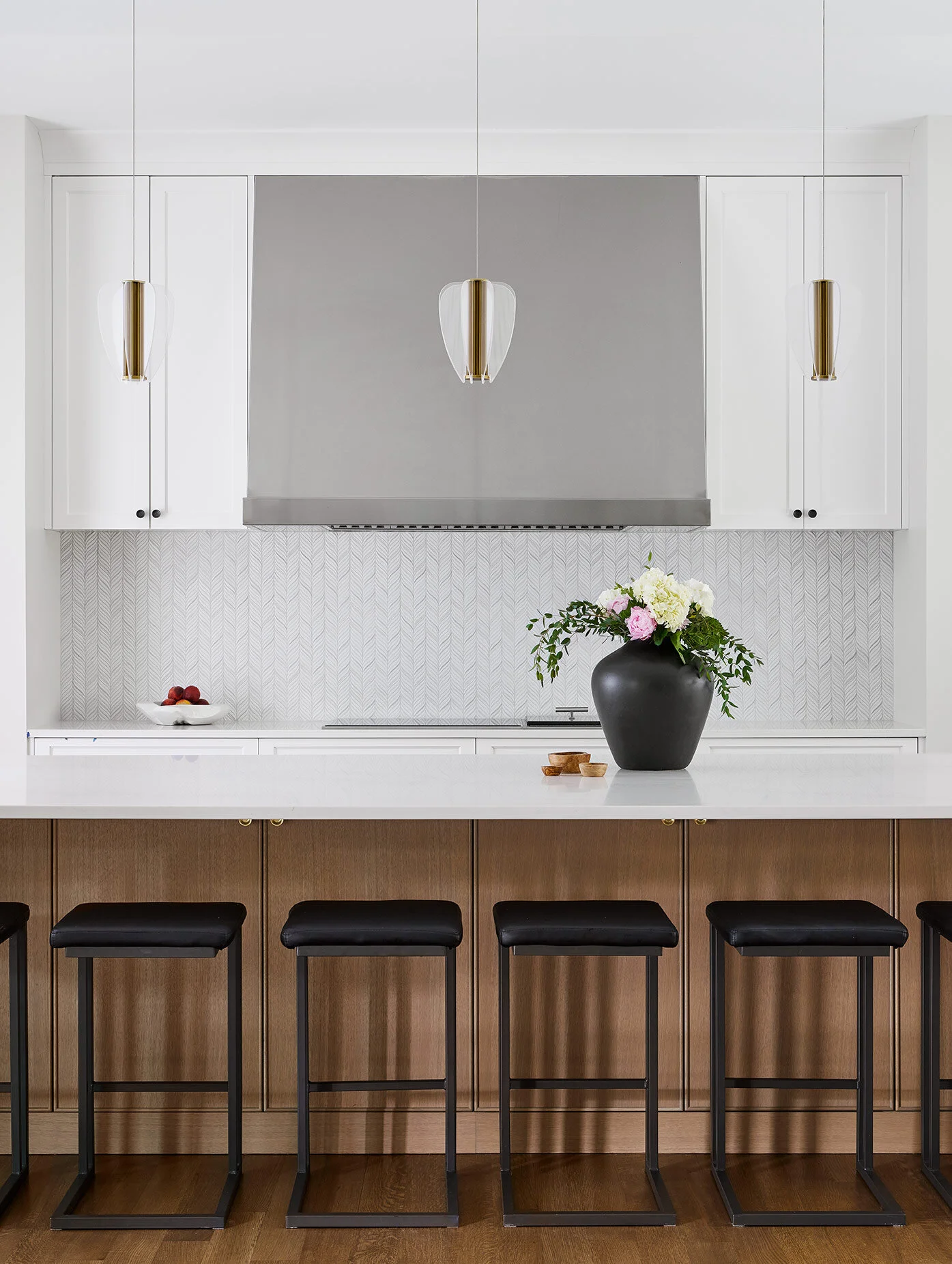
We opted for classic white kitchen cabinets along the perimeter, but for the island we chose to carry in the wood finish from the built-ins in the rest of the space. Matte black hardware was selected for the white cabinets to add contrast, but on the light wood island we selected brass hardware to add warmth.
The black counter stools at the island add depth and contrast, while remaining cohesive with the rest of the home. Modern, delicate pendants hang above the island adding subtle texture and warmth.
The outdoor terrace with both a dining area and a lounge area is another reminder that this is not your average city home. Outdoor spaces in the city are hard to come by, so this oasis off of the main floor adds so much value to this home.
The basement family room is the perfect space for the kids to play so we carried in some colorful throw pillows and a colorful are rug for a playful feel to the space. We created a reading nook under the stairs that creates the perfect spot for the kids to curl up with a book.
The design of the basement bathroom is more moody and dramatic compared to the rest of the home. A geometric, wood look wall tile covers the main wall of the bathroom adding plenty of texture and warmth to the space. A dark grey vanity and countertop grounds the bathroom.
That completes the tour, we hope you enjoyed it! We are so honored we had the opportunity to help design this amazing home for our clients and their young family. This was such a special project, and we hope they love it for years to come!
-dgw
Photos: Dustin Halleck
Builder/Architect: Savane Properties


